Category: Art Experiments

  • Reduction Study No. 2: French Press

    Reduction Study No. 2: French Press

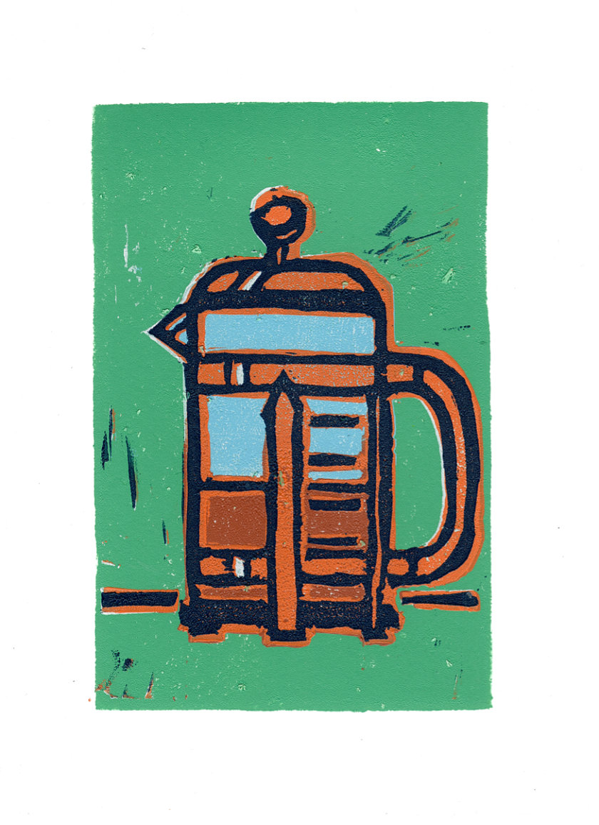
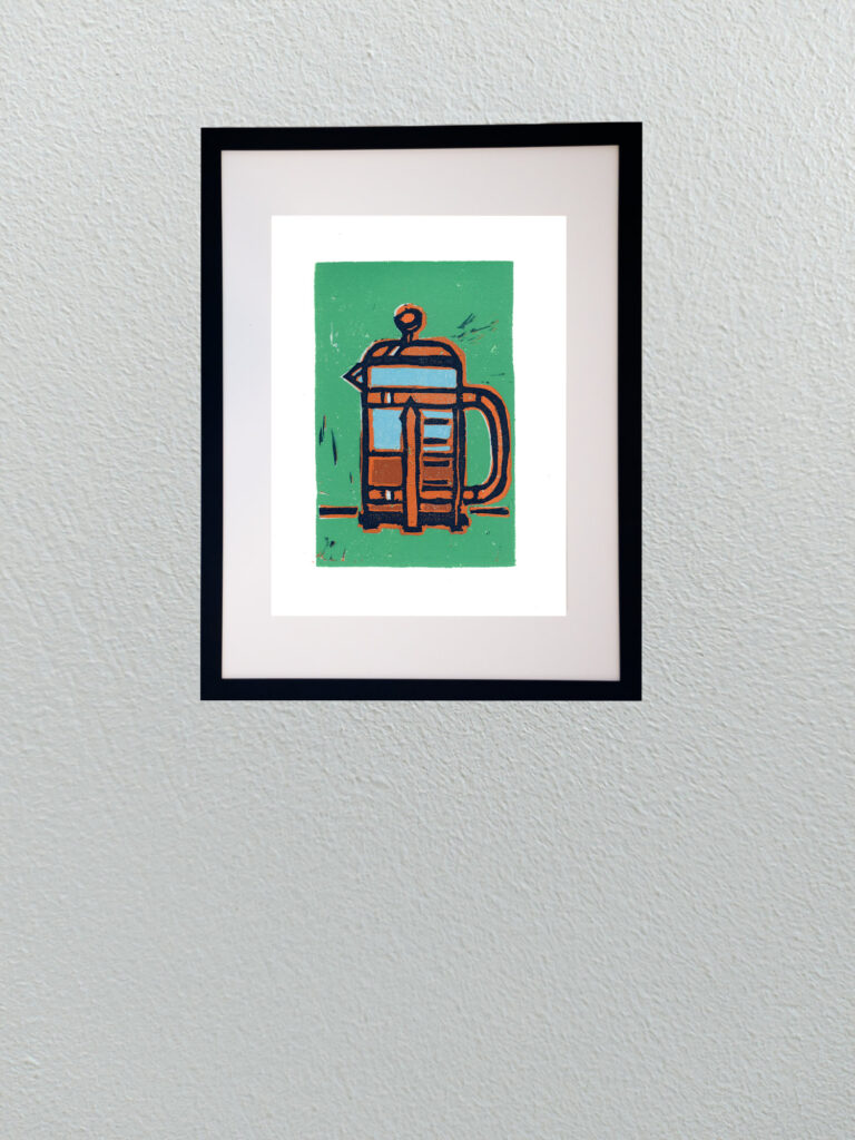
    Continuing with my deep dive into re-learning reduction linocut printing, this new piece takes the coffee theme a step further. While the earlier moka pot study was a great warm-up in carving and basic registration, this French press piece pushed into much more complex territory as a 6-color reduction print.

    Reduction printing is an unforgiving process because thereโ€™s no turning backโ€”once you carve away a layer of linoleum for the next color pass, that previous stage is gone forever. Managing six distinct color passes meant planning out the light blues, warm terracottas, rich coffee tones, jade background, and heavy dark outlines in strict sequence.

    Working through six passes also means wrestling with registration precision and ink trap behavior on the block. Small variations in pressure or carving depth show up immediately, but that physical unpredictability is exactly what makes relief printmaking so rewarding. The slight chatter marks left in the background and the overlap of heavy ink layers create a graphic, tactile punch that you simply canโ€™t replicate with a pen or digital tool.


  • Relief Print: Moka Pot

    Relief Print: Moka Pot

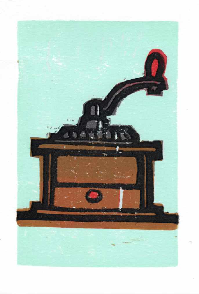
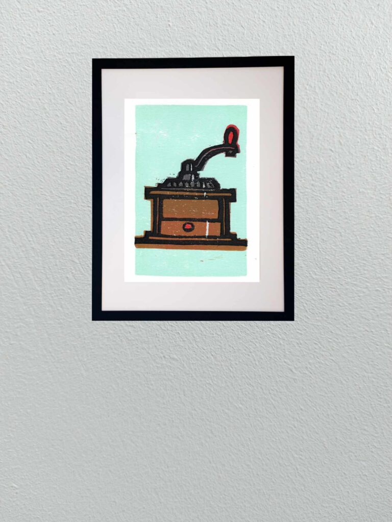
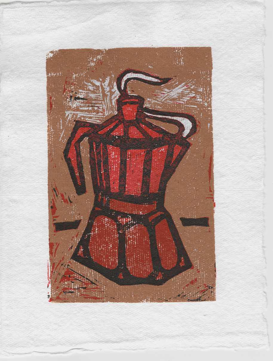
    This recent piece is a sharp departure from my usual studio routineโ€”an experimental reduction lino print of a classic moka pot. Relief printmaking is a medium I havenโ€™t actively worked in for a very long time, making this a deliberate exercise in re-learning some lost skills.

    Reduction printing forces you to think entirely in reverse and in stages, carving away layers of the same linoleum block between color runs. For this trial, I pressed the inks onto a coarse, heavily textured handmade paper. The paperโ€™s prominent tooth and organic surface grain deliberately fight the smooth coverage of the ink, leaving behind a raw, weathered texture that emphasizes the mechanical nature of the press.

    Stepping away from the precision of fine pens to wrestle with carving tools and ink rollers is a great reminder of how grounding it is to be a beginner again in a medium. Itโ€™s an untamed, physical process where you have to learn to embrace the friction and the happy accidents of the print.


  • Frenetic Canopy

    Frenetic Canopy

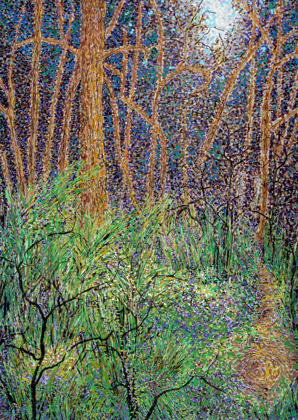
    I wanted to move away from the quiet, still qualities of a traditional landscape and focus entirely on energy. Nature is rarely static. It is constantly growing, decaying, and shifting. This piece was a deliberate experiment in capturing that hidden, frenetic activityโ€”making a forest look as though it is writhing and moving right in front of you.

    Technically, this required a dense orchestration of different tools and medium behaviors on smooth hot press paper. I built the surface using a heavy blend of Faber-Castell Pitt pens, Staedtler pigment pens, acrylic pens, and Sakura gel pens.

    The process was rhythmic and intense. I used the fine precision of the Staedtler pens to create an intricate web of overlapping, high-contrast lines for the undergrowth and the tree trunks. The fine, colorful lines slashing through the foliage were accomplished with Sakura gel pens, giving those bright accents a sharp, clean edge. Instead of blending colors smoothly, I relied on rapid dashes and tight clusters of stippling with the acrylic and Pitt pens. By placing contrasting tones directly side-by-sideโ€”the electric greens against the deep purples and warm ochresโ€”the canopy begins to optically vibrate.

    It is a chaotic way to build a landscape, but letting the marks layer over one another without correcting the friction gives the piece its pulse. It records the grit and the constant motion of the woods rather than a sanitized portrait of them.