Category: Illustration

  • The Yellow Patio

    The Yellow Patio

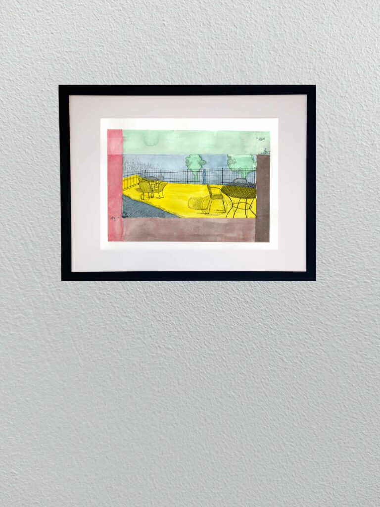
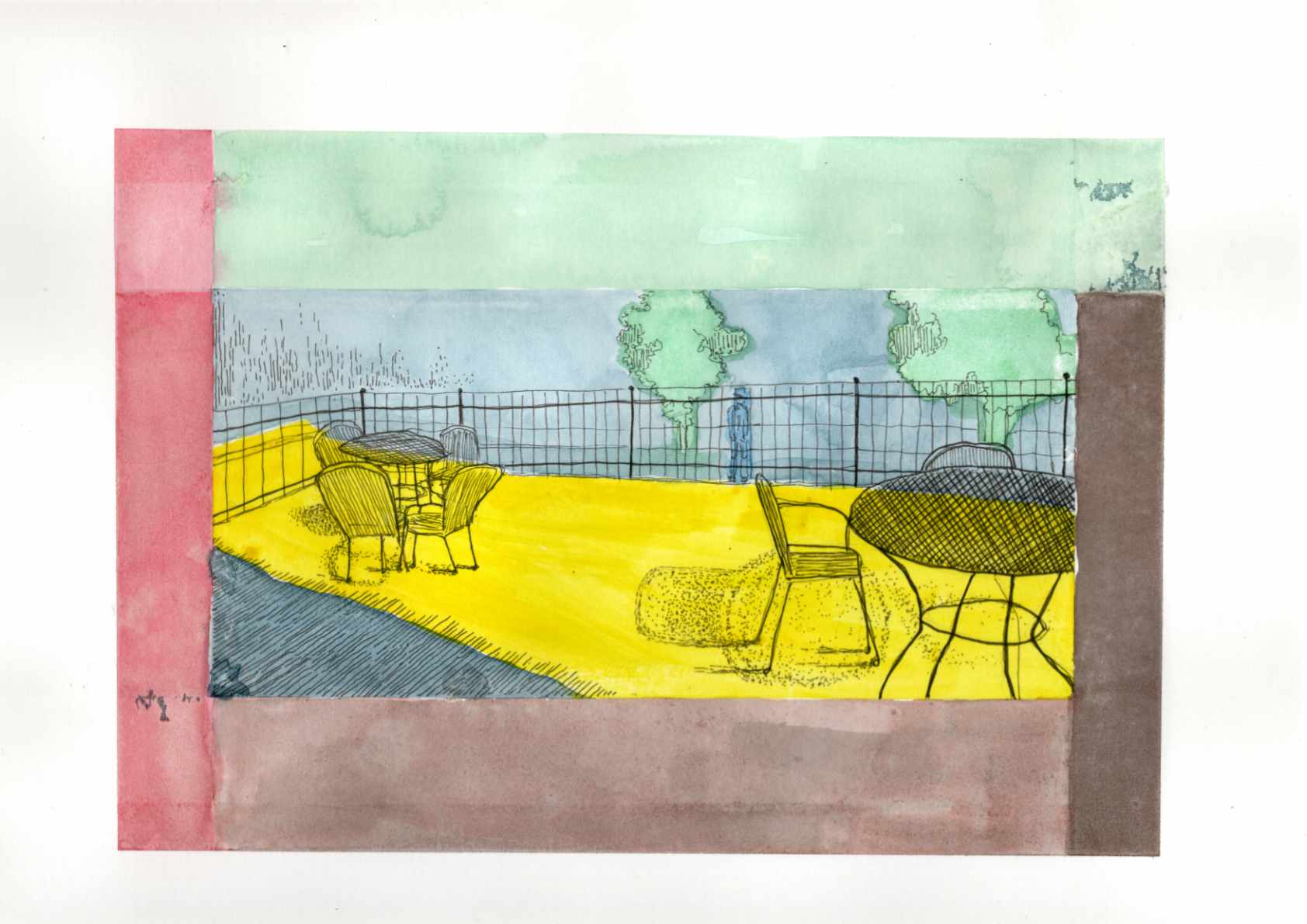
    Today I am sharing a new graphic piece titled “The Yellow Patio.” The title is intentionally a bit on the nose—an ironic nod to a cheerful early spring setting that actually masks the heavier, psychological weight of the scene.

    Based on a reference photo of a small bistro area, this piece gave me the opportunity to lean heavily into a Synthetist, graphic style of color blocking. The composition is built entirely on the boundary between light and dark, inside and outside. To translate the intense feeling of that boundary, I used deep, unnatural blues and heavy purples to anchor the foreground shadows, which perfectly frame the harsh, acidic, vibrating yellow of the sunlight hitting the concrete floor.

    This piece ties directly into the theme of the “quiet observer” that runs through much of my work. By placing the viewer firmly within the cold shadow, looking out past the empty iron chairs toward a lone, distant figure beyond the fence, it creates a distinct sense of isolation and voyeurism. It’s a moment of being entirely separated from the warmth and the outside world, suspended in bold, flat color.

    Technical Details:

    • 9×12 140lb hot press
    • Sakura fine liners
    • India ink
  • Summer Dusk

    Summer Dusk

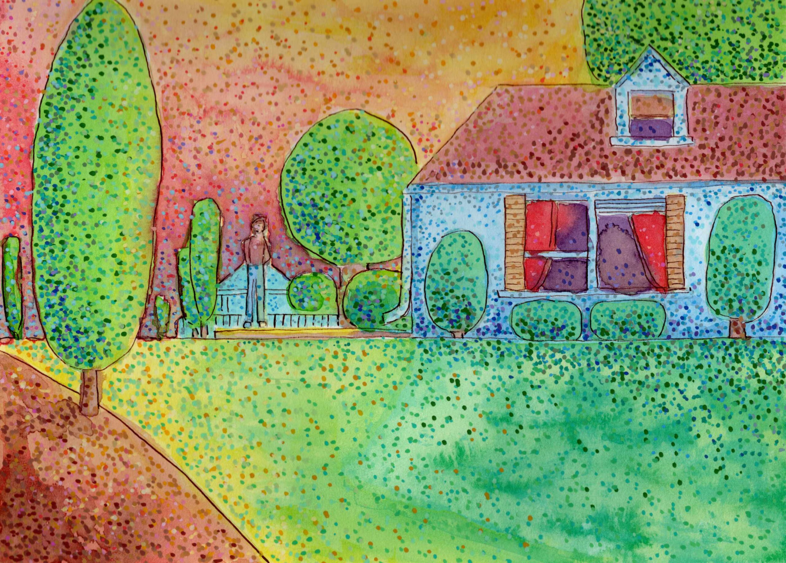
    Today I am sharing a new 8×10 study that explores the specific atmosphere of late summer. I wanted to capture not just the intense colors of the season, but the underlying mood—a suggestion of the mysterious melancholy that often accompanies the heavy heat before autumn arrives.

    To build this atmosphere, I completely shifted my mark-making, relying on a stippling technique using Pitt pens and acrylic markers on cold press paper. By applying the color in thousands of distinct dots rather than smooth lines or washes, the surface of the piece seems to physically vibrate. The bright yellows, greens, and warm oranges create a visual “heat haze.”

    To introduce that feeling of mystery, I leaned on contrast. The cooler blues in the shadows of the house and the solitary, undefined figure standing in the yard anchor the piece in a quiet, slightly unsettling stillness. It is an exercise in letting the optical mixing of colors dictate both the light and the emotional weight of the scene.

    Technical Detail:

    • Shuttle Art acrylic brush pens
    • India ink
    • Dip pen
    • 9×12 140lb cold press

  • Heat on the Water

    Heat on the Water

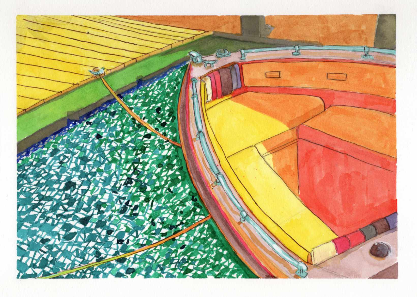
    Recently, I shared a highly saturated, small-scale study of a boat docked on a blindingly bright summer day, done entirely with Zebra Sarasa gel pens. That initial piece was all about capturing the raw, vibrating heat and light from an old reference photo.

    Today, I am sharing the larger, translated version of that same scene, completed this time using India ink.

    It is always a fascinating process to see how a composition shifts and breathes differently when you change both the scale and the medium. While the gel pen study was built on tight, scratchy, directional strokes, moving to India ink allowed for broader, smoother washes of color.

    You can see how the vivid yellows, reds, and oranges of the boat’s interior feel a bit more grounded and painterly in this version. However, I intentionally kept that fragmented, graphic, mosaic-like texture in the water to maintain the harsh, rippling reflection of the summer sun.

    Taking a piece from a small, experimental study to a larger ink format is a balancing act—trying to refine the forms without losing the initial, spontaneous energy that made the sketch work in the first place.

    Technical Details:

    • India Ink
    • Strathmore heavyweight mixed media 350lb 9×12
    • Liquitex white acrylic ink

  • Spring Vetch

    Spring Vetch

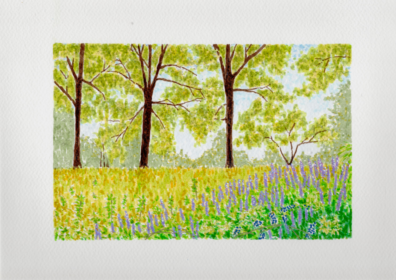
    This study captures a spring field in Georgia, where the greens and yellows feel like they arrived overnight. I used India ink to build the colors in layers, following an Impressionist approach where the depth emerges slowly through repeated marks rather than solid lines. Against that translucent ink, I used acrylics sparingly as a solid, opaque counterpoint.

    I applied them specifically to the purple vetch in the foreground and a few select leaves to give the eye a place to land. The cold press paper captures and holds the ink exactly where I want it, keeping the pigment in place while allowing just the smallest edges to blend into the tooth. It’s a fast, rhythmic way to work that records the spirit of the place without getting bogged down in every individual blade of grass.

    Technical Details:

    • 8×10 140lb cold press
    • Sakura Pigma pens
    • Faber-Castell Pitt pens
    • Acrylic swipe
  • The Reader and the Statue

    The Reader and the Statue

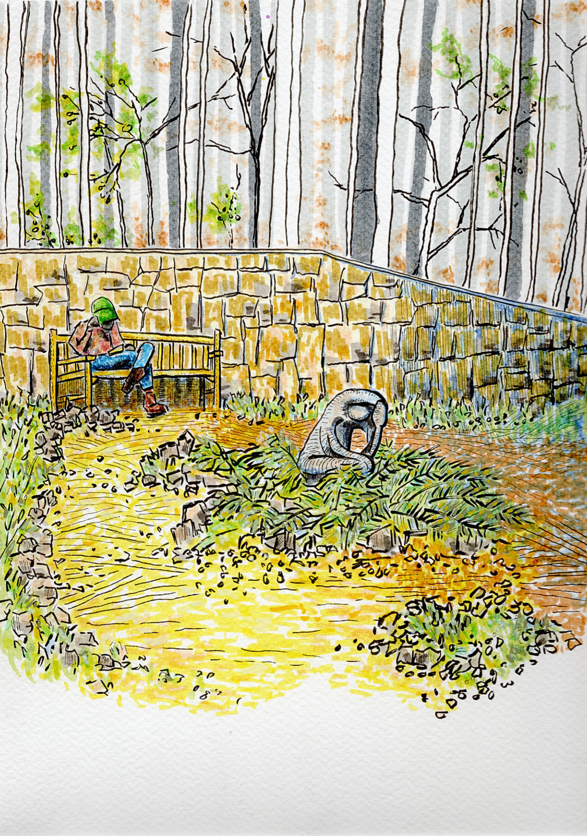
    I’m sharing a new piece today, built from a reference photo I took on a cool spring afternoon at the Georgia State Botanical Gardens in Athens.

    Walking through the grounds, I was immediately drawn to the relationship between these two figures—a man reading on a bench and a nearby sculpture. I loved the accidental, imitative gestures; both the living man and the stone figure seemed equally invested in their quiet activities. The contrast between the fleeting stillness of the reader and the permanent stillness of the stone was a dynamic I wanted to capture on paper.

    For this piece, I wanted the technique to reflect the atmosphere of that afternoon. Instead of rigid, heavy linework, I relied on quick dashes and the natural, expressive tendency of India ink. My goal was to give the illustration a whimsical and impressionistic sensation, capturing the feeling of the garden rather than just mapping out its exact details.

    To balance that loose, kinetic energy, I brought in acrylic ink very sparingly. It was used just to provide some opaque grounding in a few sparse locations across the piece, anchoring the expressive ink lines and giving the composition a bit of weight.

    It’s a quick study of a quiet moment—where life and art happened to be doing the exact same thing.

    Technical Details:

    • 9×12 140lb cold press
    • Faber-Castell Pitt pens
    • Shuttle Art paint pens
    • Staedtler Pigment Liner
  • sweets shoppe

    sweets shoppe

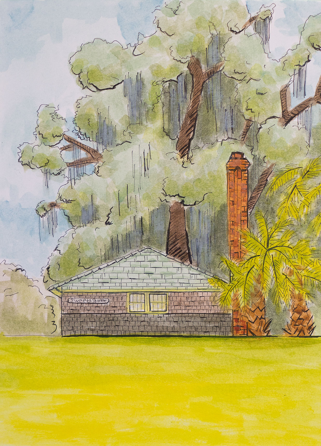
    The painting presents a charming drawing of a local confectionery by a verdant landscape. The house itself has a classic design, featuring a grey roof and brick walls, with two windows that add to its cozy and welcoming appearance. 

    In the background, the image is framed by towering trees with dense foliage, providing a natural backdrop that contributes to the overall serenity. The variety of trees, including palm trees on the right, adds a touch of tropical beauty and diversity to the setting. The bright colors used for the sky and surroundings indicate that it is daytime, casting the entire scene in a cheerful and peaceful light. The drawing captures a picturesque moment, inviting viewers to imagine the tranquility of life in such a lovely environment.

    Technical Details:

    • Acrylic wash
    • Sakura Pigma pens
    • 9×12 140lb cold press
  • Snow Day in North Georgia

    Snow Day in North Georgia

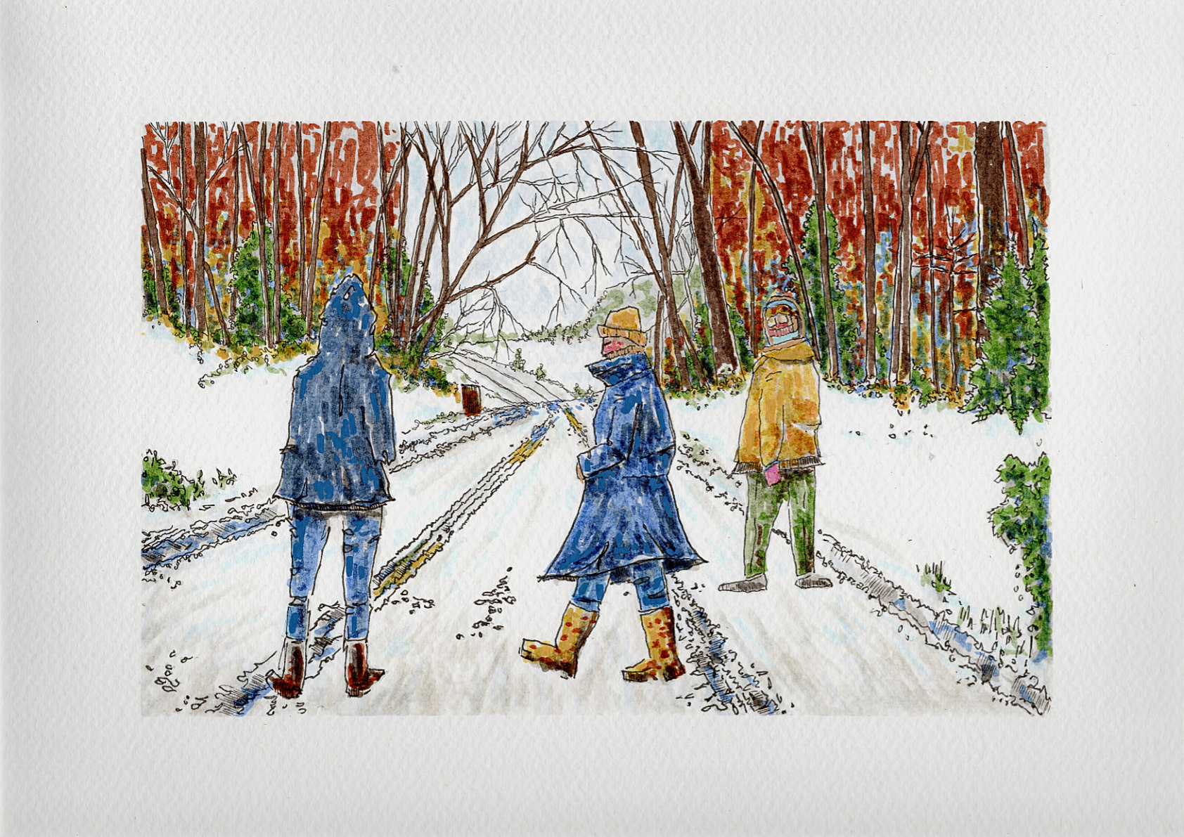
    I’m sharing another new piece today, this one capturing a completely different kind of stillness. Based on a cold, snowy day up in North Georgia, it depicts a few figures standing right in the middle of an iced-over road.

    There is a very specific kind of quiet that happens when it snows heavily around here—the cars stop, the world slows down, and suddenly the middle of the street becomes a place to just stand and take it all in. I wanted to capture that rare, communal pause.

    To get the atmosphere right, I used the same technique as my recent Botanical Gardens piece. I relied on the expressive, fast nature of India ink, using quick dashes rather than rigid lines. This approach gives the illustration a whimsical, impressionistic sensation that mimics the raw, biting energy of a freezing winter afternoon. The scratchy ink work was perfect for mapping out the bare, shivering trees and the heavy tire tracks carved into the ice.

    Just like the last piece, I used acrylic ink very sparingly to provide some opaque grounding. The bright hits of color on the winter coats and the deep, rusty reds in the background tree line help anchor the composition, allowing the white of the cold press paper to do the heavy lifting for the snow.

    It’s a quick snapshot of a rare winter moment, frozen in ink.

    Technical Details:

    • 9×12 140lb cold press
    • Faber-Castell Pitt pens
    • Shuttle Art paint pens
    • Staedtler Pigment Liner

  • Physical: Nunnally Road

    Physical: Nunnally Road

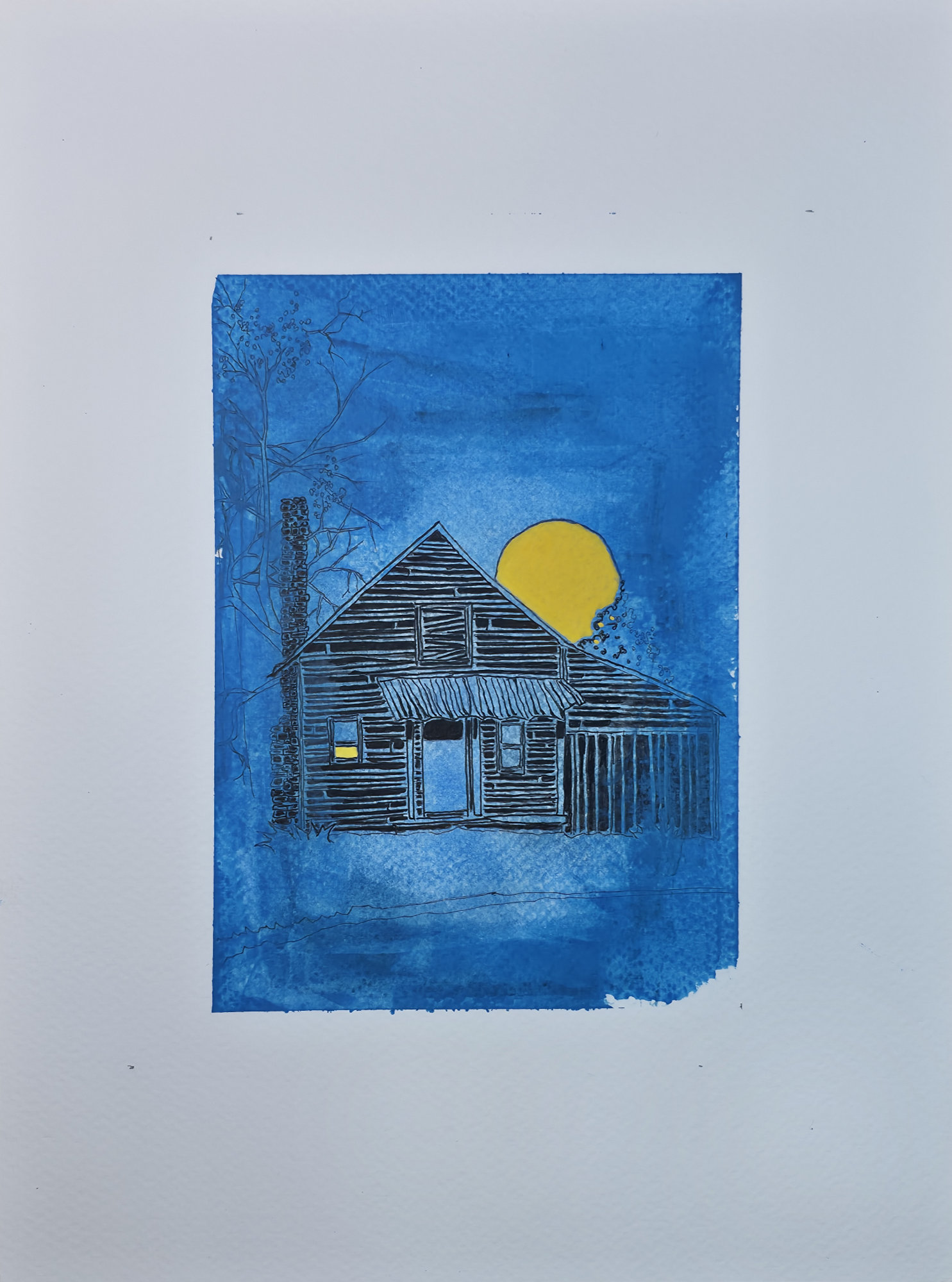
    Here is the first of the physical work for this series.

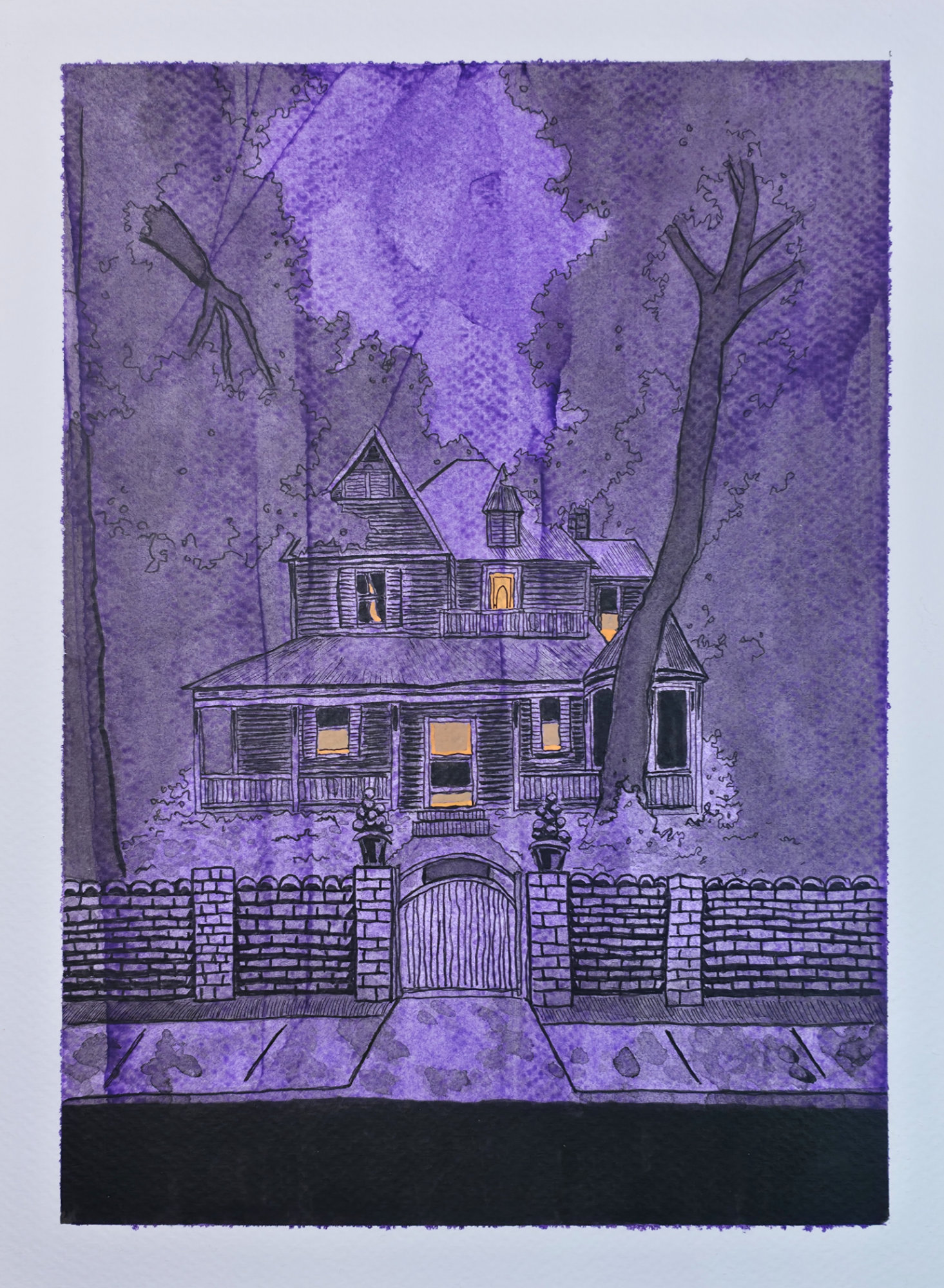
    I’m excited to introduce the first piece in a new three-part illustrative series. The theme is a blend of seasonal whimsy and the gentle, spooky feeling of unique, isolated structures. Over the years, I’ve collected photographs of fascinating buildings, and this series gives them a new life and a new story.

    I chose a stark, graphic style with strong linework to evoke the feeling of a classic block print or a storybook illustration. While this image was created digitally, I’m currently working on its physical counterpart, exploring the dialogue between the two mediums. This piece, “Nunnally Road,” is the beginning of that exploration.

    Technical Details:

    • Acrylic swipe
    • Sakura Pigma pens
    • 9×12 140lb cold press
  • Physical: Hightower Road

    Physical: Hightower Road

    My physical creation of the original digital piece.

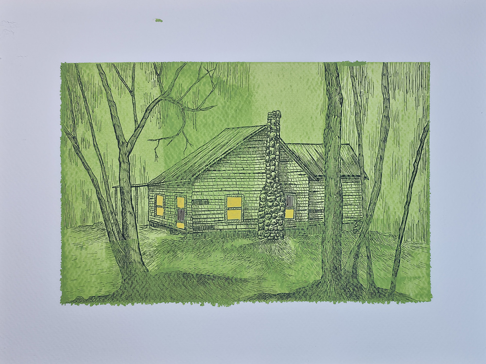
    Continuing my new three-part illustrative series where seasonal whimsy meets eerie Americana. This second piece is titled “Hightower Road,” and it carries forward the theme of bringing old, forgotten structures back to life with a new, illustrative story.

    The style remains graphic and sketch-like, evoking the feel of a classic block print. As with the first piece, this is the digital version, and I’m continuing to develop the physical counterparts. The exploration of bridging these two mediums is at the heart of this series, and “Hightower Road” is the next step in that journey.

    Technical Details:

    • Acrylic swipe
    • Sakura Pigma pens
    • 9×12 140lb cold press

  • Physical: Cemetery Road

    Physical: Cemetery Road

    Physical version of this original digital piece.

    And with that, the series is complete. This three-part digital collection was an exploration of seasonal whimsy and the mysterious vibes of forgotten places. From the first piece to this final one, “Cemetery Road,” my goal was to take real structures I’ve photographed and imbue them with the feeling of a modern folk tale.

    For this final installment, I used a monochromatic green palette and the enchanting glow of fireflies to create a uniquely eerie and magical atmosphere. It’s been a fantastic journey blending photography, memory, and digital illustration. Physical versions of all three are still in the works!

    Technical Details:

    • Acrylic swipe
    • Sakura Pigma pens
    • 9×12 140lb cold press