Tag: botanical

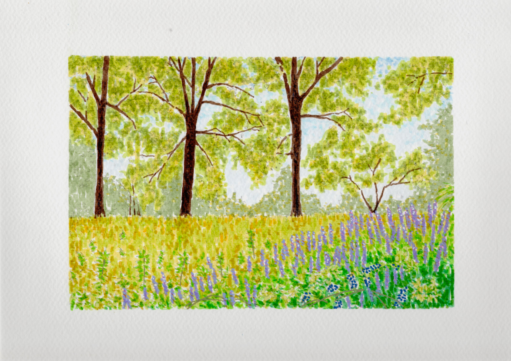
  • Spring Vetch

    Spring Vetch

    This study captures a spring field in Georgia, where the greens and yellows feel like they arrived overnight. I used India ink to build the colors in layers, following an Impressionist approach where the depth emerges slowly through repeated marks rather than solid lines. Against that translucent ink, I used acrylics sparingly as a solid, opaque counterpoint.

    I applied them specifically to the purple vetch in the foreground and a few select leaves to give the eye a place to land. The cold press paper captures and holds the ink exactly where I want it, keeping the pigment in place while allowing just the smallest edges to blend into the tooth. It’s a fast, rhythmic way to work that records the spirit of the place without getting bogged down in every individual blade of grass.

    Technical Details:

    • 8×10 140lb cold press
    • Sakura Pigma pens
    • Faber-Castell Pitt pens
    • Acrylic swipe
  • The Reader and the Statue

    The Reader and the Statue

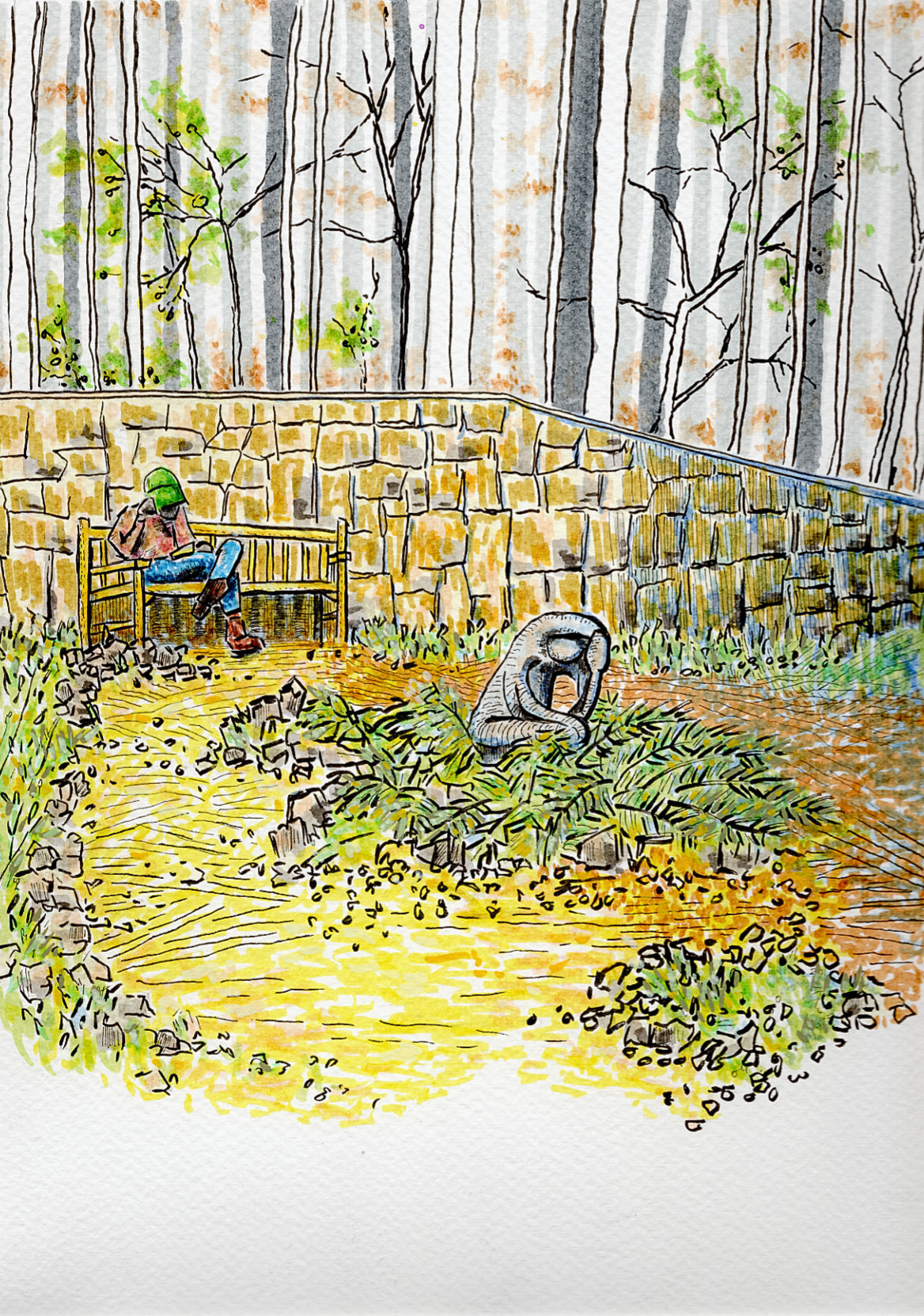
    I’m sharing a new piece today, built from a reference photo I took on a cool spring afternoon at the Georgia State Botanical Gardens in Athens.

    Walking through the grounds, I was immediately drawn to the relationship between these two figures—a man reading on a bench and a nearby sculpture. I loved the accidental, imitative gestures; both the living man and the stone figure seemed equally invested in their quiet activities. The contrast between the fleeting stillness of the reader and the permanent stillness of the stone was a dynamic I wanted to capture on paper.

    For this piece, I wanted the technique to reflect the atmosphere of that afternoon. Instead of rigid, heavy linework, I relied on quick dashes and the natural, expressive tendency of India ink. My goal was to give the illustration a whimsical and impressionistic sensation, capturing the feeling of the garden rather than just mapping out its exact details.

    To balance that loose, kinetic energy, I brought in acrylic ink very sparingly. It was used just to provide some opaque grounding in a few sparse locations across the piece, anchoring the expressive ink lines and giving the composition a bit of weight.

    It’s a quick study of a quiet moment—where life and art happened to be doing the exact same thing.

    Technical Details:

    • 9×12 140lb cold press
    • Faber-Castell Pitt pens
    • Shuttle Art paint pens
    • Staedtler Pigment Liner
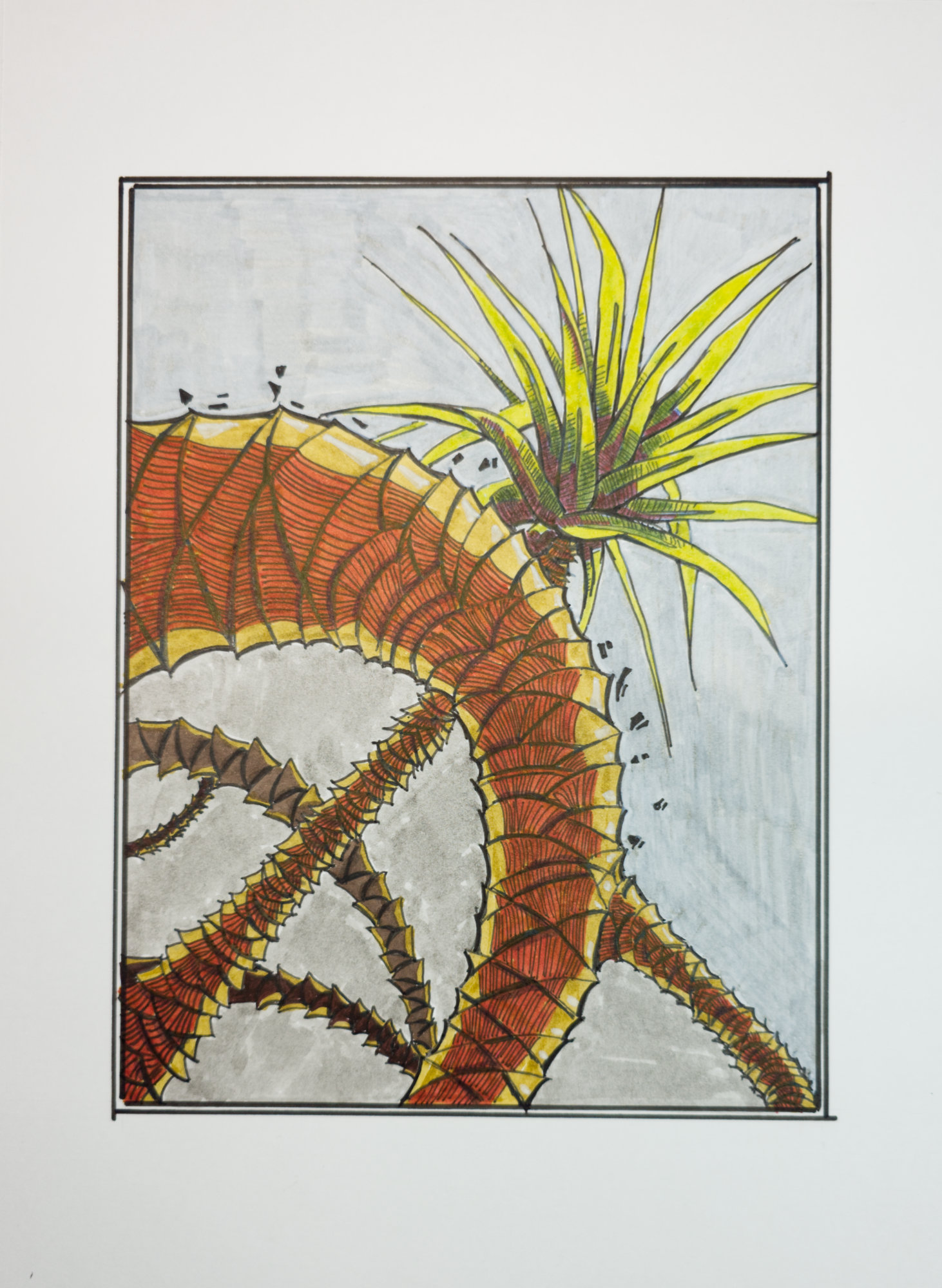
  • Illustration of Dragon Tree

    Illustration of Dragon Tree

    Illustration of Dragon Tree

    Technical Details:

    • 9×12 140lb hot press
    • Sakura Pigma pens
    • Faber-Castell Pitt pens

  • Flowers and Undergrowth

    Flowers and Undergrowth

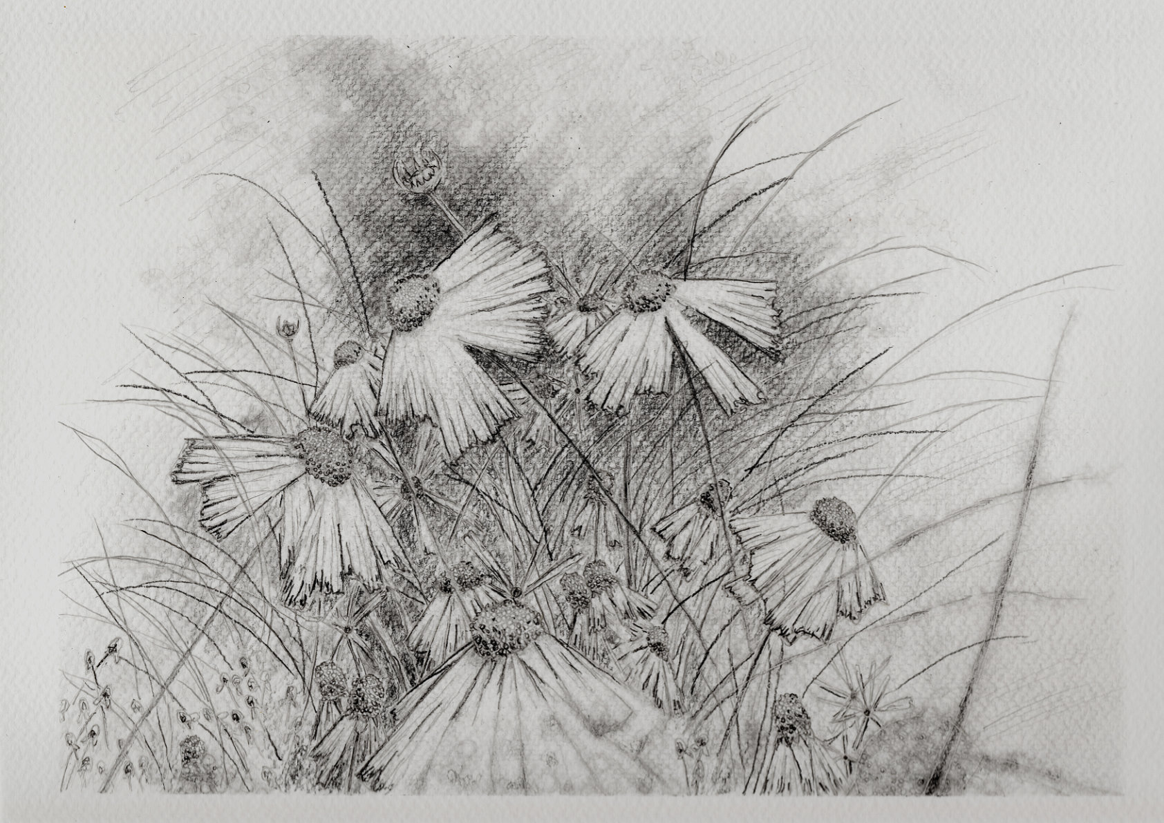
    I am sharing a new piece today that steps away from the ink and mixed media for a moment to focus entirely on pure pencil work. There is a specific kind of quiet intimacy that comes with a graphite study—it feels like a direct, unfiltered look into the sketchbook.

    This drawing is a study of the wild, tangled details of the undergrowth. My main goal was to play with extreme contrast and negative space. By heavily shading the background to create a deep, soft, almost hazy shadow, I was able to push the untouched white of the cold press paper forward. This allows the delicate petals of the flowers to catch the light and practically glow against the darkness.

    To keep the composition from feeling too heavy, I used sweeping, thin lines for the tall grasses. That fine linework gives the piece a lot of kinetic energy, which balances perfectly against the heavier, more textured shading in the centers of the blooms.

    It is a quiet observation of the forest floor, relying entirely on shifting values to find the light hidden in the shadows.

    Technical Details:

    • Mitsubishi graphite pencils
    • 9×12 140lb cold press

  • Dragon Tree

    Dragon Tree

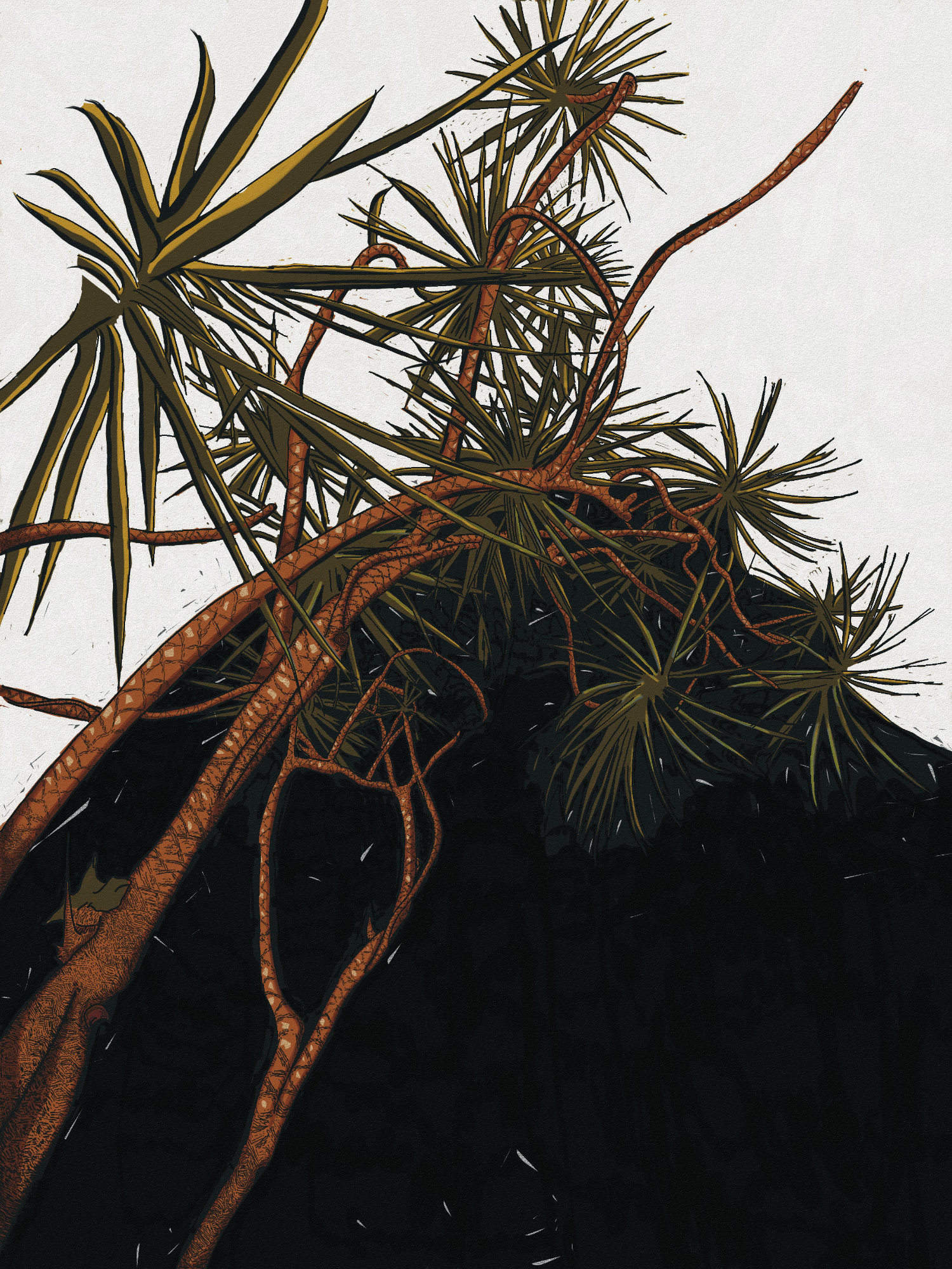
    The first in a new conceptual series exploring the “Dragon Tree.”

    I’ve always been fascinated by the line between a botanical specimen and its mythological namesake. This piece, inspired by a tree at the Georgia Botanical Gardens, imagines the “dragon” brooding in darkness and finally breaking free.

    To capture this, I chose the graphic language of a woodcut. The heavy use of black and the stark contrast aren’t just for drama; they represent the chasm from which the form emerges. The low, upward angle is meant to feel confrontational, putting the viewer at the base of this powerful, uncoiling creature. It’s a study in using negative space and bold lines to tell a story of transformation.

    Technical Details:

    • Samsung Tab9 Ultra
    • Infinite Painter
  • A Visit to the Daffodils

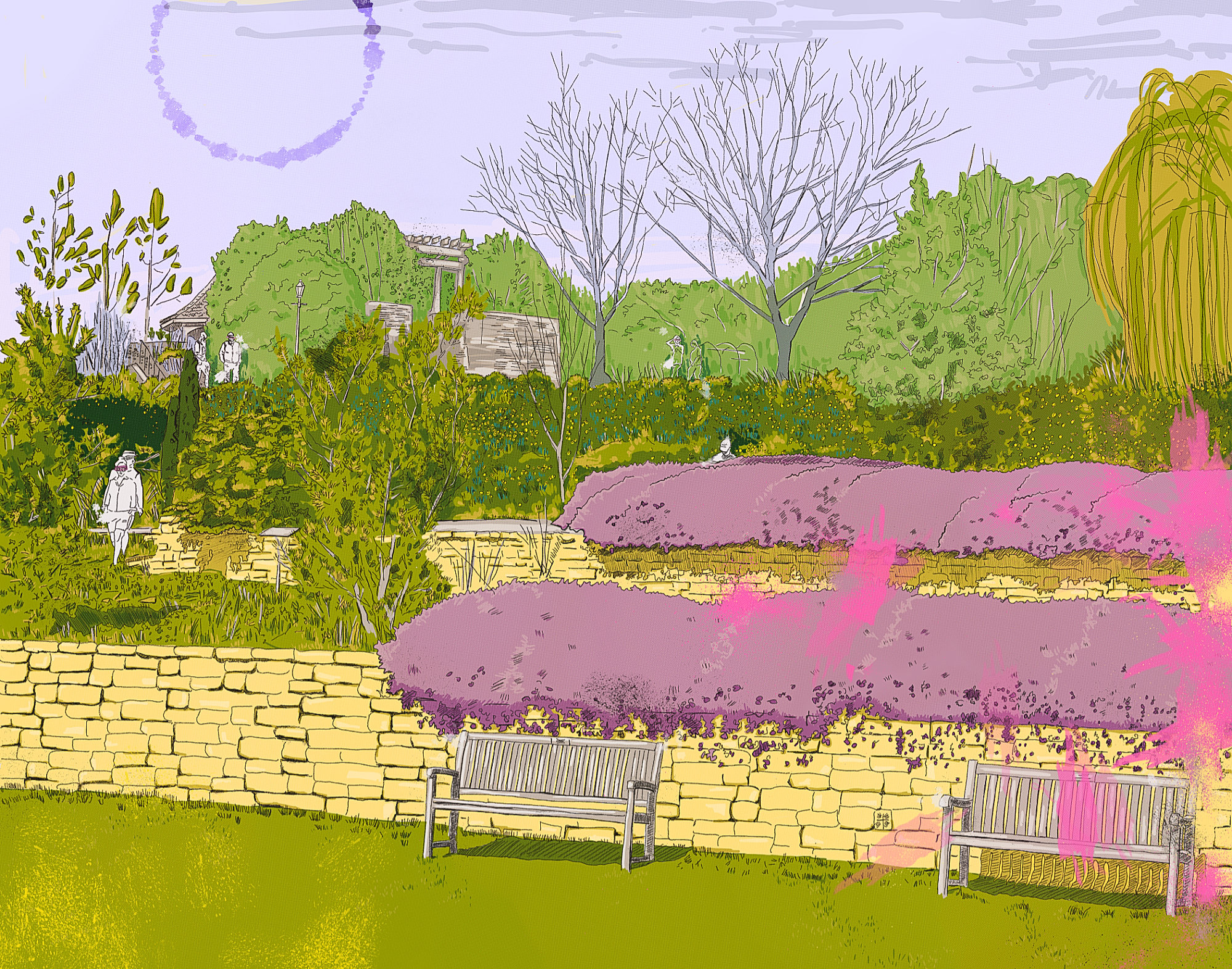
    A Visit to the Daffodils

    This digital illustration presents a stylized garden scene, rendered with a vibrant yet somewhat muted color palette and a distinct layering of textures and lines. The composition features terraced brick walls supporting lush greenery, including rounded purple bushes, various trees depicted with differing levels of detail, and patches of bright green lawn. Figures are sparsely placed within the landscape, adding a touch of narrative ambiguity. The overall effect leans towards a contemporary take on landscape art, blending elements of graphic design with painterly washes of color and a deliberate flattening of perspective. The artist employs a combination of precise linework and more gestural, almost abstract applications of color, particularly the energetic bursts of pink in the foreground, creating a dynamic tension between representation and abstraction.

    The illustrative style and focus on simplified forms and expressive color evoke connections to several art movements. The flattened perspective and bold use of color resonate with aspects of Post-Impressionism, particularly the decorative qualities found in the work of artists like Édouard Vuillard. Simultaneously, the graphic quality of the linework and the layering of distinct visual elements bear similarities to aspects of Pop Art, recalling the screen-printed aesthetic and interest in everyday scenes seen in the work of David Hockney. The combination of natural subject matter with a stylized, almost graphic execution creates a unique dialogue between these artistic traditions.

    Technical Details:

    • Samsung Tab9 Ultra
    • Infinite Painter
  • Arrowhead

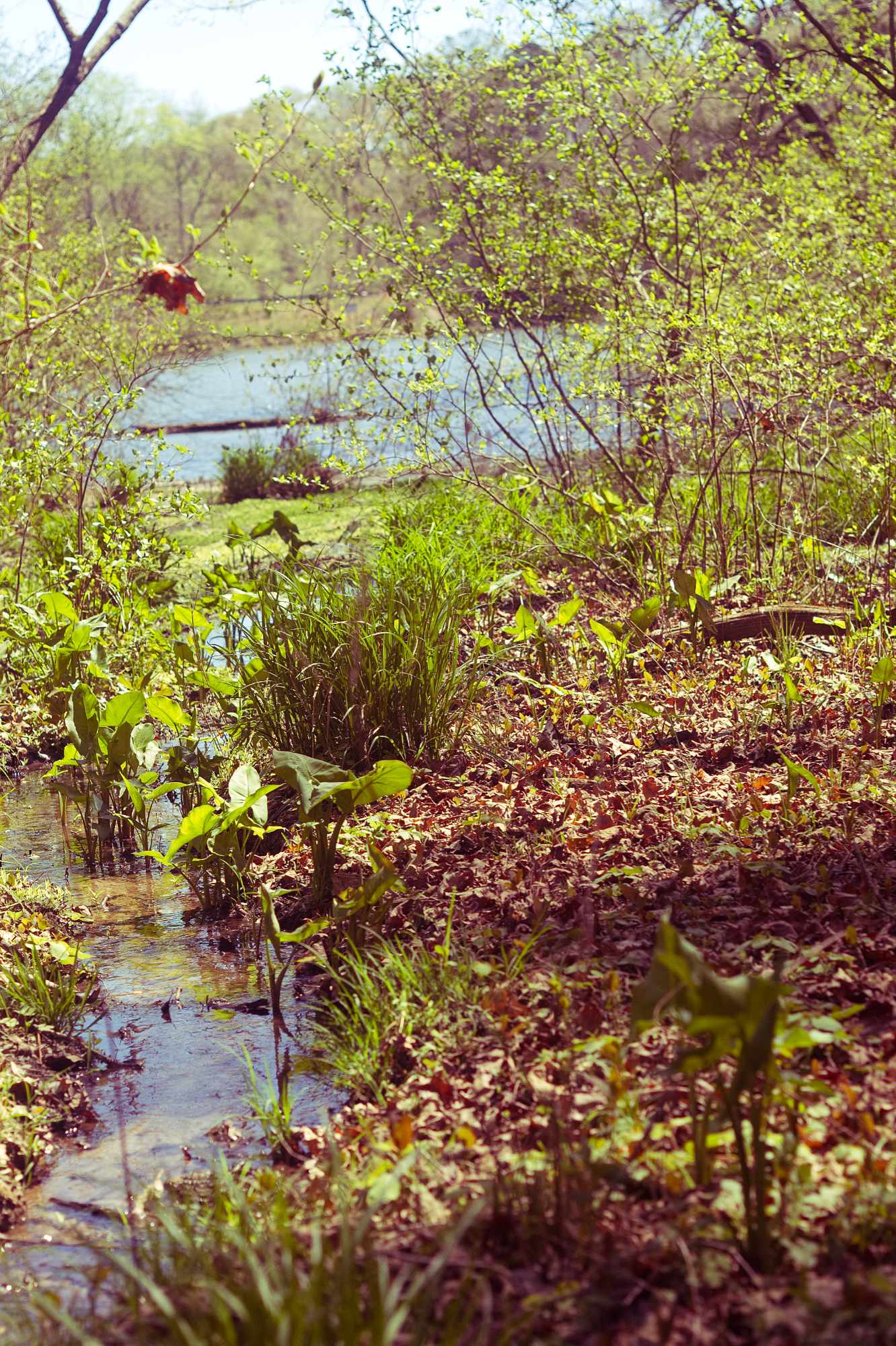
    Arrowhead

    Date taken: 3/28/26
    Camera: Pentax istDL
    ISO 200 | 1/1000
    M42 Petri 1.8/55

  • Cranes and Philodendron

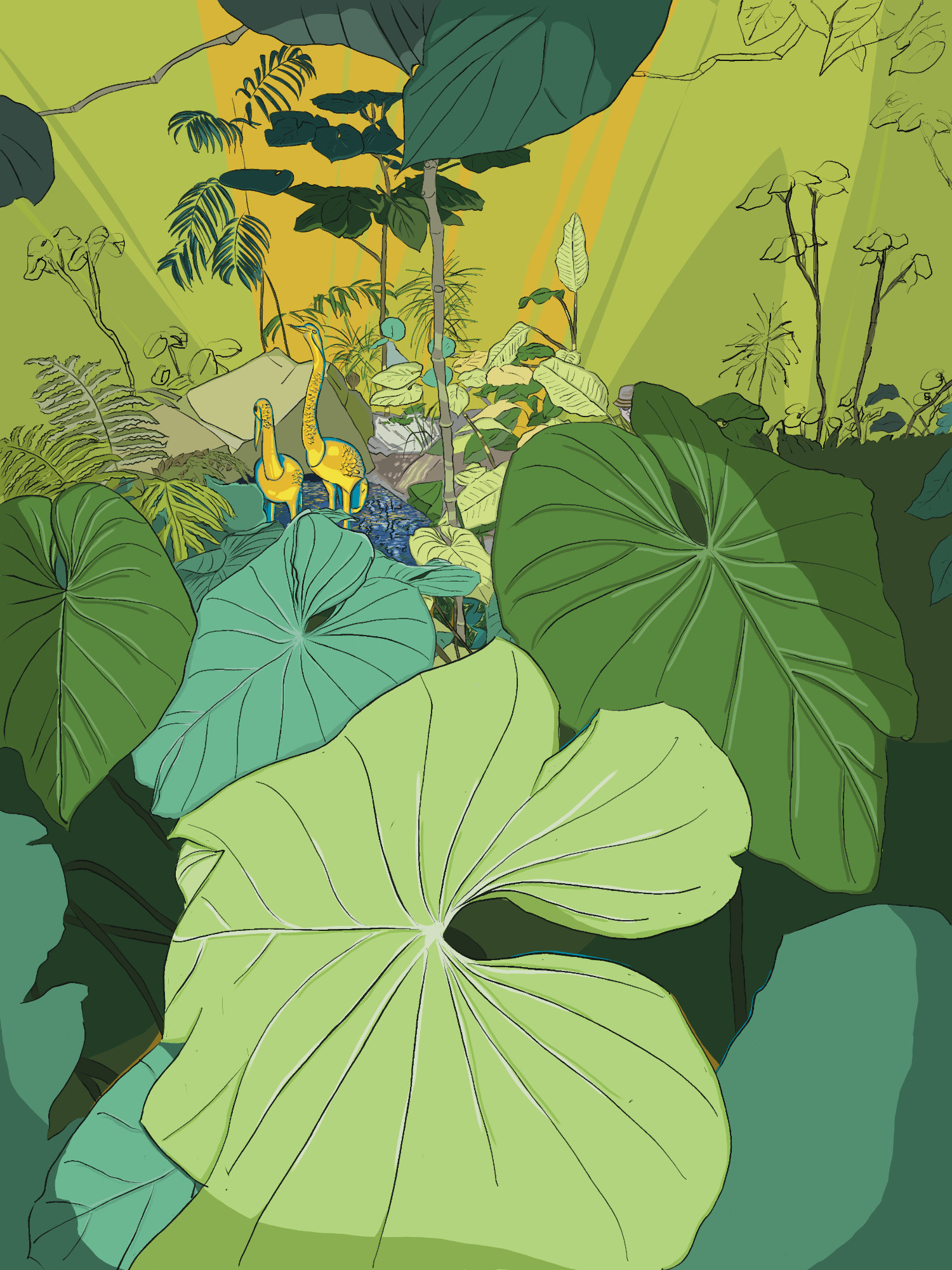
    Cranes and Philodendron

    In my latest piece, “Cranes and Philodendron,” my goal was to translate an internal state into a visual language, using the landscape as my primary medium. The strong compositional elements, like the framing leaves and distinct color fields, draw directly from my interest in Ukiyo-e and Post-Impressionist Synthetism. The defined lines and flattened perspective are an intentional departure from naturalism, allowing the focus to shift toward the scene’s emotional tone and purely aesthetic qualities. The palette itself is Fauvist in spirit; the heightened greens and radiant yellows are meant to evoke the potent atmosphere of a quiet, ephemeral moment rather than to document a literal space.

    This illustration is a direct reflection of my practice, where observations of the world are synthesized with introspective inquiry. The juxtaposition of the serene, stylized cranes within the wild, sprawling foliage touches on the ironic and narrative themes I often explore. For fellow artists, the piece is a case study in stylistic fusion. For collectors, it offers an emotional landscape—a work that aims to do more than represent a scene, but to capture the transient feeling of a specific instance of discovery, hope, and quiet contemplation.

    Technical Details

    Medium: Digital, Infinite Painter
    Surface: Samsung Tab 9 Ultra
    Dimensions: 9×12

  • Ironweed

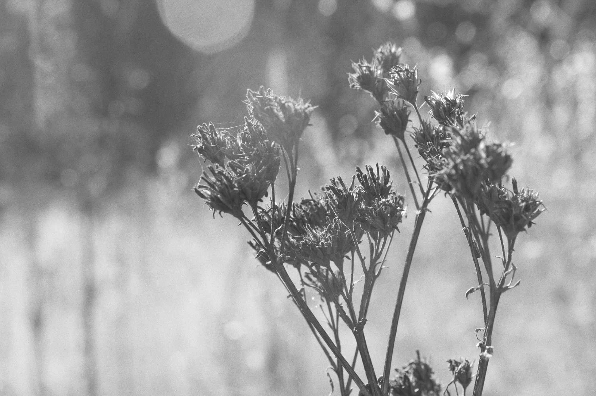
    Ironweed

    Ironweed
    Camera: Nikon D5000
    ISO – 320 | f/11 | 1/60
    48mm Focal Length