Tag: ink

  • Relief Print: Moka Pot

    Relief Print: Moka Pot

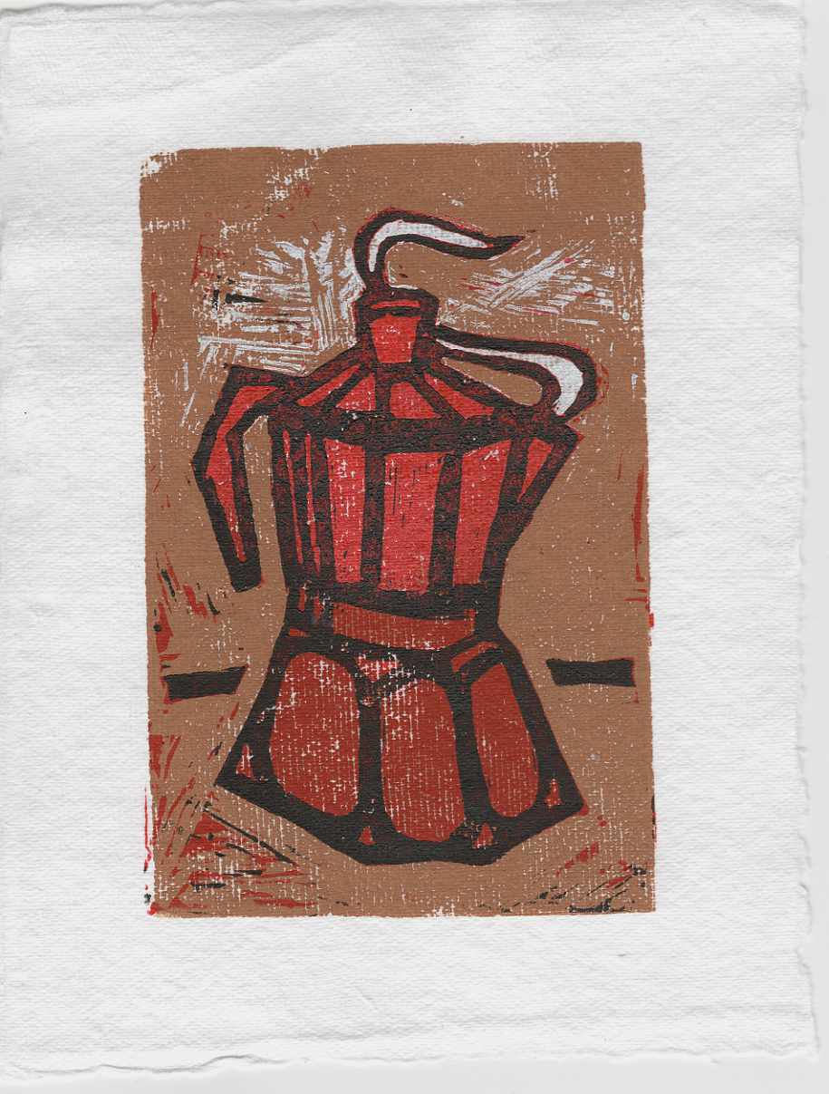
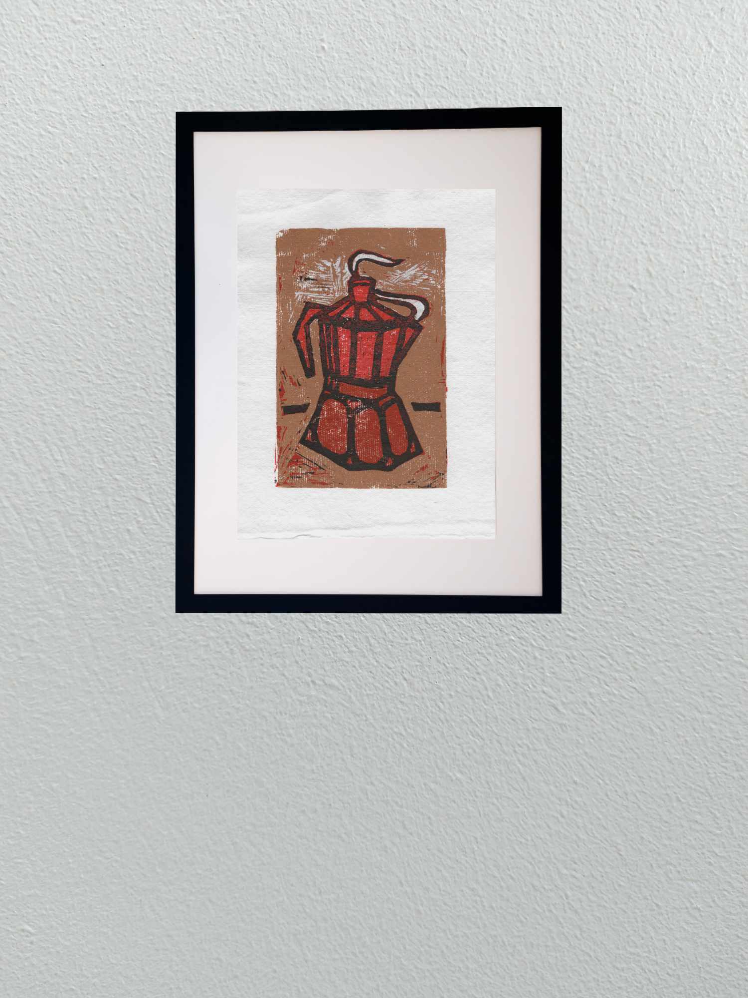
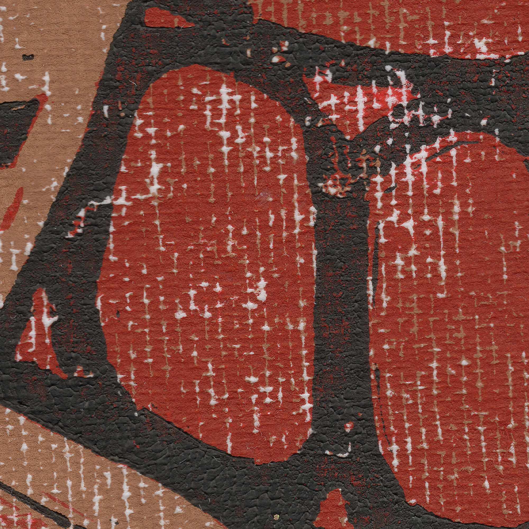
    This recent piece is a sharp departure from my usual studio routineโ€”an experimental reduction lino print of a classic moka pot. Relief printmaking is a medium I havenโ€™t actively worked in for a very long time, making this a deliberate exercise in re-learning some lost skills.

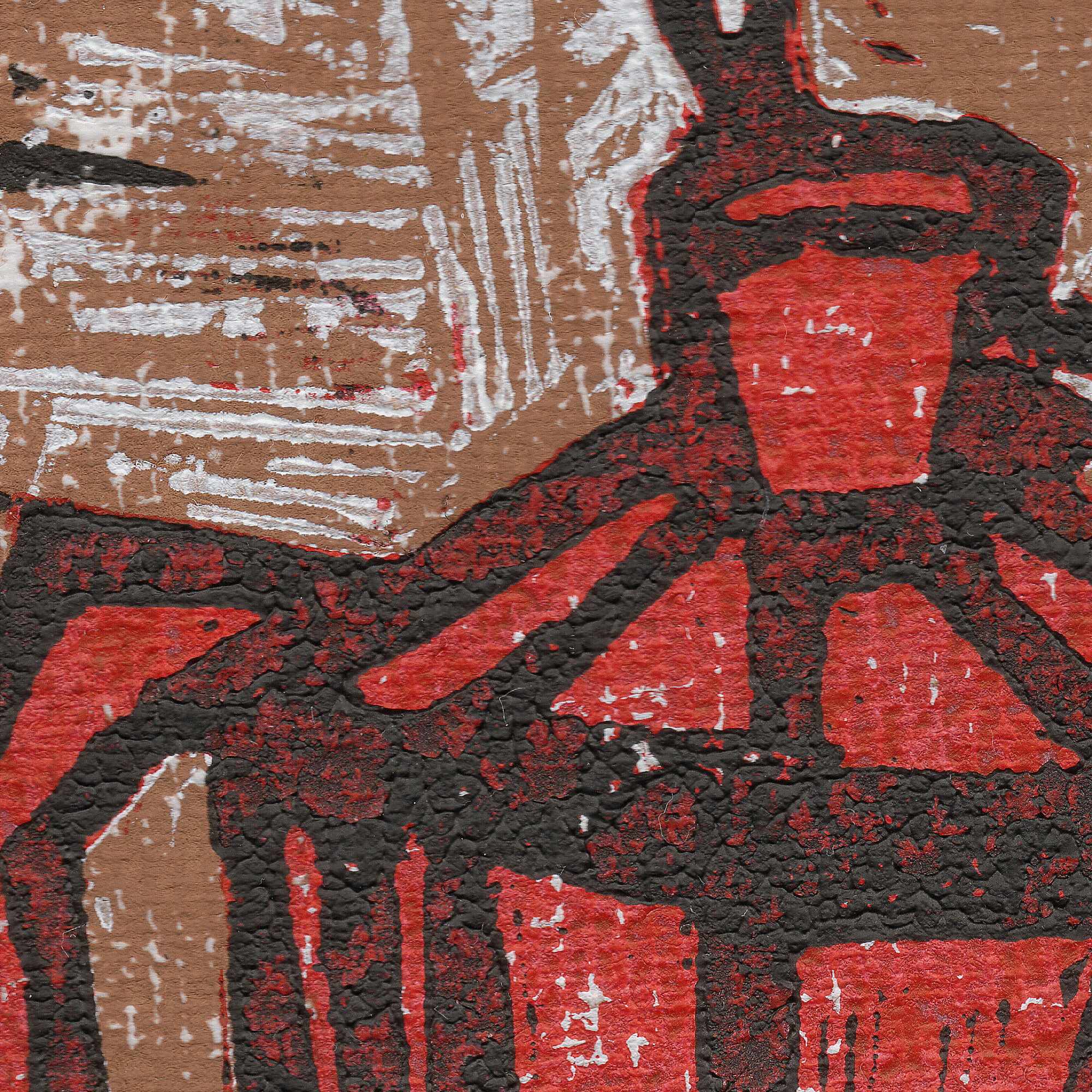
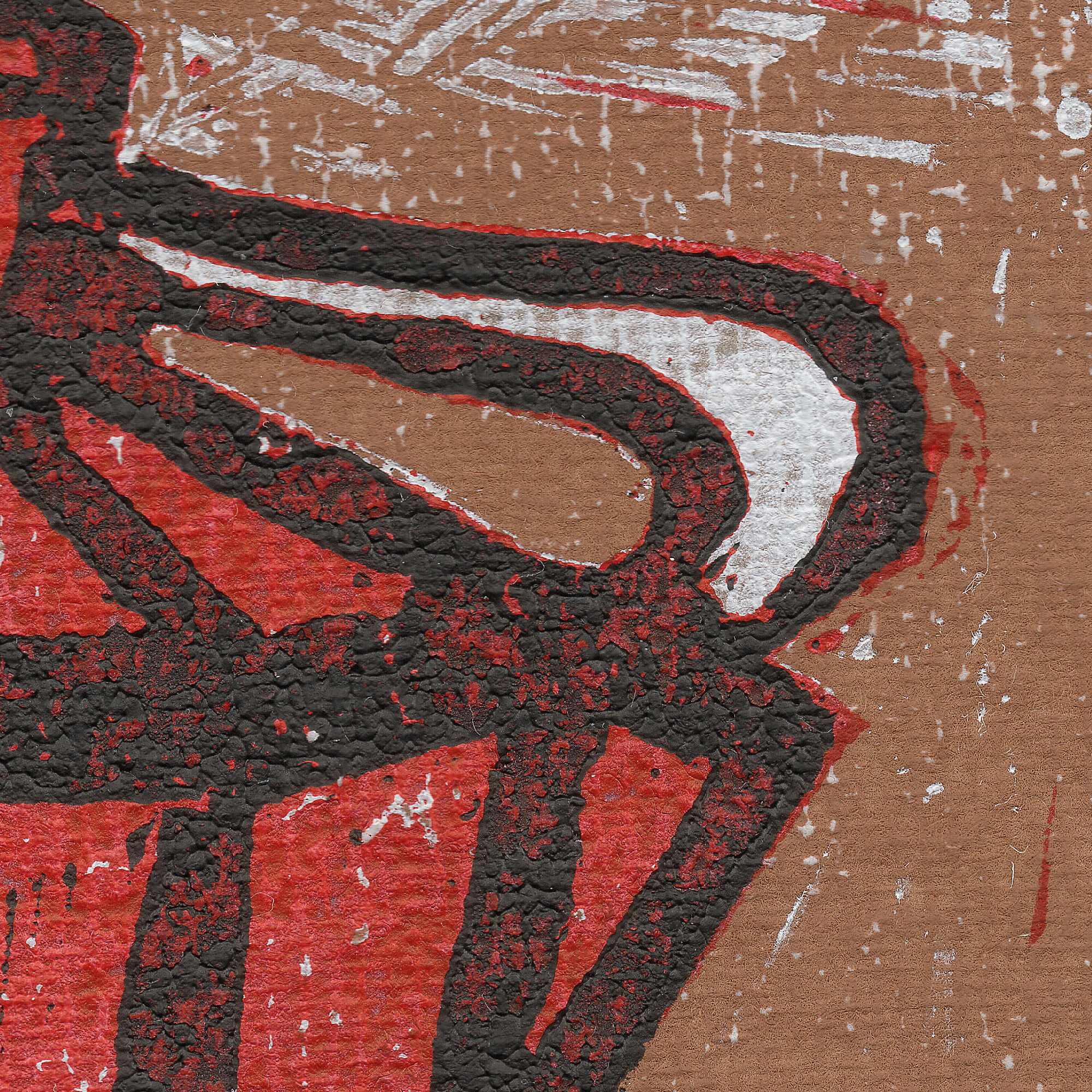
    Reduction printing forces you to think entirely in reverse and in stages, carving away layers of the same linoleum block between color runs. For this trial, I pressed the inks onto a coarse, heavily textured handmade paper. The paperโ€™s prominent tooth and organic surface grain deliberately fight the smooth coverage of the ink, leaving behind a raw, weathered texture that emphasizes the mechanical nature of the press.

    Stepping away from the precision of fine pens to wrestle with carving tools and ink rollers is a great reminder of how grounding it is to be a beginner again in a medium. Itโ€™s an untamed, physical process where you have to learn to embrace the friction and the happy accidents of the print.


  • Heat on the Water

    Heat on the Water

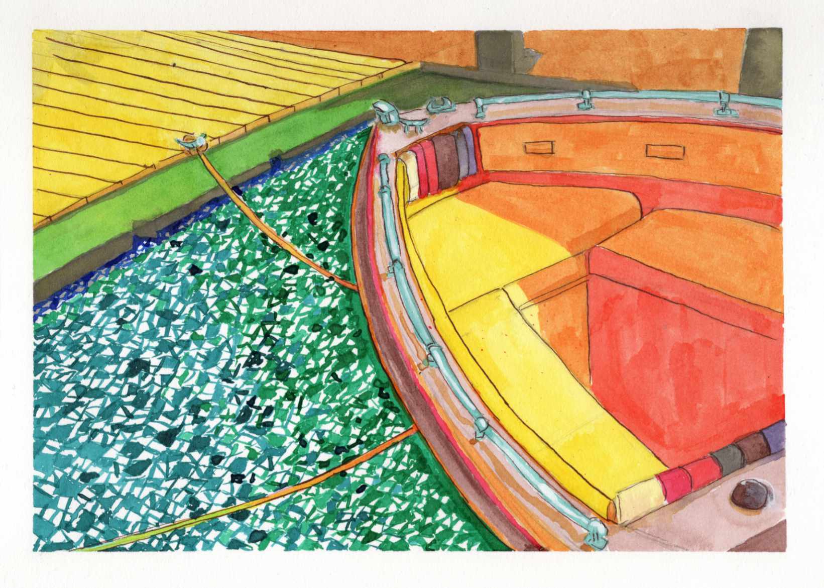
    Recently, I shared a highly saturated, small-scale study of a boat docked on a blindingly bright summer day, done entirely with Zebra Sarasa gel pens. That initial piece was all about capturing the raw, vibrating heat and light from an old reference photo.

    Today, I am sharing the larger, translated version of that same scene, completed this time using India ink.

    It is always a fascinating process to see how a composition shifts and breathes differently when you change both the scale and the medium. While the gel pen study was built on tight, scratchy, directional strokes, moving to India ink allowed for broader, smoother washes of color.

    You can see how the vivid yellows, reds, and oranges of the boatโ€™s interior feel a bit more grounded and painterly in this version. However, I intentionally kept that fragmented, graphic, mosaic-like texture in the water to maintain the harsh, rippling reflection of the summer sun.

    Taking a piece from a small, experimental study to a larger ink format is a balancing actโ€”trying to refine the forms without losing the initial, spontaneous energy that made the sketch work in the first place.

    Technical Details:

    • India Ink
    • Strathmore heavyweight mixed media 350lb 9×12
    • Liquitex white acrylic ink

  • River Bottom Watchman

    River Bottom Watchman

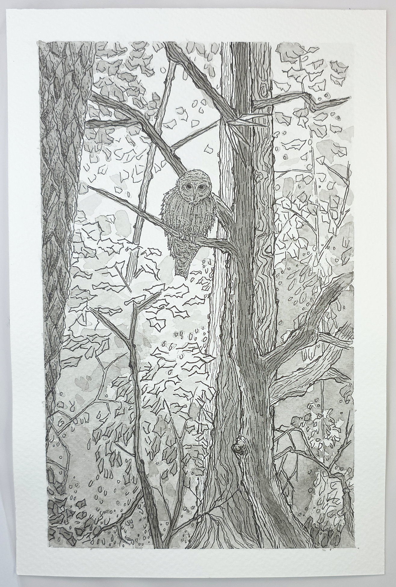
    This Barred Owl lives nearby and is a frequent sight (and sound) among the trees along the river. For this study, I wanted to capture how perfectly his plumage blends with the textured bark of the pines.

    Itโ€™s a challenge in camouflageโ€”using pen and ink to define the bird while letting him remain part of the forest. The wash adds depth without breaking the stillness of the scene. A quiet portrait of a local resident.

    Technical Details:

    • 6×9 140lb cold press
    • Sakura Pigma pens
  • The Throat โ€“ Physical Version

    The Throat โ€“ Physical Version

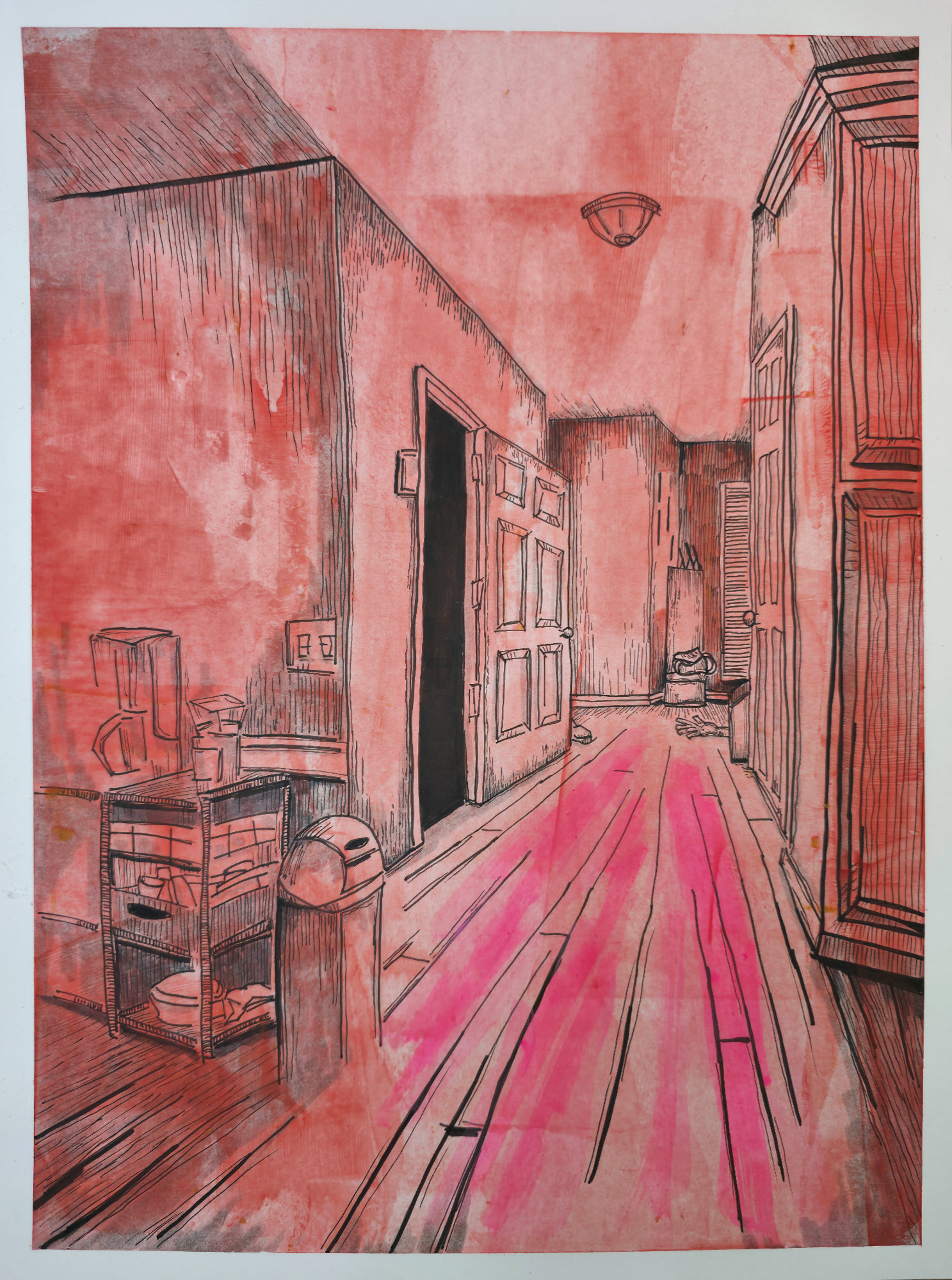
    This is the final, physical state of โ€œThe Throat.โ€ My goal was to capture the sensory experience of claustrophobia, but the transition to paper added a layer of grime and texture that the concept was missing. The way the red wash sits on the page makes the air in the hallway feel thick, heavy, and hot.

    It transforms a mundane domestic hallway into a trap. The sharp perspective tries to pull your eye immediately to that pitch-black doorway at the end, but donโ€™t rush. Let your gaze slide slowly down the hall instead. Along that saturated path, past the silent clutter and the shapes near the floorboards. The real tension isnโ€™t waiting at the destination; itโ€™s right here, holding its breath in the corridor.

    Technical Details

    • Medium: Acrylic swipe, Sakura Pigma pens, Drip Pen w/ India Ink
    • Surface: 9ร—10 Fabriano hot press
    • Dimensions: 9ร—12