Tag: linoprint

  • The Morning Mug

    The Morning Mug

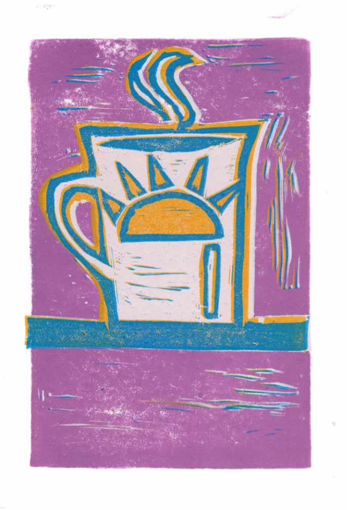
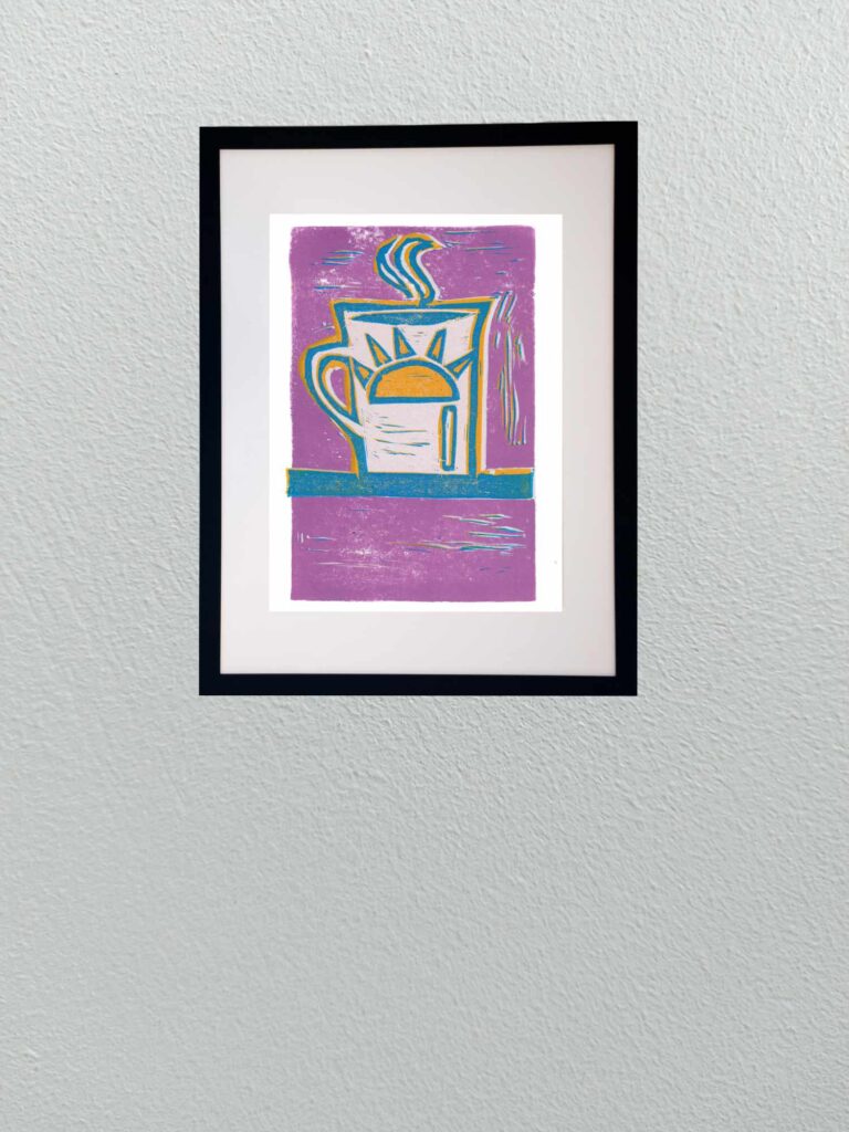
    This piece completes my mini-trio of coffee-themed reduction linocuts. After focusing on the preparation tools—the moka pot and hand grinder—this final print lands on the ritual itself: the first steaming cup of the day.

    The palette pivots into bright, expressive color. A bold field of dusty lavender surrounds the mug, framed with warm golden-yellow accents and crisp teal-blue contour lines. Carving out the body of the mug allows the clean white of the paper to hold the center, letting the stylized sun emblem and curling steam stand out in sharp relief.

    Technically, this print balances fluid gouge work with flat color registration. The expressive chatter marks cutting through the lavender background add movement, mimicking ambient morning light and steam drifting across the counter. Working through this three-print series served as an ideal playground for re-establishing block-carving muscle memory, testing color traps, and dialing in ink pressure.
  • A Hand Grinder in Five Passes

    A Hand Grinder in Five Passes

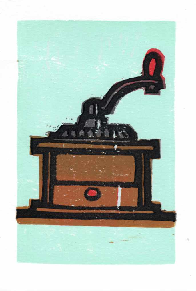
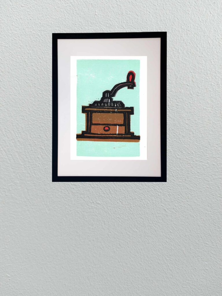
    Continuing the ongoing “Coffee” series, this piece shifts focus to an antique-style hand coffee grinder. Following the earlier studies, this was executed as a 5-color reduction print, peeling away layers of the design sequentially from the same block.

    Reduction printing always brings a healthy dose of discipline to the studio table. Because the block is progressively destroyed with each color pass, there is no backtracking—every cut has to be planned around the sequence of values. The print balances warm ochre and chestnut wood tones for the box, bold red accents on the drawer knob and crank handle, a solid black structural outline for the cast hopper and arm, and a cool, muted mint background.

    Technically, this was carved into a Speedball Speedy-Carve block and printed on Strathmore heavyweight printmaking paper using Speedball water-based inks. The pink rubber block cuts smoothly, allowing for fluid curved lines on the crank and hopper while still holding crisp architectural edges on the box. The water-based ink lays down with a velvety, slightly broken texture on the heavy paper, giving the final pull an honest, hand-crafted feel.


  • Reduction Study No. 2: French Press

    Reduction Study No. 2: French Press

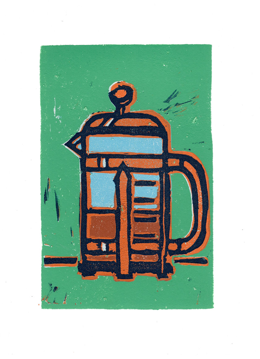
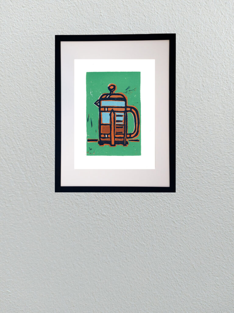
    Continuing with my deep dive into re-learning reduction linocut printing, this new piece takes the coffee theme a step further. While the earlier moka pot study was a great warm-up in carving and basic registration, this French press piece pushed into much more complex territory as a 6-color reduction print.

    Reduction printing is an unforgiving process because there’s no turning back—once you carve away a layer of linoleum for the next color pass, that previous stage is gone forever. Managing six distinct color passes meant planning out the light blues, warm terracottas, rich coffee tones, jade background, and heavy dark outlines in strict sequence.

    Working through six passes also means wrestling with registration precision and ink trap behavior on the block. Small variations in pressure or carving depth show up immediately, but that physical unpredictability is exactly what makes relief printmaking so rewarding. The slight chatter marks left in the background and the overlap of heavy ink layers create a graphic, tactile punch that you simply can’t replicate with a pen or digital tool.