Tag: strathmore

  • Solitary Traverse

    Solitary Traverse

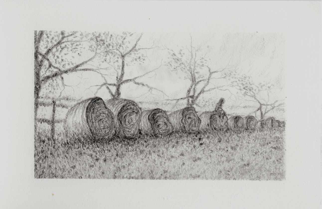
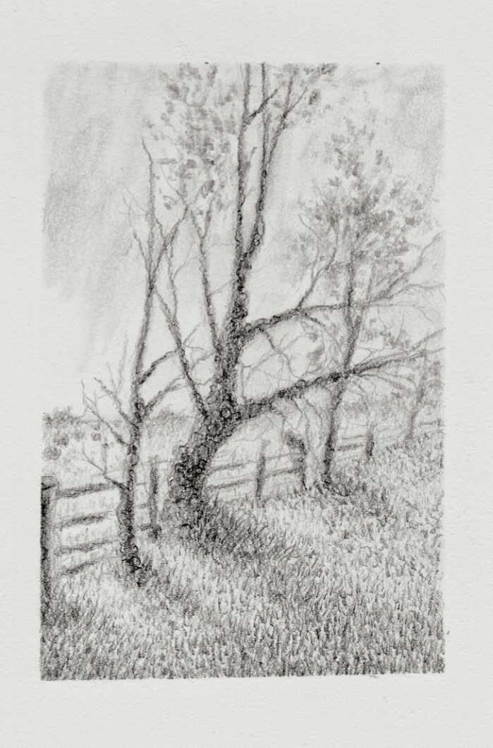
    This graphite drawing steps back into a quiet, atmospheric space, continuing my exploration of solitude, loss, and the unknown. At first glance, the composition presents a familiar rural vista: a weathered fence line tracing the curve of a hill, distant hay bales resting in the pasture, and a small cluster of bare trees leaning against the sky.

    Looking closer between the trunks reveals a faint, subtly shaded figure walking along the boundary. That quiet presence shifts the entire mood of the scene, turning a simple field study into a contemplative moment of transition. Is it a wanderer passing through, or an echo tied to these quiet acres? Leaving that narrative open allows the viewer to project their own sense of memory and stillness into the frame.

    Technically, the piece was completed on Strathmore heavyweight mixed media paper using Winsor & Newton medium graphite pencils. The pencils were a blind buy, but their soft, creamy graphite application laid down rich, dark values on the textured surface. The natural tooth of the heavyweight paper grabs the medium cleanly, creating a soft, stippled grain in the grass and sky while letting the darker graphite build dense, tactile fissures along the tree bark.


  • Bound Sentry

    Bound Sentry

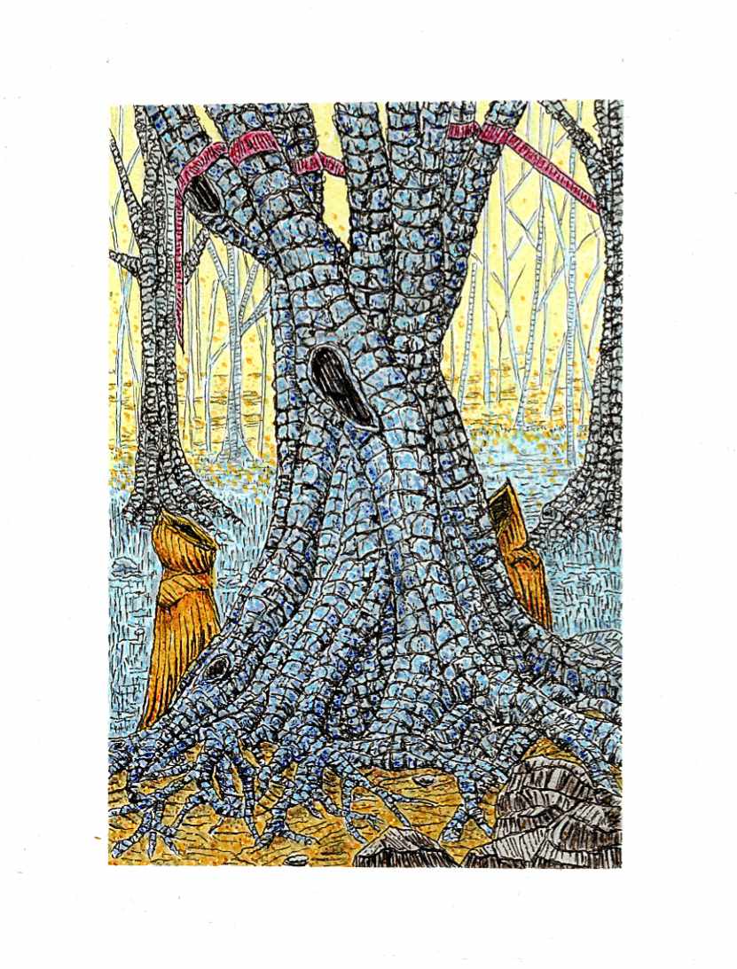
    This piece continues my exploration of folklore and the eerie quiet of deep woodland spaces. The composition centers on a massive, ancient tree whose trunk and sprawling root system dominate the foreground, breaking the forest floor like petrified muscle.

    Flanking the base of the roots are two hooded figures cloaked in deep ochre, standing motionless before the hollows of the trunk. High in the branches, the crimson ribbon appears once again, bound around the limbsโ€”a subtle, recurring marker that weaves through this series, hinting at an unseen presence or a quiet rite known only to those who wander these woods.

    Technically, this was completed on Strathmore heavyweight mixed media paper using Faber-Castell Pitt pens and Staedtler fine liners, with subtle pointillism applied via acrylic pens. I used the fine liners to construct the heavy, modular texture of the bark, mapping out dense, individual fissures across the trunk. Pitt pen washes established the cool blue-gray tones of the wood and the glowing yellow light filtering through the background trees. To bring extra vibration to the canopy and ground plane, I layered fine acrylic dots over the ink work, giving the ambient light an electric, atmospheric tooth.


  • Heat on the Water

    Heat on the Water

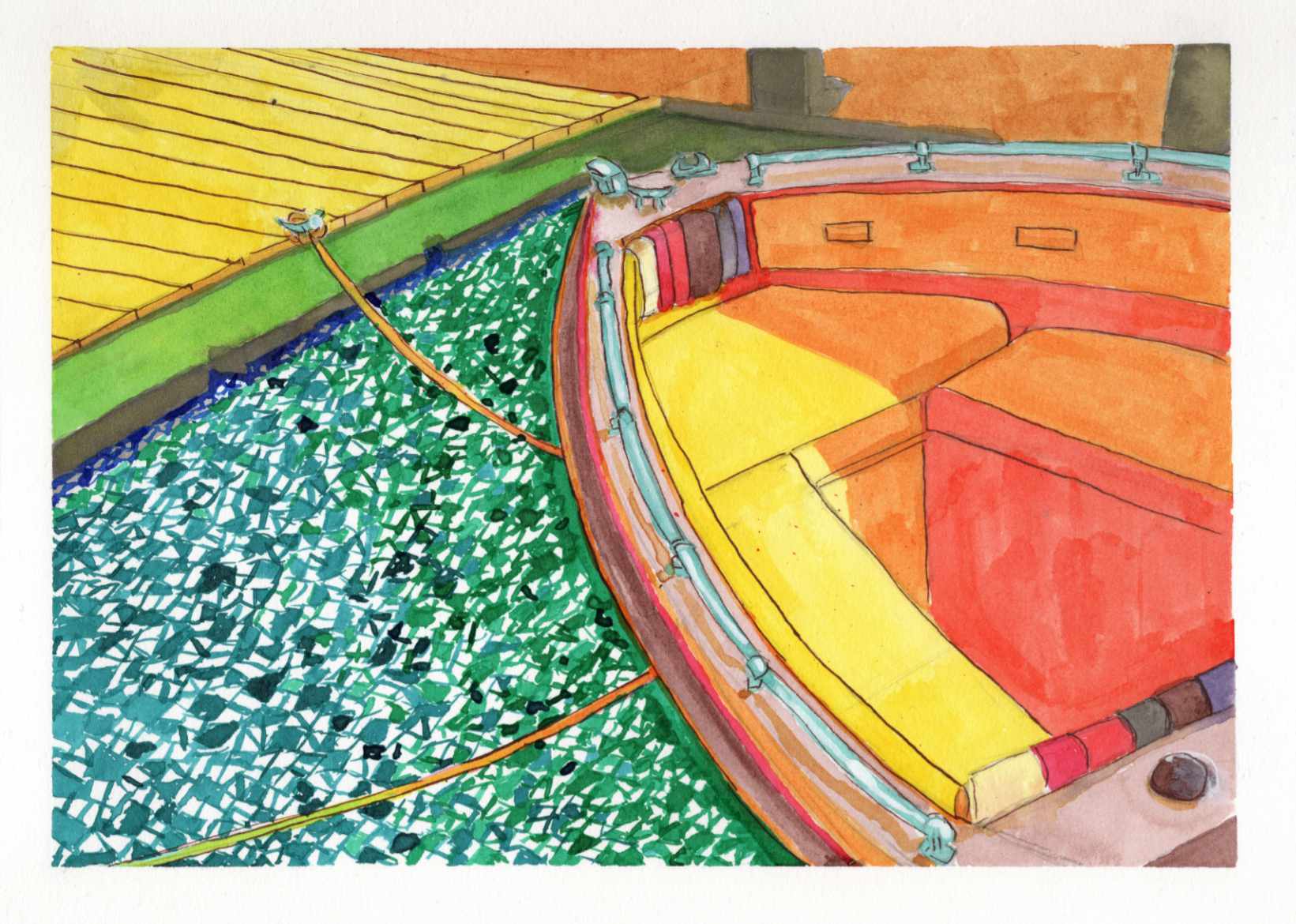
    Recently, I shared a highly saturated, small-scale study of a boat docked on a blindingly bright summer day, done entirely with Zebra Sarasa gel pens. That initial piece was all about capturing the raw, vibrating heat and light from an old reference photo.

    Today, I am sharing the larger, translated version of that same scene, completed this time using India ink.

    It is always a fascinating process to see how a composition shifts and breathes differently when you change both the scale and the medium. While the gel pen study was built on tight, scratchy, directional strokes, moving to India ink allowed for broader, smoother washes of color.

    You can see how the vivid yellows, reds, and oranges of the boatโ€™s interior feel a bit more grounded and painterly in this version. However, I intentionally kept that fragmented, graphic, mosaic-like texture in the water to maintain the harsh, rippling reflection of the summer sun.

    Taking a piece from a small, experimental study to a larger ink format is a balancing actโ€”trying to refine the forms without losing the initial, spontaneous energy that made the sketch work in the first place.

    Technical Details:

    • India Ink
    • Strathmore heavyweight mixed media 350lb 9×12
    • Liquitex white acrylic ink