Tag: vibrant

  • The Morning Mug

    The Morning Mug

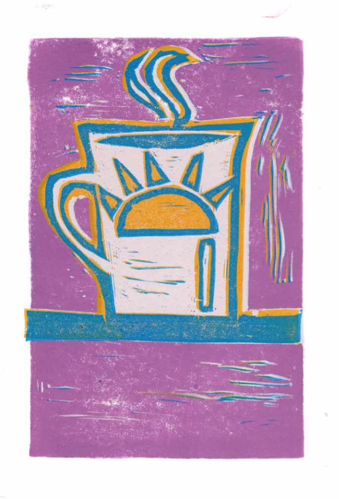
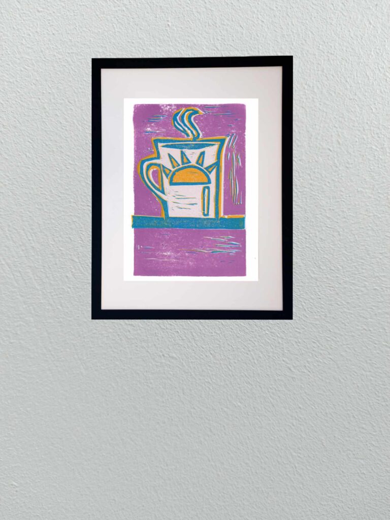
    This piece completes my mini-trio of coffee-themed reduction linocuts. After focusing on the preparation tools—the moka pot and hand grinder—this final print lands on the ritual itself: the first steaming cup of the day.

    The palette pivots into bright, expressive color. A bold field of dusty lavender surrounds the mug, framed with warm golden-yellow accents and crisp teal-blue contour lines. Carving out the body of the mug allows the clean white of the paper to hold the center, letting the stylized sun emblem and curling steam stand out in sharp relief.

    Technically, this print balances fluid gouge work with flat color registration. The expressive chatter marks cutting through the lavender background add movement, mimicking ambient morning light and steam drifting across the counter. Working through this three-print series served as an ideal playground for re-establishing block-carving muscle memory, testing color traps, and dialing in ink pressure.
  • Bound Sentry

    Bound Sentry

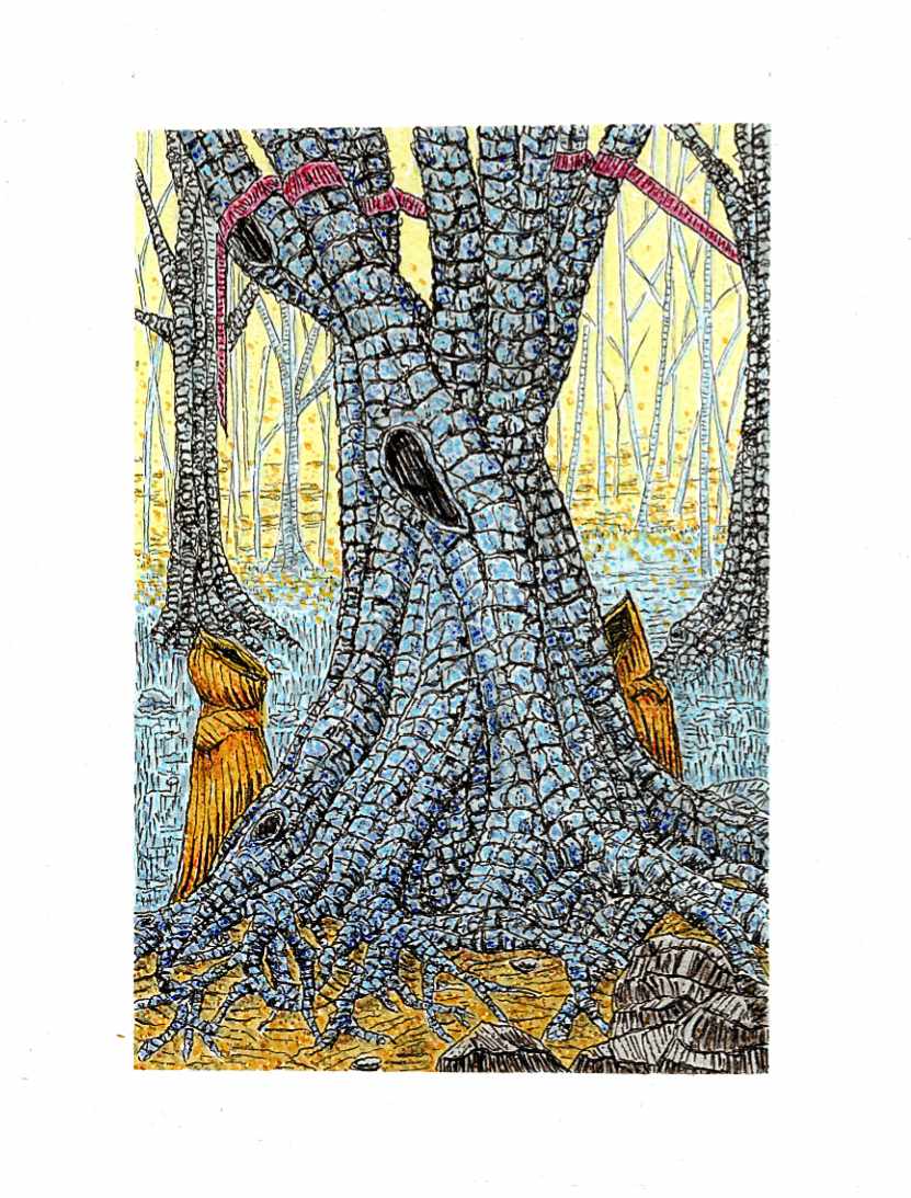
    This piece continues my exploration of folklore and the eerie quiet of deep woodland spaces. The composition centers on a massive, ancient tree whose trunk and sprawling root system dominate the foreground, breaking the forest floor like petrified muscle.

    Flanking the base of the roots are two hooded figures cloaked in deep ochre, standing motionless before the hollows of the trunk. High in the branches, the crimson ribbon appears once again, bound around the limbs—a subtle, recurring marker that weaves through this series, hinting at an unseen presence or a quiet rite known only to those who wander these woods.

    Technically, this was completed on Strathmore heavyweight mixed media paper using Faber-Castell Pitt pens and Staedtler fine liners, with subtle pointillism applied via acrylic pens. I used the fine liners to construct the heavy, modular texture of the bark, mapping out dense, individual fissures across the trunk. Pitt pen washes established the cool blue-gray tones of the wood and the glowing yellow light filtering through the background trees. To bring extra vibration to the canopy and ground plane, I layered fine acrylic dots over the ink work, giving the ambient light an electric, atmospheric tooth.


  • Frenetic Canopy

    Frenetic Canopy

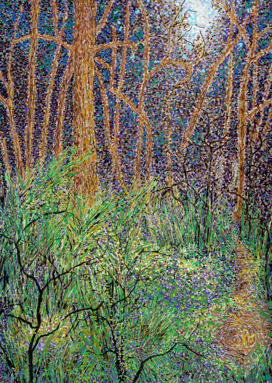
    I wanted to move away from the quiet, still qualities of a traditional landscape and focus entirely on energy. Nature is rarely static. It is constantly growing, decaying, and shifting. This piece was a deliberate experiment in capturing that hidden, frenetic activity—making a forest look as though it is writhing and moving right in front of you.

    Technically, this required a dense orchestration of different tools and medium behaviors on smooth hot press paper. I built the surface using a heavy blend of Faber-Castell Pitt pens, Staedtler pigment pens, acrylic pens, and Sakura gel pens.

    The process was rhythmic and intense. I used the fine precision of the Staedtler pens to create an intricate web of overlapping, high-contrast lines for the undergrowth and the tree trunks. The fine, colorful lines slashing through the foliage were accomplished with Sakura gel pens, giving those bright accents a sharp, clean edge. Instead of blending colors smoothly, I relied on rapid dashes and tight clusters of stippling with the acrylic and Pitt pens. By placing contrasting tones directly side-by-side—the electric greens against the deep purples and warm ochres—the canopy begins to optically vibrate.

    It is a chaotic way to build a landscape, but letting the marks layer over one another without correcting the friction gives the piece its pulse. It records the grit and the constant motion of the woods rather than a sanitized portrait of them.


  • The Yellow Patio

    The Yellow Patio

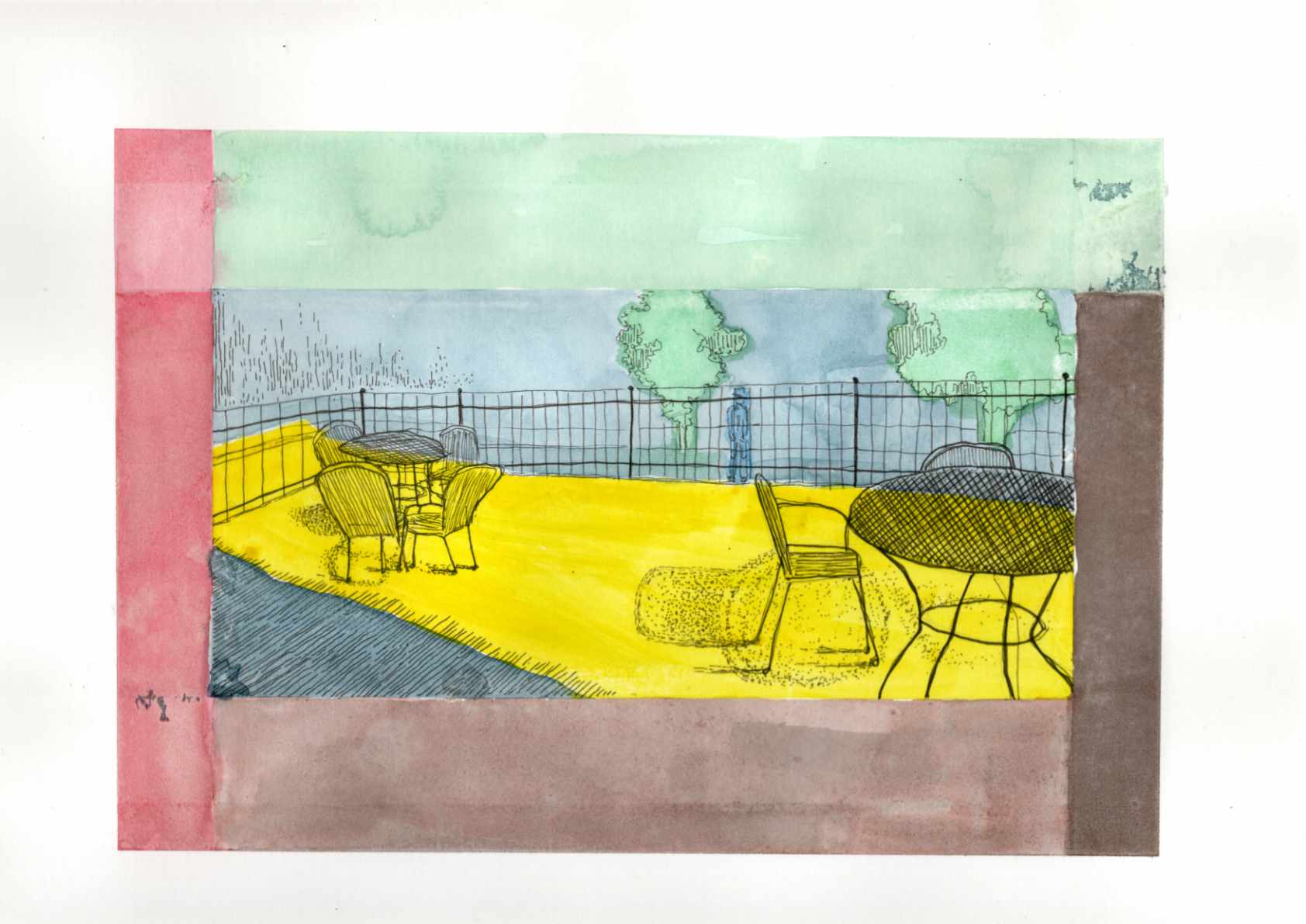
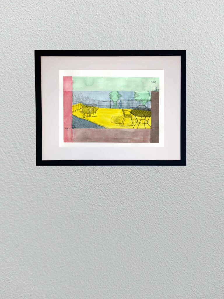
    Today I am sharing a new graphic piece titled “The Yellow Patio.” The title is intentionally a bit on the nose—an ironic nod to a cheerful early spring setting that actually masks the heavier, psychological weight of the scene.

    Based on a reference photo of a small bistro area, this piece gave me the opportunity to lean heavily into a Synthetist, graphic style of color blocking. The composition is built entirely on the boundary between light and dark, inside and outside. To translate the intense feeling of that boundary, I used deep, unnatural blues and heavy purples to anchor the foreground shadows, which perfectly frame the harsh, acidic, vibrating yellow of the sunlight hitting the concrete floor.

    This piece ties directly into the theme of the “quiet observer” that runs through much of my work. By placing the viewer firmly within the cold shadow, looking out past the empty iron chairs toward a lone, distant figure beyond the fence, it creates a distinct sense of isolation and voyeurism. It’s a moment of being entirely separated from the warmth and the outside world, suspended in bold, flat color.

    Technical Details:

    • 9×12 140lb hot press
    • Sakura fine liners
    • India ink
  • Heat on the Water

    Heat on the Water

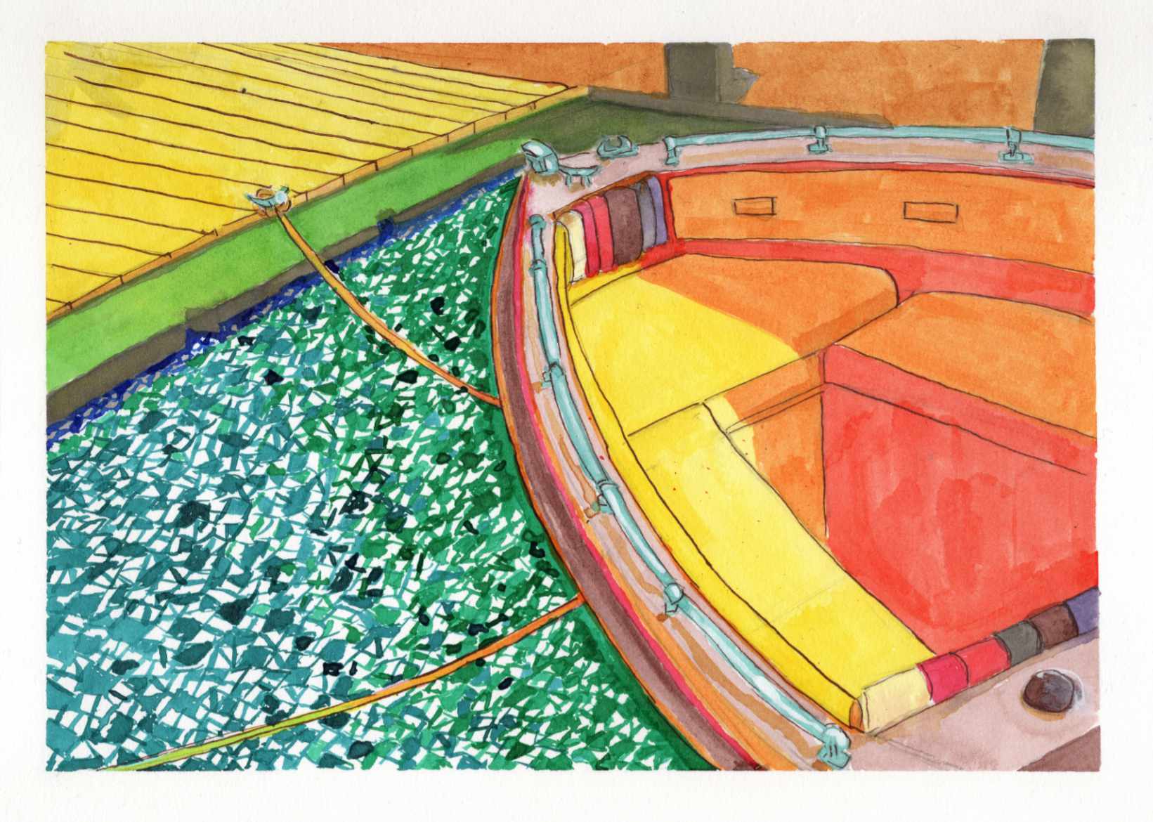
    Recently, I shared a highly saturated, small-scale study of a boat docked on a blindingly bright summer day, done entirely with Zebra Sarasa gel pens. That initial piece was all about capturing the raw, vibrating heat and light from an old reference photo.

    Today, I am sharing the larger, translated version of that same scene, completed this time using India ink.

    It is always a fascinating process to see how a composition shifts and breathes differently when you change both the scale and the medium. While the gel pen study was built on tight, scratchy, directional strokes, moving to India ink allowed for broader, smoother washes of color.

    You can see how the vivid yellows, reds, and oranges of the boat’s interior feel a bit more grounded and painterly in this version. However, I intentionally kept that fragmented, graphic, mosaic-like texture in the water to maintain the harsh, rippling reflection of the summer sun.

    Taking a piece from a small, experimental study to a larger ink format is a balancing act—trying to refine the forms without losing the initial, spontaneous energy that made the sketch work in the first place.

    Technical Details:

    • India Ink
    • Strathmore heavyweight mixed media 350lb 9×12
    • Liquitex white acrylic ink

  • Physical: Nunnally Road

    Physical: Nunnally Road

    Here is the first of the physical work for this series.

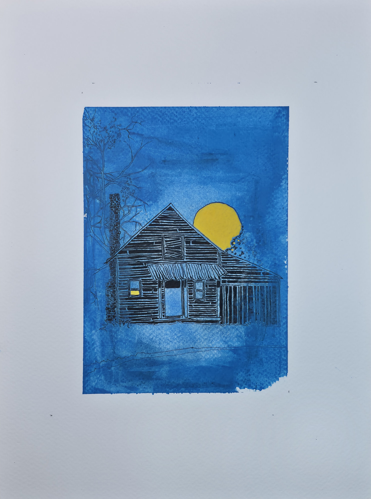
    I’m excited to introduce the first piece in a new three-part illustrative series. The theme is a blend of seasonal whimsy and the gentle, spooky feeling of unique, isolated structures. Over the years, I’ve collected photographs of fascinating buildings, and this series gives them a new life and a new story.

    I chose a stark, graphic style with strong linework to evoke the feeling of a classic block print or a storybook illustration. While this image was created digitally, I’m currently working on its physical counterpart, exploring the dialogue between the two mediums. This piece, “Nunnally Road,” is the beginning of that exploration.

    Technical Details:

    • Acrylic swipe
    • Sakura Pigma pens
    • 9×12 140lb cold press
  • Physical: Cemetery Road

    Physical: Cemetery Road

    Physical version of this original digital piece.

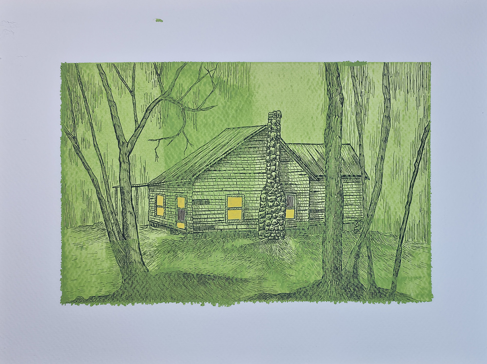
    And with that, the series is complete. This three-part digital collection was an exploration of seasonal whimsy and the mysterious vibes of forgotten places. From the first piece to this final one, “Cemetery Road,” my goal was to take real structures I’ve photographed and imbue them with the feeling of a modern folk tale.

    For this final installment, I used a monochromatic green palette and the enchanting glow of fireflies to create a uniquely eerie and magical atmosphere. It’s been a fantastic journey blending photography, memory, and digital illustration. Physical versions of all three are still in the works!

    Technical Details:

    • Acrylic swipe
    • Sakura Pigma pens
    • 9×12 140lb cold press
  • The Lure

    The Lure

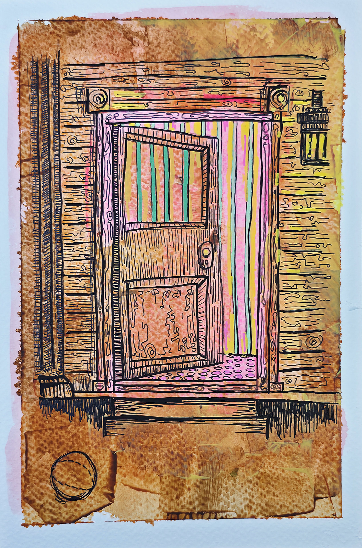
    On the outside, it’s just weathered wood and rust. But when the door cracks open, the mask slips. This illustration is about that moment of realization—when the familiar peels back to reveal something sickly and wrong underneath.

    The colors inside are too bright, too vertical. They vibrate against the rot of the doorframe.

    Technical Details:

    • Acrylic swipe
    • Sakura Pigma pens
    • India ink with drip pen
    • 9×12 140lb cold press press
  • The Throat – Physical Version

    The Throat – Physical Version

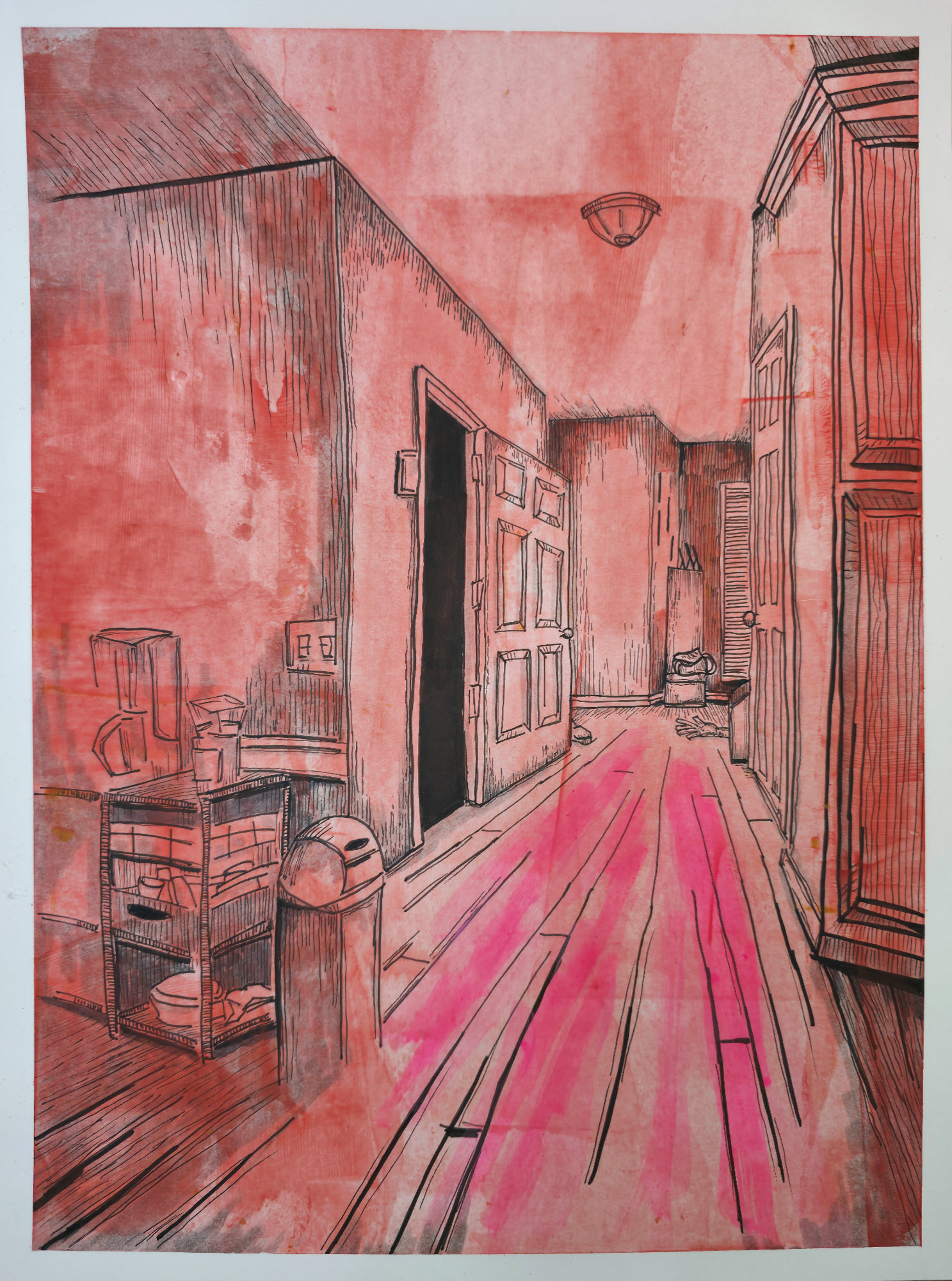
    This is the final, physical state of “The Throat.” My goal was to capture the sensory experience of claustrophobia, but the transition to paper added a layer of grime and texture that the concept was missing. The way the red wash sits on the page makes the air in the hallway feel thick, heavy, and hot.

    It transforms a mundane domestic hallway into a trap. The sharp perspective tries to pull your eye immediately to that pitch-black doorway at the end, but don’t rush. Let your gaze slide slowly down the hall instead. Along that saturated path, past the silent clutter and the shapes near the floorboards. The real tension isn’t waiting at the destination; it’s right here, holding its breath in the corridor.

    Technical Details

    • Medium: Acrylic swipe, Sakura Pigma pens, Drip Pen w/ India Ink
    • Surface: 9×10 Fabriano hot press
    • Dimensions: 9×12

  • Collapse

    Collapse

    My new self-portrait, “Collapse.” An unflinching look at the acidic
    passage of time, rendered in a clash of textured orange and chemical magenta. It’s about the weight of self-inspection when you feel the world, and yourself, beginning to corrode.

    The gaze is everything. It’s what’s left when the rest starts to dissolve.

    Technical Details:

    • Samsung Tab9 Ultra
    • Infinite Painter