Author: Mark Hewatt

  • Solitary Traverse

    Solitary Traverse

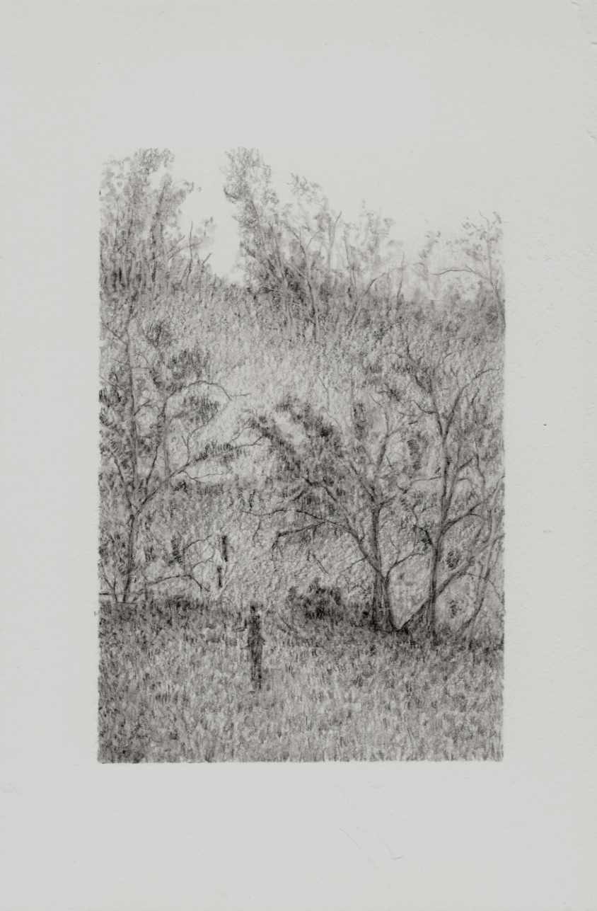
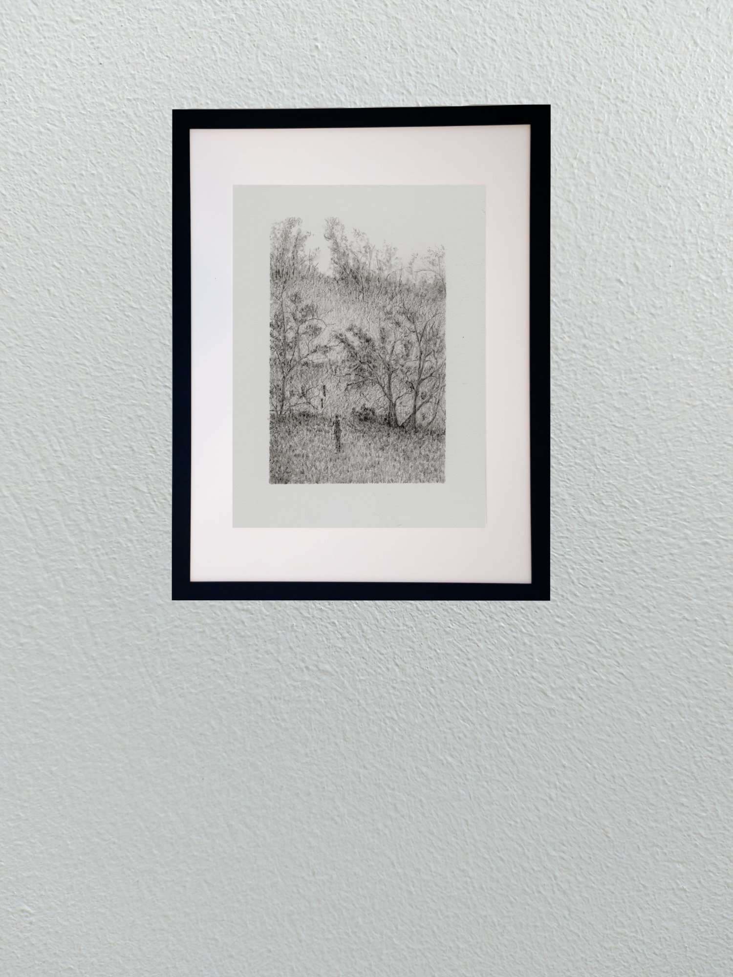
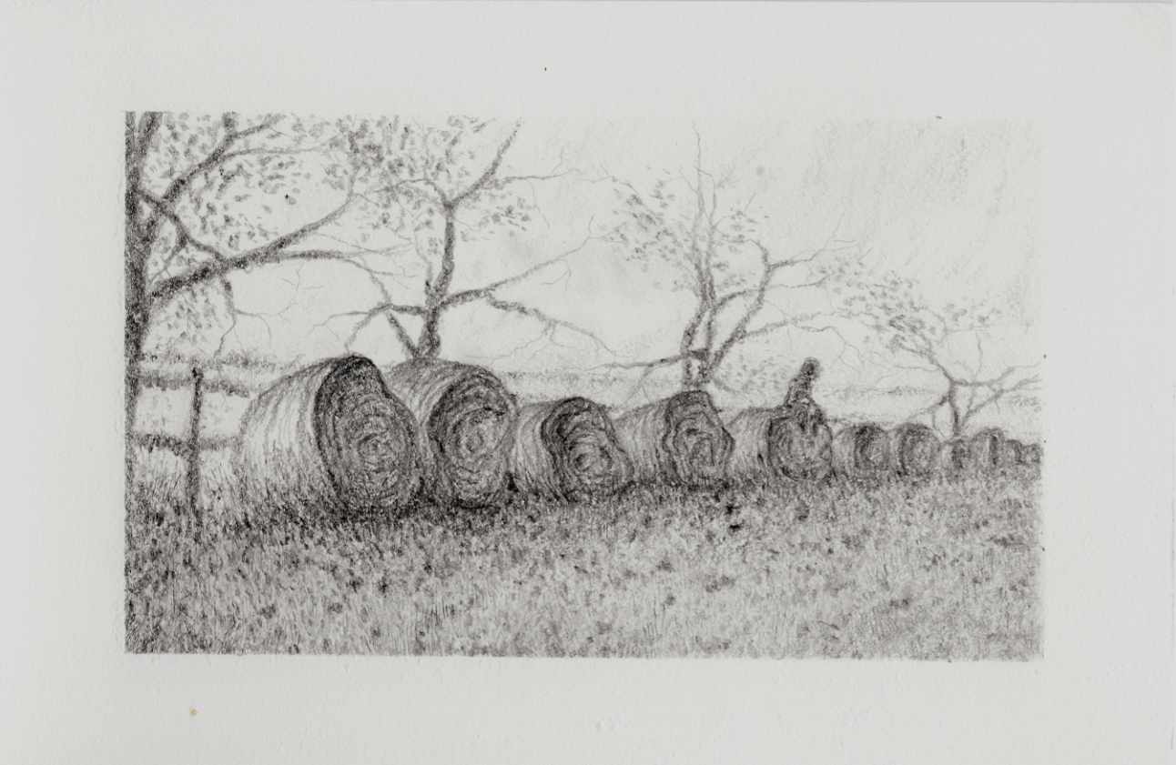
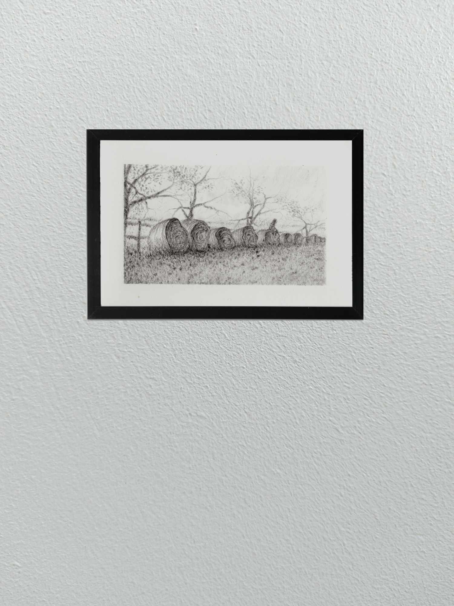
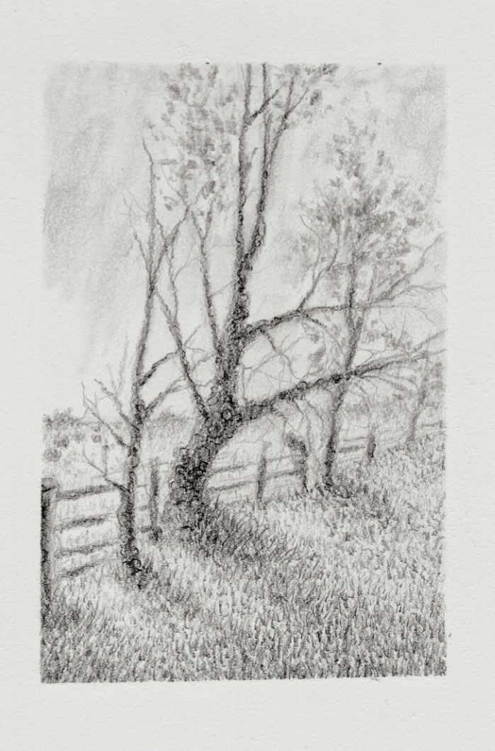
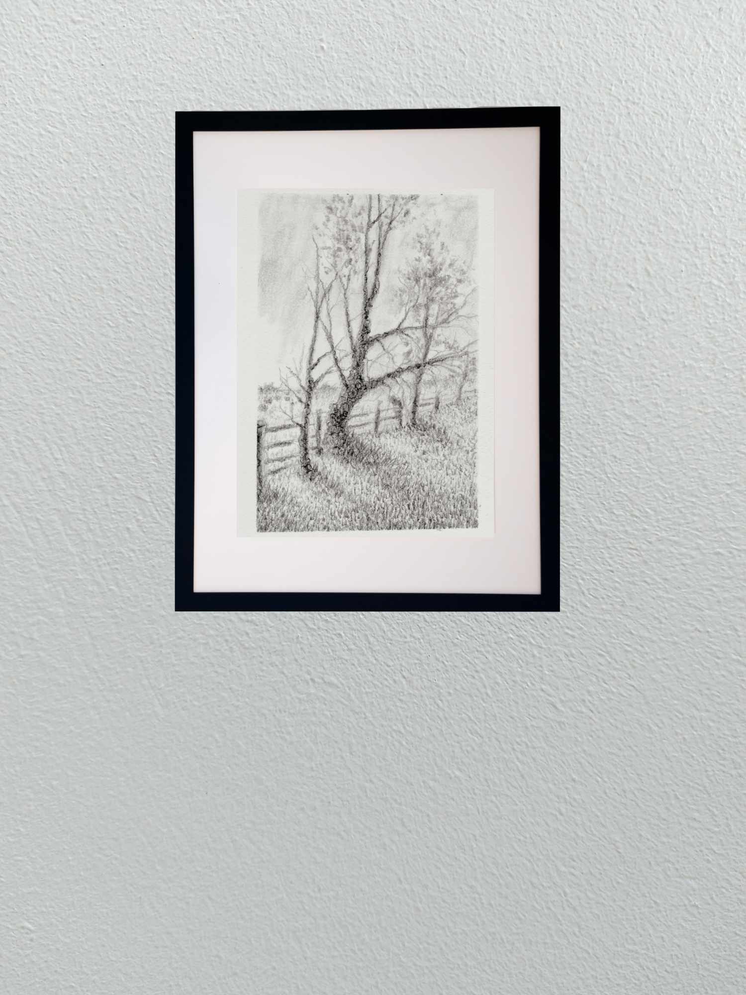
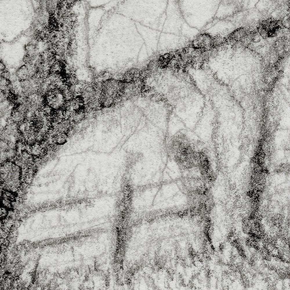
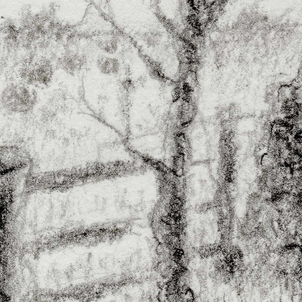
    This graphite drawing steps back into a quiet, atmospheric space, continuing my exploration of solitude, loss, and the unknown. At first glance, the composition presents a familiar rural vista: a weathered fence line tracing the curve of a hill, distant hay bales resting in the pasture, and a small cluster of bare trees leaning against the sky.

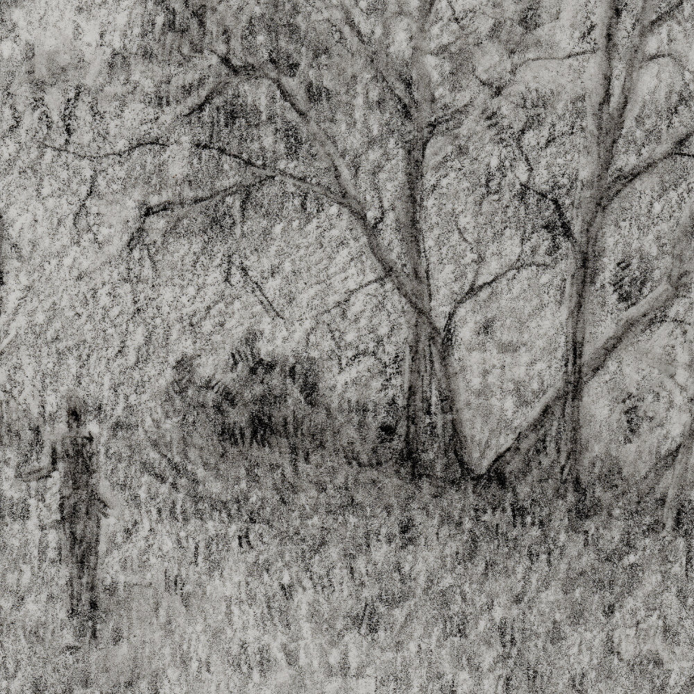
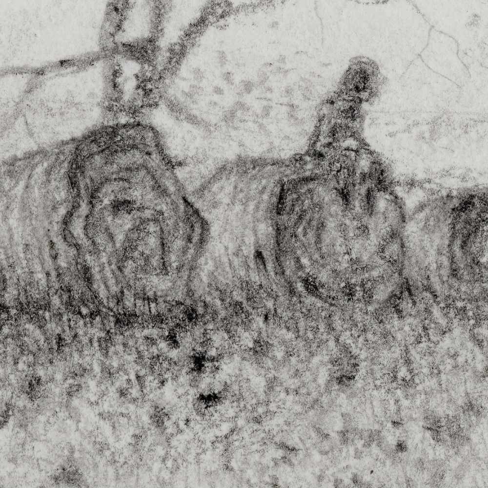
    Looking closer between the trunks reveals a faint, subtly shaded figure walking along the boundary. That quiet presence shifts the entire mood of the scene, turning a simple field study into a contemplative moment of transition. Is it a wanderer passing through, or an echo tied to these quiet acres? Leaving that narrative open allows the viewer to project their own sense of memory and stillness into the frame.

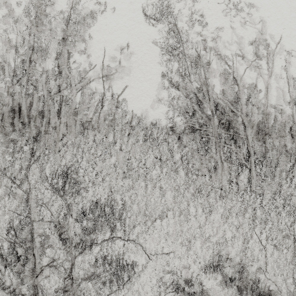
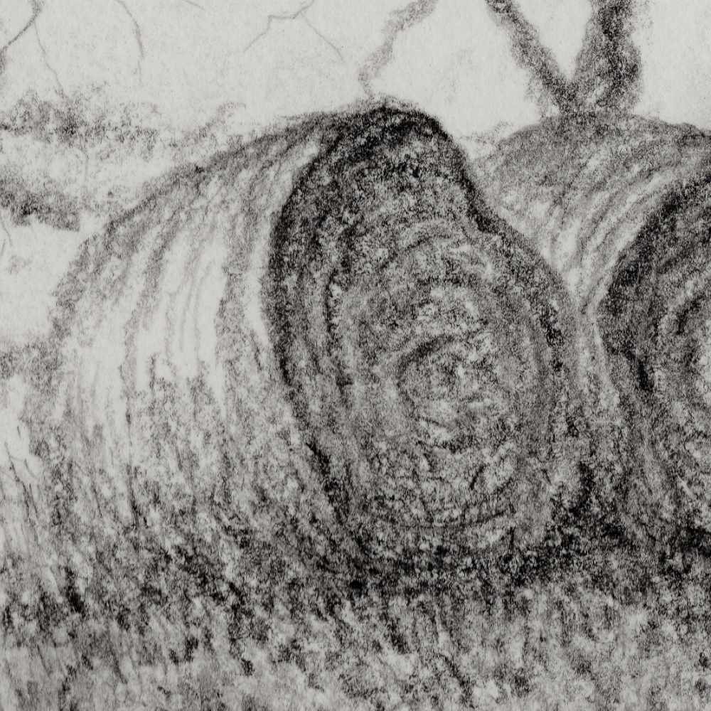
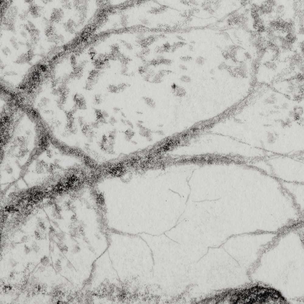
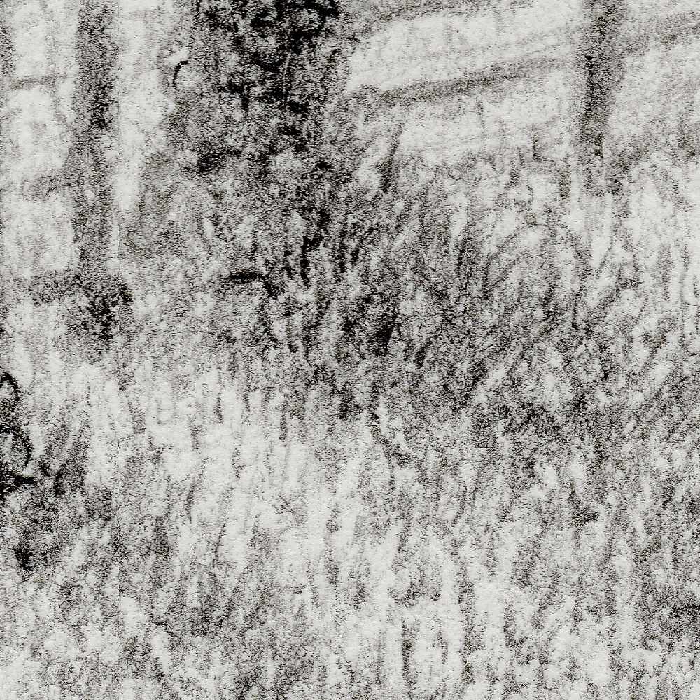
    Technically, the piece was completed on Strathmore heavyweight mixed media paper using Winsor & Newton medium graphite pencils. The pencils were a blind buy, but their soft, creamy graphite application laid down rich, dark values on the textured surface. The natural tooth of the heavyweight paper grabs the medium cleanly, creating a soft, stippled grain in the grass and sky while letting the darker graphite build dense, tactile fissures along the tree bark.


  • Bound Sentry

    Bound Sentry

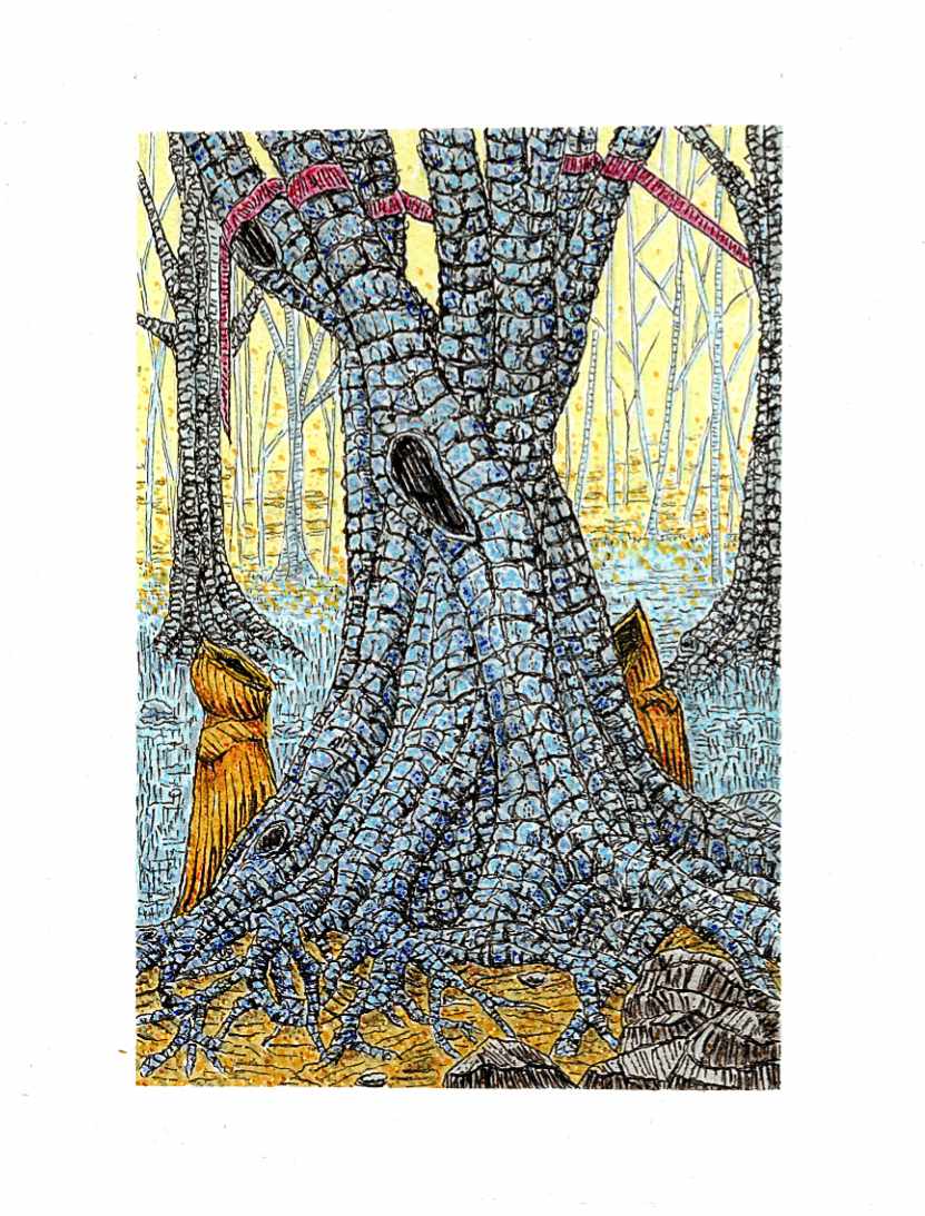
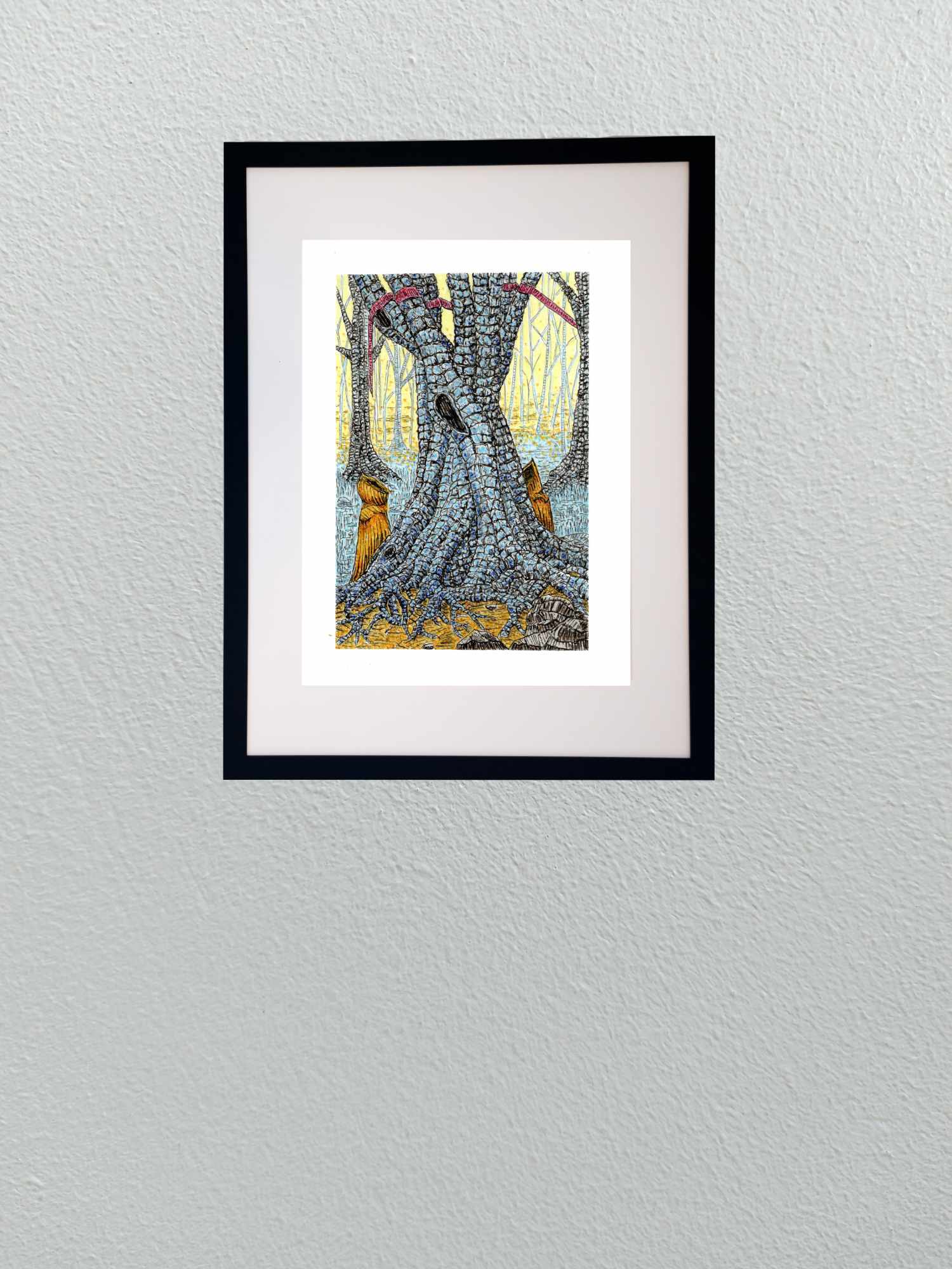
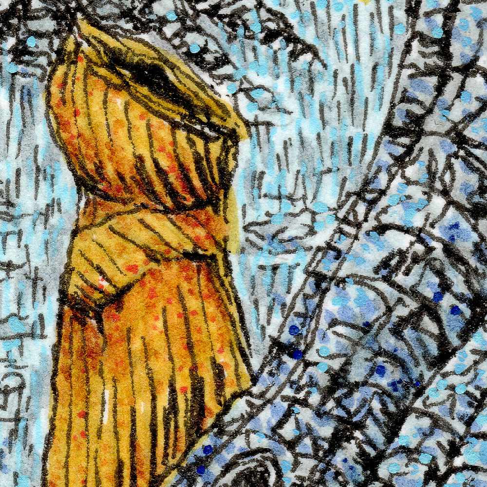
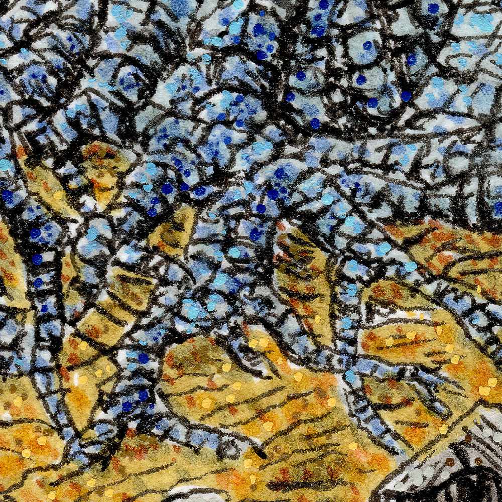
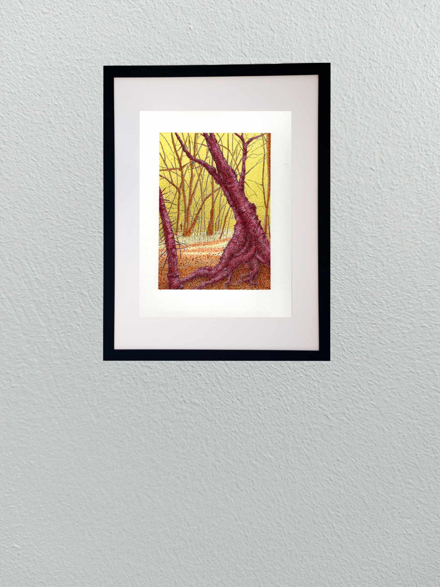
    This piece continues my exploration of folklore and the eerie quiet of deep woodland spaces. The composition centers on a massive, ancient tree whose trunk and sprawling root system dominate the foreground, breaking the forest floor like petrified muscle.

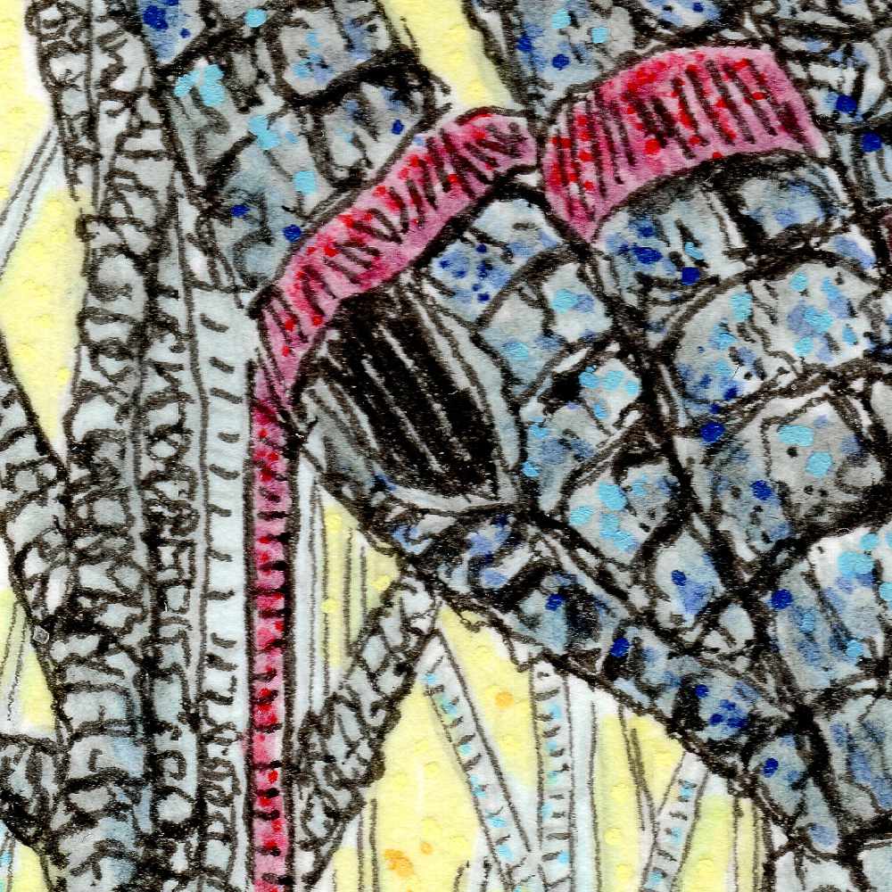
    Flanking the base of the roots are two hooded figures cloaked in deep ochre, standing motionless before the hollows of the trunk. High in the branches, the crimson ribbon appears once again, bound around the limbsโ€”a subtle, recurring marker that weaves through this series, hinting at an unseen presence or a quiet rite known only to those who wander these woods.

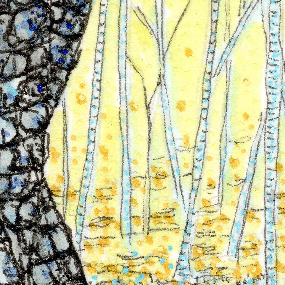
    Technically, this was completed on Strathmore heavyweight mixed media paper using Faber-Castell Pitt pens and Staedtler fine liners, with subtle pointillism applied via acrylic pens. I used the fine liners to construct the heavy, modular texture of the bark, mapping out dense, individual fissures across the trunk. Pitt pen washes established the cool blue-gray tones of the wood and the glowing yellow light filtering through the background trees. To bring extra vibration to the canopy and ground plane, I layered fine acrylic dots over the ink work, giving the ambient light an electric, atmospheric tooth.


  • Swamp Fugue

    Swamp Fugue

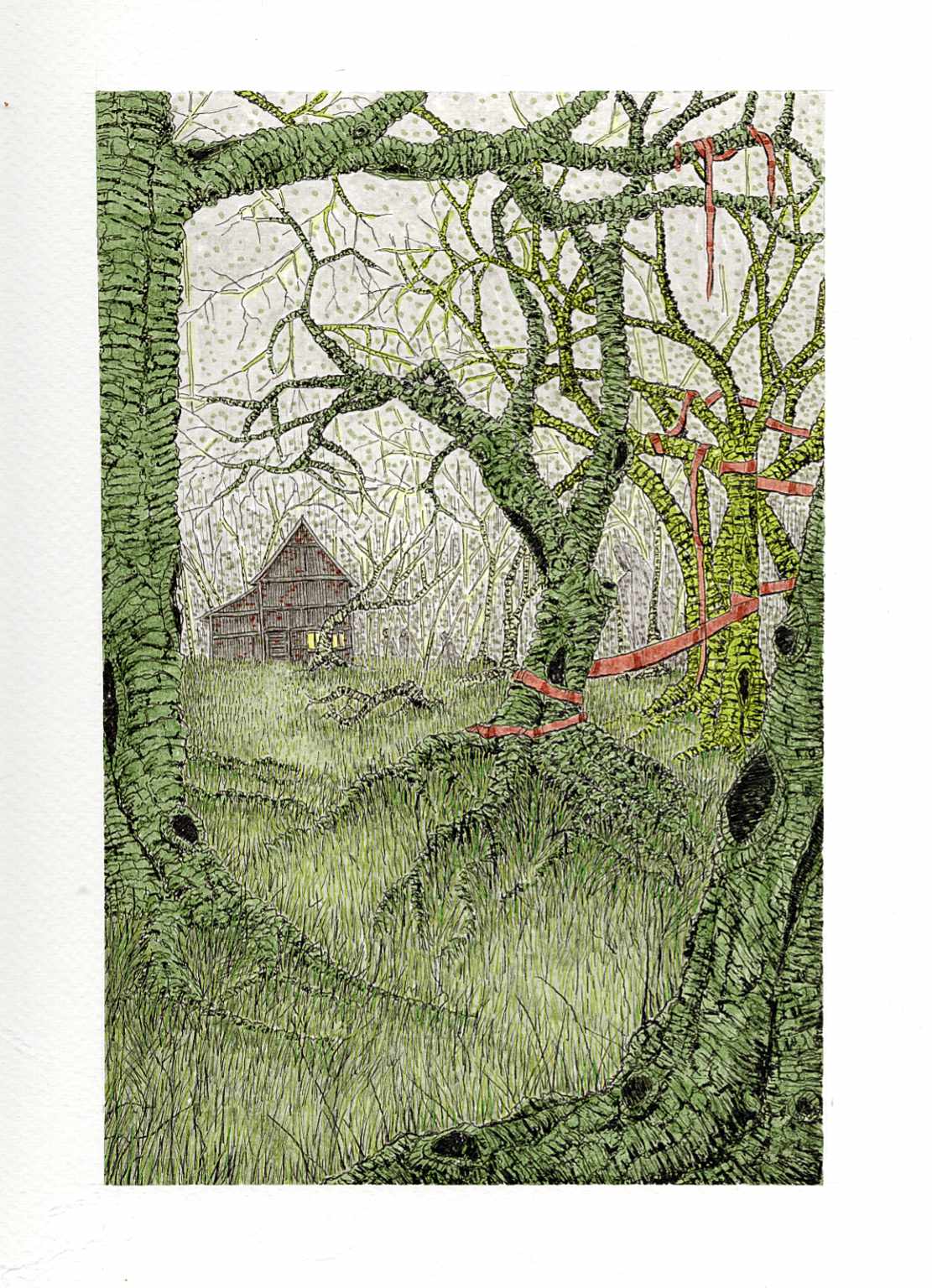
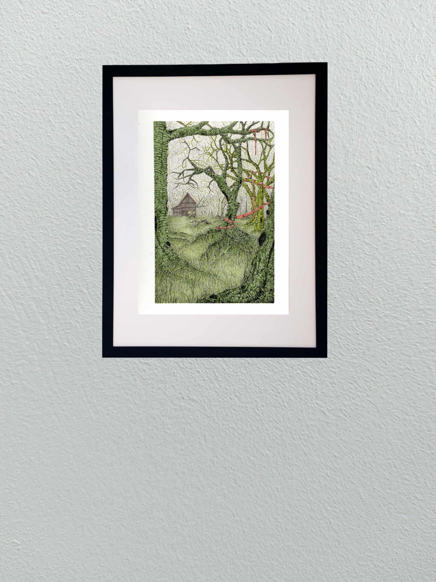
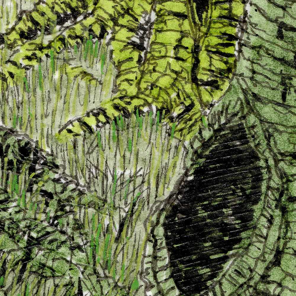
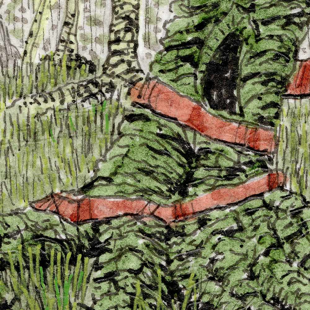
    Continuing my focus on folklore and eldritch horror within deep forest environments, this piece moves into a dense, swampy green fugue. The scene is framed by heavy, twisted trunksโ€”ancient, highly textured sentinels that act as a visual boundary looking out toward a distant clearing.

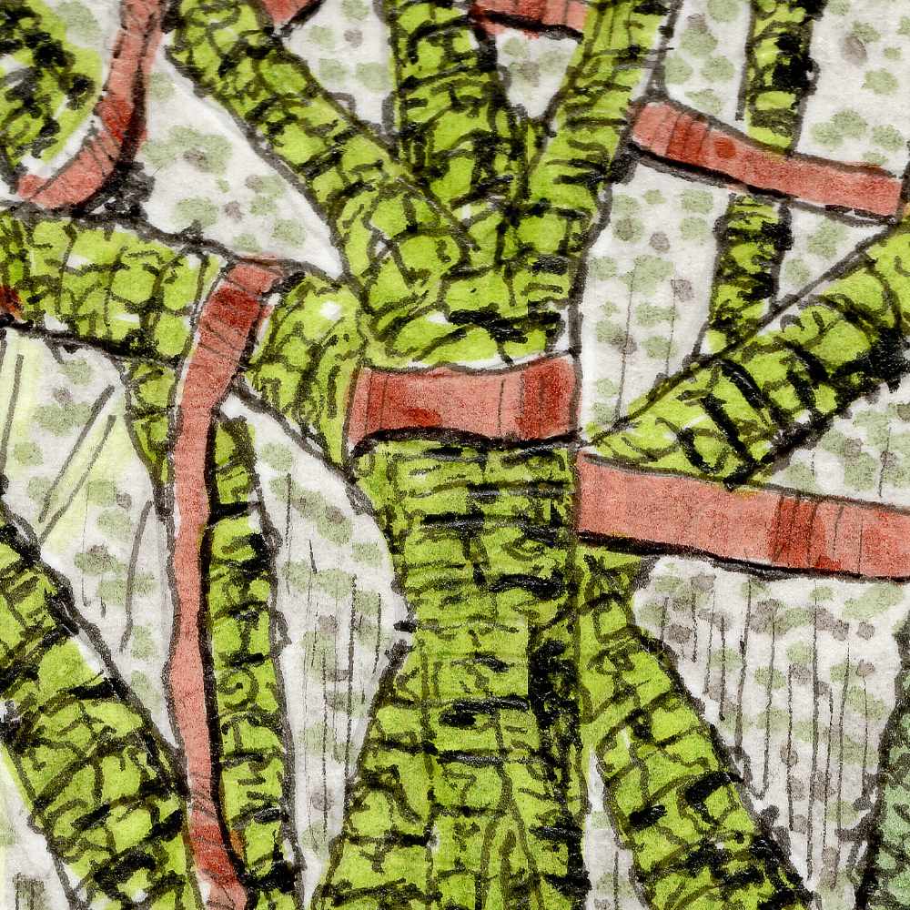
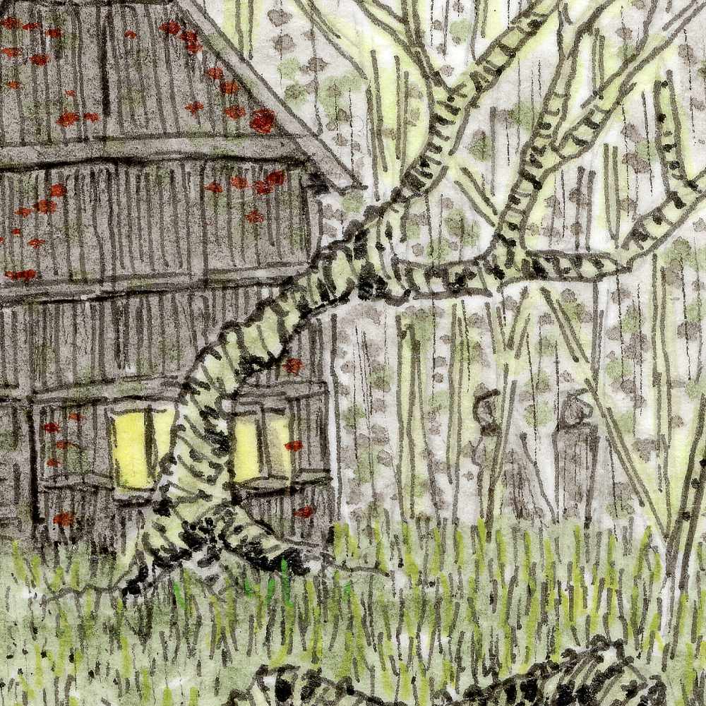
    Deep in the mist, a lit shack casts a warm, unsettling glow against the cool pale sky, drawing subtle, hooded figures through the woods toward whatever gathering awaits. Suspended in the midground, bound tightly around the branches of a gnarled tree, is a stark crimson ribbon. It is a deliberate, unnatural mark cutting through the wild green overgrowth. Whether it serves as a boundary, a remnant of some forgotten ritual, or a subtle signifier of the strange, ancient presences that drift through these woods, its true purpose is left unsaid.

    Technically, Swamp Fugue was worked on cold press paper using a combination of Faber-Castell Pitt pens, Staedtler fine liners, and Staedtler pigment pens. I used the fine liners to build the dense, organic contour lines that give the bark its heavy, ridged texture, while layering Pitt pen washes to establish the murky, moss-toned atmosphere. The fine stippling in the upper canopy allows the pale mist to hum with static, balancing the sharp, linear detail of the grass and foreground roots.


  • Amber Shadows

    Amber Shadows

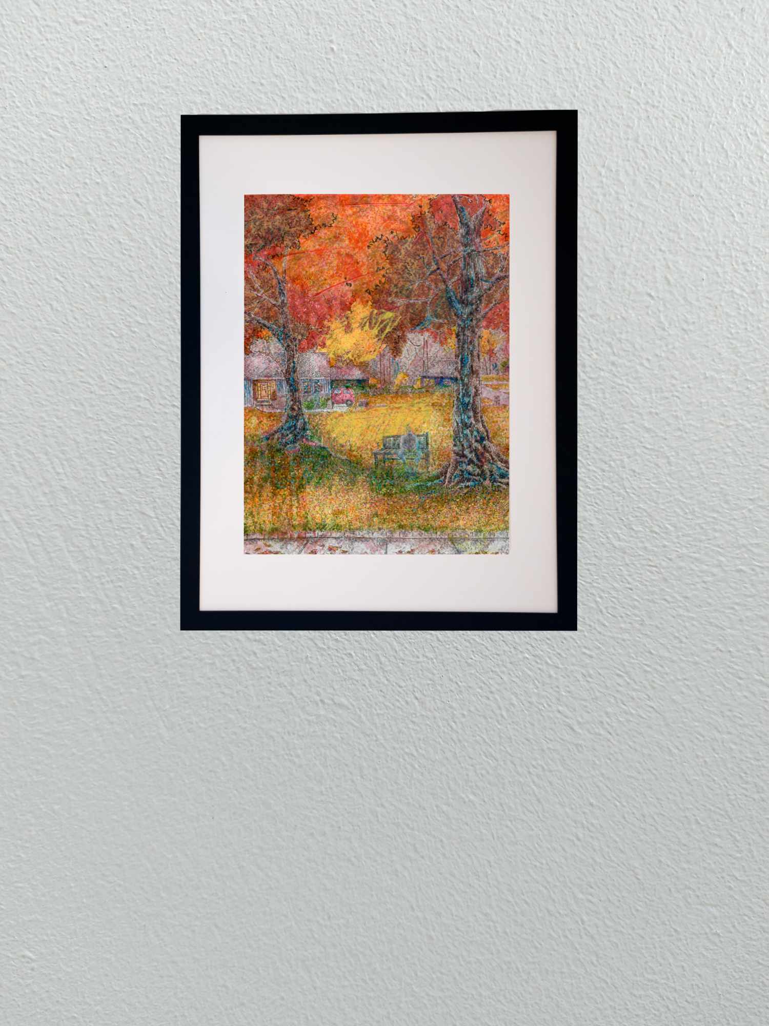
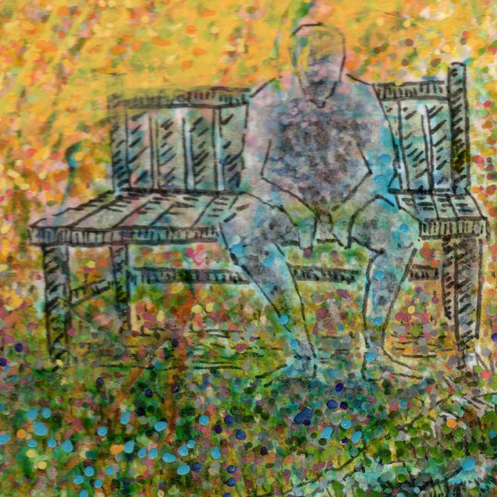
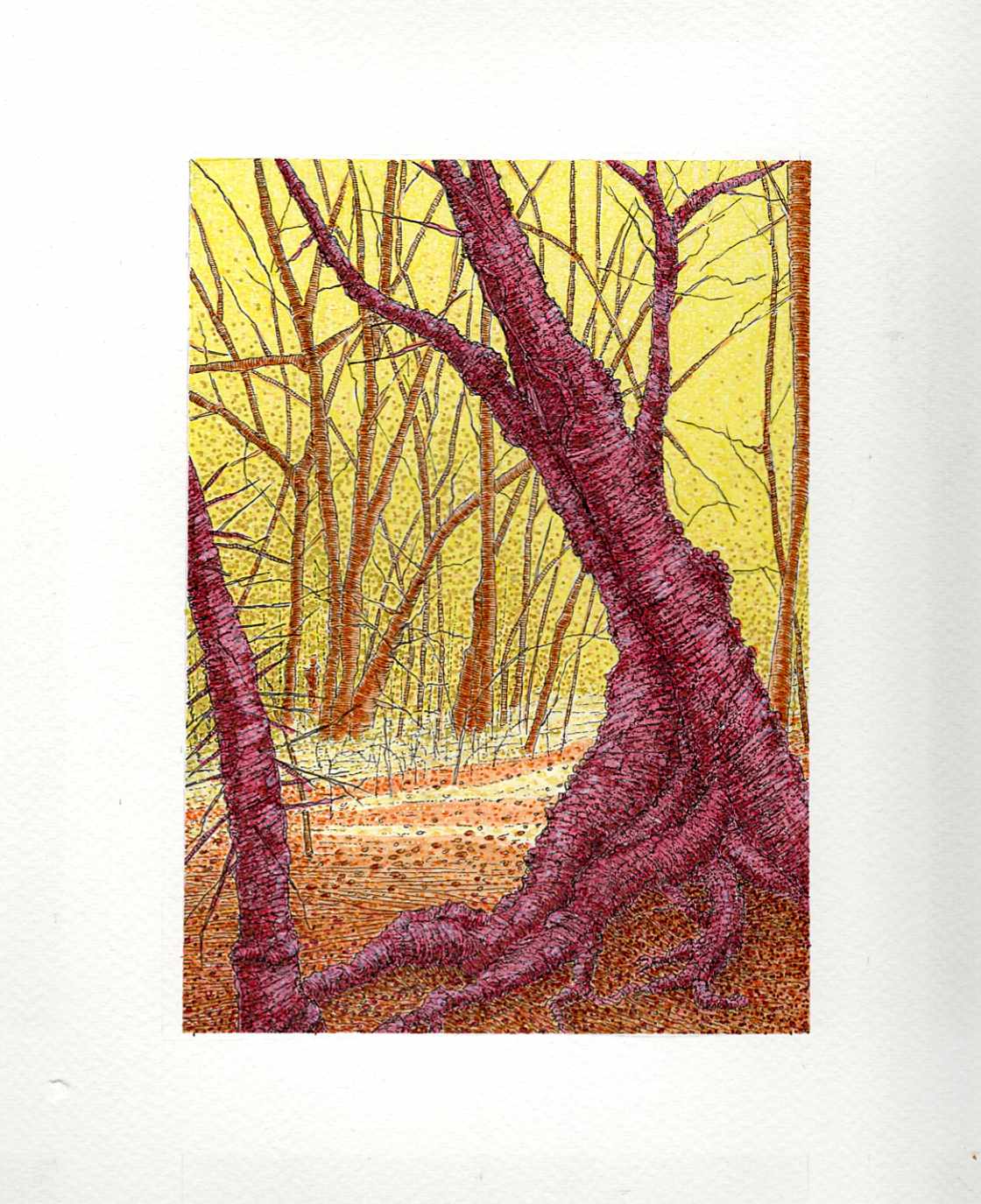
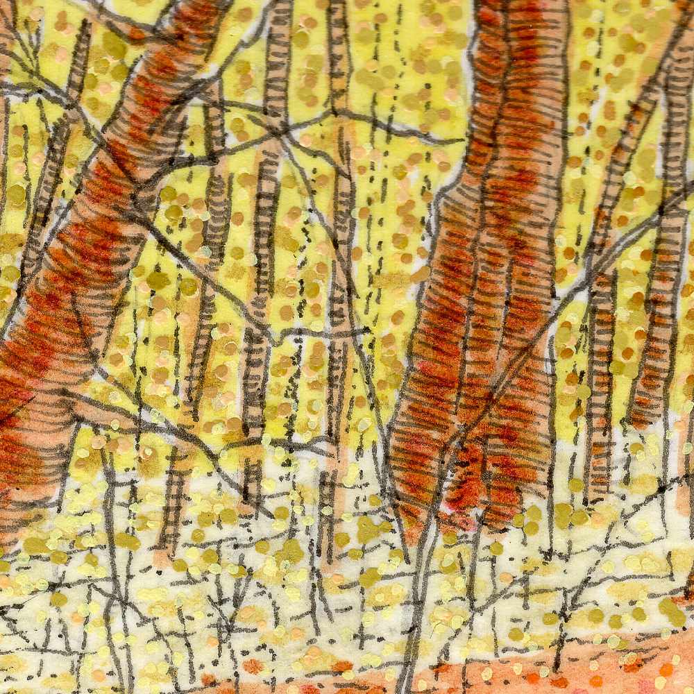
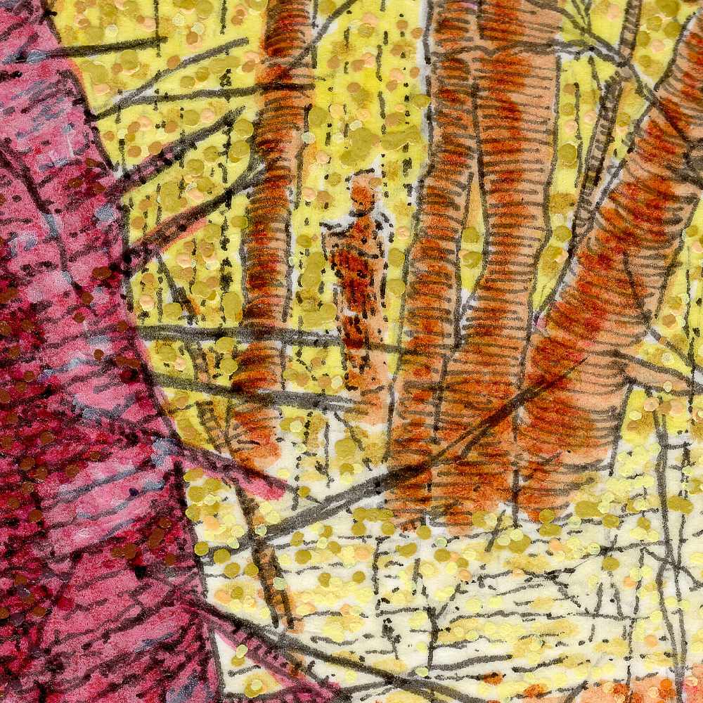
    In this latest piece, I wanted to step away from the cooler, muted tones of the deep woods and test what happens when you push a landscape into high-vibrancy territory. The goal was to capture an impression of folkloreโ€”that feeling of stepping into a stretch of woods where the light behaves strangely and the trees carry an ancient, deliberate presence. Across these recent folklore experiments, a common thread has begun to emerge: the quiet, mysterious presence of distant figures going about some unknown, ancient task just beyond the foreground.

    Technically, this was built on cold press paper using a multi-layered approach with Faber-Castell Pitt pens, Sakura fine liners, and bullet-tip acrylic pens.

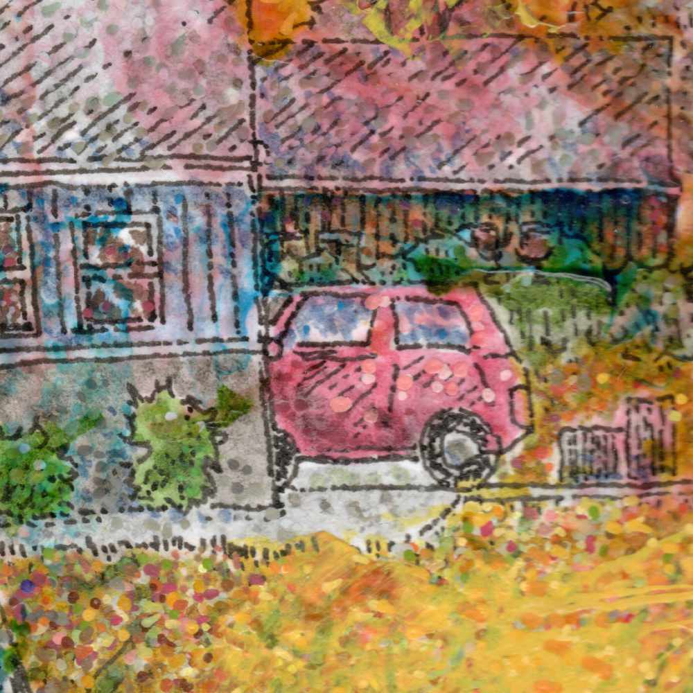
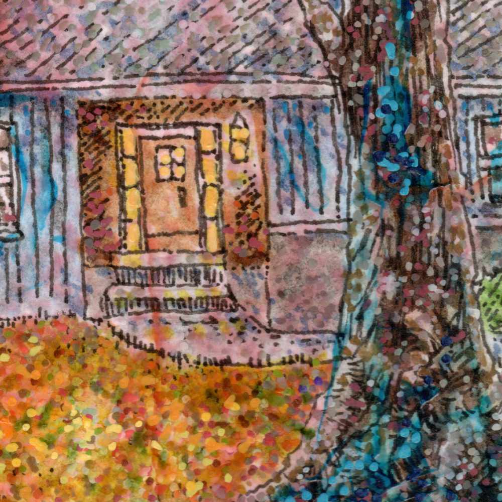
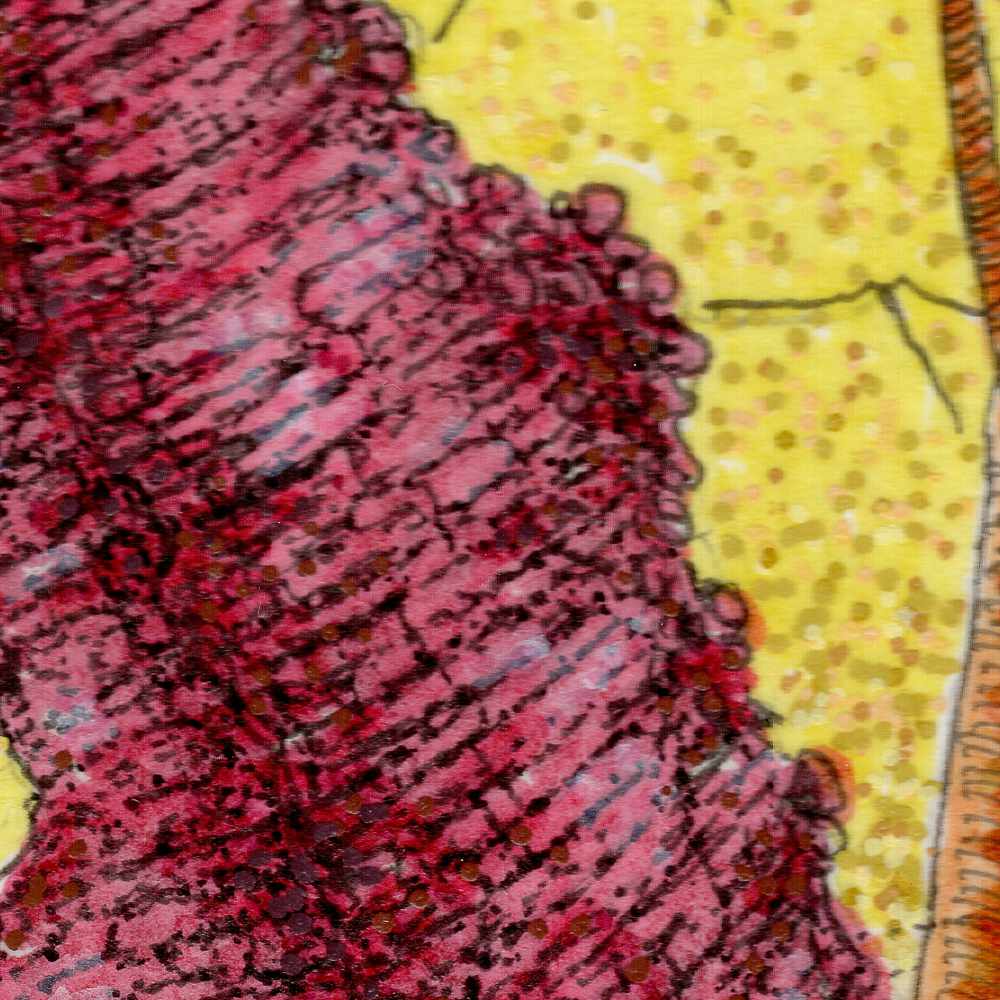
    The process relied on layering different styles of mark-making to establish depth and tactile friction. I used tight ink strokes and heavy cross-hatching with the fine liners to map out the complex, muscular bark and gnarled root structure of the central trunk. The rich, vibrant color fields throughout the piece were applied directly with Pitt pens. To create the vibrating, atmospheric background, I layered fine, precise dots of pointillist texture over those washes using bullet-tip acrylic pens. The tooth of the cold press paper catches those opaque micro-dots, allowing the canopy to hum with an electric, golden light.

    Itโ€™s an exercise in narrative and structural contrastโ€”letting the rigid precision of ink linework clash against the soft, vibrating texture of a pointillist sky while hinting at a world moving quietly in the shadows.


  • Reduction Study No. 2: French Press

    Reduction Study No. 2: French Press

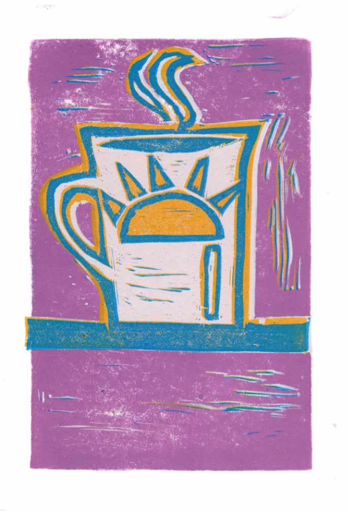
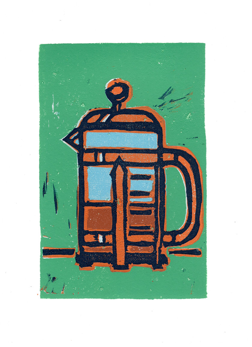
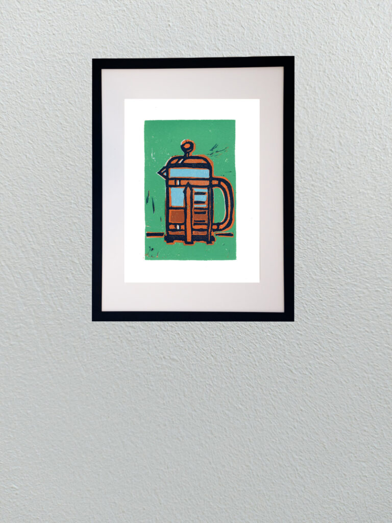
    Continuing with my deep dive into re-learning reduction linocut printing, this new piece takes the coffee theme a step further. While the earlier moka pot study was a great warm-up in carving and basic registration, this French press piece pushed into much more complex territory as a 6-color reduction print.

    Reduction printing is an unforgiving process because thereโ€™s no turning backโ€”once you carve away a layer of linoleum for the next color pass, that previous stage is gone forever. Managing six distinct color passes meant planning out the light blues, warm terracottas, rich coffee tones, jade background, and heavy dark outlines in strict sequence.

    Working through six passes also means wrestling with registration precision and ink trap behavior on the block. Small variations in pressure or carving depth show up immediately, but that physical unpredictability is exactly what makes relief printmaking so rewarding. The slight chatter marks left in the background and the overlap of heavy ink layers create a graphic, tactile punch that you simply can’t replicate with a pen or digital tool.


  • The Fire Behind

    The Fire Behind

    This latest piece continues my dive into folklore-inspired landscapes, using a rural backdrop to hold a quiet, unsettling moment. On the surface, itโ€™s a familiar structureโ€”a weathered wooden barn or outbuilding sitting at the edge of a field. But the narrative turns on the corner of that wall, where three pale, hooded figures stand in the shadows, peering past the wood toward a sudden burst of flame.

    Technically, this was built using a tight mix of acrylic pens, Sakura gel pens, and Faber-Castell Pitt pens on cold press paper. I wanted the architecture and the field to feel heavily textured, using dense, directional strokes to capture the rough grain of the wooden siding and the dry, standing grass.

    The atmospheric tension comes from the contrast in mark-making and color temperature. I used a stippling technique for the sky, layering blues, purples, and cool grays to give the canopy a vibrating, electric static. That cold background makes the hot oranges and yellows of the fire spill around the corner with real intensity, throwing the three specters into stark relief as they witness whatever is burning just out of sight.

    Leaving the source of the fire and the identity of the observers open-ended is the core of the piece. It frames a moment of quiet intrusionโ€”where the mundane rural landscape breaks open to reveal a ritual or a reckoning.


  • Relief Print: Moka Pot

    Relief Print: Moka Pot

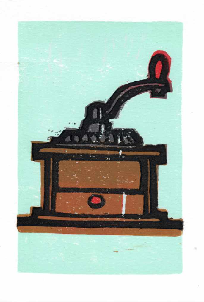
    This recent piece is a sharp departure from my usual studio routineโ€”an experimental reduction lino print of a classic moka pot. Relief printmaking is a medium I havenโ€™t actively worked in for a very long time, making this a deliberate exercise in re-learning some lost skills.

    Reduction printing forces you to think entirely in reverse and in stages, carving away layers of the same linoleum block between color runs. For this trial, I pressed the inks onto a coarse, heavily textured handmade paper. The paperโ€™s prominent tooth and organic surface grain deliberately fight the smooth coverage of the ink, leaving behind a raw, weathered texture that emphasizes the mechanical nature of the press.

    Stepping away from the precision of fine pens to wrestle with carving tools and ink rollers is a great reminder of how grounding it is to be a beginner again in a medium. Itโ€™s an untamed, physical process where you have to learn to embrace the friction and the happy accidents of the print.


  • Lumbering Bier

    Lumbering Bier

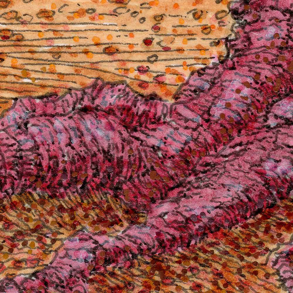
    In this second installment of the series, our ambiguous land deity is no longer a distant silhouette on a ridge line. Here, the entity is a massive, lumbering presence actively moving across a raw, windswept field. I wanted to shift the atmosphere to something highly kinetic, capturing the restless friction of an old god traversing its domain while the grass churns around it.

    Technically, expanding this world required a dense mixed-media approach on cold press paper to handle the sheer volume of texture. I built the environment using a layered blend of Faber-Castell Pitt pens, Staedtler pigment pens, acrylic brushes, and Sakura gel pens.

    The process itself was highly rhythmic. I used the fine precision of the Staedtler and Pitt pens to map out the intricate, flowing lines of the prairie grass, mimicking the paths of the wind cutting across the earth. For the figure itself, I wanted a stark architectural contrast; its blocky, horned head is built with textured gray tones, while its heavy cloak is a dense thatch of deep crimson lines interwoven with pale, root-like fibers. The sky is composed entirely of meticulous stipplingโ€”thousands of individual dots of ink and acrylic that create a vibrating, static-like atmosphere above the field. The tooth of the cold press paper catches these distinct mediums differently, keeping the individual marks crisp while allowing the colors to optically blend into a restless, living landscape.

    There is a solemn, ritualistic quality to this giant form moving through the elements, acting as an ancient shepherd of the wild, untamed acres.


  • Sedge Walking

    Sedge Walking

    This pencil sketch is the first concrete concept for a new direction I’m exploring. The series centers on the quiet, ancient presence that occupies our fields and prairies, using a recurring horned entity as a narrative anchor. I’ve been drawing inspiration from the looming, watchful nature of old-world land spirits like the Leshen, mixing that folklore with the indifferent vastness of our own open plains.

    With this specific piece, titled Sedge Walking, I wanted to play with a very quiet, localized scale of cosmic ambiguity. On first glance, you see the entity cresting the far ridge line, surveying the landscape. But if you look closer at the foreground, tangled and collapsed beneath the rough blades of the sedge, there is a second figure.

    By pulling that detail into the frame, the entire relationship shifts. It moves the work into a space of forlorn loss and raises questions I have no intention of answering cleanly. Is this ancient presence an active participant in this person’s quiet end, or is it merely a cosmic custodian performing the final, silent funeral rites for what the earth reclaims? Is it a protector, or an accountant taking a cold inventory of the decay?

    Technically, keeping this in pure pencil on cold press paper allowed me to focus entirely on the texture and the weight of the environment. The fine, dense linework builds the chaotic grain of the grass, burying the foreground figure in a way that forces the viewer to slow down and actually look for the story. Future pieces will continue to track this entityโ€”or the trailing remnants of its presenceโ€”through various field settings, establishing a running dialogue between the observer and the soil.


  • Frenetic Canopy

    Frenetic Canopy

    I wanted to move away from the quiet, still qualities of a traditional landscape and focus entirely on energy. Nature is rarely static. It is constantly growing, decaying, and shifting. This piece was a deliberate experiment in capturing that hidden, frenetic activityโ€”making a forest look as though it is writhing and moving right in front of you.

    Technically, this required a dense orchestration of different tools and medium behaviors on smooth hot press paper. I built the surface using a heavy blend of Faber-Castell Pitt pens, Staedtler pigment pens, acrylic pens, and Sakura gel pens.

    The process was rhythmic and intense. I used the fine precision of the Staedtler pens to create an intricate web of overlapping, high-contrast lines for the undergrowth and the tree trunks. The fine, colorful lines slashing through the foliage were accomplished with Sakura gel pens, giving those bright accents a sharp, clean edge. Instead of blending colors smoothly, I relied on rapid dashes and tight clusters of stippling with the acrylic and Pitt pens. By placing contrasting tones directly side-by-sideโ€”the electric greens against the deep purples and warm ochresโ€”the canopy begins to optically vibrate.
    It is a chaotic way to build a landscape, but letting the marks layer over one another without correcting the friction gives the piece its pulse. It records the grit and the constant motion of the woods rather than a sanitized portrait of them.