Tag: coldpress

  • Lumbering Bier

    Lumbering Bier

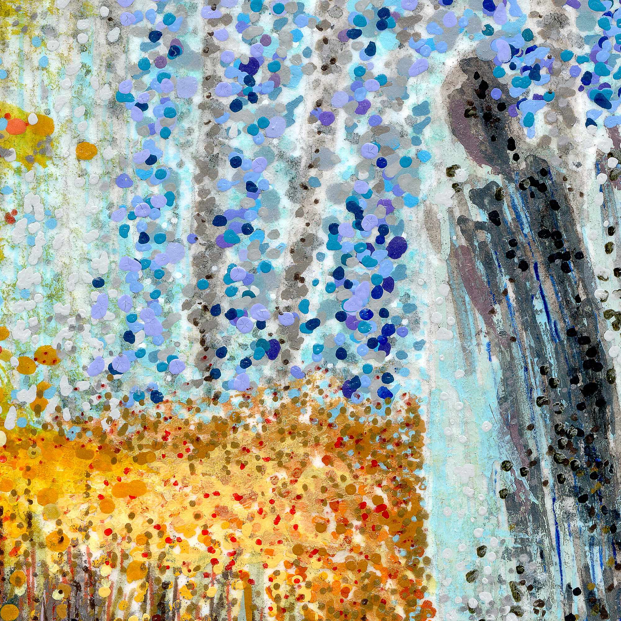
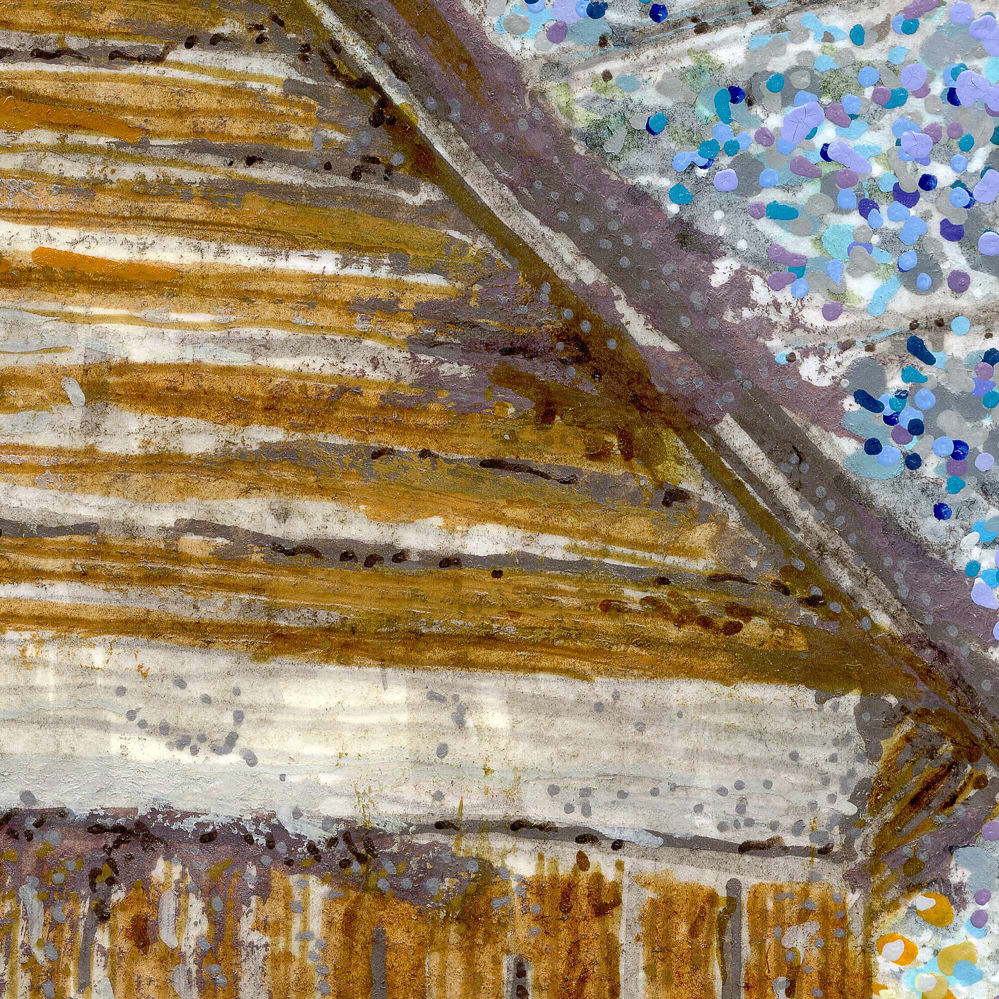
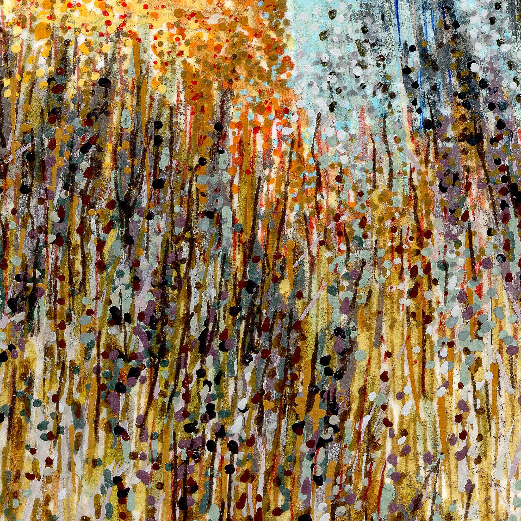
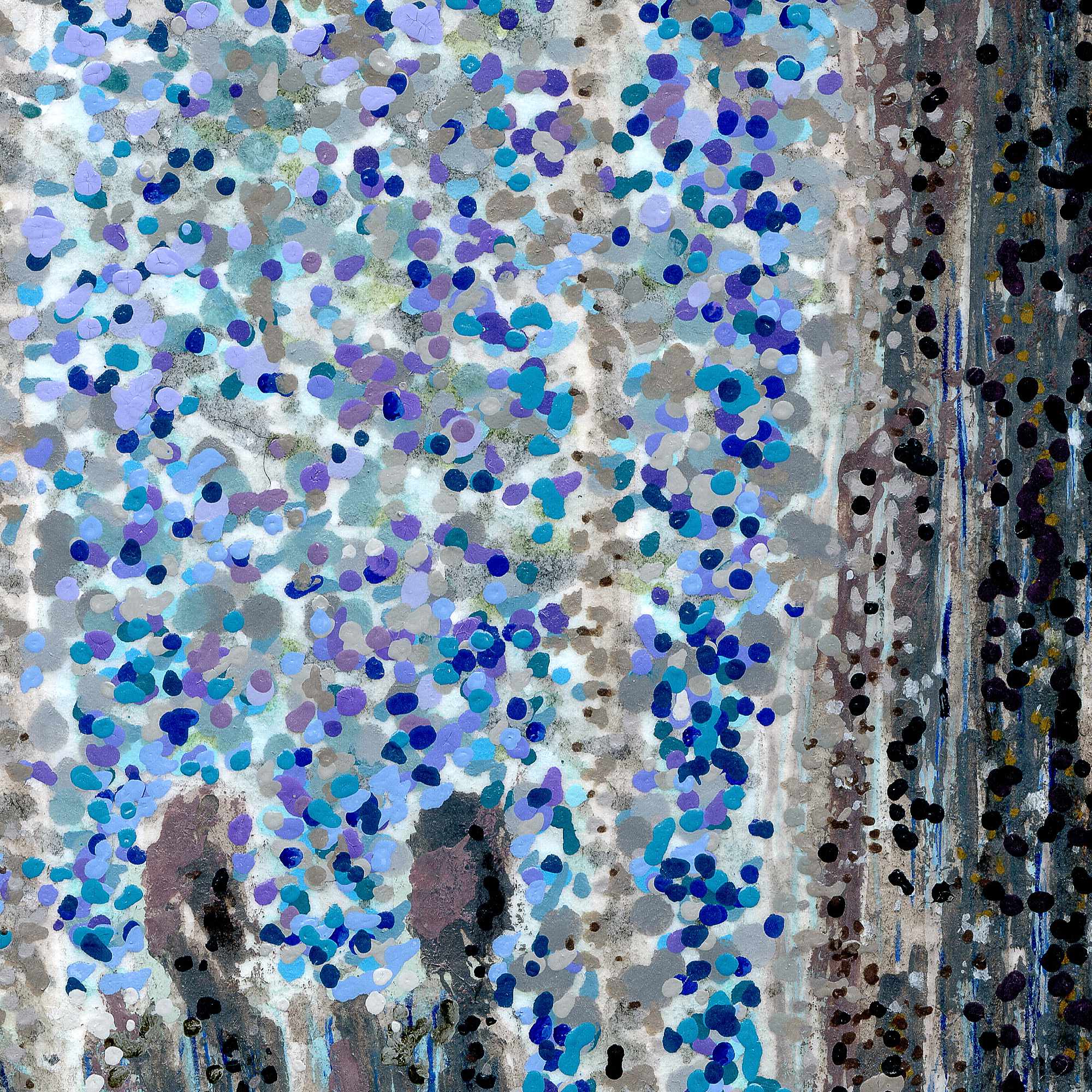
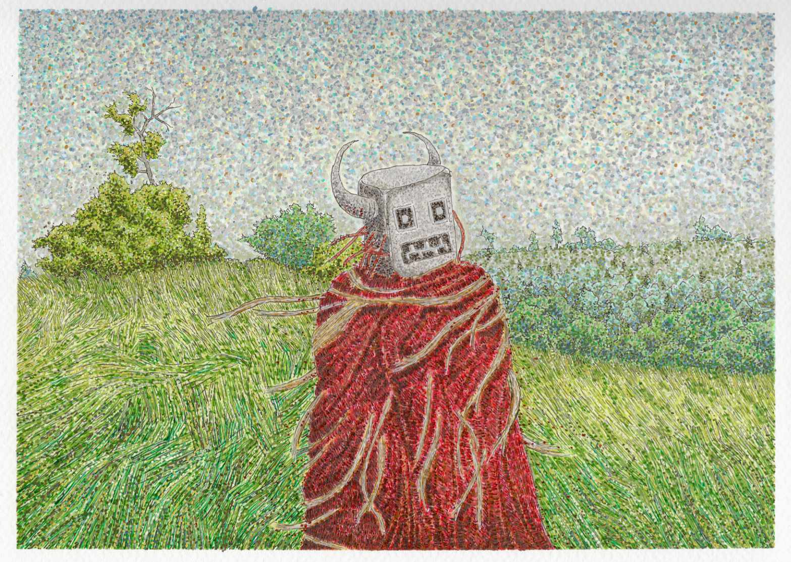
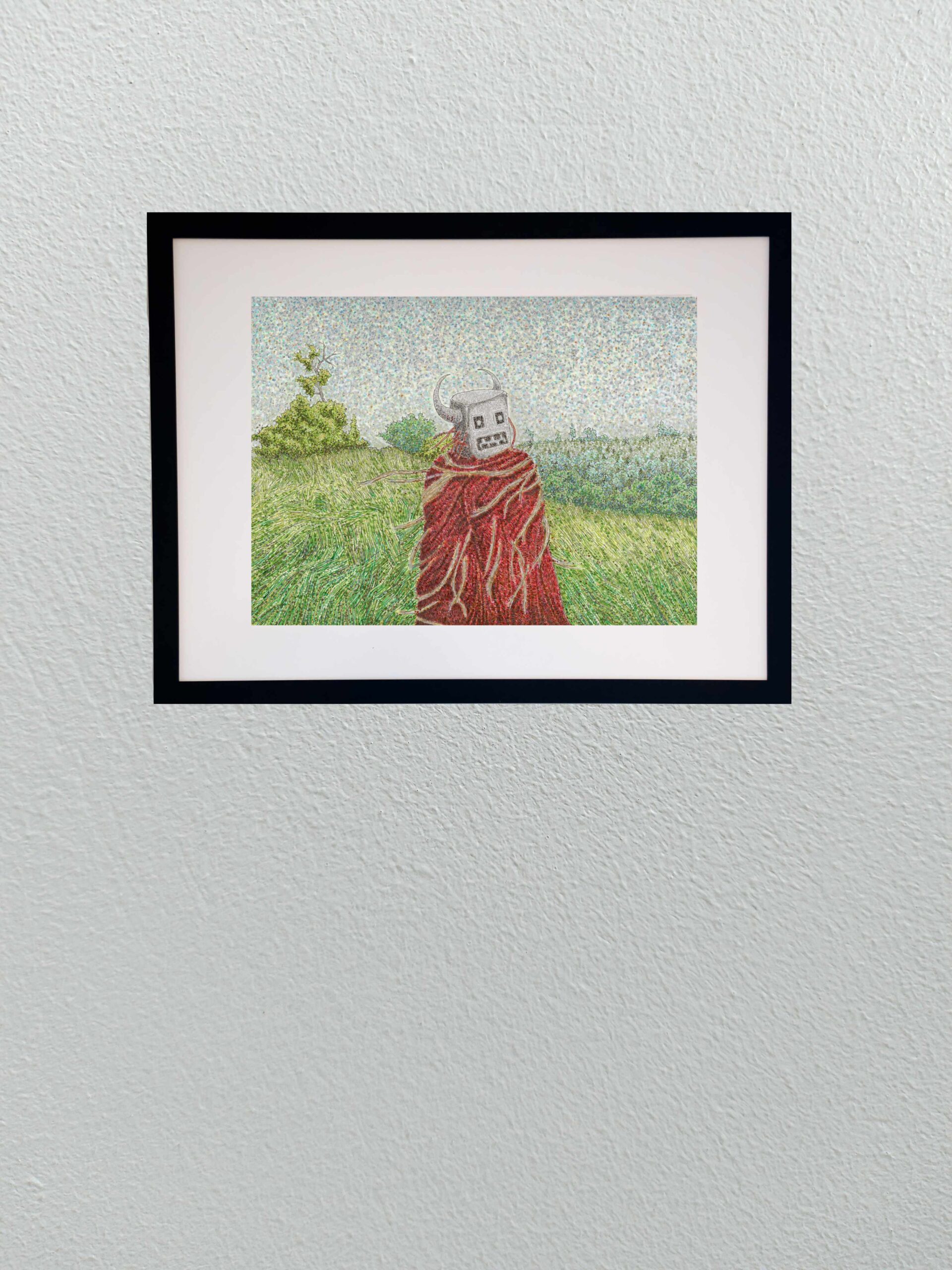
    In this second installment of the series, our ambiguous land deity is no longer a distant silhouette on a ridge line. Here, the entity is a massive, lumbering presence actively moving across a raw, windswept field. I wanted to shift the atmosphere to something highly kinetic, capturing the restless friction of an old god traversing its domain while the grass churns around it.
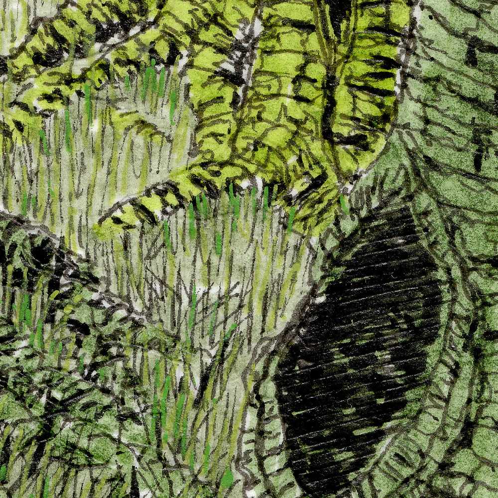
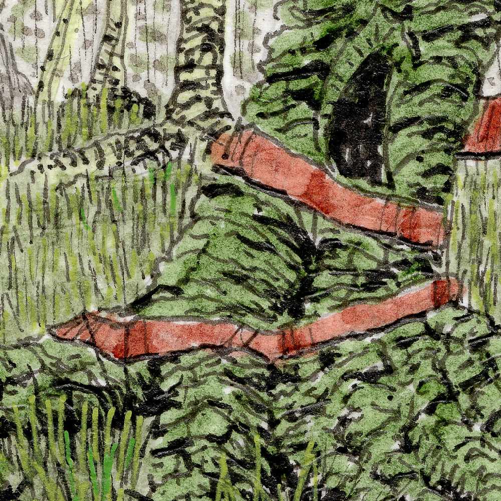
    Technically, expanding this world required a dense mixed-media approach on cold press paper to handle the sheer volume of texture. I built the environment using a layered blend of Faber-Castell Pitt pens, Staedtler pigment pens, acrylic brushes, and Sakura gel pens.

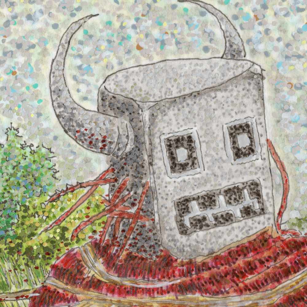
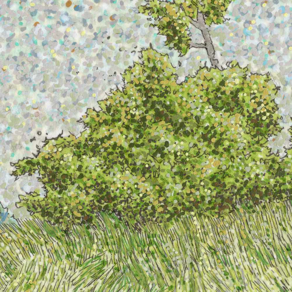
    The process itself was highly rhythmic. I used the fine precision of the Staedtler and Pitt pens to map out the intricate, flowing lines of the prairie grass, mimicking the paths of the wind cutting across the earth. For the figure itself, I wanted a stark architectural contrast; its blocky, horned head is built with textured gray tones, while its heavy cloak is a dense thatch of deep crimson lines interwoven with pale, root-like fibers. The sky is composed entirely of meticulous stipplingโ€”thousands of individual dots of ink and acrylic that create a vibrating, static-like atmosphere above the field. The tooth of the cold press paper catches these distinct mediums differently, keeping the individual marks crisp while allowing the colors to optically blend into a restless, living landscape.

    There is a solemn, ritualistic quality to this giant form moving through the elements, acting as an ancient shepherd of the wild, untamed acres.


  • Sedge Walking

    Sedge Walking

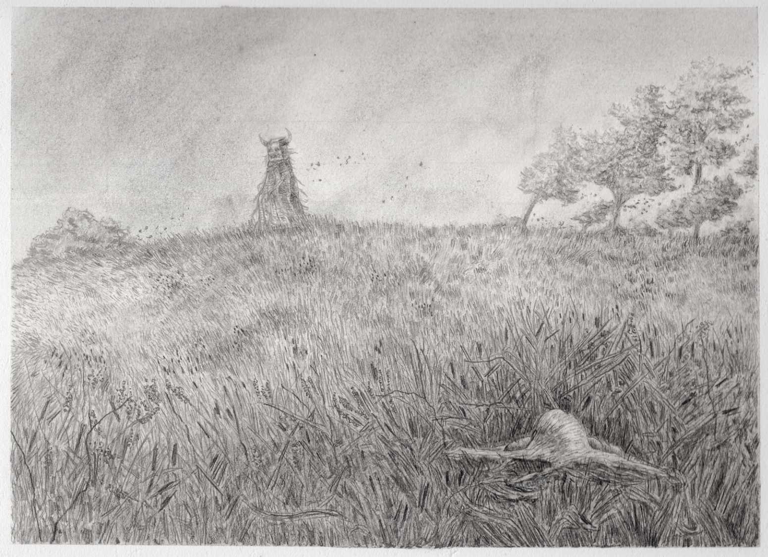
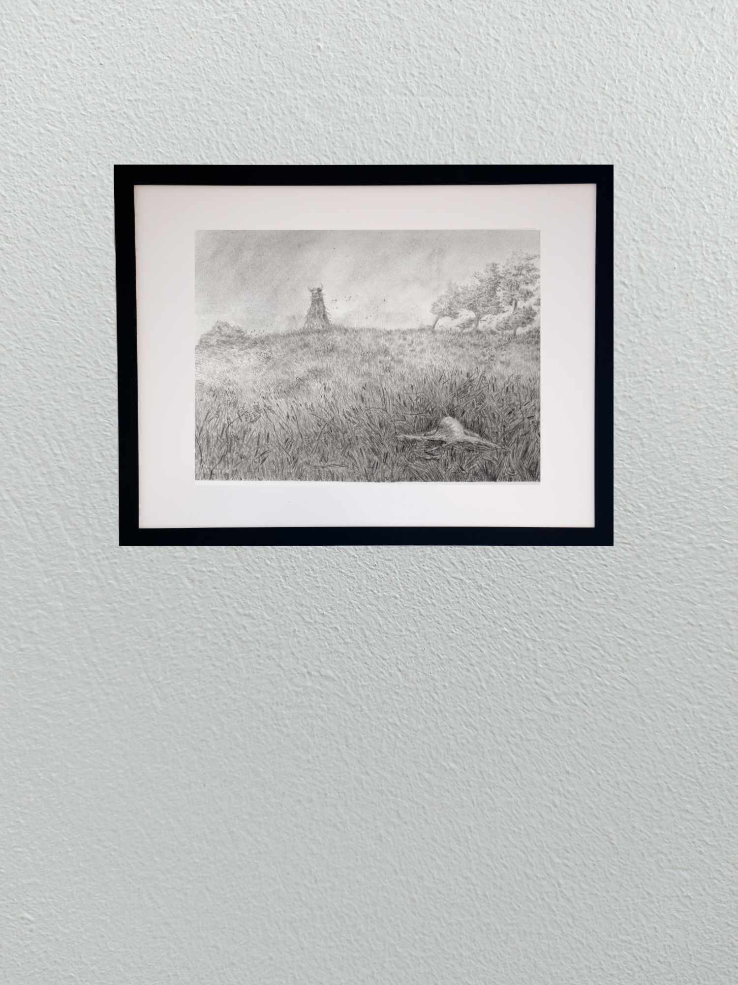
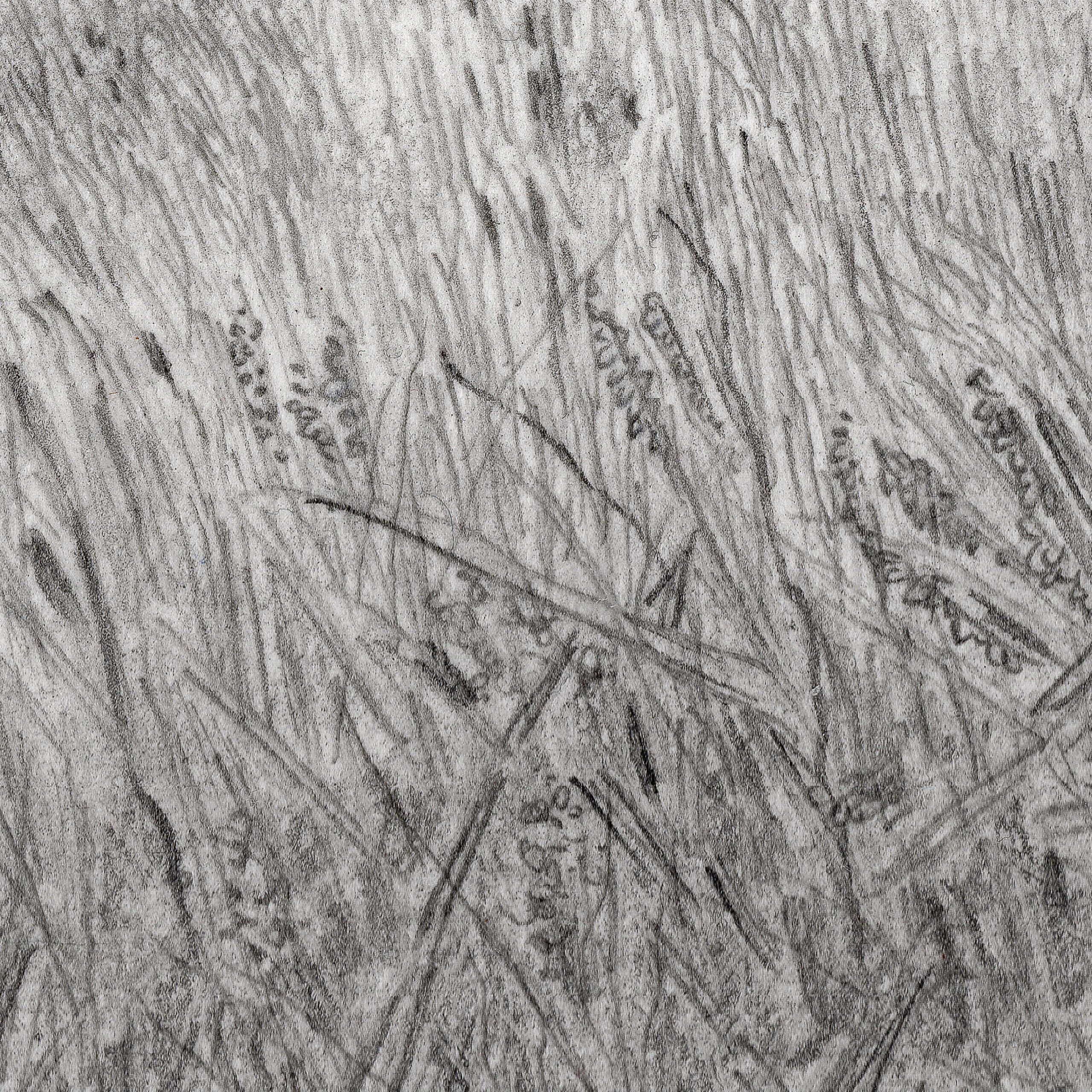
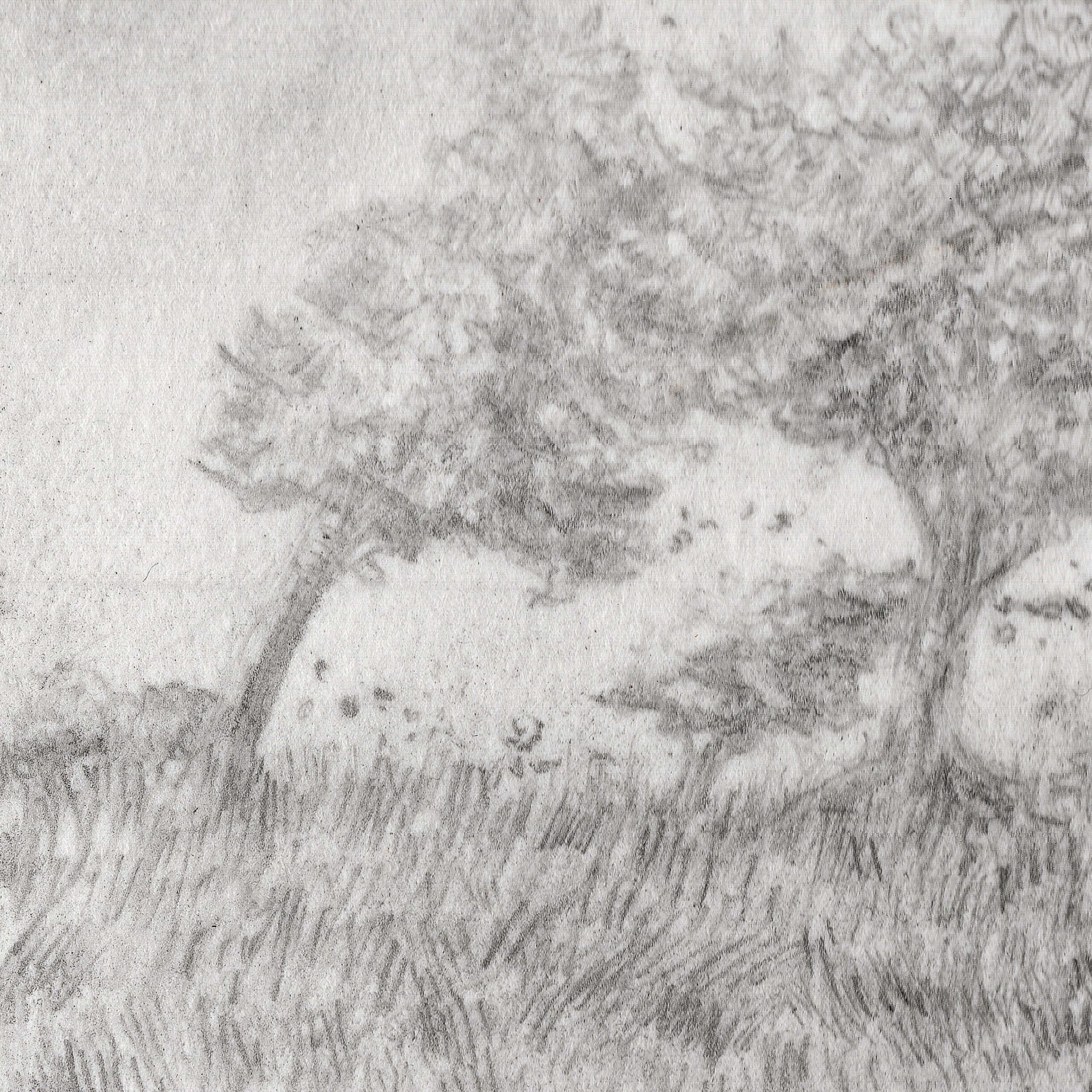
    This pencil sketch is the first concrete concept for a new direction I’m exploring. The series centers on the quiet, ancient presence that occupies our fields and prairies, using a recurring horned entity as a narrative anchor. I’ve been drawing inspiration from the looming, watchful nature of old-world land spirits like the Leshen, mixing that folklore with the indifferent vastness of our own open plains.

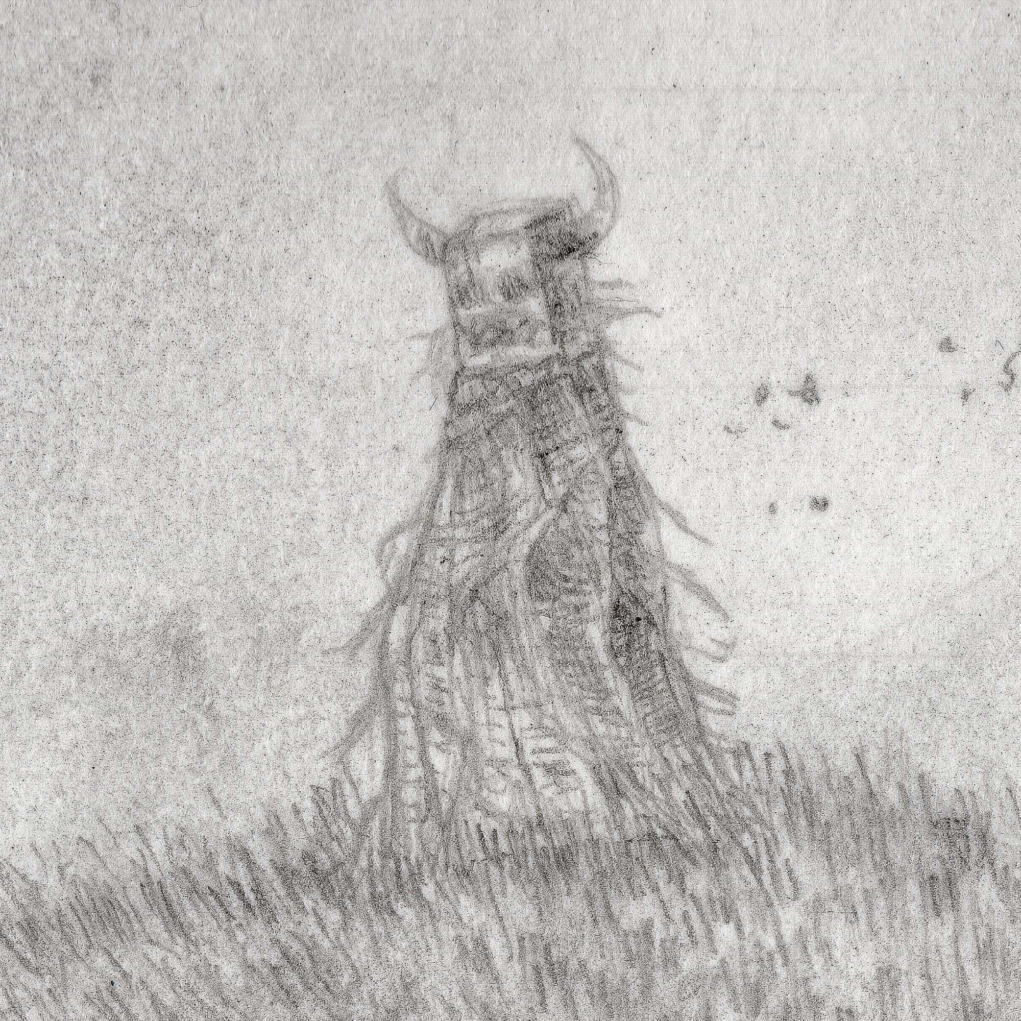
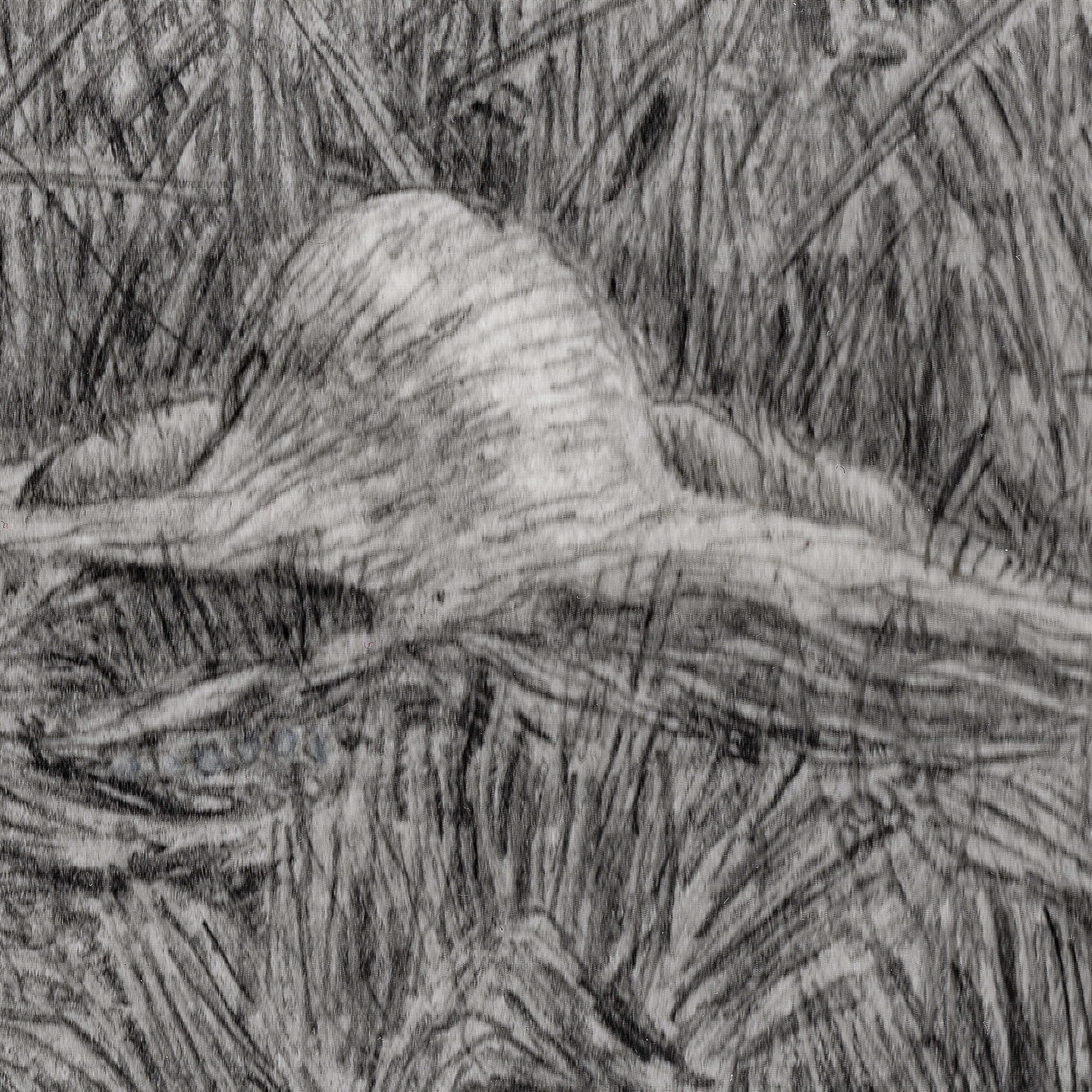
    With this specific piece, titled Sedge Walking, I wanted to play with a very quiet, localized scale of cosmic ambiguity. On first glance, you see the entity cresting the far ridge line, surveying the landscape. But if you look closer at the foreground, tangled and collapsed beneath the rough blades of the sedge, there is a second figure.

    By pulling that detail into the frame, the entire relationship shifts. It moves the work into a space of forlorn loss and raises questions I have no intention of answering cleanly. Is this ancient presence an active participant in this person’s quiet end, or is it merely a cosmic custodian performing the final, silent funeral rites for what the earth reclaims? Is it a protector, or an accountant taking a cold inventory of the decay?

    Technically, keeping this in pure pencil on cold press paper allowed me to focus entirely on the texture and the weight of the environment. The fine, dense linework builds the chaotic grain of the grass, burying the foreground figure in a way that forces the viewer to slow down and actually look for the story. Future pieces will continue to track this entityโ€”or the trailing remnants of its presenceโ€”through various field settings, establishing a running dialogue between the observer and the soil.


  • Sells Mill: Late Winter Light

    Sells Mill: Late Winter Light

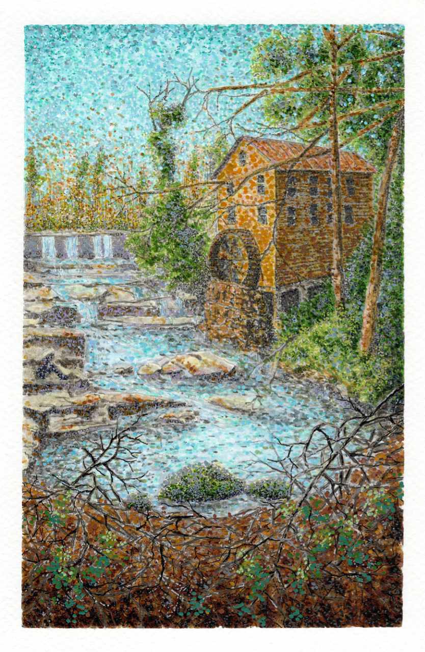
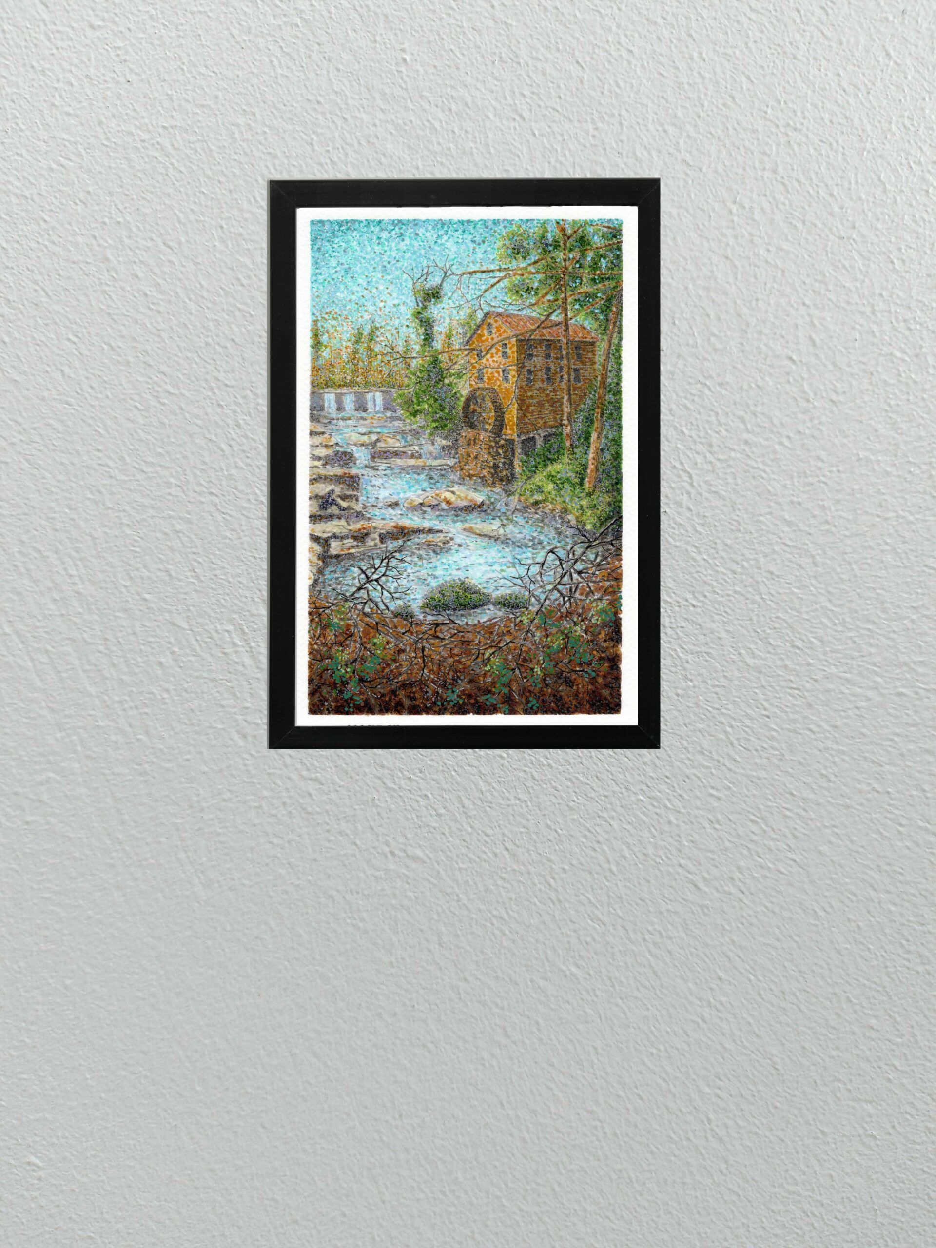
    here is a brief window at the end of winter where the landscape feels entirely transitional. The trees are still bare, but the light changes, catching the water and the earth differently. This study of Sells Mill was an attempt to record that specific, shifting energy.

    Technically, Iโ€™ve continued to explore the boundaries of my mixed-media approach on cold press paper. I used a combination of Faber-Castell Pitt pens, acrylic pens, and Sakura pens to build the scene layer by layer.

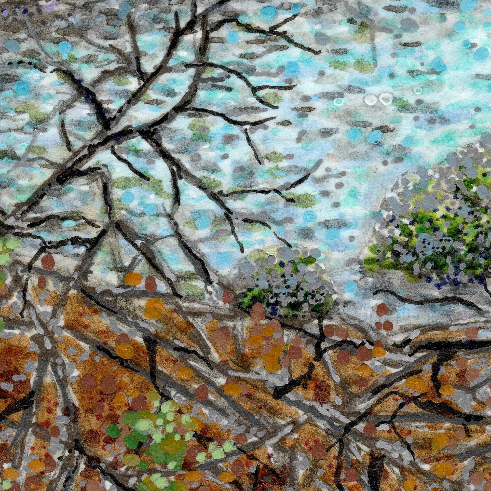
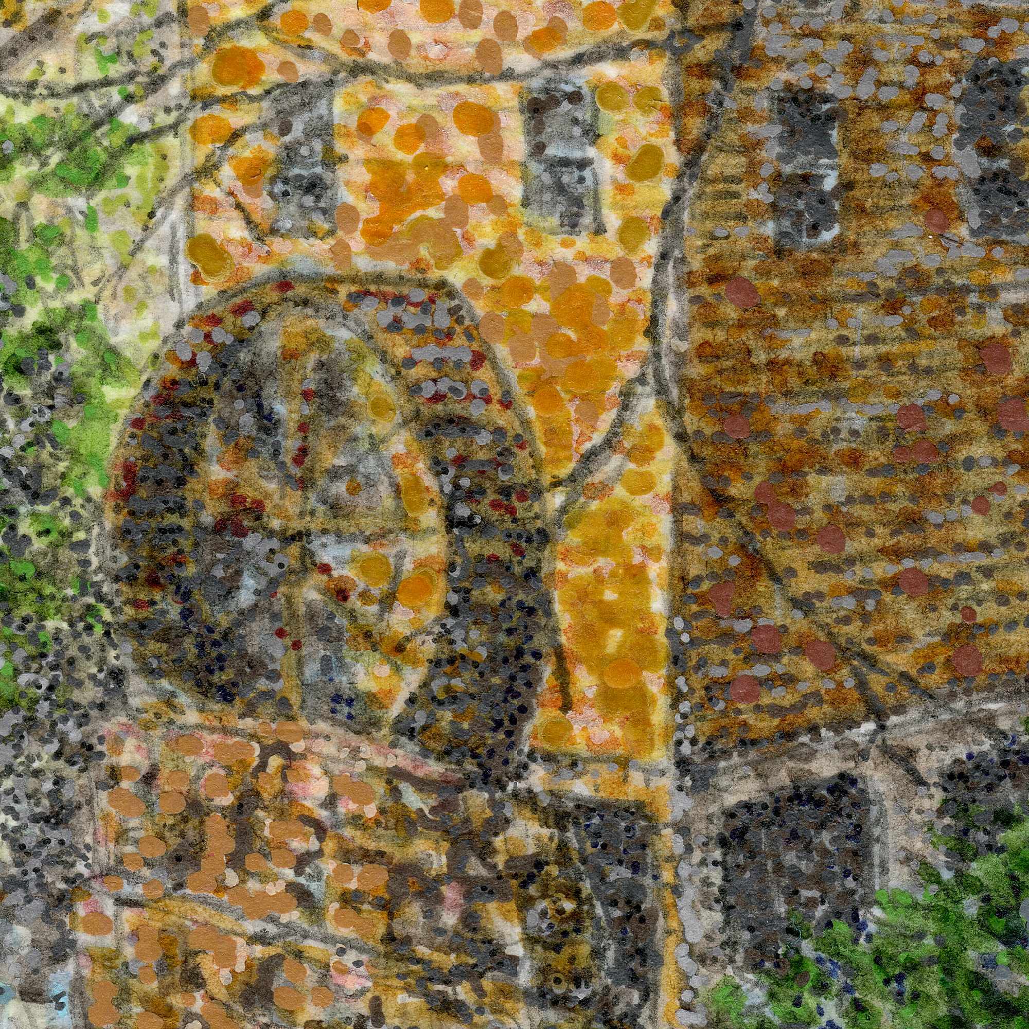
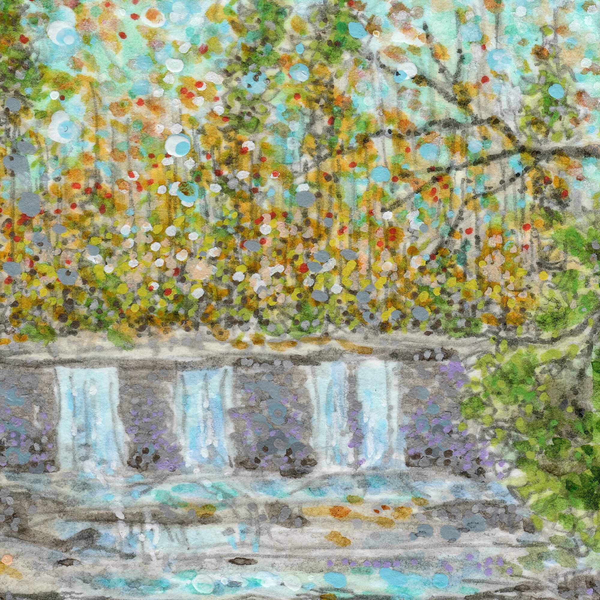
    The process is a deliberate balance between structured architecture and organic chaos. I used the fine precision of the Sakura and Pitt pens to draft the rigid lines of the historic mill and the dense, tangled thicket of branches in the foreground. For the sky, the water, and the stone faรงade, I leaned heavily into a pointillist technique. By applying thousands of individual dots of ink and acrylic, the surface begins to vibrateโ€”allowing the cool blues of the late winter sky and the rushing stream to catch a sense of movement.

    The paperโ€™s tooth works as a quiet partner here, holding the pigments exactly where they land but allowing the sheer volume of marks to optically blend. Itโ€™s a slow, rhythmic way to work that captures the texture of a place without forcing it into a sterile, perfect drawing.


  • The Fence Line

    The Fence Line

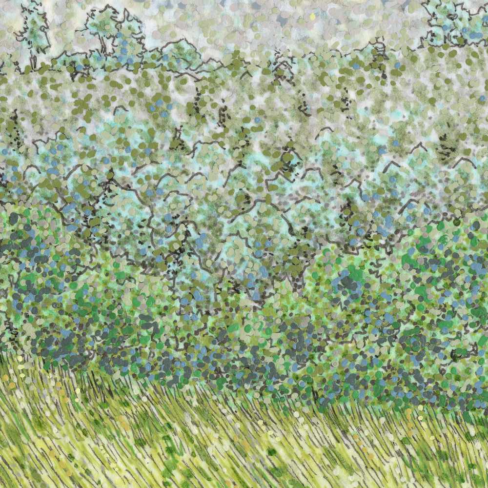
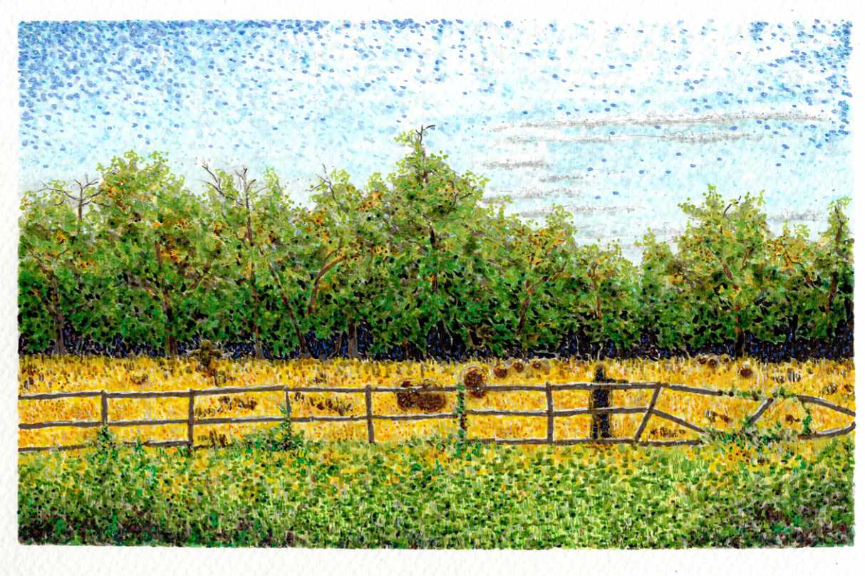
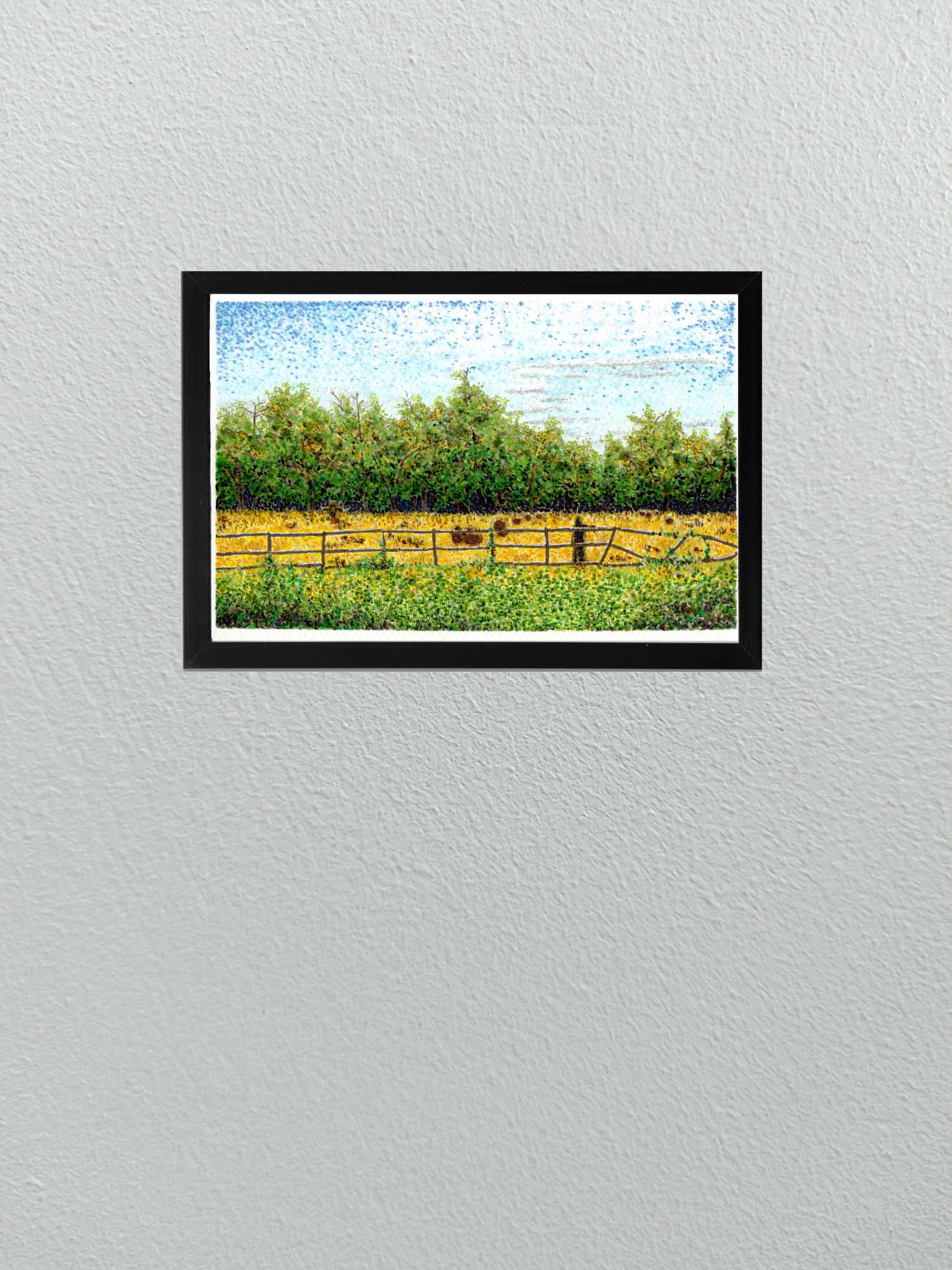
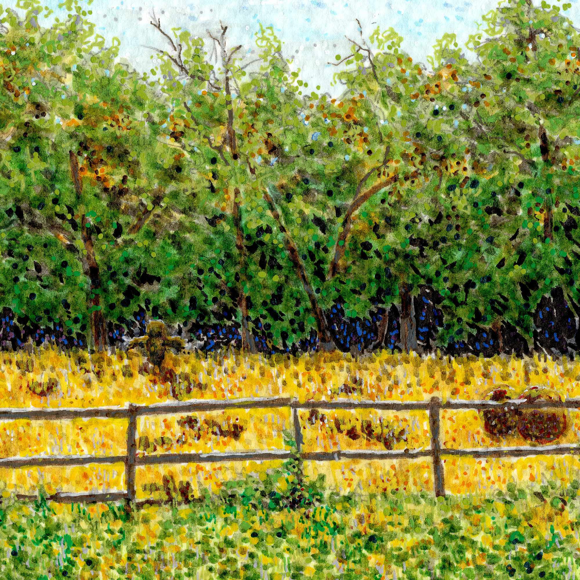
    This is a small 6×9 study on cold press paper, born from an interest in the quiet friction between the ordinary and the unknown. On the surface, itโ€™s a mundane rural sceneโ€”a sunlit field, a line of dense green trees, and a weathered wooden fence stretching across the frame.

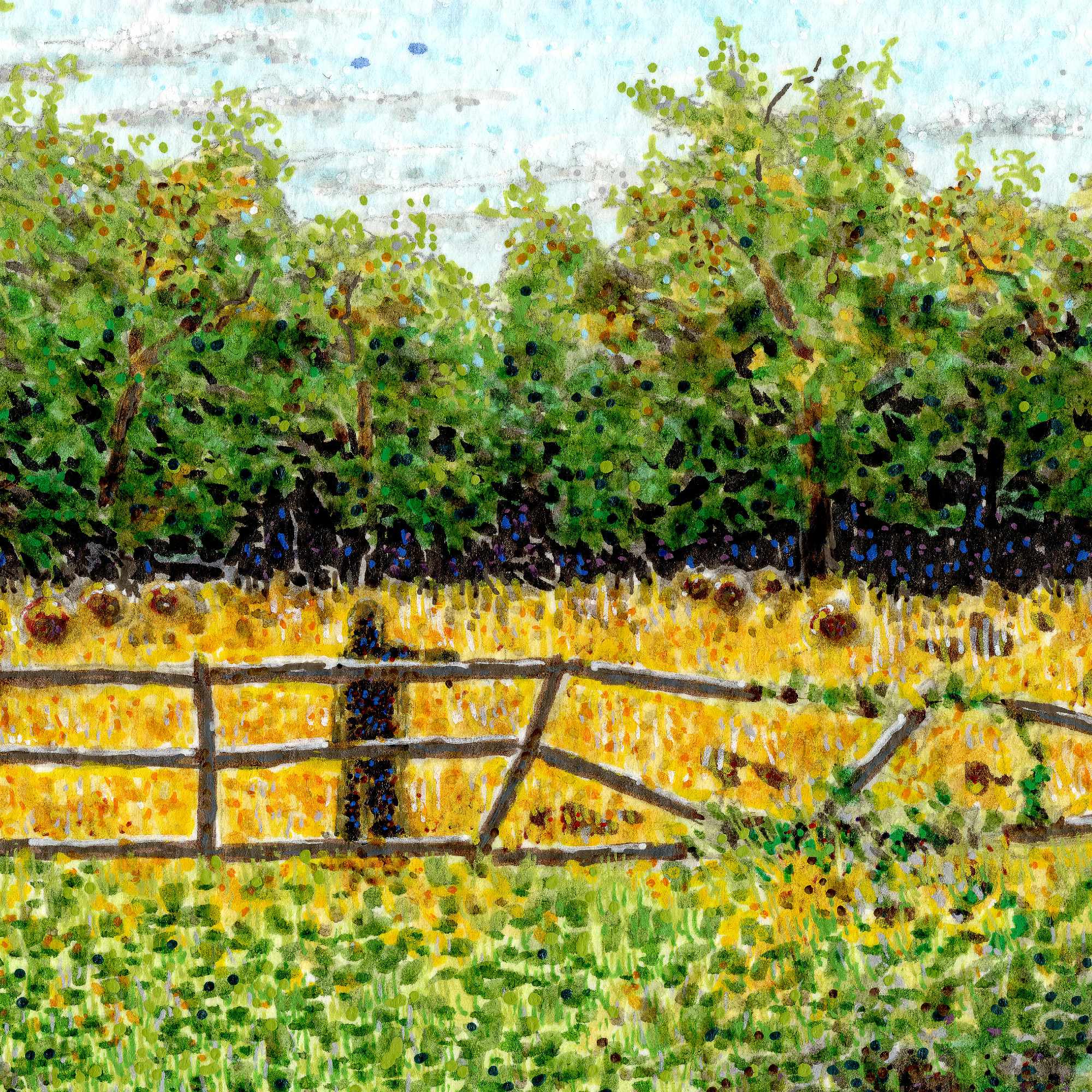
    I built the composition using Faber-Castell Pitt pens and acrylic. The cold press texture acts as a partner in the process, catching the ink and stippled marks to build up the fields of color without losing the organic feel of the paper. I wanted the sky and the foreground greenery to feel alive, using rapid dots of pigment that make the light shimmer across the canvas.

    The real shift in the piece comes with the shaded figure standing in the foreground field. By placing this dark, silhouetted form right against the fence line, a simple landscape transforms into a moment of mystery. It introduces a narrative element without over-explaining itself, leaving the viewer to wonder who is standing by the field, and why.


  • The Yellow Hat

    The Yellow Hat

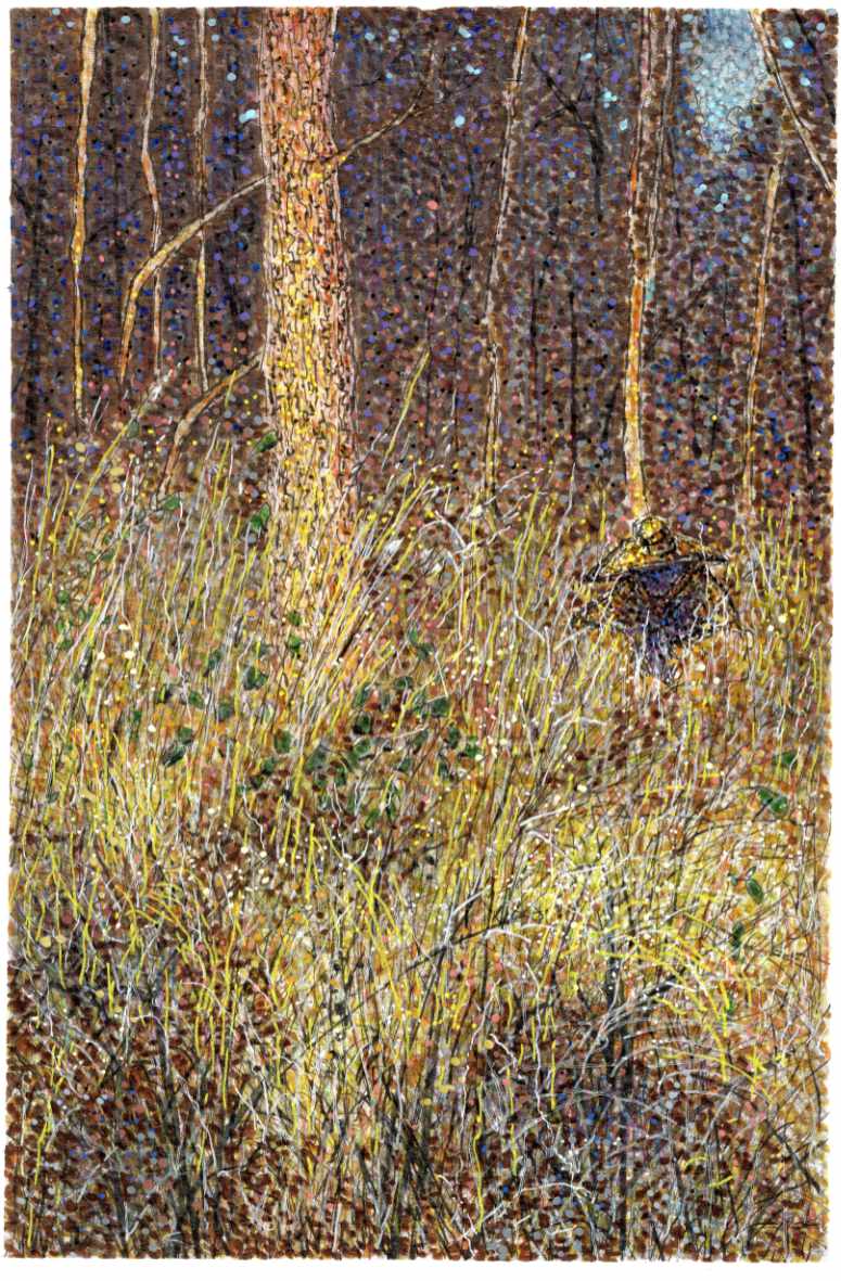
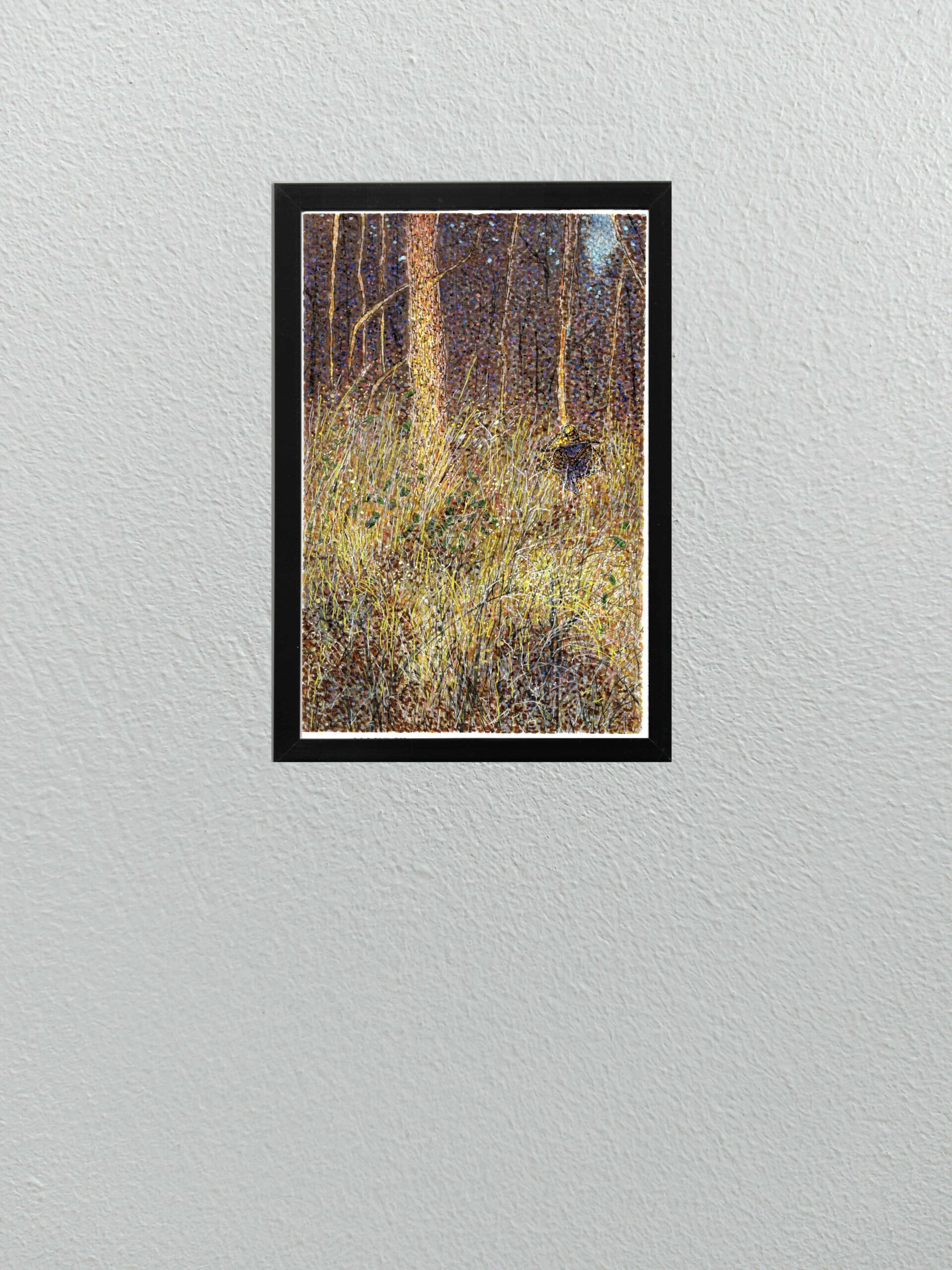
    Today I am sharing a new multi-media piece that continues to push the boundaries of my recent experiments with pointillism, but with a distinct narrative twist.

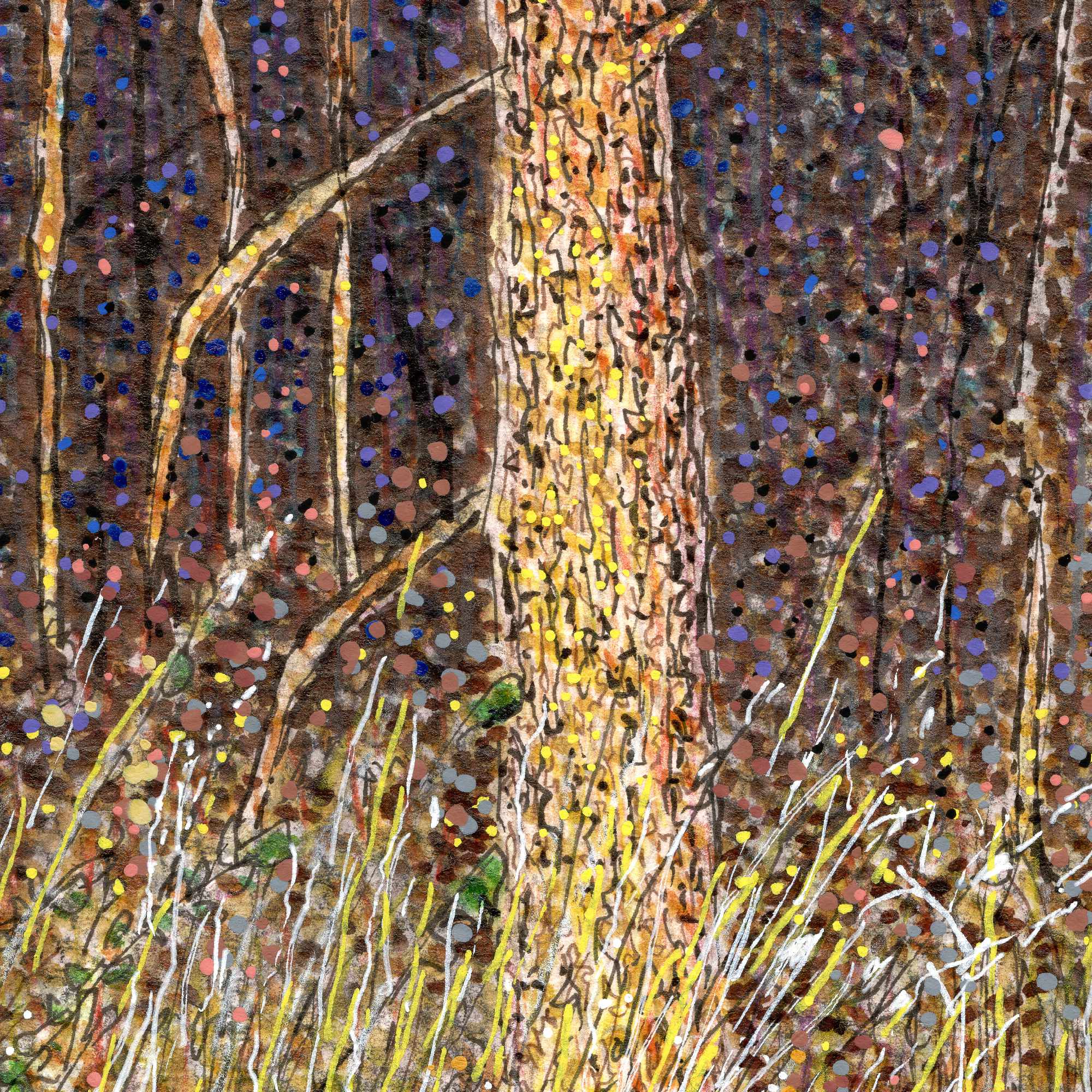
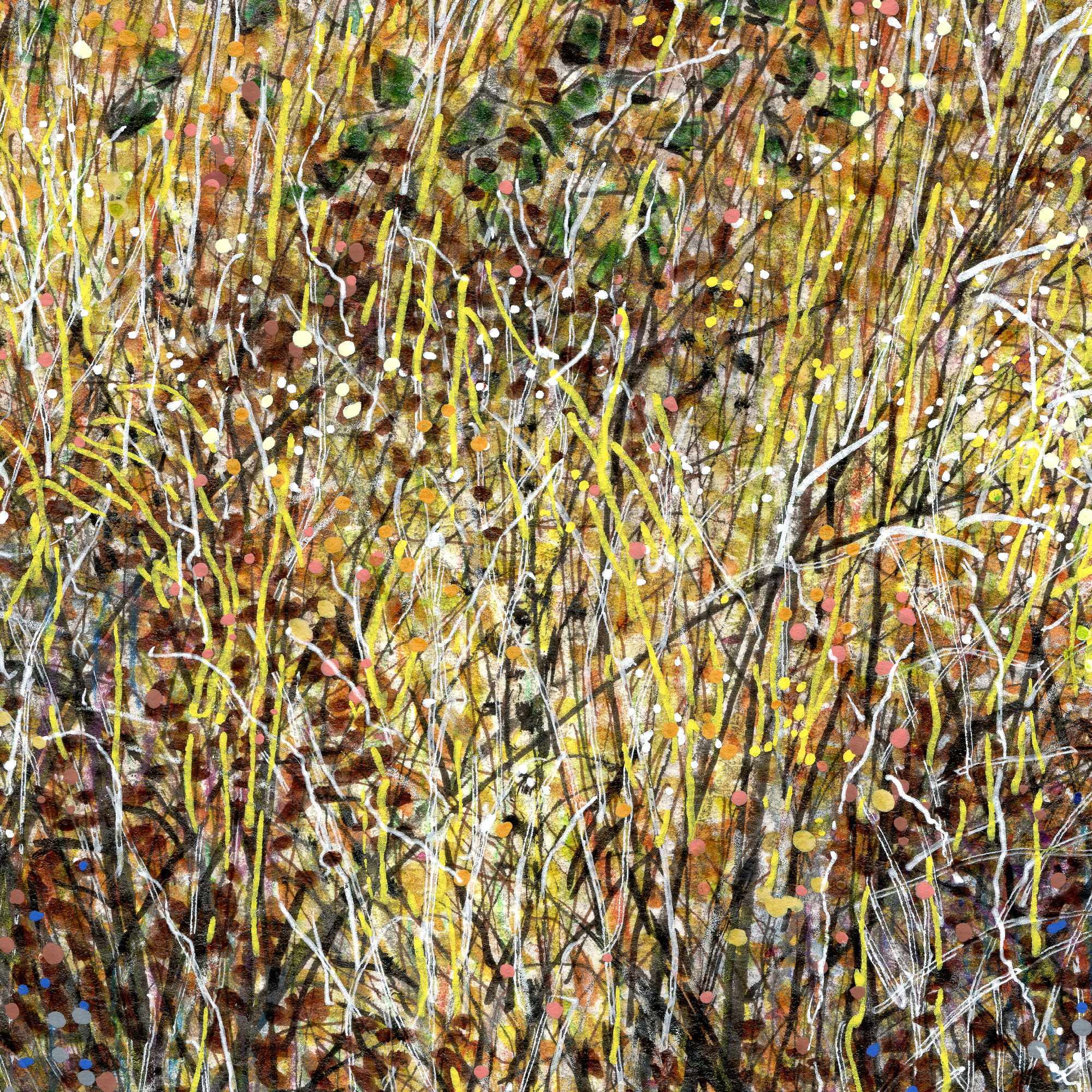
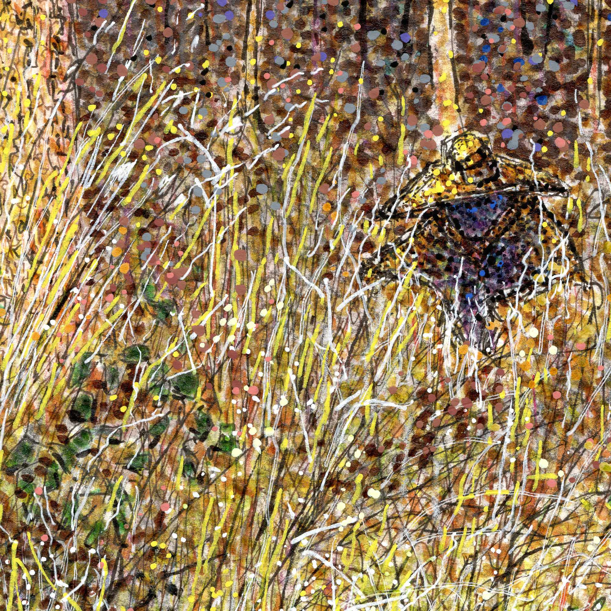
    This piece, based on an older photograph of a dense tree line and brush, relies on a highly textured mix of India ink, acrylic pens, and Pigma fine liners. To capture the thick, almost claustrophobic atmosphere of the undergrowth, I combined sharp, vertical scratches for the tall grass with heavy, vibrating dots of color. The optical mixing of the bright yellows and oranges in the foreground against the deep, heavy purples and blacks of the background gives the entire scene a buzzing, nocturnal energy.

    But this isn’t just a landscape study. If you look closely at the middle-right side of the composition, tucked away in the tall grass, there is a cloaked figure wearing a wide-brimmed yellow hat.

    I rendered this figure using the exact same pointillist and linework techniques as the surrounding environment, perfectly camouflaging them into the brush. Much of my work centers around the idea of being a “quiet observer” in rural, forgotten spaces. With this piece, I wanted to flip that dynamic. It introduces a subtle, eerie, Southern Gothic narrativeโ€”a reminder that when you are out observing the quiet edges of the world, sometimes you are also being observed.


  • Summer Dusk

    Summer Dusk

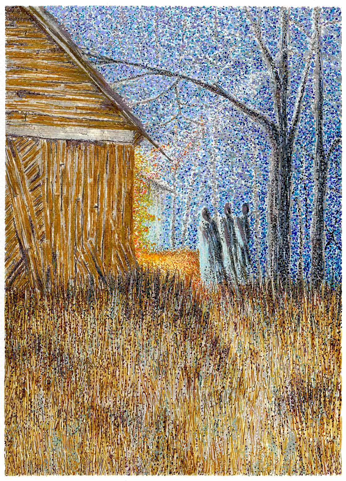
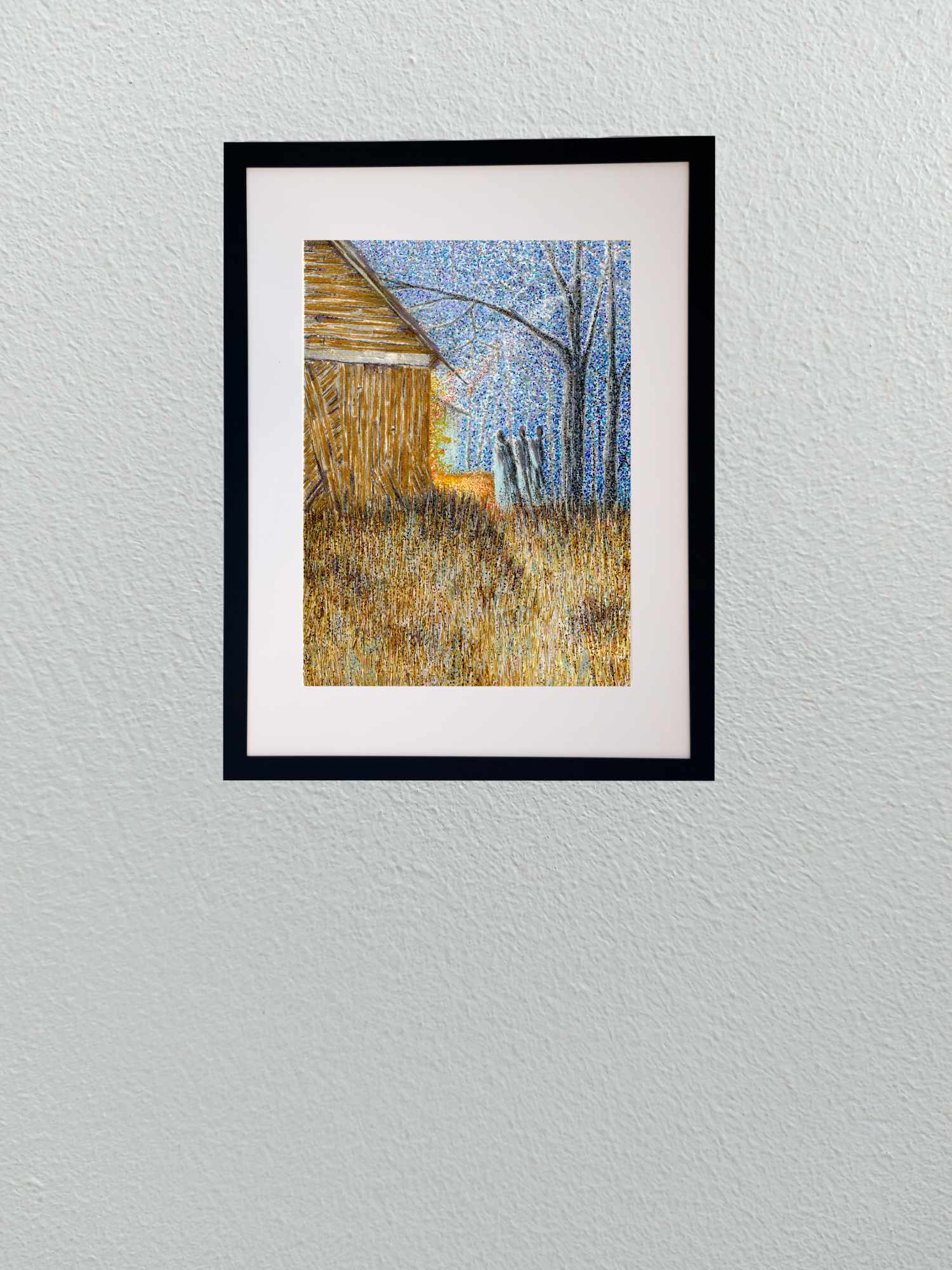
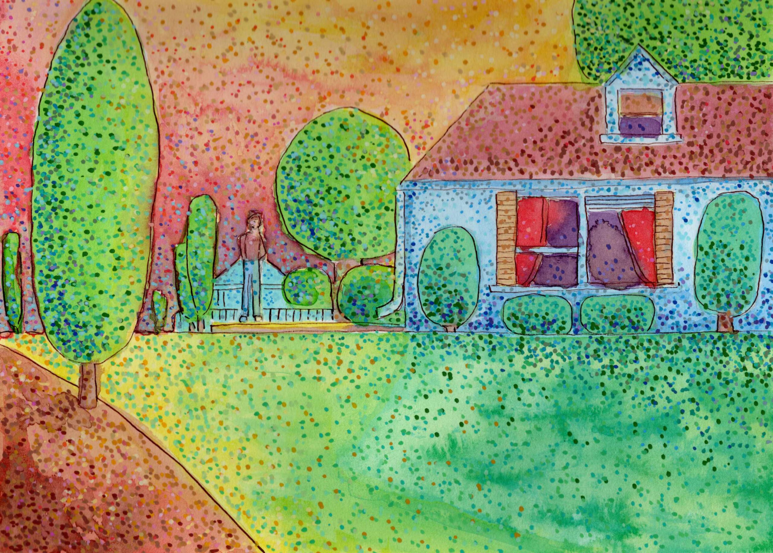
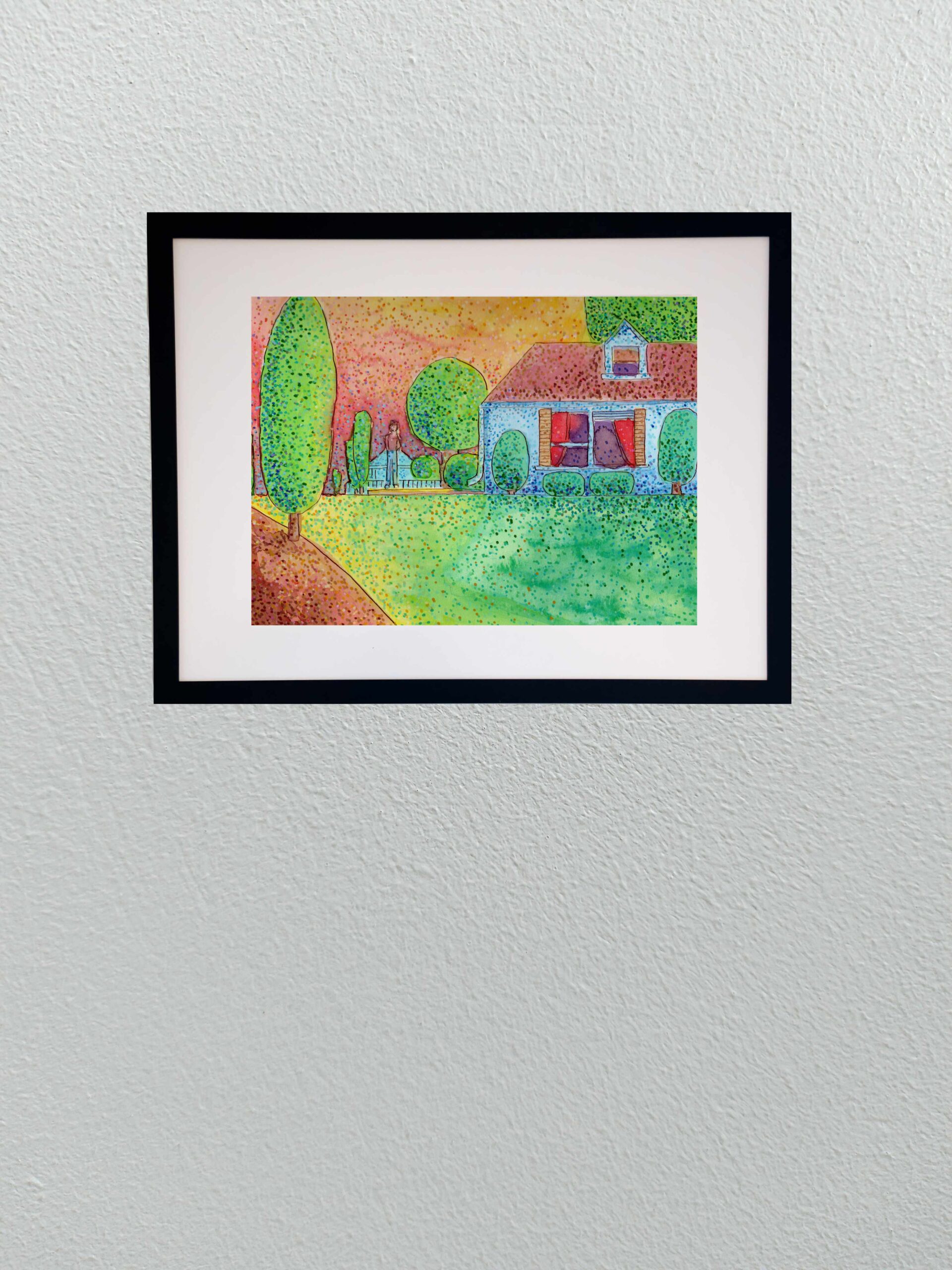
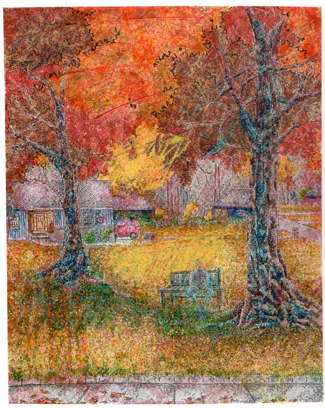
    Today I am sharing a new 8×10 study that explores the specific atmosphere of late summer. I wanted to capture not just the intense colors of the season, but the underlying moodโ€”a suggestion of the mysterious melancholy that often accompanies the heavy heat before autumn arrives.

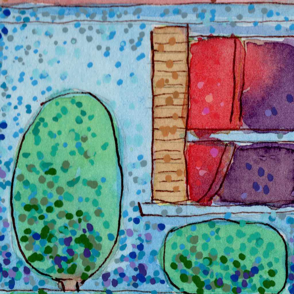
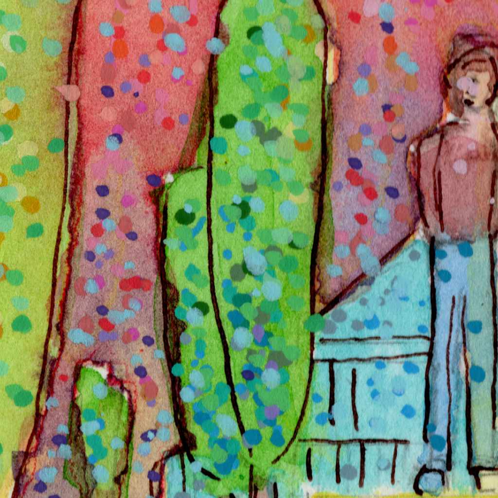
    To build this atmosphere, I completely shifted my mark-making, relying on a stippling technique using Pitt pens and acrylic markers on cold press paper. By applying the color in thousands of distinct dots rather than smooth lines or washes, the surface of the piece seems to physically vibrate. The bright yellows, greens, and warm oranges create a visual “heat haze.”

    To introduce that feeling of mystery, I leaned on contrast. The cooler blues in the shadows of the house and the solitary, undefined figure standing in the yard anchor the piece in a quiet, slightly unsettling stillness. It is an exercise in letting the optical mixing of colors dictate both the light and the emotional weight of the scene.

    Technical Detail:

    • Shuttle Art acrylic brush pens
    • India ink
    • Dip pen
    • 9ร—12 140lb cold press

  • Heat on the Water

    Heat on the Water

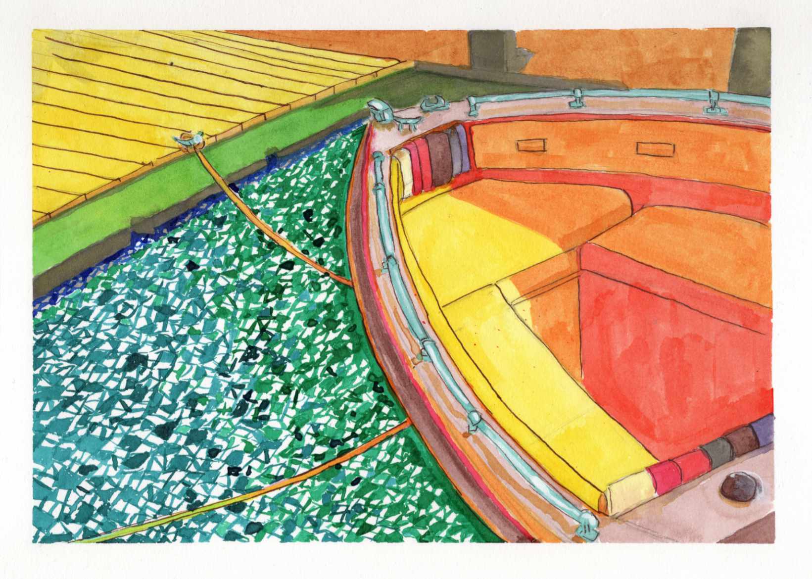
    Recently, I shared a highly saturated, small-scale study of a boat docked on a blindingly bright summer day, done entirely with Zebra Sarasa gel pens. That initial piece was all about capturing the raw, vibrating heat and light from an old reference photo.

    Today, I am sharing the larger, translated version of that same scene, completed this time using India ink.

    It is always a fascinating process to see how a composition shifts and breathes differently when you change both the scale and the medium. While the gel pen study was built on tight, scratchy, directional strokes, moving to India ink allowed for broader, smoother washes of color.

    You can see how the vivid yellows, reds, and oranges of the boatโ€™s interior feel a bit more grounded and painterly in this version. However, I intentionally kept that fragmented, graphic, mosaic-like texture in the water to maintain the harsh, rippling reflection of the summer sun.

    Taking a piece from a small, experimental study to a larger ink format is a balancing actโ€”trying to refine the forms without losing the initial, spontaneous energy that made the sketch work in the first place.

    Technical Details:

    • India Ink
    • Strathmore heavyweight mixed media 350lb 9×12
    • Liquitex white acrylic ink

  • Spring Vetch

    Spring Vetch

    This study captures a spring field in Georgia, where the greens and yellows feel like they arrived overnight. I used India ink to build the colors in layers, following an Impressionist approach where the depth emerges slowly through repeated marks rather than solid lines. Against that translucent ink, I used acrylics sparingly as a solid, opaque counterpoint.

    I applied them specifically to the purple vetch in the foreground and a few select leaves to give the eye a place to land. The cold press paper captures and holds the ink exactly where I want it, keeping the pigment in place while allowing just the smallest edges to blend into the tooth. Itโ€™s a fast, rhythmic way to work that records the spirit of the place without getting bogged down in every individual blade of grass.

    Technical Details:

    • 8×10 140lb cold press
    • Sakura Pigma pens
    • Faber-Castell Pitt pens
    • Acrylic swipe
  • The Reader and the Statue

    The Reader and the Statue

    Iโ€™m sharing a new piece today, built from a reference photo I took on a cool spring afternoon at the Georgia State Botanical Gardens in Athens.

    Walking through the grounds, I was immediately drawn to the relationship between these two figuresโ€”a man reading on a bench and a nearby sculpture. I loved the accidental, imitative gestures; both the living man and the stone figure seemed equally invested in their quiet activities. The contrast between the fleeting stillness of the reader and the permanent stillness of the stone was a dynamic I wanted to capture on paper.

    For this piece, I wanted the technique to reflect the atmosphere of that afternoon. Instead of rigid, heavy linework, I relied on quick dashes and the natural, expressive tendency of India ink. My goal was to give the illustration a whimsical and impressionistic sensation, capturing the feeling of the garden rather than just mapping out its exact details.

    To balance that loose, kinetic energy, I brought in acrylic ink very sparingly. It was used just to provide some opaque grounding in a few sparse locations across the piece, anchoring the expressive ink lines and giving the composition a bit of weight.

    Itโ€™s a quick study of a quiet momentโ€”where life and art happened to be doing the exact same thing.

    Technical Details:

    • 9×12 140lb cold press
    • Faber-Castell Pitt pens
    • Shuttle Art paint pens
    • Staedtler Pigment Liner
  • sweets shoppe

    sweets shoppe

    The painting presents a charming drawing of a local confectionery by a verdant landscape. The house itself has a classic design, featuring a grey roof and brick walls, with two windows that add to its cozy and welcoming appearance.ย 

    In the background, the image is framed by towering trees with dense foliage, providing a natural backdrop that contributes to the overall serenity. The variety of trees, including palm trees on the right, adds a touch of tropical beauty and diversity to the setting. The bright colors used for the sky and surroundings indicate that it is daytime, casting the entire scene in a cheerful and peaceful light. The drawing captures a picturesque moment, inviting viewers to imagine the tranquility of life in such a lovely environment.

    Technical Details:

    • Acrylic wash
    • Sakura Pigma pens
    • 9ร—12 140lb cold press