Tag: conceptual

  • A Fragment of Departure

    A Fragment of Departure

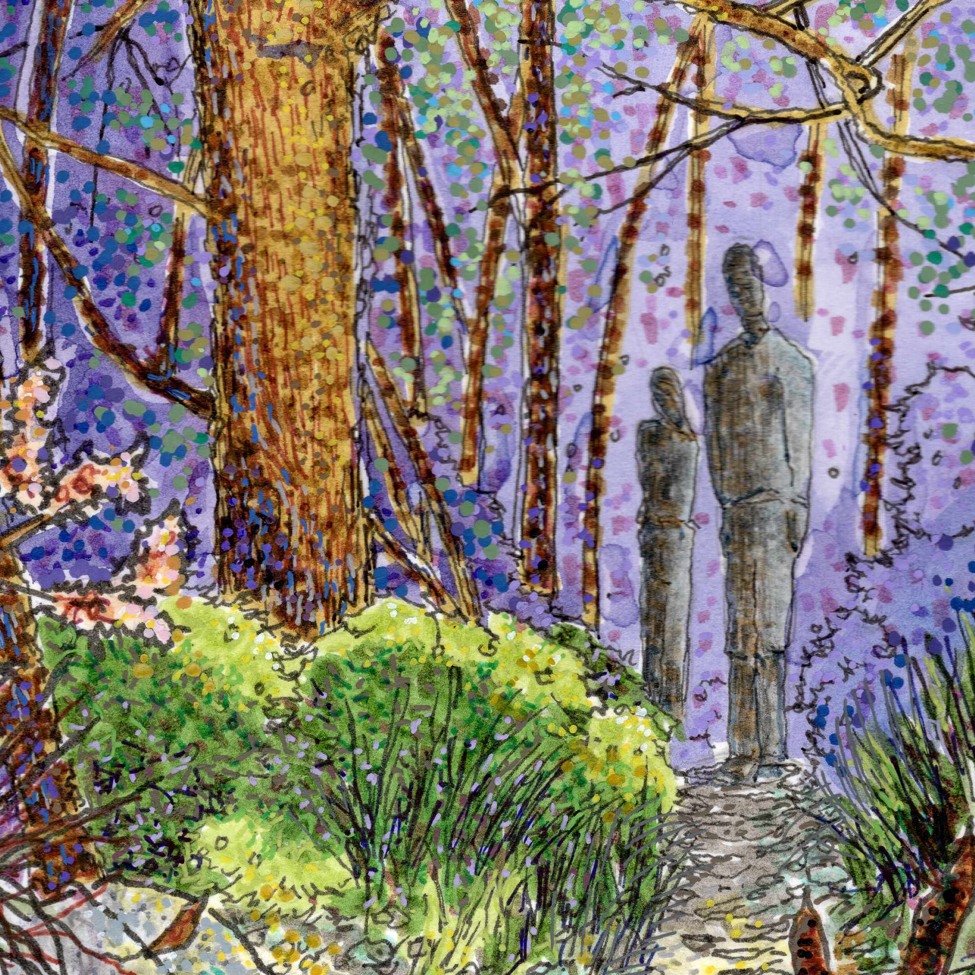
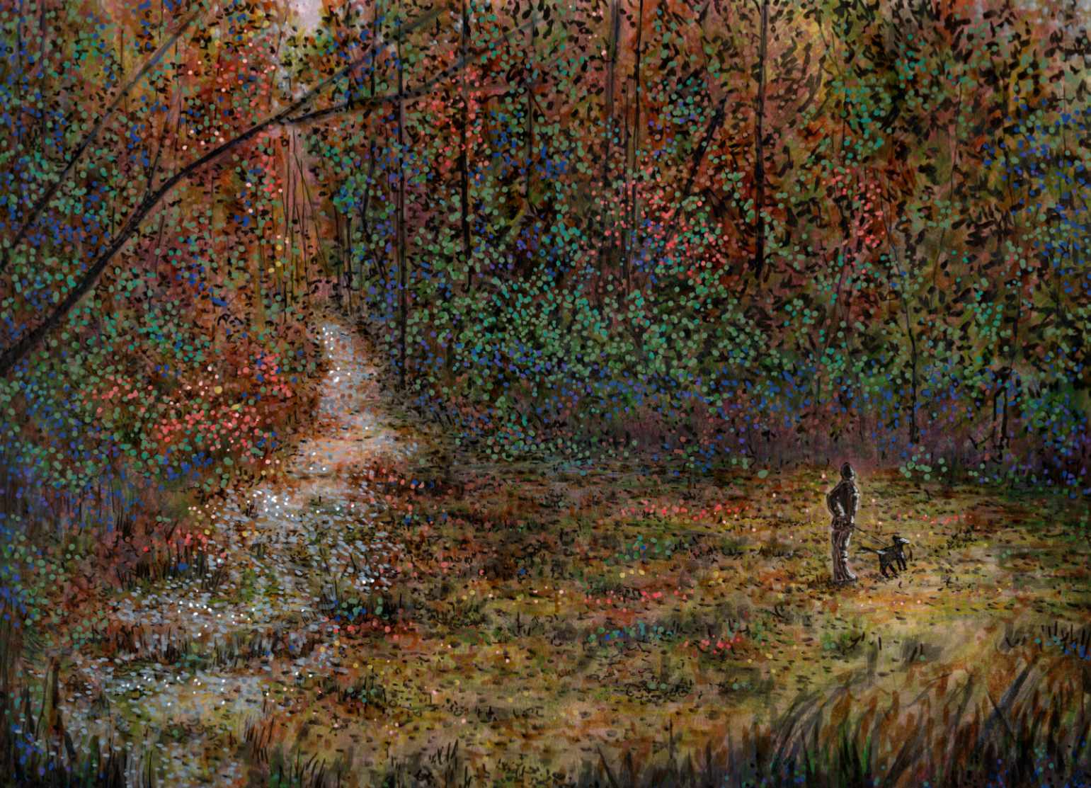
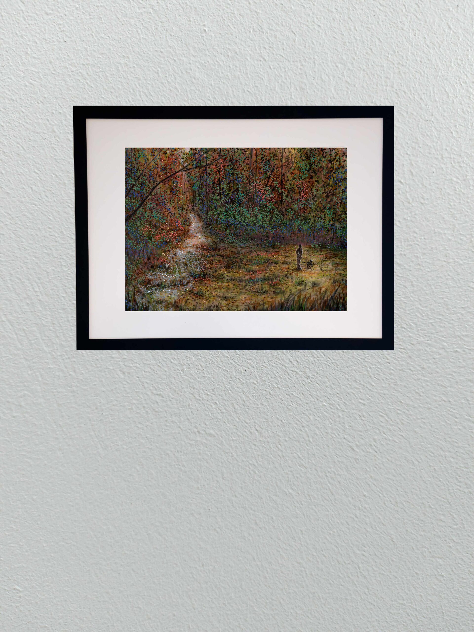
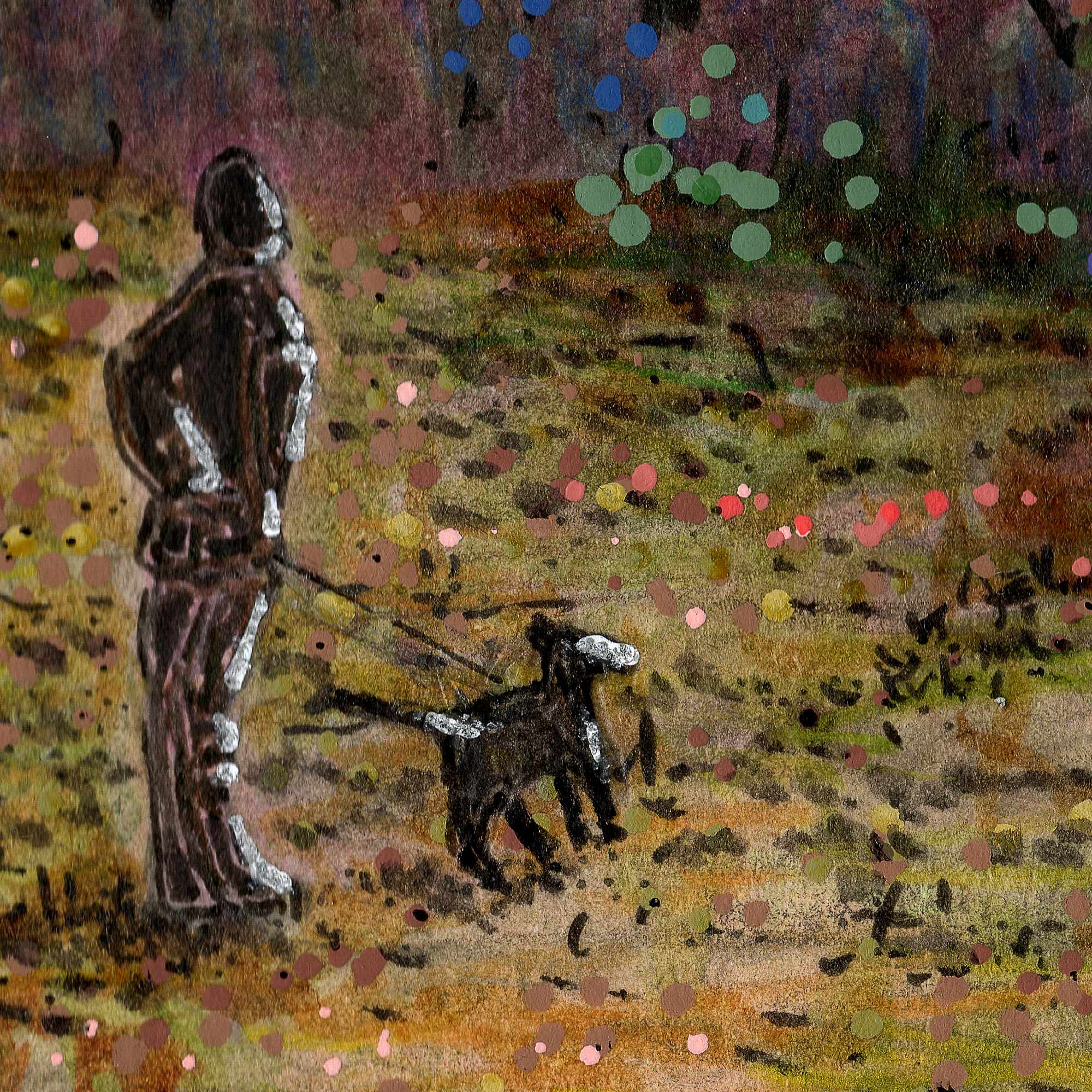
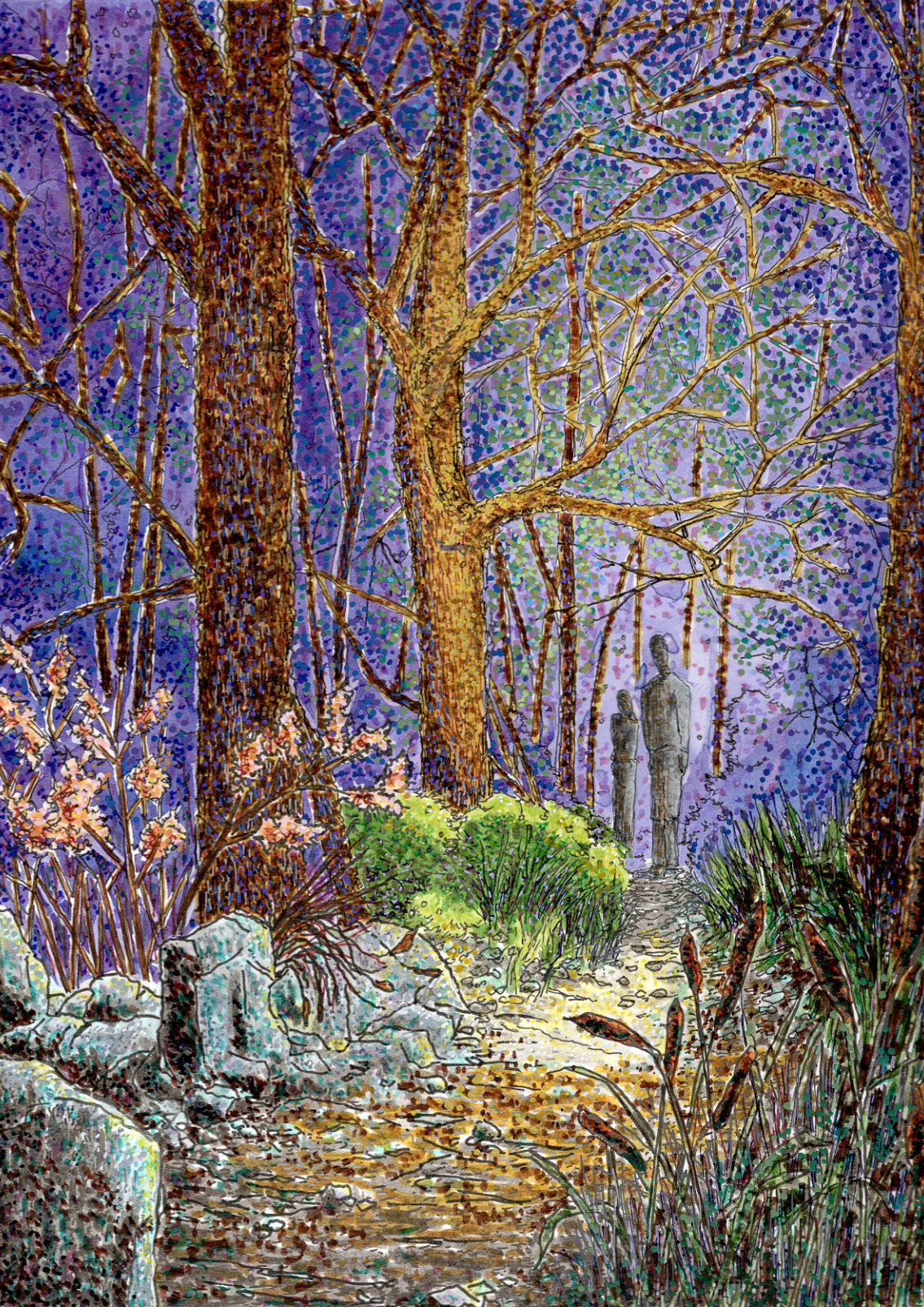
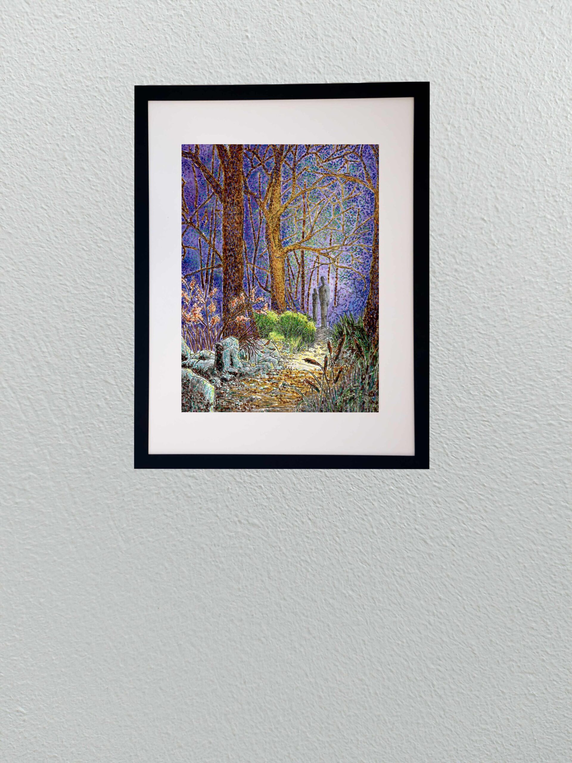
    I wanted this piece to feel like a fragment of a larger, untold story. It is composed from the exact vantage point of an unknown observer looking through the brush, watching two figures stand at a crossroads on a path. You are witnessing a fleeting, high-stakes moment, but the context is deliberately stripped away. Is one figure looking back because they finally spotted you? Are they standing forlornly as someone else prepares to disappear into the heavy tree line? Or are they simply frozen in a moment of sharp indecision? Leaving those questions unanswered is the entire point; it forces the viewer to fill in the blanks.

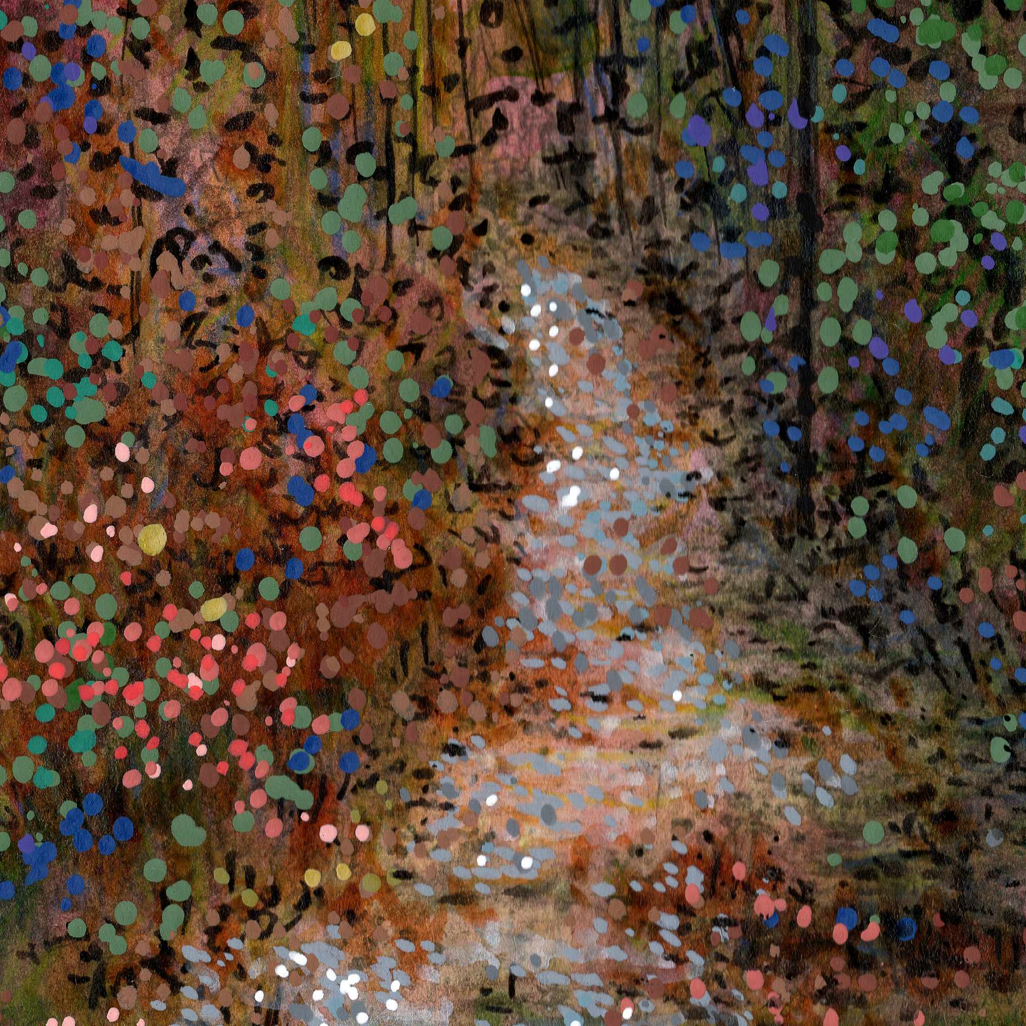
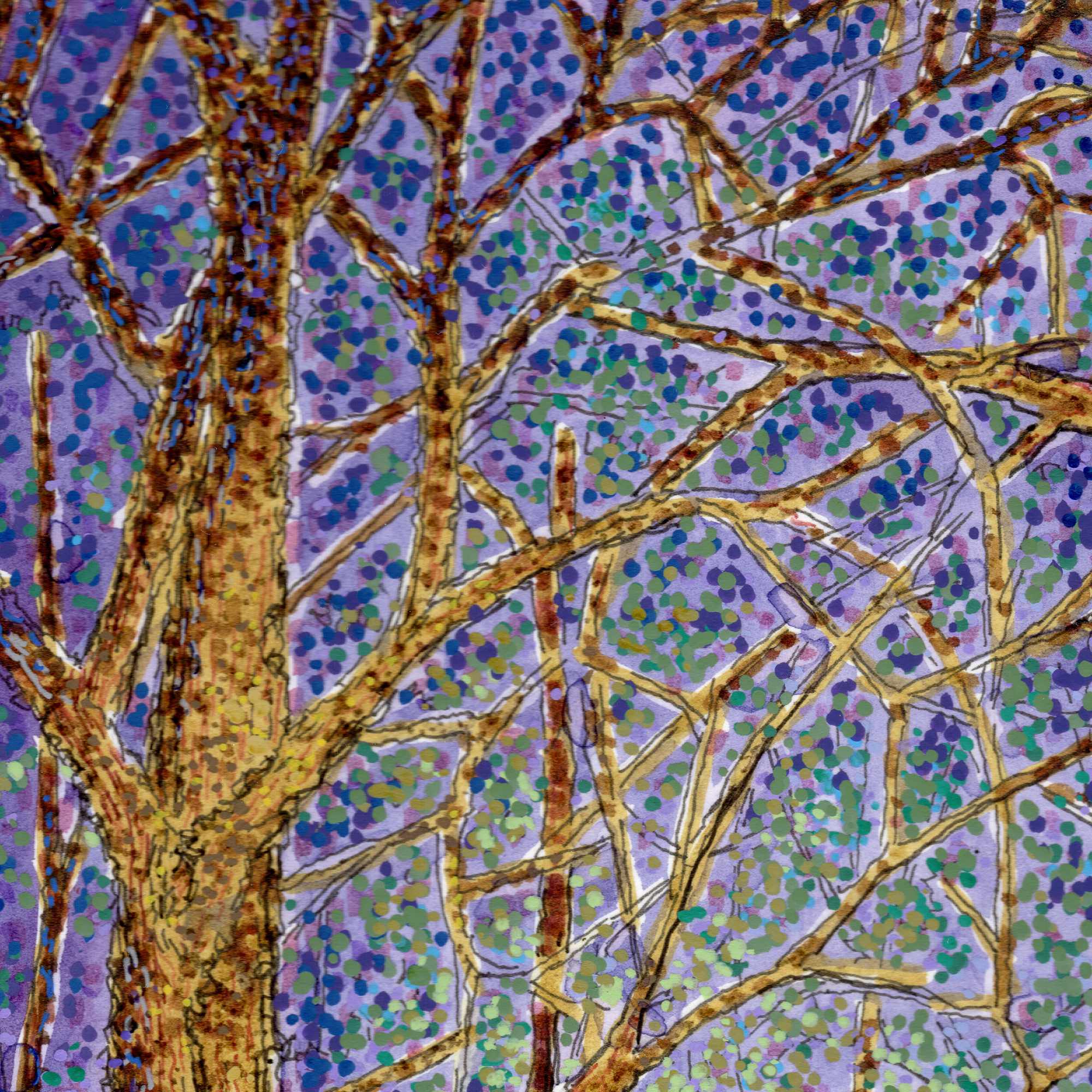
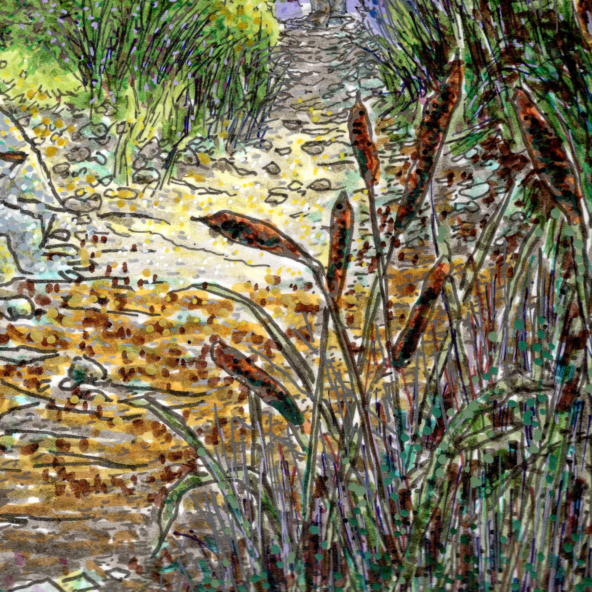
    To build this sense of atmospheric suspense, I used a complex multi-medium approach on hot press paper. I started with an India ink wash to establish the deep, heavy values and the overall mood of the environment. From there, I used a mix of Pigma pens and Pitt pens to layer the finer, sharper architectural lines of the massive tree trunks and the dense foliage. I relied heavily on stippling in the canopy, using rapid dots of vibrant purple and green to make the air itself feel like it is vibrating. Finally, I used a white gel pen to pull out the stark, sharp highlightsโ€”catching the light on the foreground rocks, cattails, and the edges of the figures to create a punchy contrast against the dark background wash. By blending the fluid ink with the rigid precision of the pens, the process itself becomes a balance of control and chaos, keeping the image grounded in texture while letting the narrative remain completely elusive.
  • The Yellow Hat

    The Yellow Hat

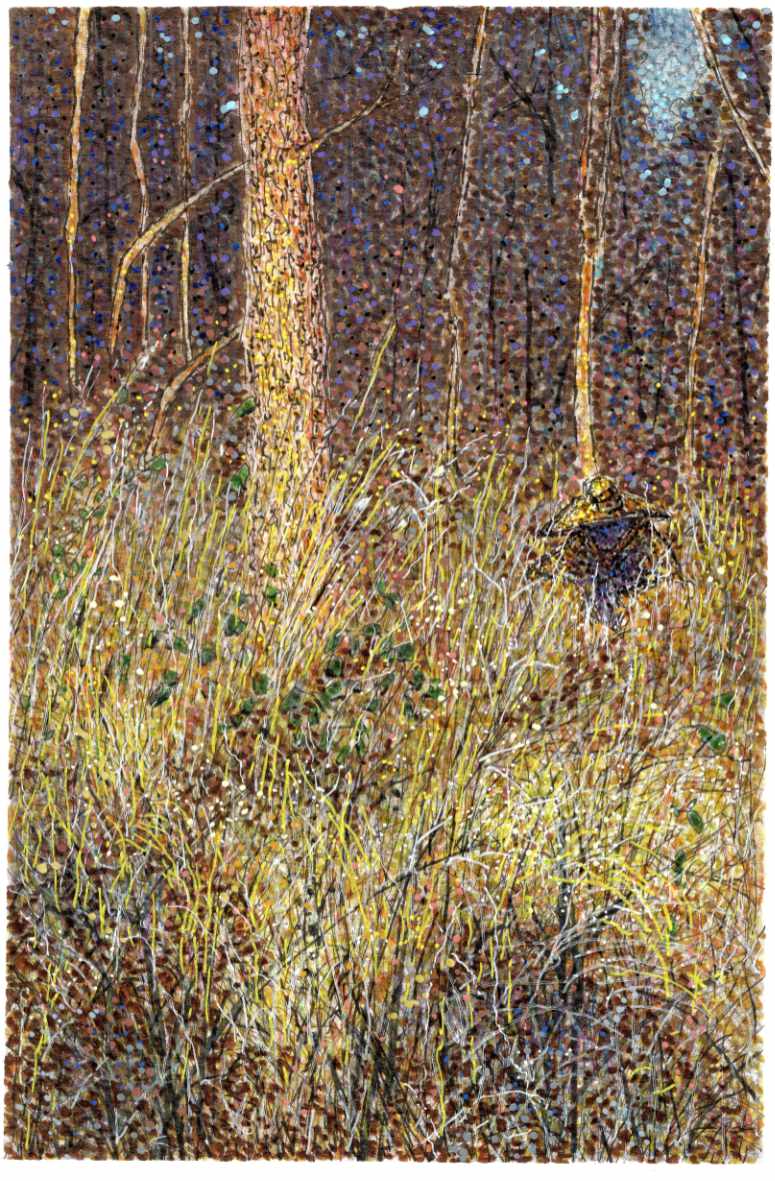
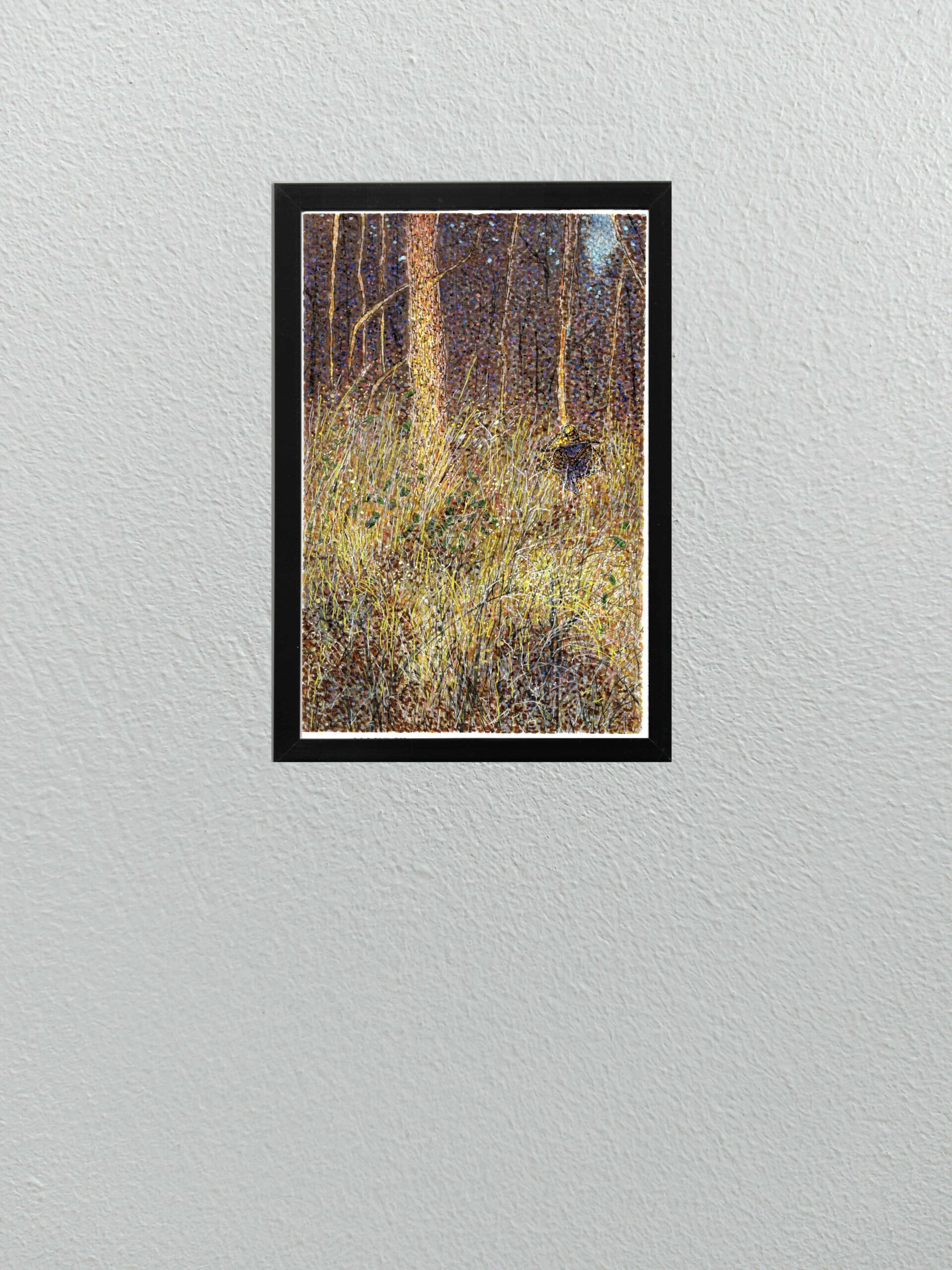
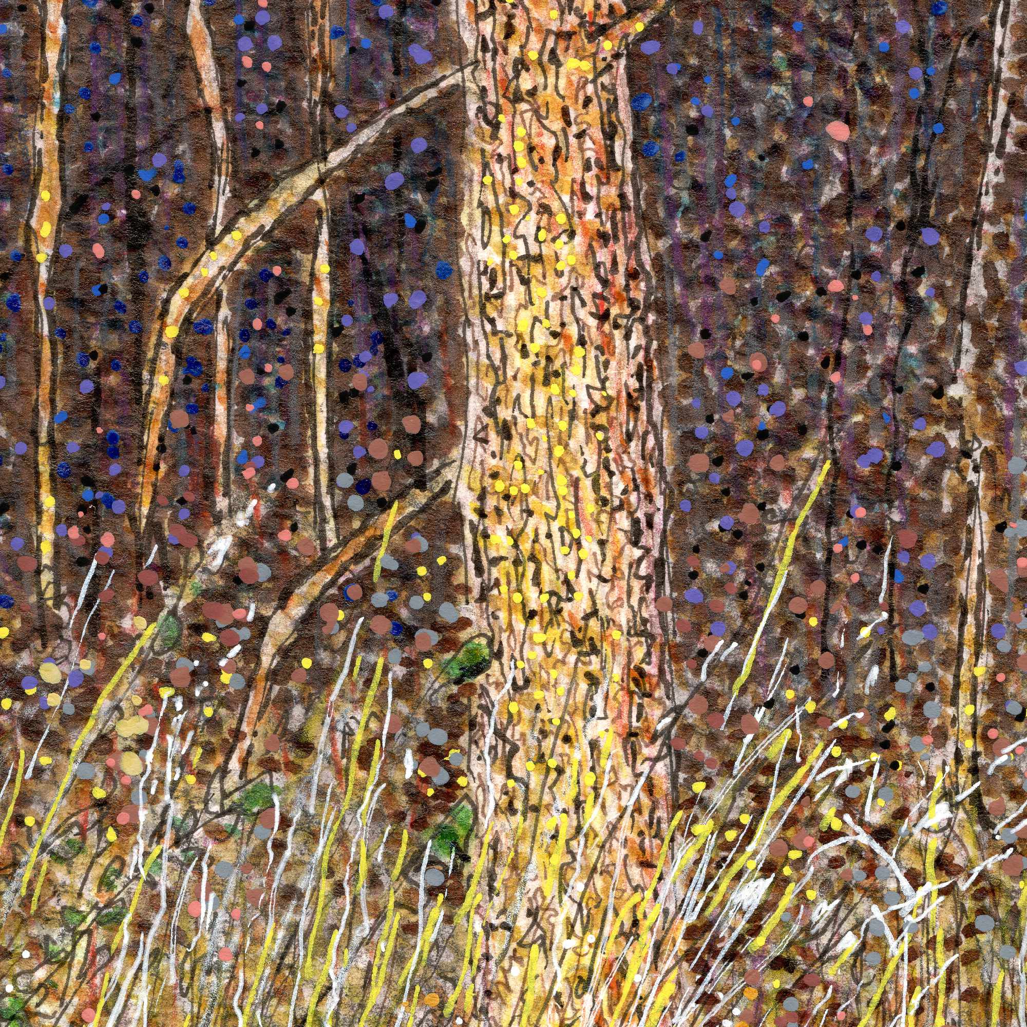
    Today I am sharing a new multi-media piece that continues to push the boundaries of my recent experiments with pointillism, but with a distinct narrative twist.

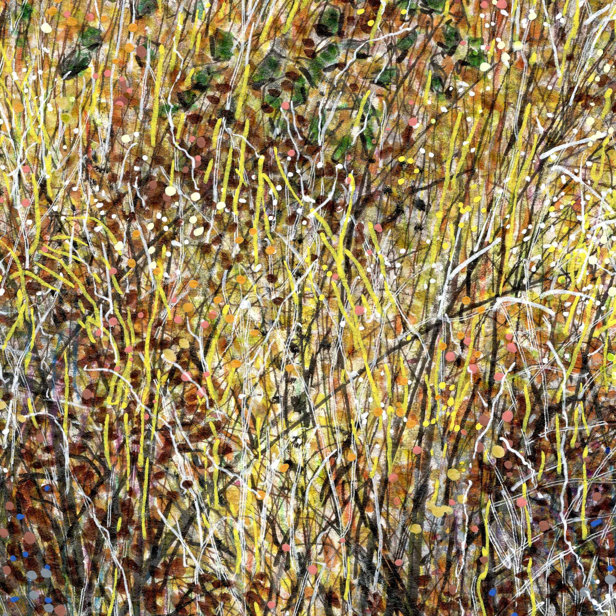
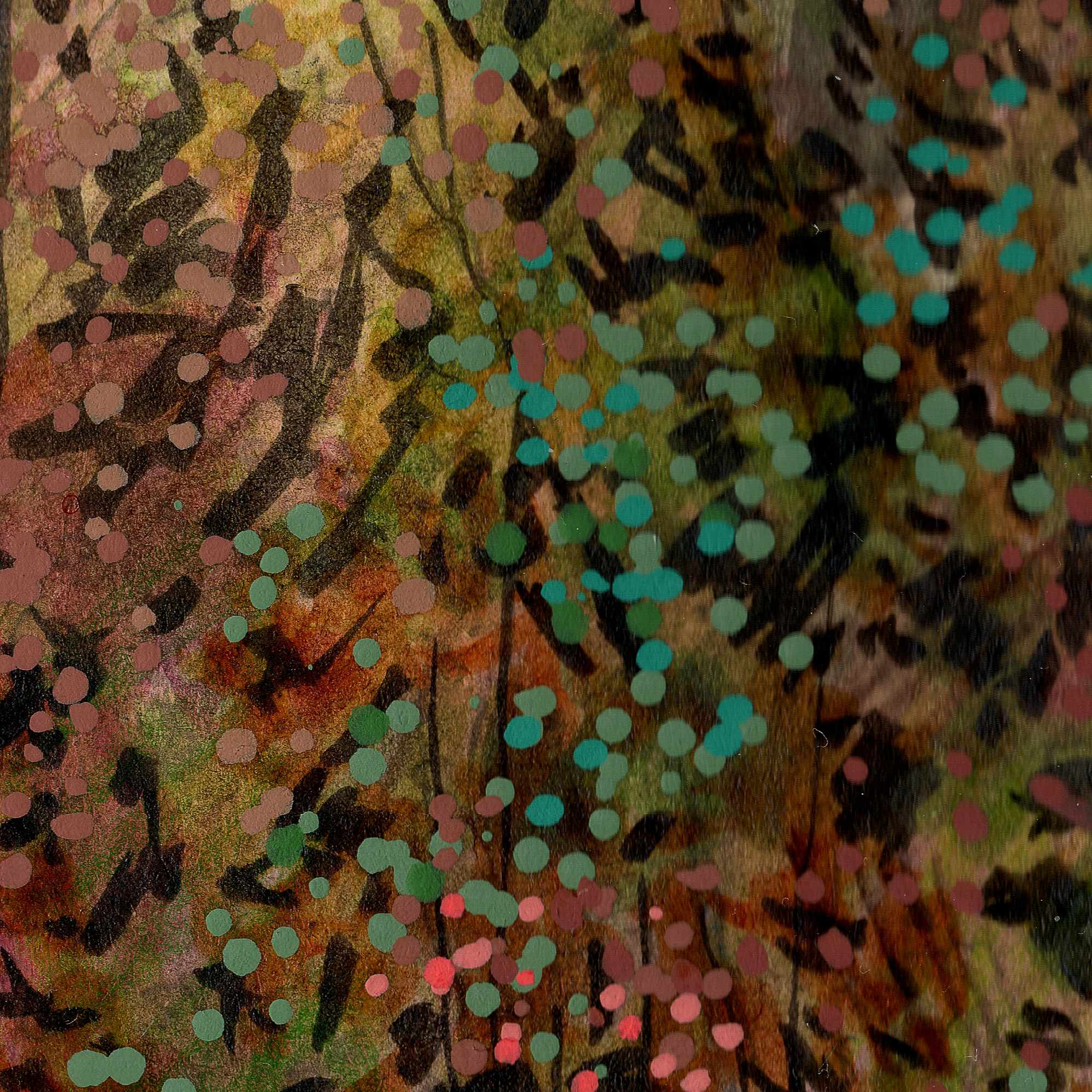
    This piece, based on an older photograph of a dense tree line and brush, relies on a highly textured mix of India ink, acrylic pens, and Pigma fine liners. To capture the thick, almost claustrophobic atmosphere of the undergrowth, I combined sharp, vertical scratches for the tall grass with heavy, vibrating dots of color. The optical mixing of the bright yellows and oranges in the foreground against the deep, heavy purples and blacks of the background gives the entire scene a buzzing, nocturnal energy.

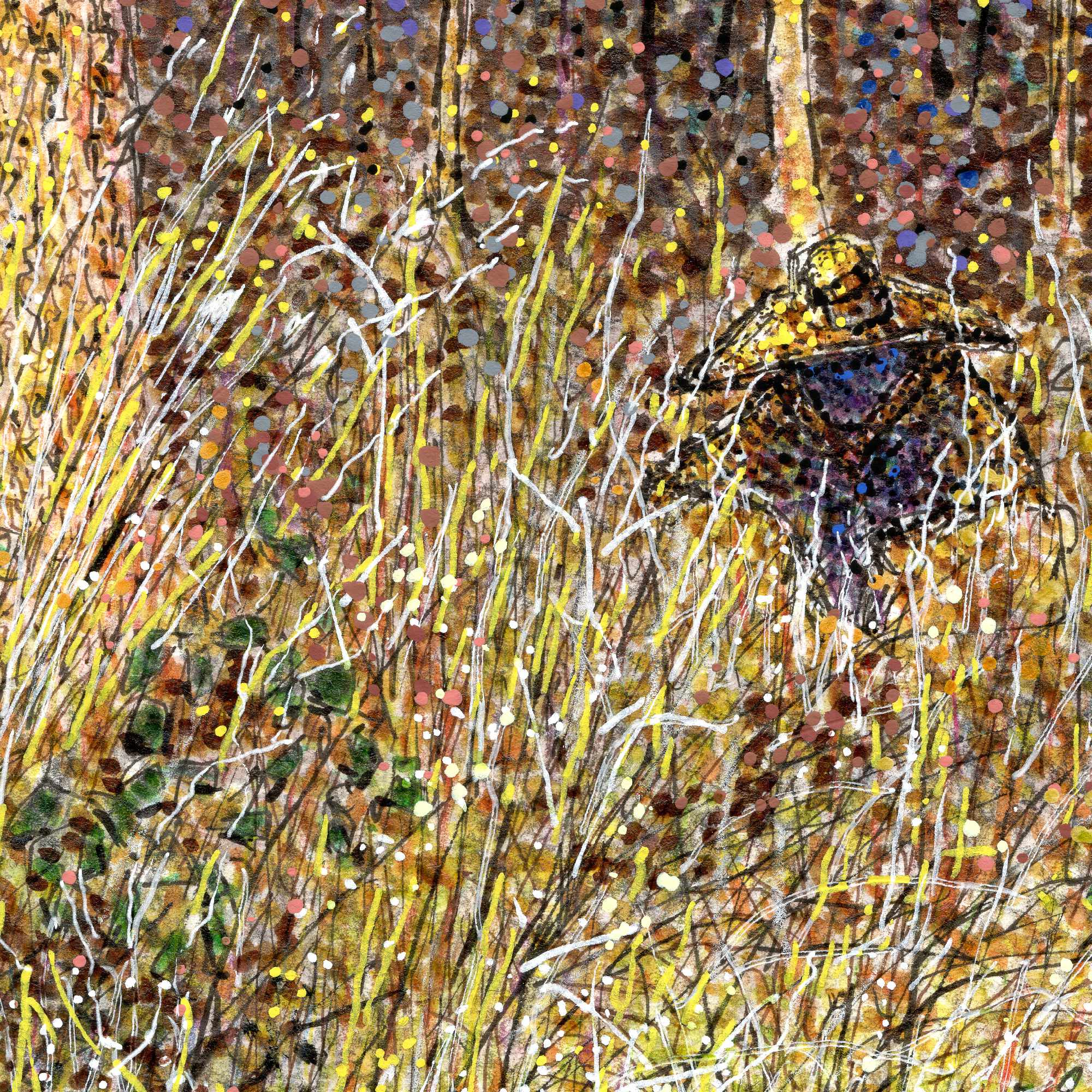
    But this isn’t just a landscape study. If you look closely at the middle-right side of the composition, tucked away in the tall grass, there is a cloaked figure wearing a wide-brimmed yellow hat.

    I rendered this figure using the exact same pointillist and linework techniques as the surrounding environment, perfectly camouflaging them into the brush. Much of my work centers around the idea of being a “quiet observer” in rural, forgotten spaces. With this piece, I wanted to flip that dynamic. It introduces a subtle, eerie, Southern Gothic narrativeโ€”a reminder that when you are out observing the quiet edges of the world, sometimes you are also being observed.


  • The Yellow Patio

    The Yellow Patio

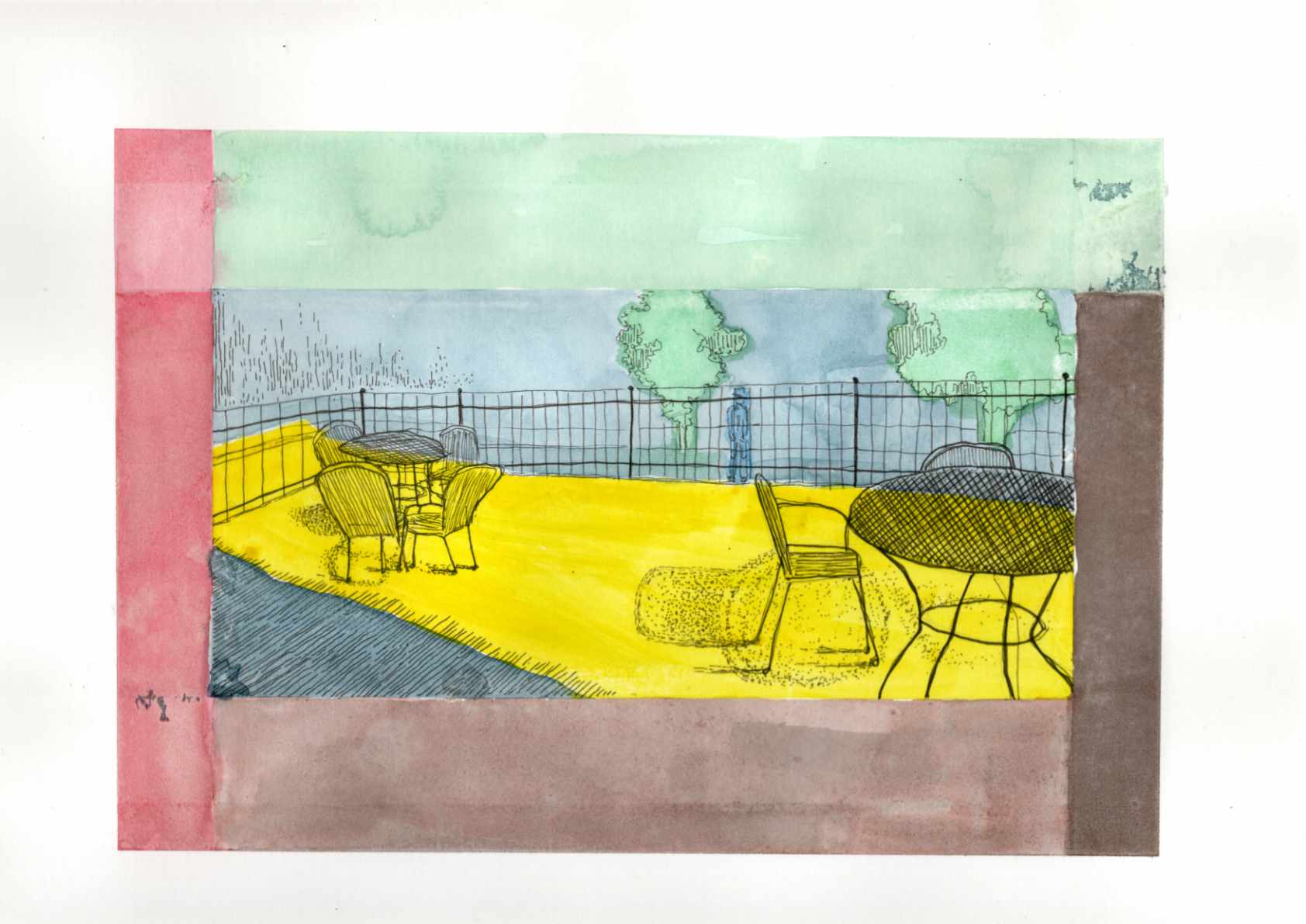
    Today I am sharing a new graphic piece titled “The Yellow Patio.” The title is intentionally a bit on the noseโ€”an ironic nod to a cheerful early spring setting that actually masks the heavier, psychological weight of the scene.

    Based on a reference photo of a small bistro area, this piece gave me the opportunity to lean heavily into a Synthetist, graphic style of color blocking. The composition is built entirely on the boundary between light and dark, inside and outside. To translate the intense feeling of that boundary, I used deep, unnatural blues and heavy purples to anchor the foreground shadows, which perfectly frame the harsh, acidic, vibrating yellow of the sunlight hitting the concrete floor.

    This piece ties directly into the theme of the “quiet observer” that runs through much of my work. By placing the viewer firmly within the cold shadow, looking out past the empty iron chairs toward a lone, distant figure beyond the fence, it creates a distinct sense of isolation and voyeurism. Itโ€™s a moment of being entirely separated from the warmth and the outside world, suspended in bold, flat color.

    Technical Details:

    • 9×12 140lb hot press
    • Sakura fine liners
    • India ink
  • Eveningโ€™s Quiet Unrest

    Eveningโ€™s Quiet Unrest

    Today I am sharing a new mixed media piece that explores a specific memoryโ€”twilight in a silent meadow. This composition, based on a low-light photograph taken a few years ago, was an exercise in capturing a delicate visual tension. The scene possesses a profound tranquility, yet beneath that stillness lies something subtly unsettlingโ€”a feeling I wanted to preserve and amplify.

    While the original photo provided the structure and the quiet posture of the figure, the translation to paper was driven entirely by a need to dictate emotional weight through medium. I build the density and movement in the foreground undergrowth through networks of energetic, scratching lines using Sakura fineliners and Faber-Castell Pitt pens, contrasting against the still, flat fields of color in the sky.

    By utilizing a Post-Impressionist or Synthetist paletteโ€”swapping natural colors for a heavy, low-light atmosphere of muted purple, cool blue, and an unnerving yellow-greenโ€”I aimed to create a psychological filter. This piece combines the raw texture of graphite and ink from my earlier studies with the bold, non-naturalistic color blocking I’ve been exploring recently. It is a portrait of solitude, suspended in a vibrating, eerie twilight.

    Technical Details:

    • 9×12 140lb cold press
    • Faber-Castell Pitt pens
    • Shuttle Art paint pens
    • Staedtler Pigment Liner
    • Sakura Pigma

  • Summer Dusk

    Summer Dusk

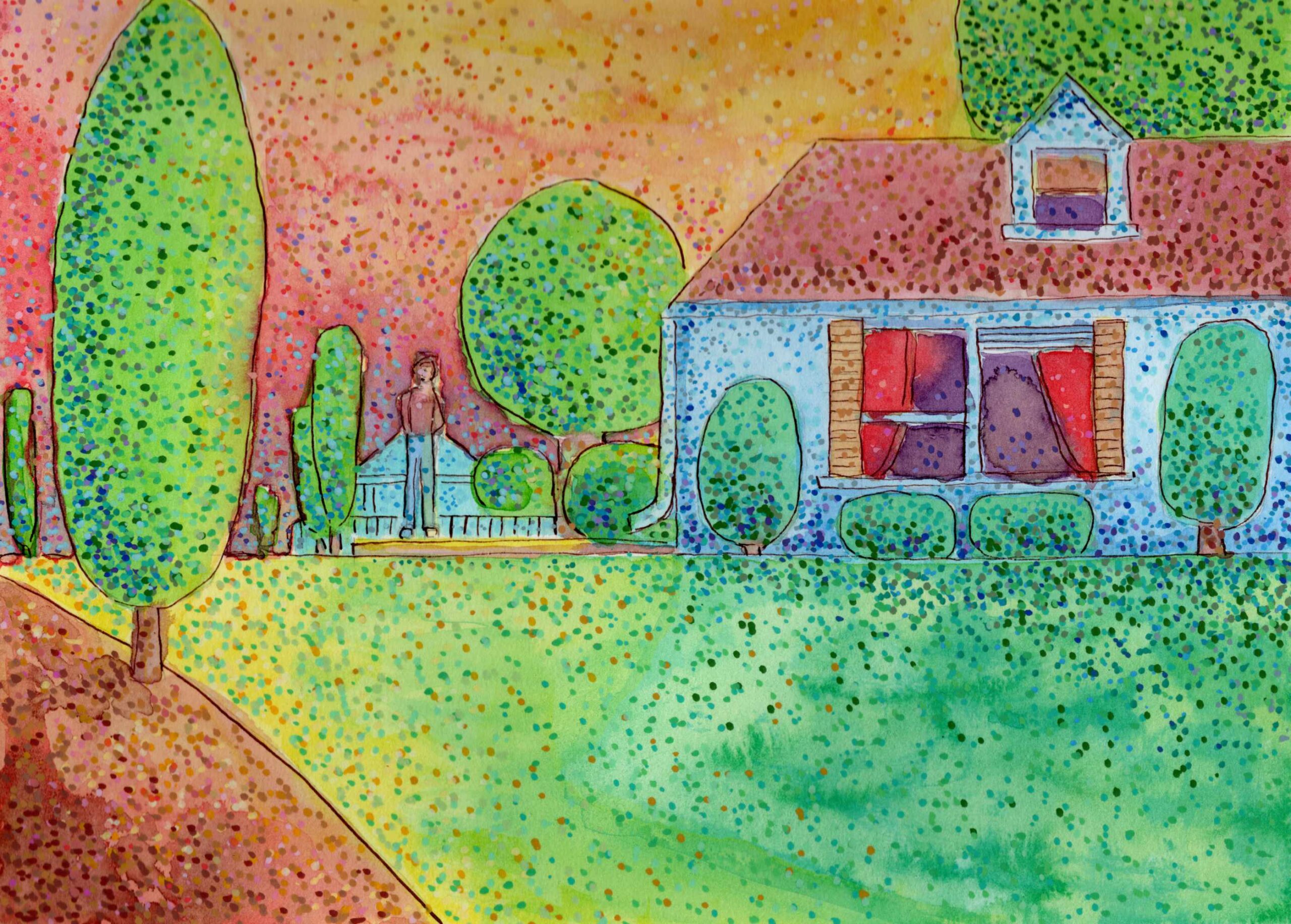
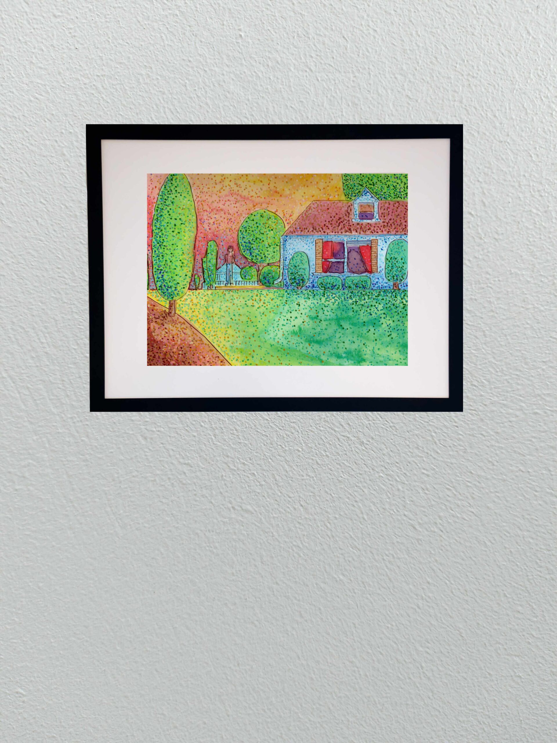
    Today I am sharing a new 8×10 study that explores the specific atmosphere of late summer. I wanted to capture not just the intense colors of the season, but the underlying moodโ€”a suggestion of the mysterious melancholy that often accompanies the heavy heat before autumn arrives.

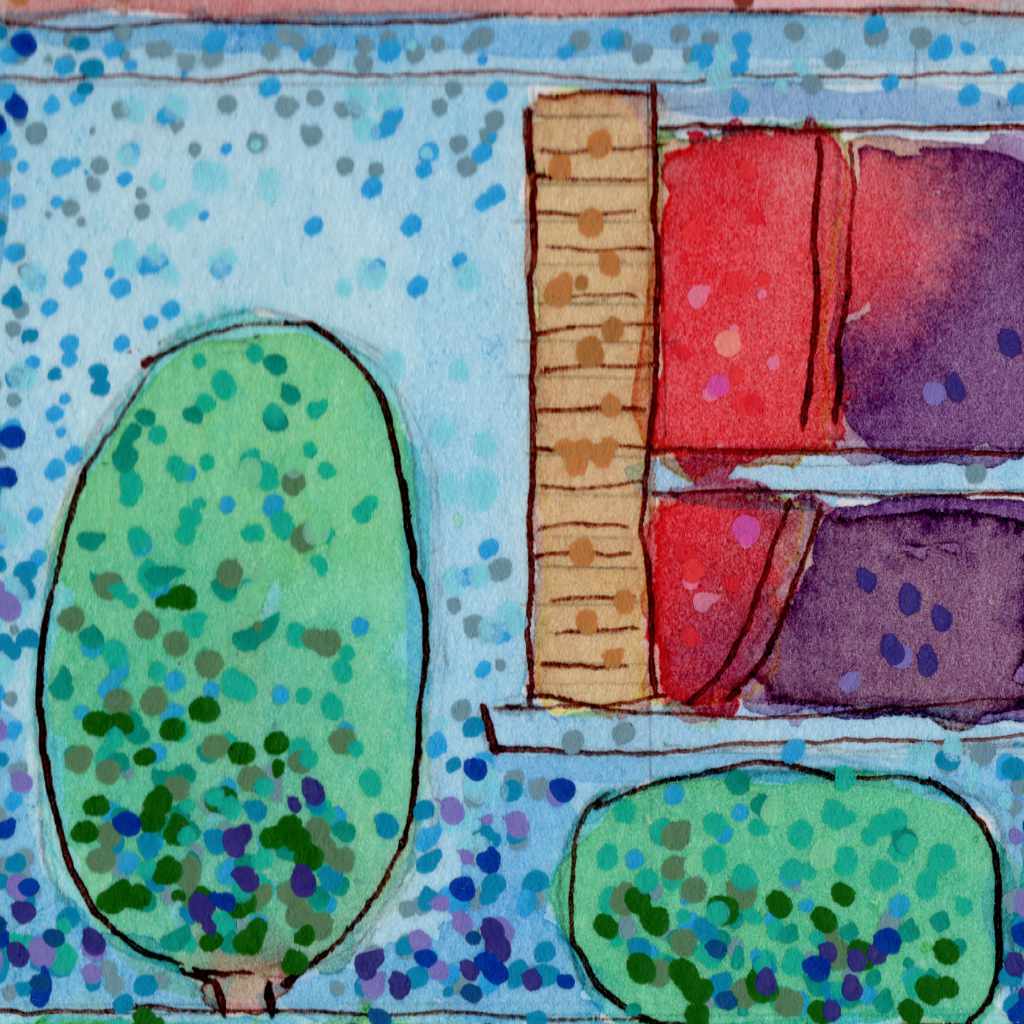
    To build this atmosphere, I completely shifted my mark-making, relying on a stippling technique using Pitt pens and acrylic markers on cold press paper. By applying the color in thousands of distinct dots rather than smooth lines or washes, the surface of the piece seems to physically vibrate. The bright yellows, greens, and warm oranges create a visual “heat haze.”

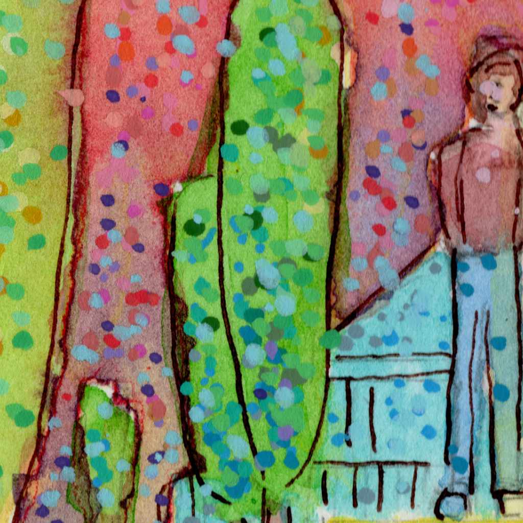
    To introduce that feeling of mystery, I leaned on contrast. The cooler blues in the shadows of the house and the solitary, undefined figure standing in the yard anchor the piece in a quiet, slightly unsettling stillness. It is an exercise in letting the optical mixing of colors dictate both the light and the emotional weight of the scene.

    Technical Detail:

    • Shuttle Art acrylic brush pens
    • India ink
    • Dip pen
    • 9ร—12 140lb cold press

  • Physical: Nunnally Road

    Physical: Nunnally Road

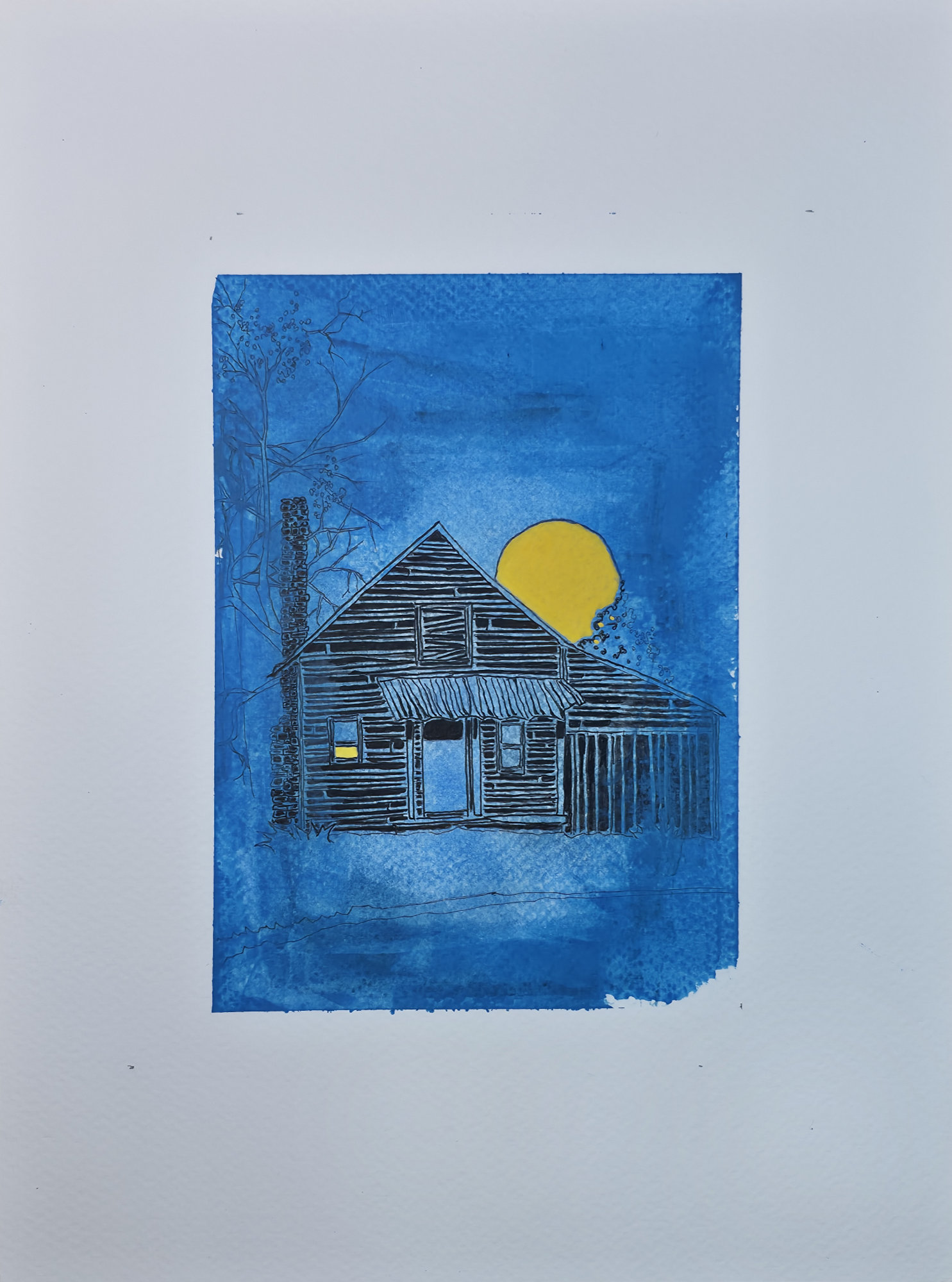
    Here is the first of the physical work for this series.

    Iโ€™m excited to introduce the first piece in a new three-part illustrative series. The theme is a blend of seasonal whimsy and the gentle, spooky feeling of unique, isolated structures. Over the years, Iโ€™ve collected photographs of fascinating buildings, and this series gives them a new life and a new story.

    I chose a stark, graphic style with strong linework to evoke the feeling of a classic block print or a storybook illustration. While this image was created digitally, Iโ€™m currently working on its physical counterpart, exploring the dialogue between the two mediums. This piece, โ€œNunnally Road,โ€ is the beginning of that exploration.

    Technical Details:

    • Acrylic swipe
    • Sakura Pigma pens
    • 9×12 140lb cold press
  • Physical: Hightower Road

    Physical: Hightower Road

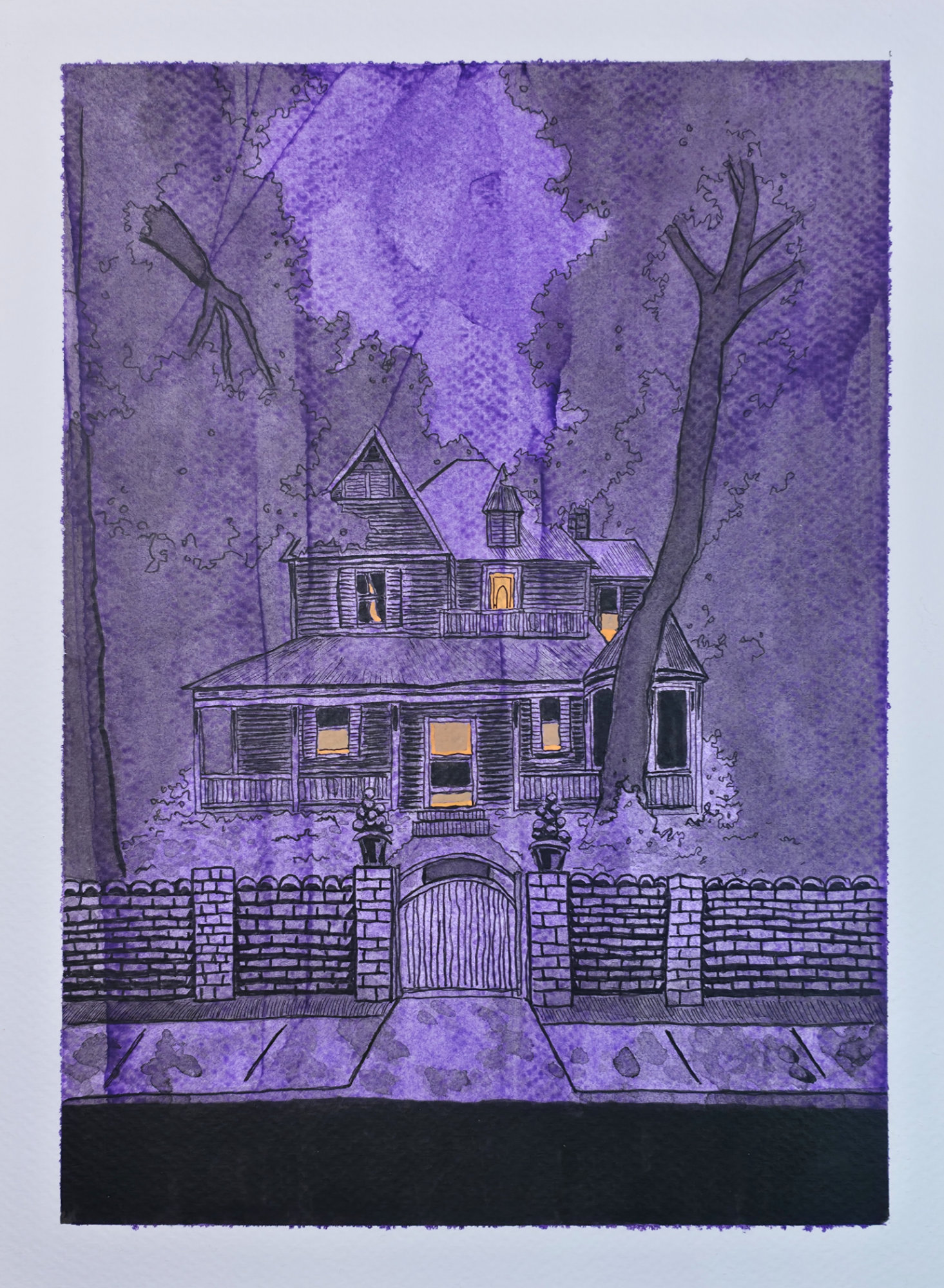
    My physical creation of the original digital piece.

    Continuing my new three-part illustrative series where seasonal whimsy meets eerie Americana. This second piece is titled โ€œHightower Road,โ€ and it carries forward the theme of bringing old, forgotten structures back to life with a new, illustrative story.

    The style remains graphic and sketch-like, evoking the feel of a classic block print. As with the first piece, this is the digital version, and Iโ€™m continuing to develop the physical counterparts. The exploration of bridging these two mediums is at the heart of this series, and โ€œHightower Roadโ€ is the next step in that journey.

    Technical Details:

    • Acrylic swipe
    • Sakura Pigma pens
    • 9×12 140lb cold press

  • Physical: Cemetery Road

    Physical: Cemetery Road

    Physical version of this original digital piece.

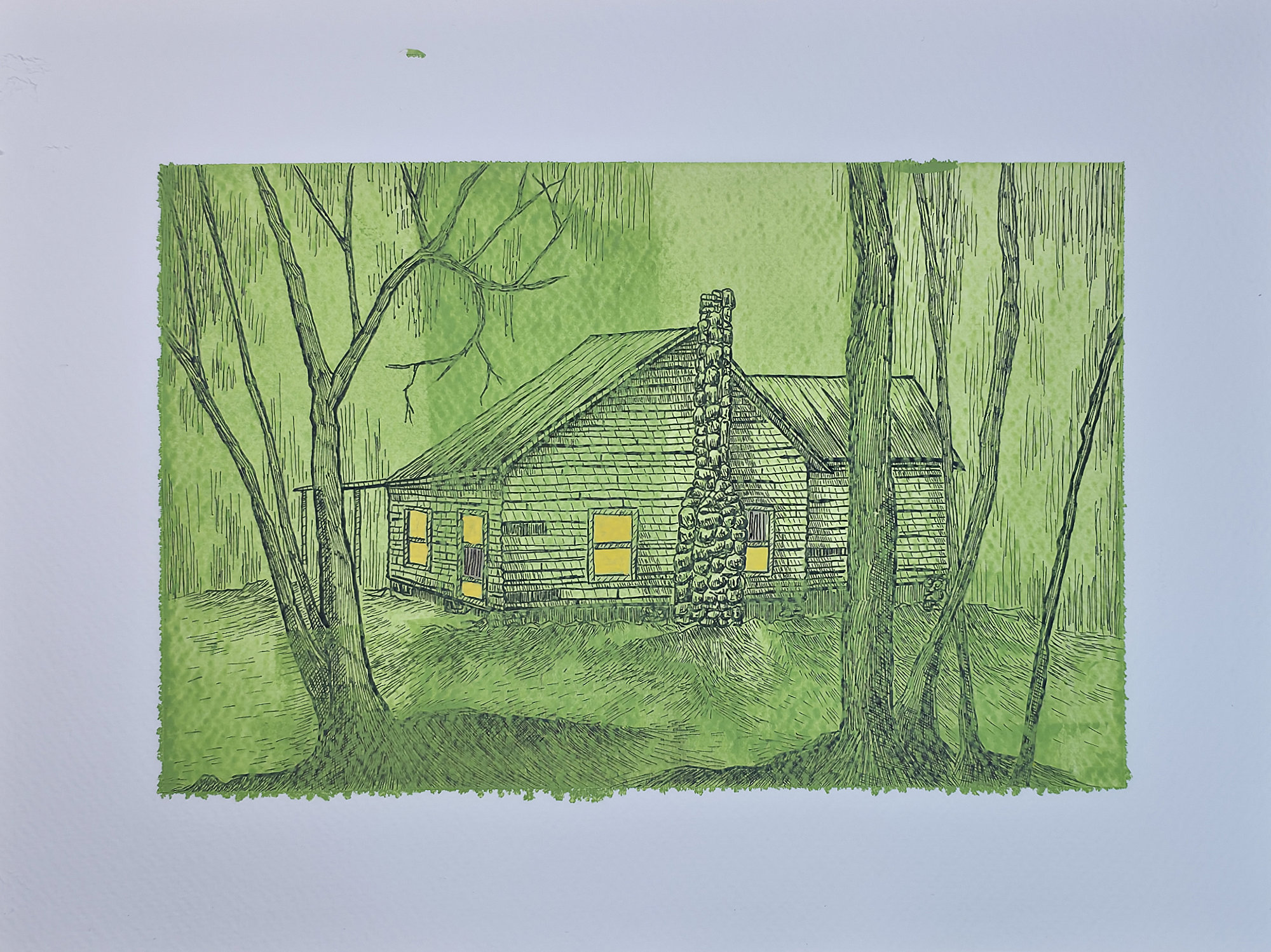
    And with that, the series is complete. This three-part digital collection was an exploration of seasonal whimsy and the mysterious vibes of forgotten places. From the first piece to this final one, โ€œCemetery Road,โ€ my goal was to take real structures Iโ€™ve photographed and imbue them with the feeling of a modern folk tale.

    For this final installment, I used a monochromatic green palette and the enchanting glow of fireflies to create a uniquely eerie and magical atmosphere. Itโ€™s been a fantastic journey blending photography, memory, and digital illustration. Physical versions of all three are still in the works!

    Technical Details:

    • Acrylic swipe
    • Sakura Pigma pens
    • 9×12 140lb cold press
  • Old Live Oak

    Old Live Oak

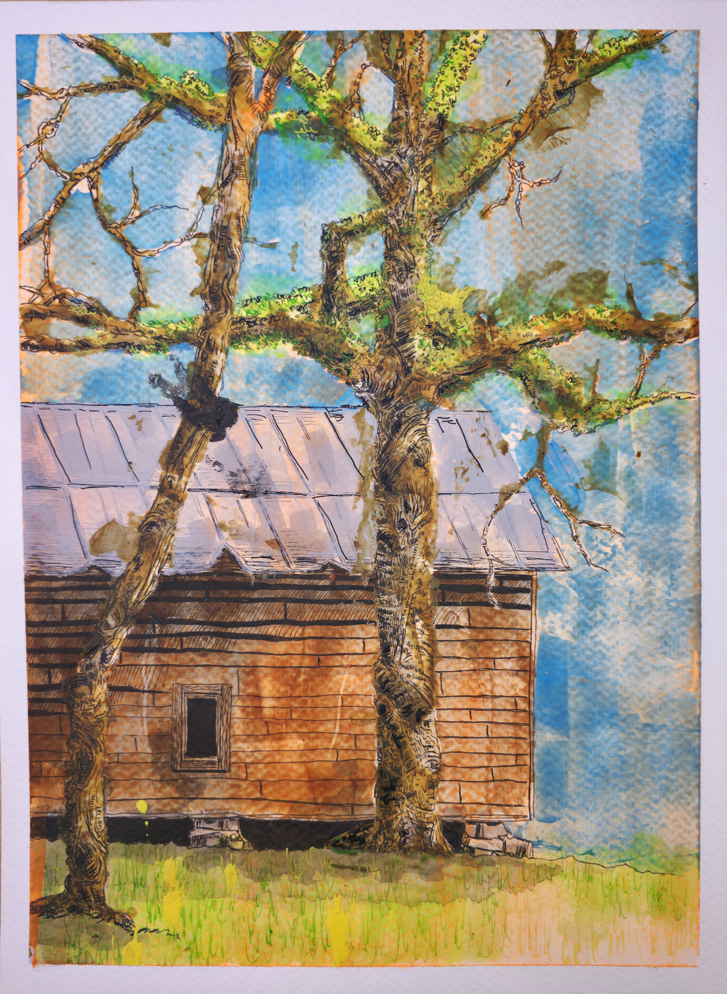
    I spotted this shack while driving. It was anchored by an old live oak with heavy, sprawling limbs. The wood was grey and tired. The tree was the oppositeโ€”covered in a vibrant green moss that felt alive against the weathered boards.

    What I found most interesting was this dimension of time. You have a structure slowly surrendering to the elements while the tree just keeps reaching. Itโ€™s a quiet, roadside dialogue.

    I used a mix of ink and acrylic for this piece. I also made a specific choice: I stopped correcting myself. If the ink bled or a line went wide, I let it stay. Usually, these are called errors. Here, the errors were the effort. They belong in the work, much like the rot belongs on the shack. Itโ€™s an honest way to record a moment.

    The ink defines the twisting architecture of the oak. The acrylic adds the weight to the sky and the moss. It is a rougher, more experimental process than my usual work, but it captures the grit I was looking for.

    Technical Details:

    • Acrylic swipe
    • Sakura Pigma pens
    • India ink with drip pen
    • 9×12 140lb cold press press
  • The Lure

    The Lure

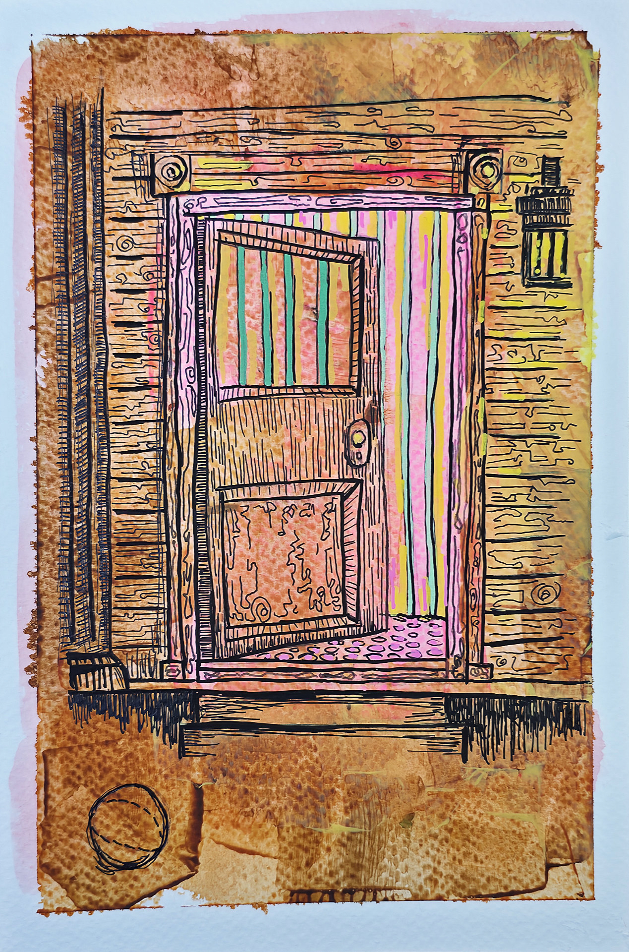
    On the outside, itโ€™s just weathered wood and rust. But when the door cracks open, the mask slips. This illustration is about that moment of realizationโ€”when the familiar peels back to reveal something sickly and wrong underneath.

    The colors inside are too bright, too vertical. They vibrate against the rot of the doorframe.

    Technical Details:

    • Acrylic swipe
    • Sakura Pigma pens
    • India ink with drip pen
    • 9×12 140lb cold press press