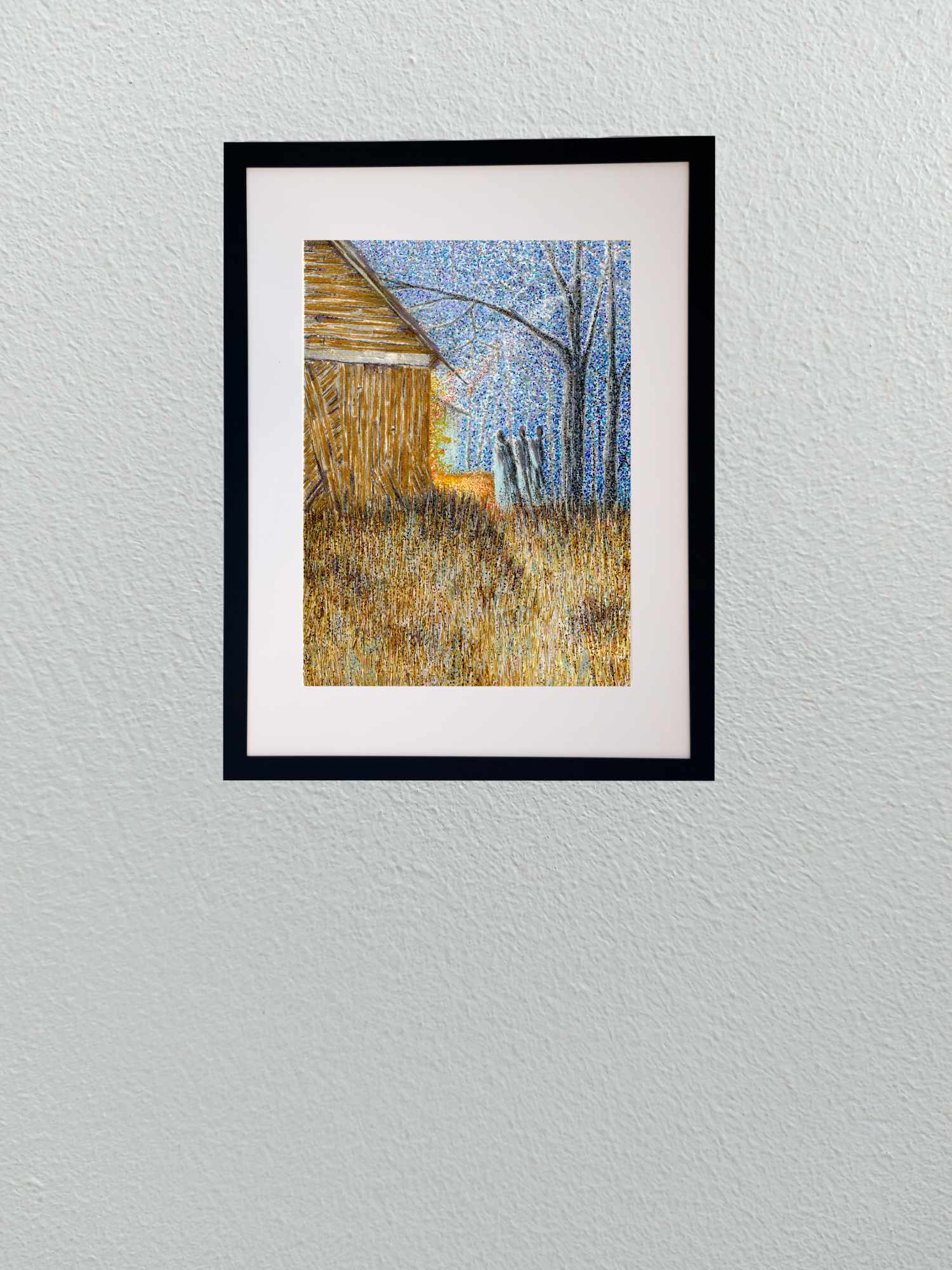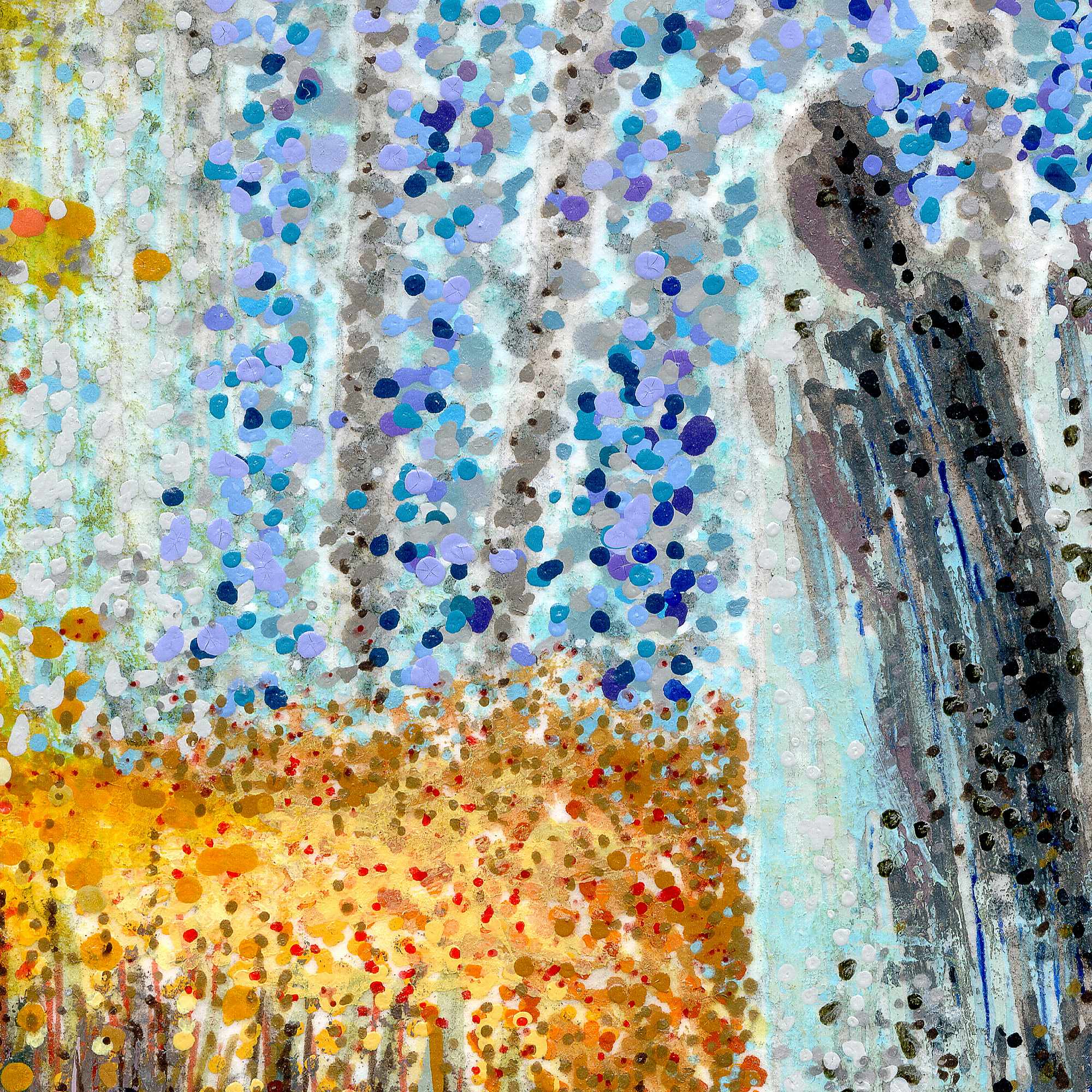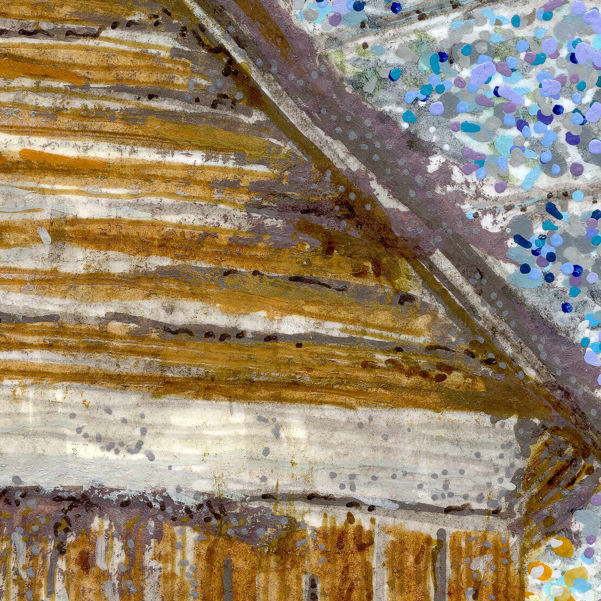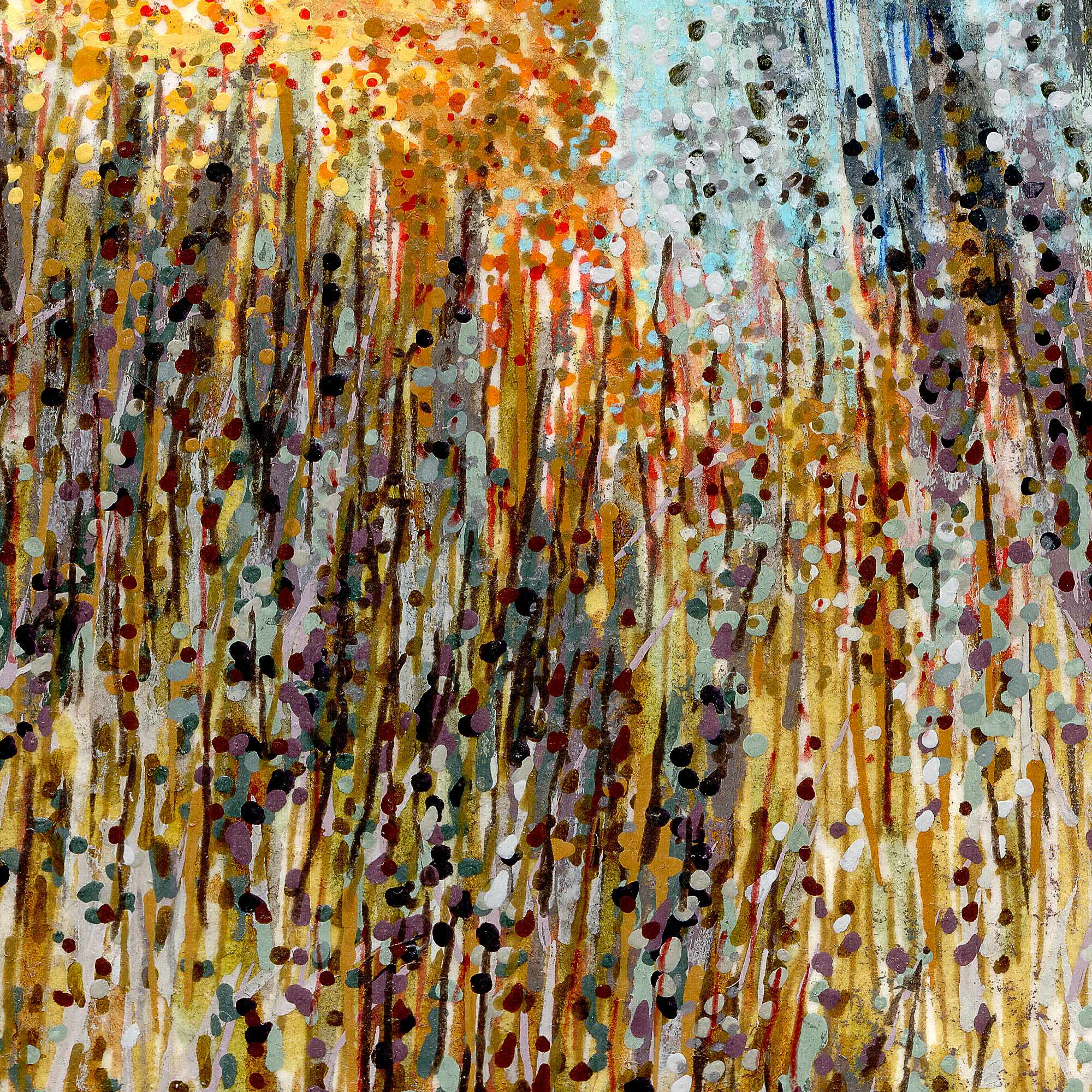
Tag: sakura

  • Lumbering Bier

    Lumbering Bier

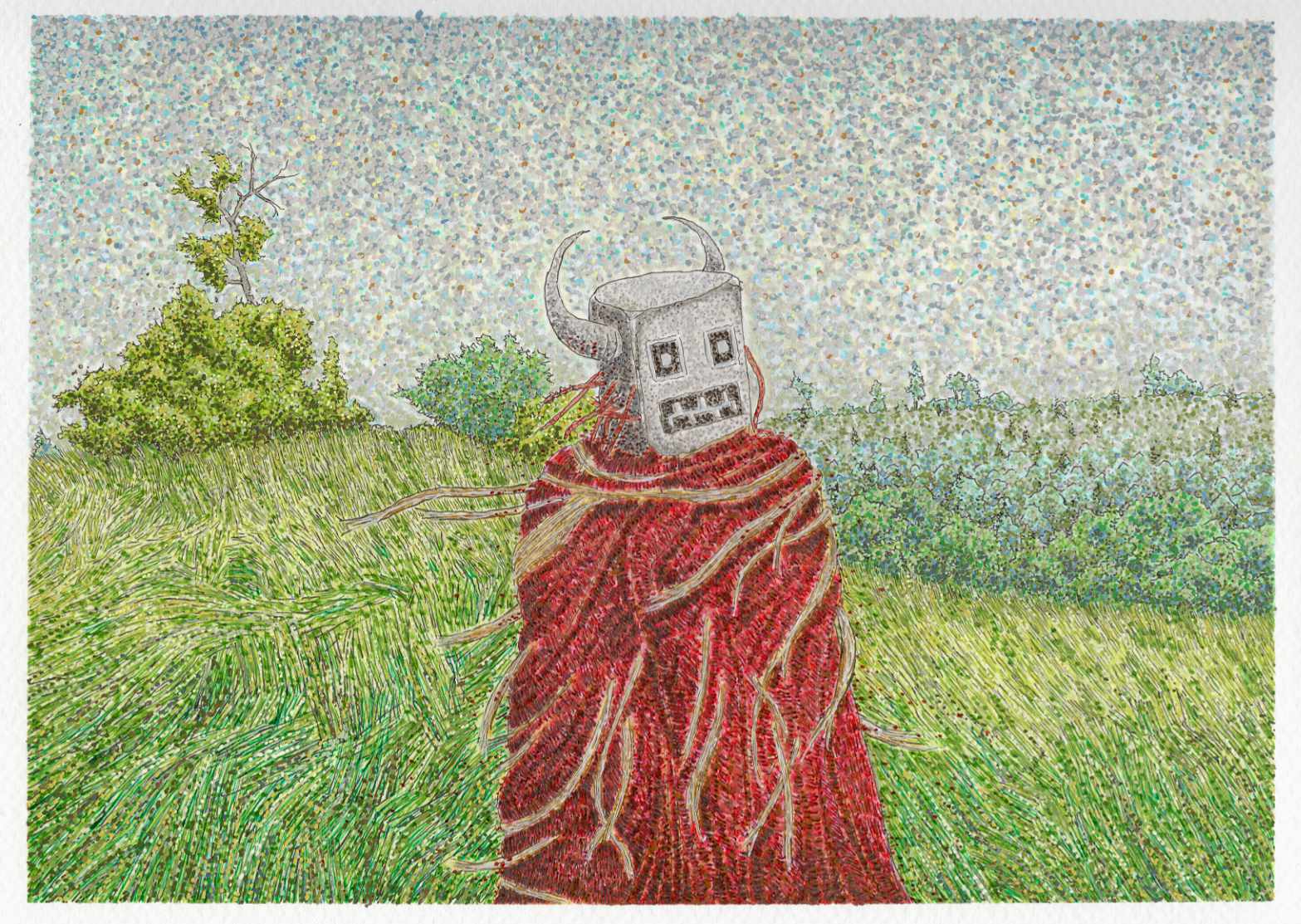
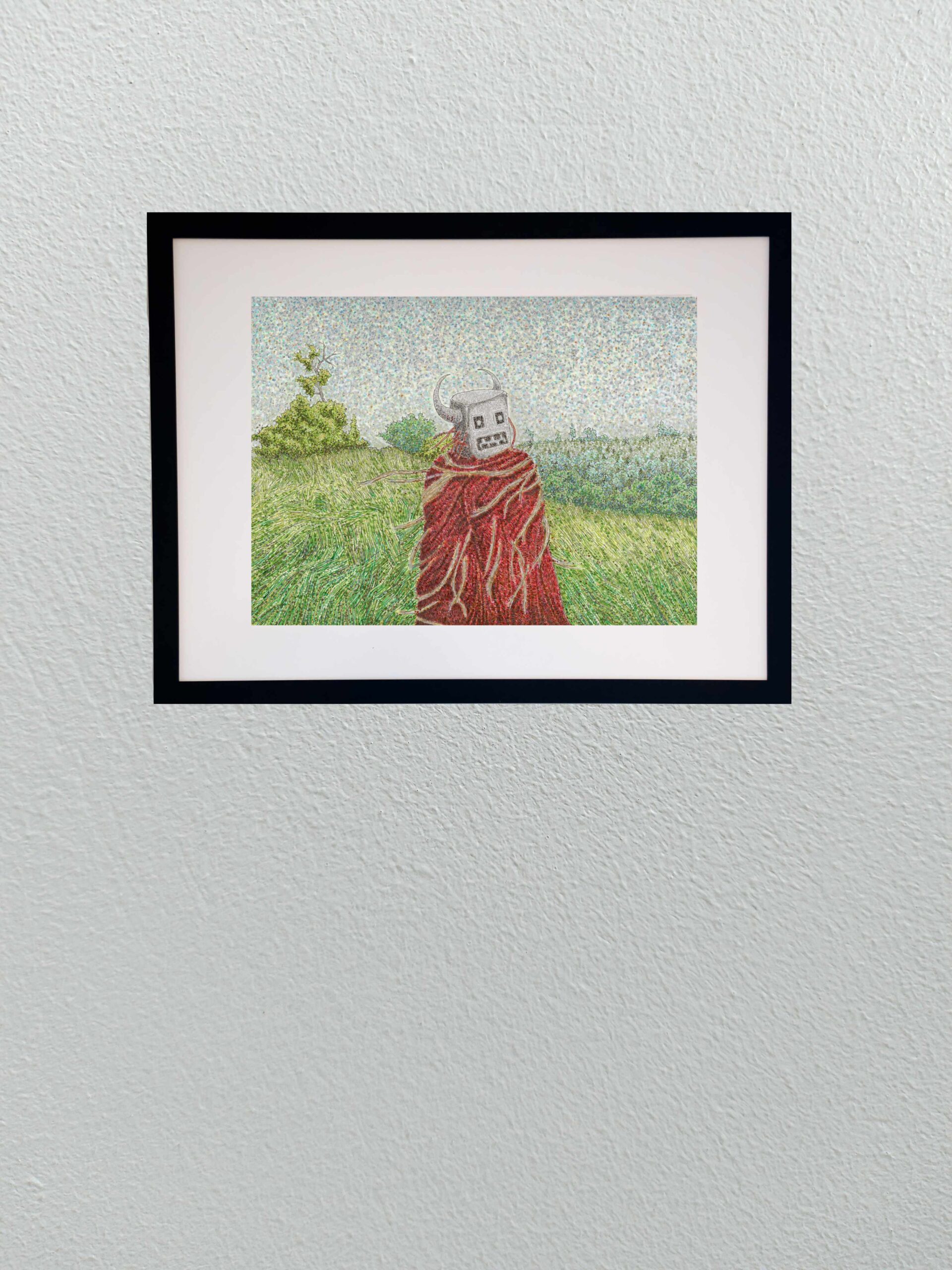
    In this second installment of the series, our ambiguous land deity is no longer a distant silhouette on a ridge line. Here, the entity is a massive, lumbering presence actively moving across a raw, windswept field. I wanted to shift the atmosphere to something highly kinetic, capturing the restless friction of an old god traversing its domain while the grass churns around it.

    Technically, expanding this world required a dense mixed-media approach on cold press paper to handle the sheer volume of texture. I built the environment using a layered blend of Faber-Castell Pitt pens, Staedtler pigment pens, acrylic brushes, and Sakura gel pens.
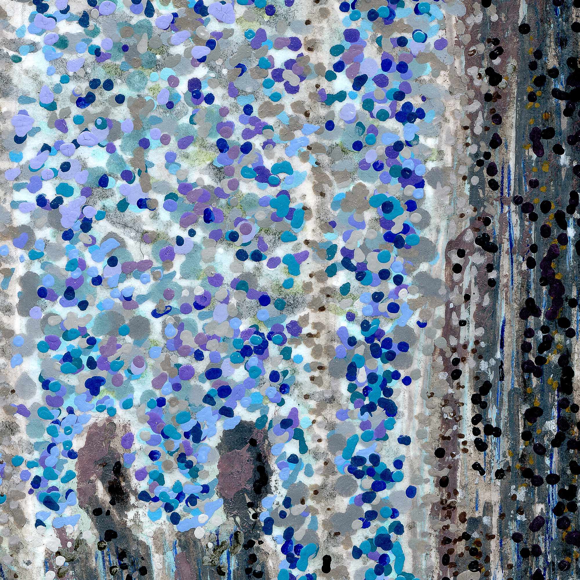
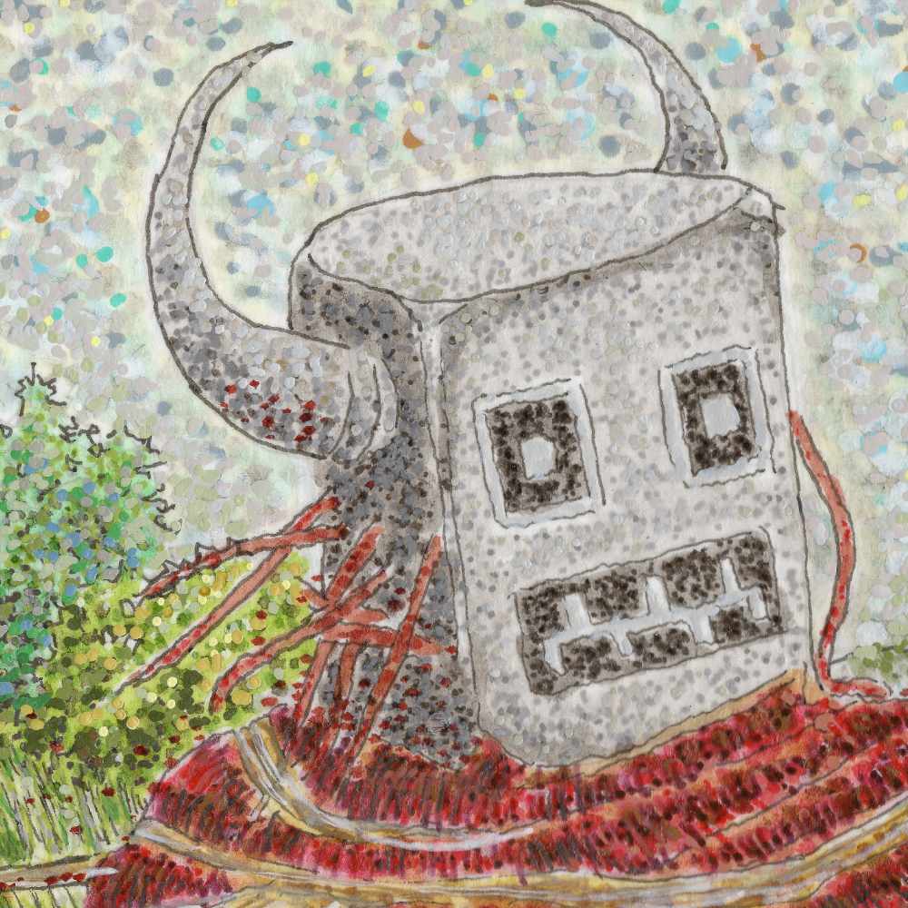
    The process itself was highly rhythmic. I used the fine precision of the Staedtler and Pitt pens to map out the intricate, flowing lines of the prairie grass, mimicking the paths of the wind cutting across the earth. For the figure itself, I wanted a stark architectural contrast; its blocky, horned head is built with textured gray tones, while its heavy cloak is a dense thatch of deep crimson lines interwoven with pale, root-like fibers. The sky is composed entirely of meticulous stipplingโ€”thousands of individual dots of ink and acrylic that create a vibrating, static-like atmosphere above the field. The tooth of the cold press paper catches these distinct mediums differently, keeping the individual marks crisp while allowing the colors to optically blend into a restless, living landscape.
    There is a solemn, ritualistic quality to this giant form moving through the elements, acting as an ancient shepherd of the wild, untamed acres.


  • Frenetic Canopy

    Frenetic Canopy

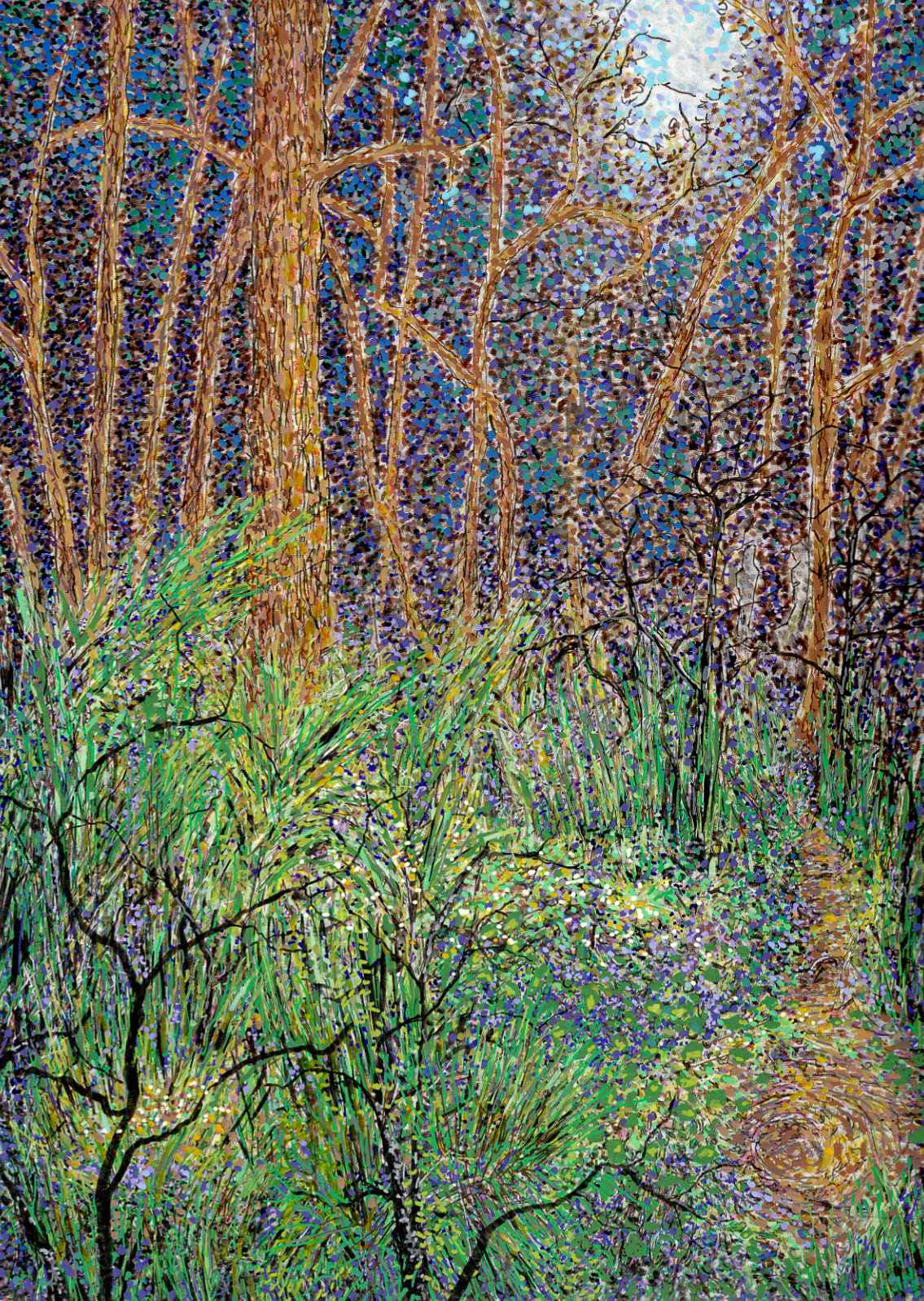
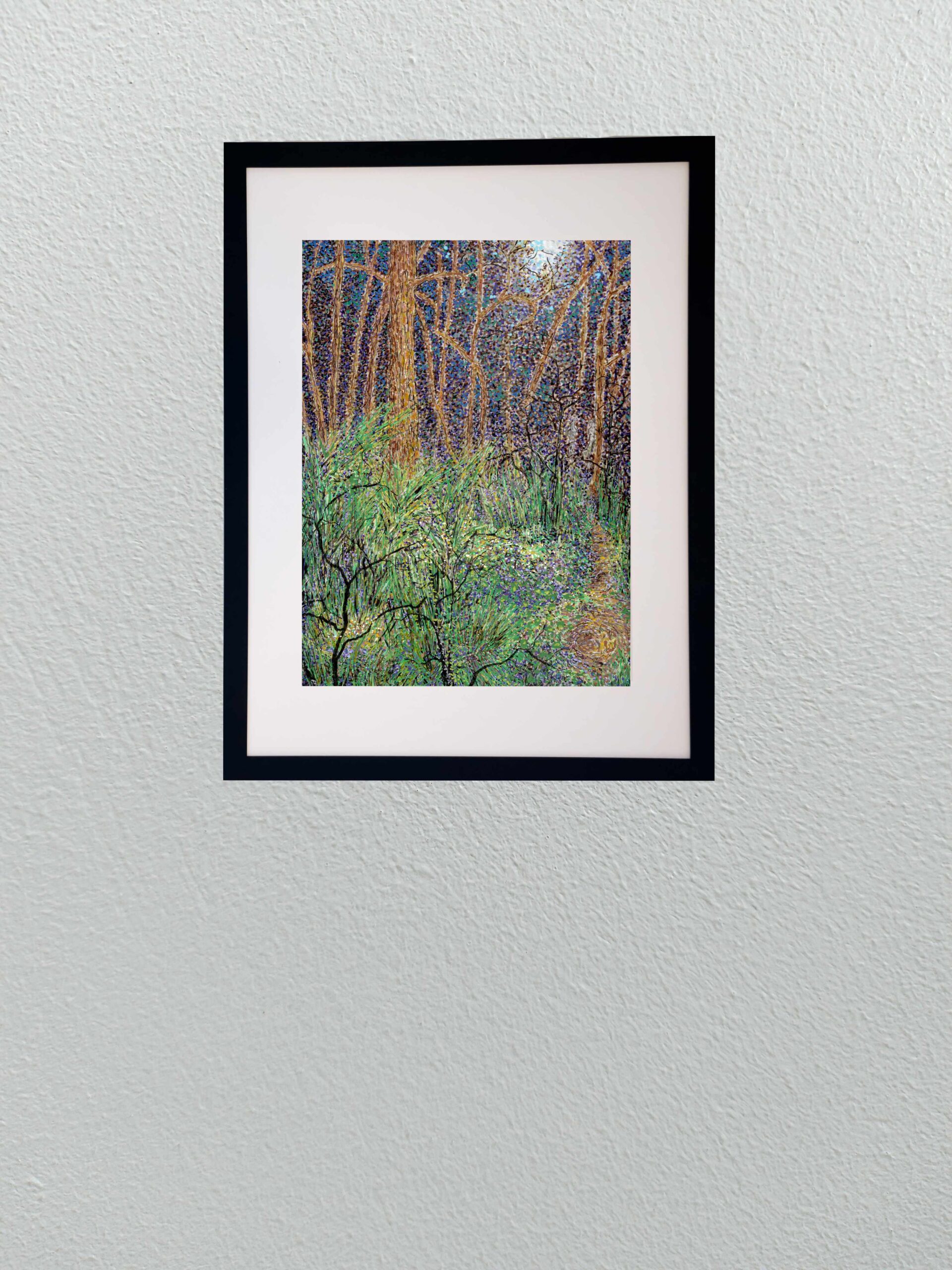
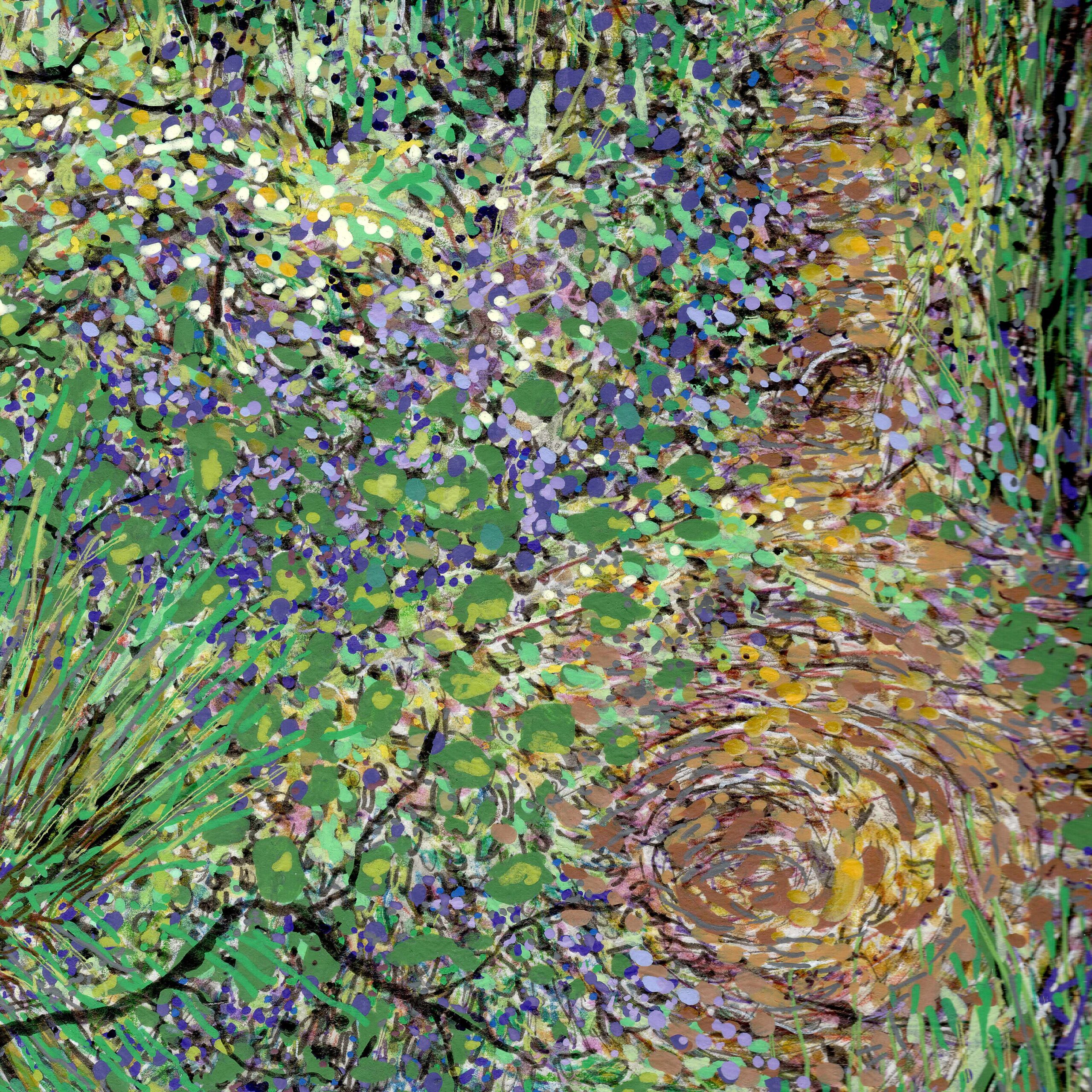
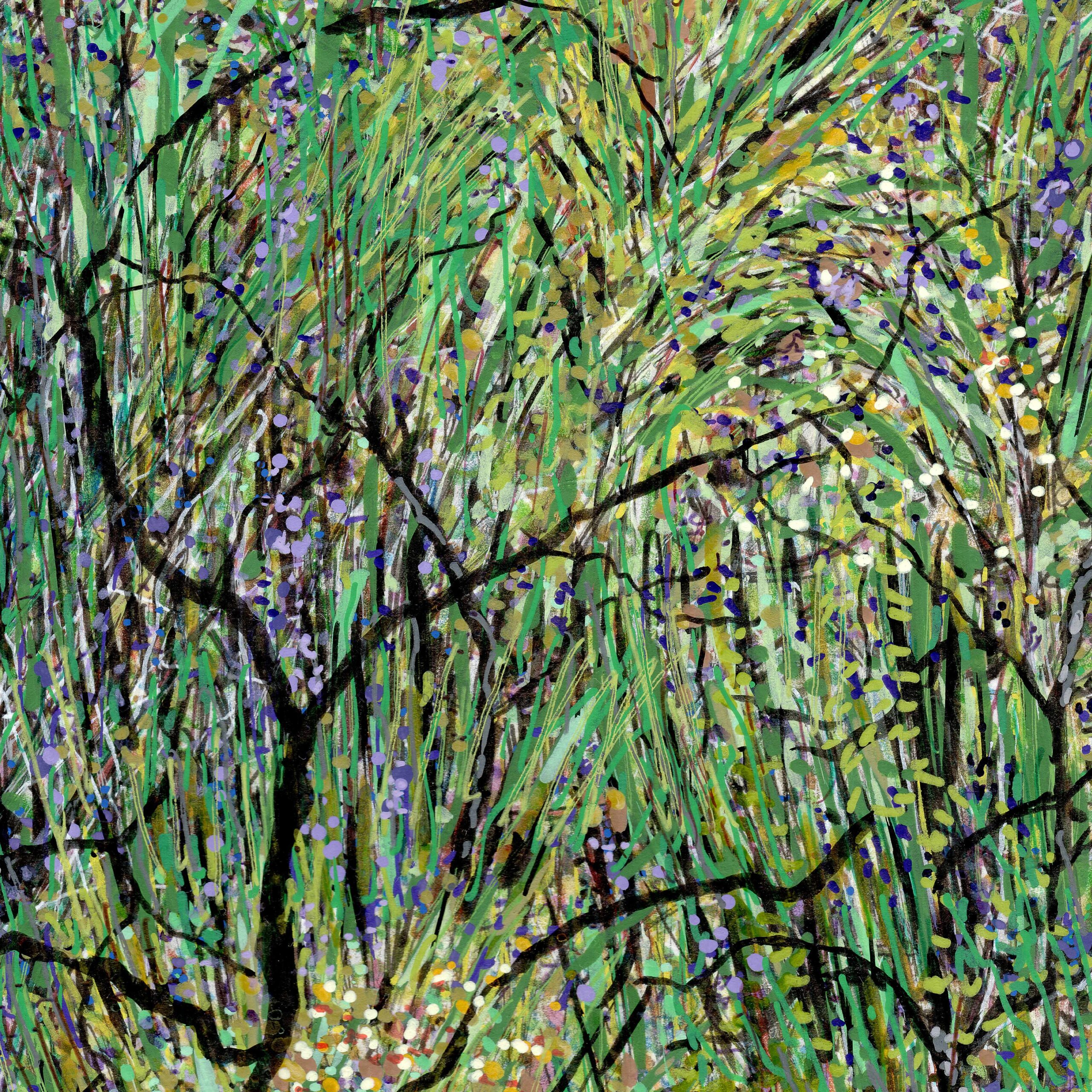
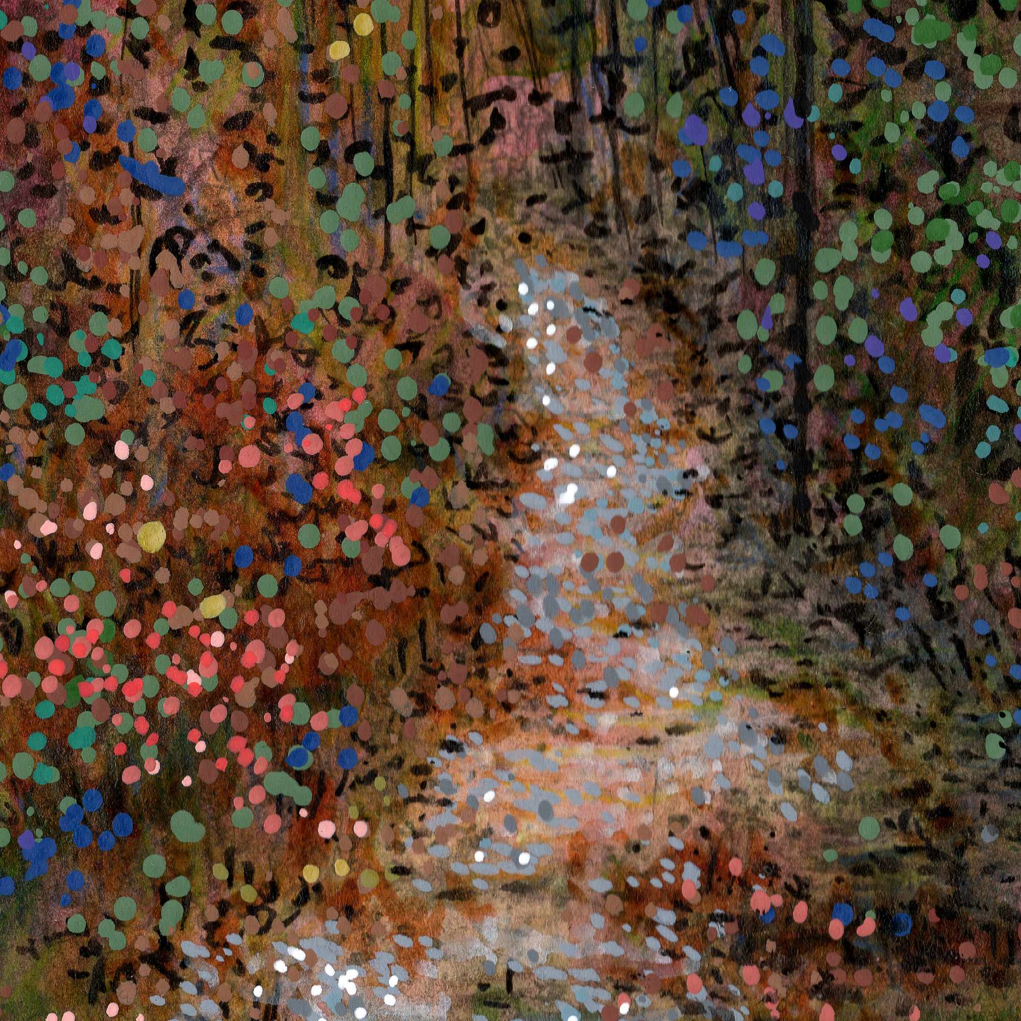
    I wanted to move away from the quiet, still qualities of a traditional landscape and focus entirely on energy. Nature is rarely static. It is constantly growing, decaying, and shifting. This piece was a deliberate experiment in capturing that hidden, frenetic activityโ€”making a forest look as though it is writhing and moving right in front of you.

    Technically, this required a dense orchestration of different tools and medium behaviors on smooth hot press paper. I built the surface using a heavy blend of Faber-Castell Pitt pens, Staedtler pigment pens, acrylic pens, and Sakura gel pens.

    The process was rhythmic and intense. I used the fine precision of the Staedtler pens to create an intricate web of overlapping, high-contrast lines for the undergrowth and the tree trunks. The fine, colorful lines slashing through the foliage were accomplished with Sakura gel pens, giving those bright accents a sharp, clean edge. Instead of blending colors smoothly, I relied on rapid dashes and tight clusters of stippling with the acrylic and Pitt pens. By placing contrasting tones directly side-by-sideโ€”the electric greens against the deep purples and warm ochresโ€”the canopy begins to optically vibrate.

    It is a chaotic way to build a landscape, but letting the marks layer over one another without correcting the friction gives the piece its pulse. It records the grit and the constant motion of the woods rather than a sanitized portrait of them.


  • Sells Mill: Late Winter Light

    Sells Mill: Late Winter Light

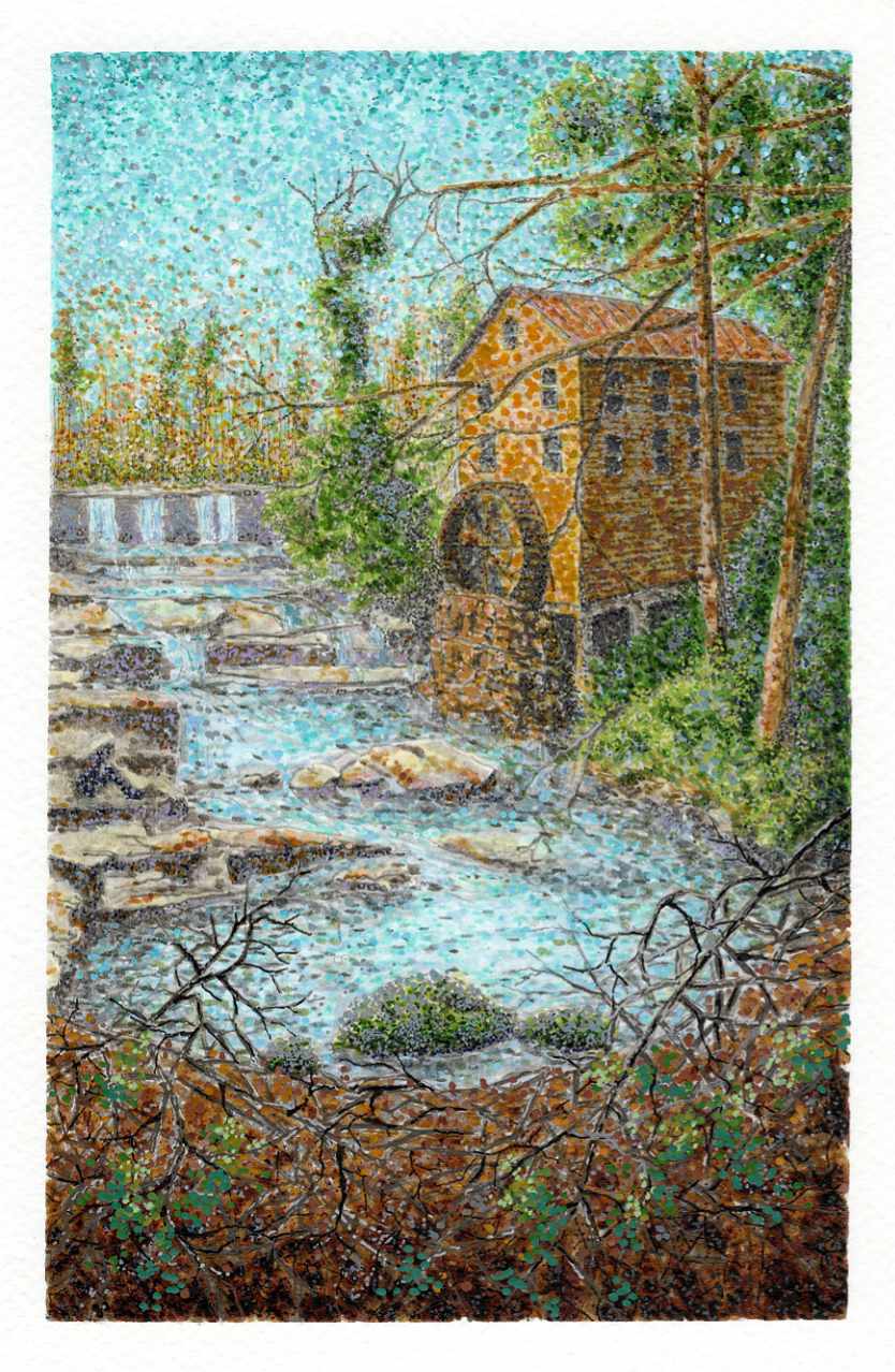
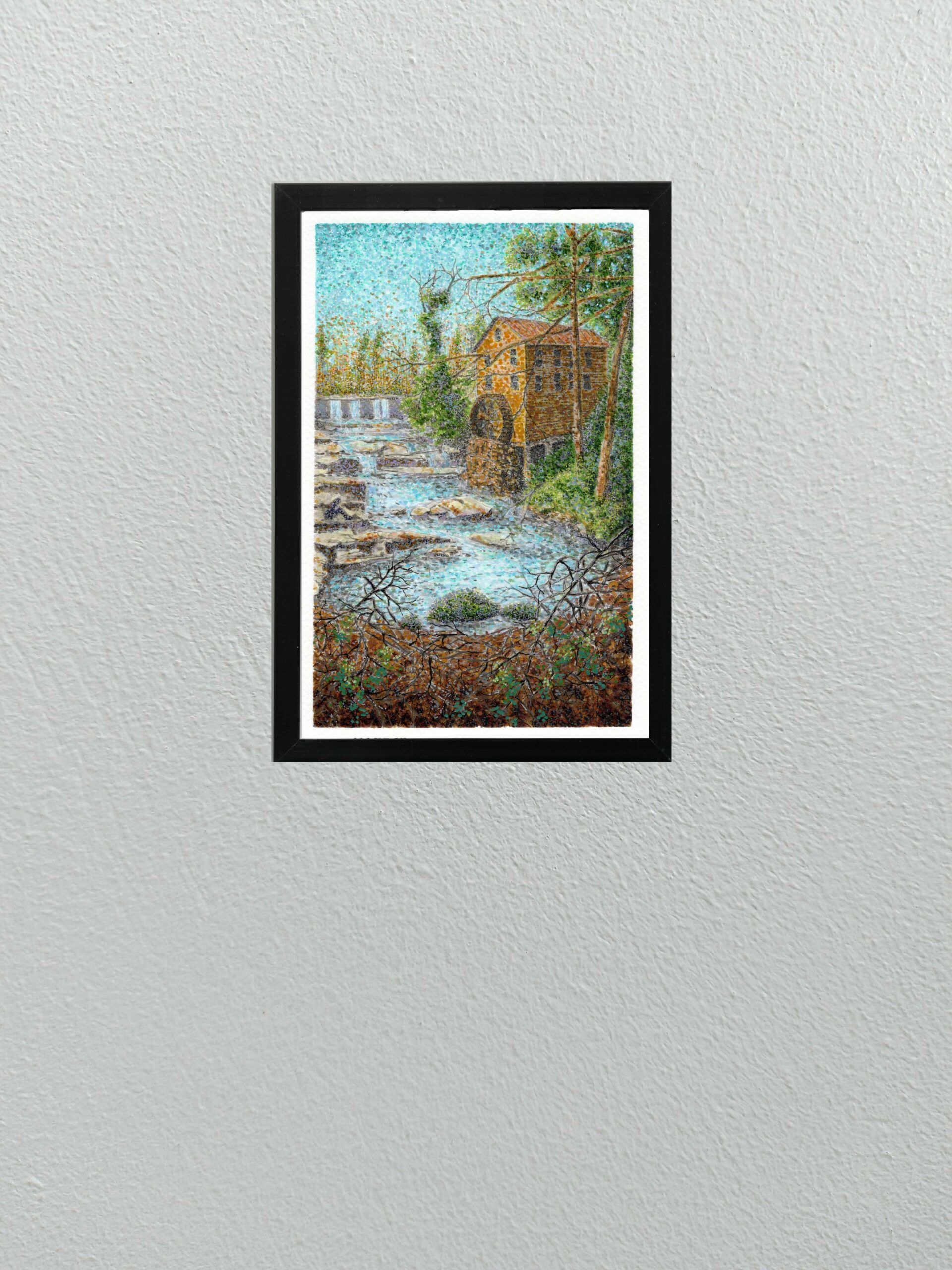
    here is a brief window at the end of winter where the landscape feels entirely transitional. The trees are still bare, but the light changes, catching the water and the earth differently. This study of Sells Mill was an attempt to record that specific, shifting energy.

    Technically, Iโ€™ve continued to explore the boundaries of my mixed-media approach on cold press paper. I used a combination of Faber-Castell Pitt pens, acrylic pens, and Sakura pens to build the scene layer by layer.

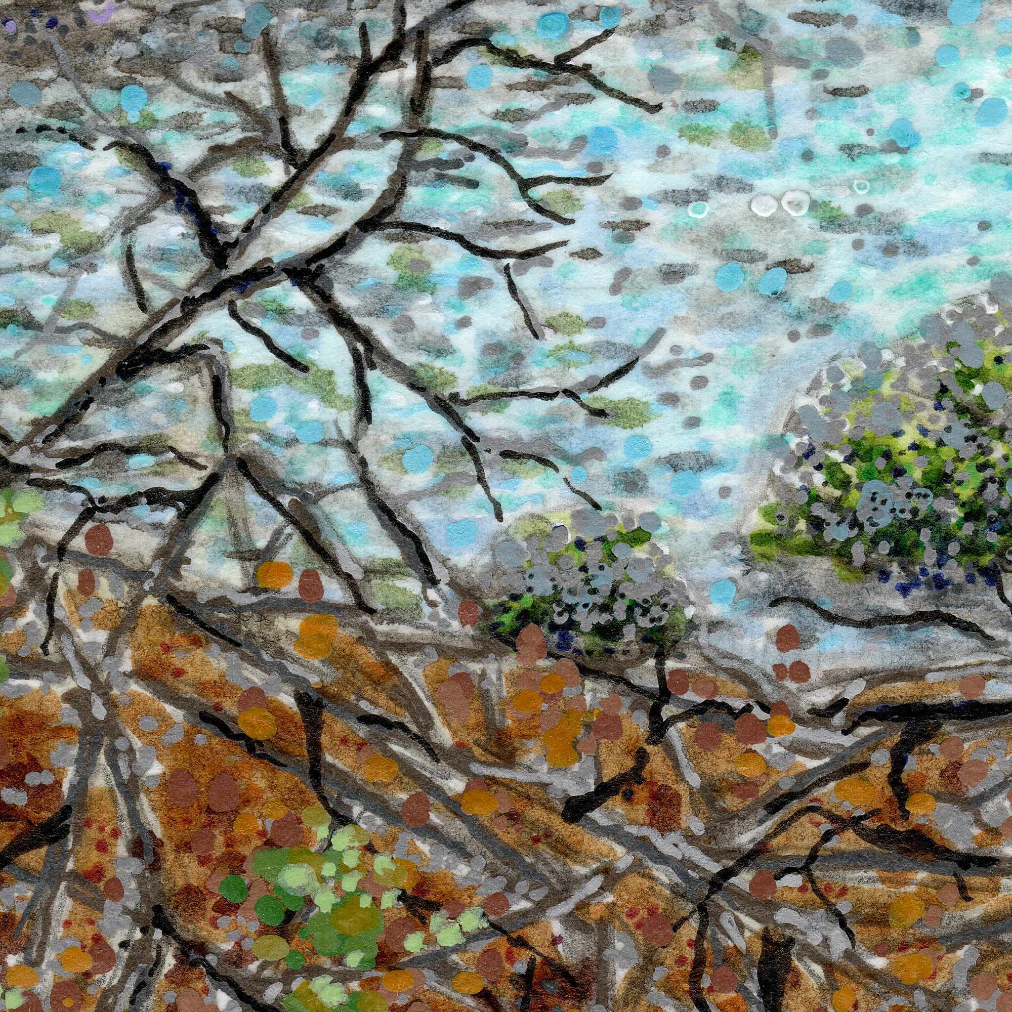
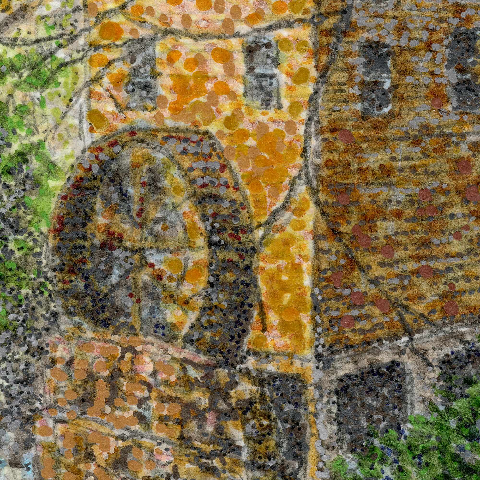
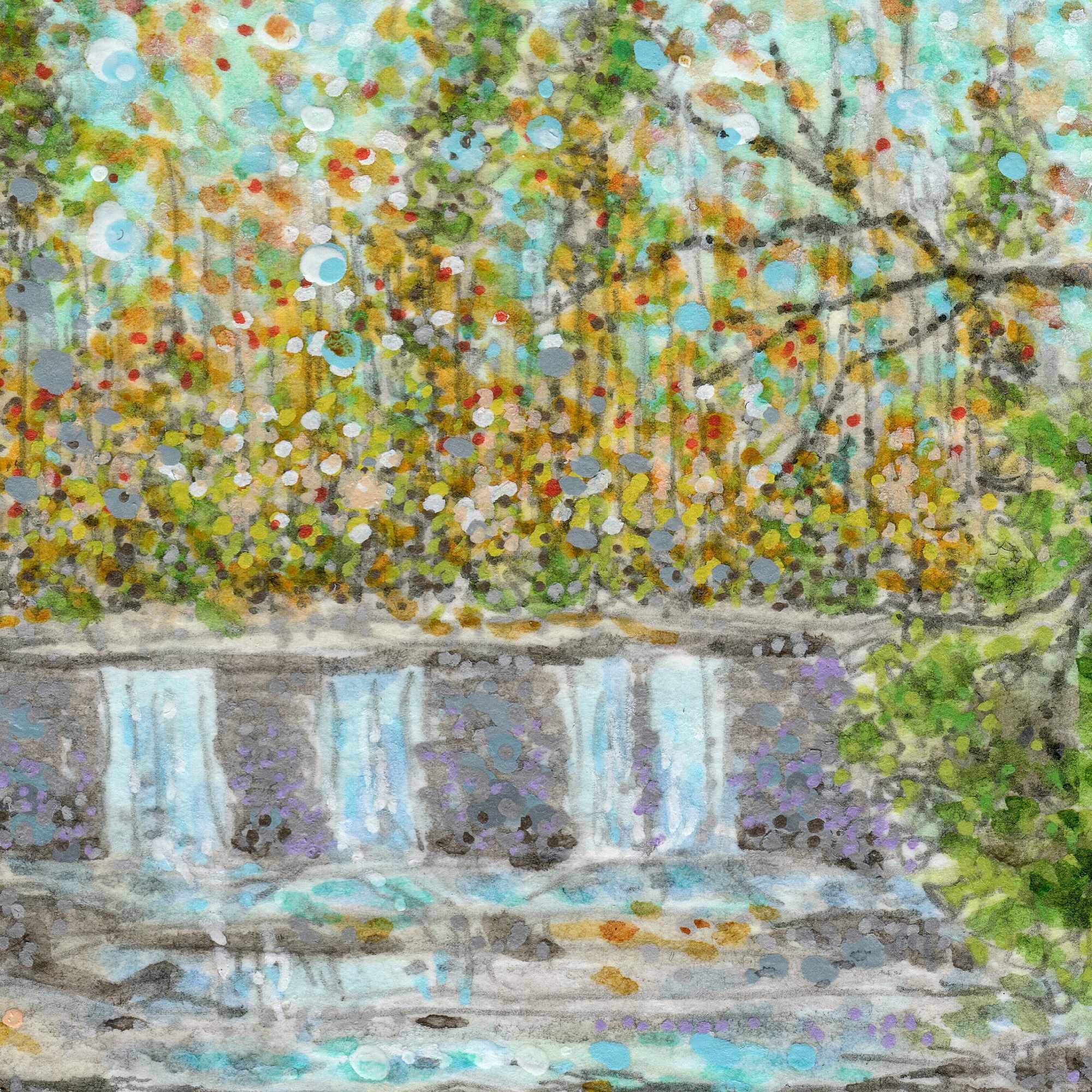
    The process is a deliberate balance between structured architecture and organic chaos. I used the fine precision of the Sakura and Pitt pens to draft the rigid lines of the historic mill and the dense, tangled thicket of branches in the foreground. For the sky, the water, and the stone faรงade, I leaned heavily into a pointillist technique. By applying thousands of individual dots of ink and acrylic, the surface begins to vibrateโ€”allowing the cool blues of the late winter sky and the rushing stream to catch a sense of movement.

    The paperโ€™s tooth works as a quiet partner here, holding the pigments exactly where they land but allowing the sheer volume of marks to optically blend. Itโ€™s a slow, rhythmic way to work that captures the texture of a place without forcing it into a sterile, perfect drawing.


  • A Fragment of Departure

    A Fragment of Departure

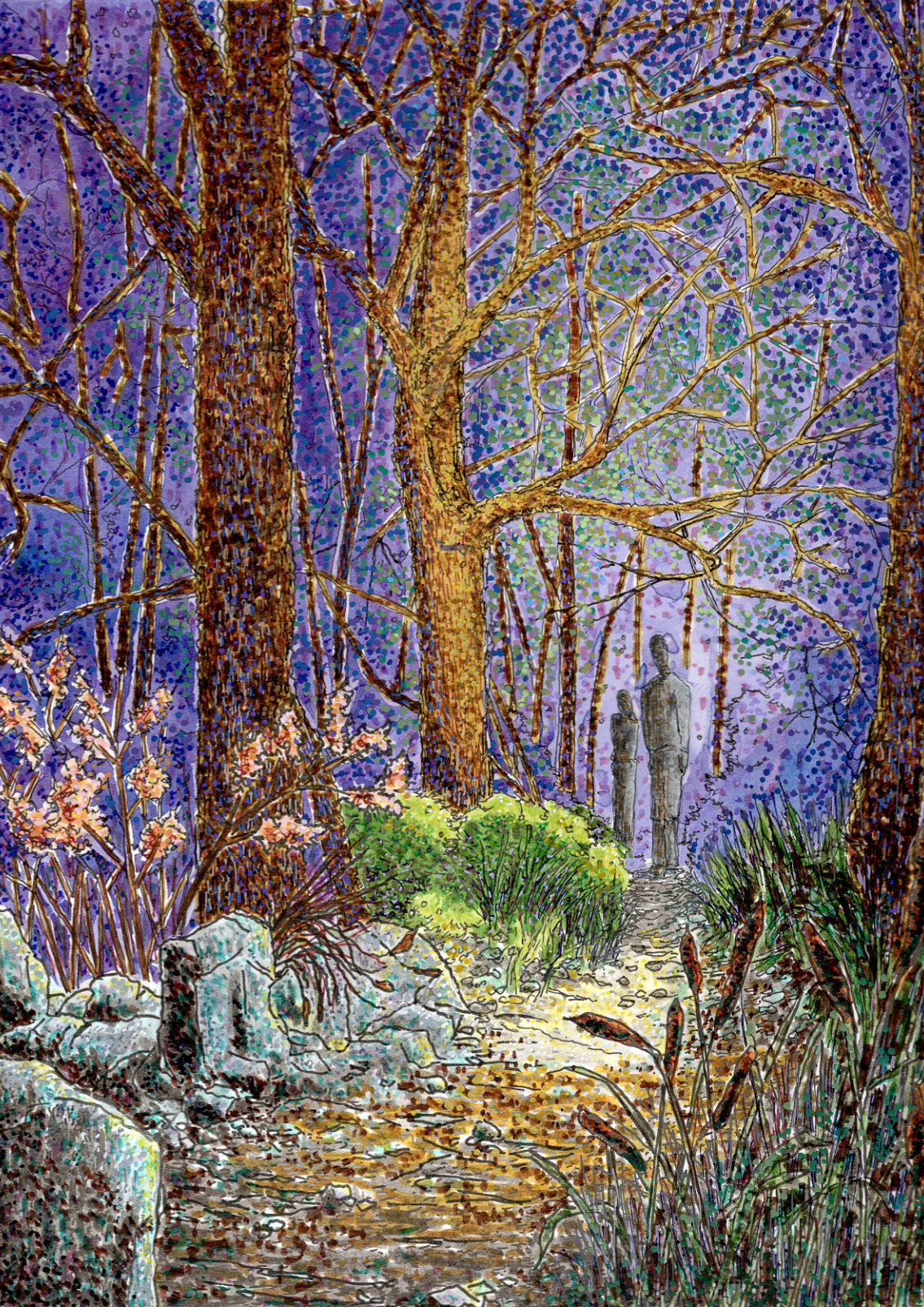
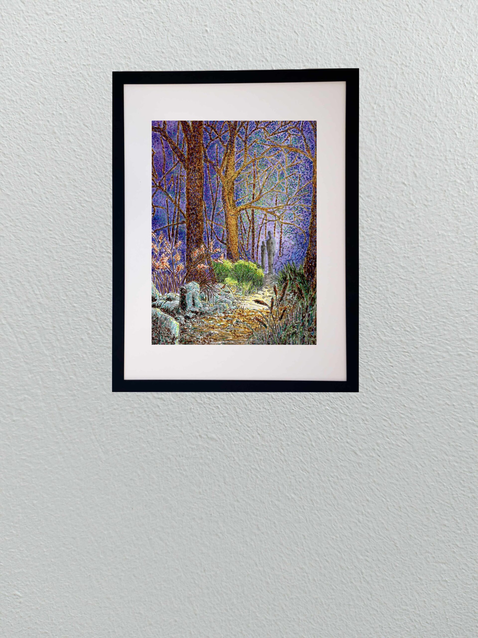
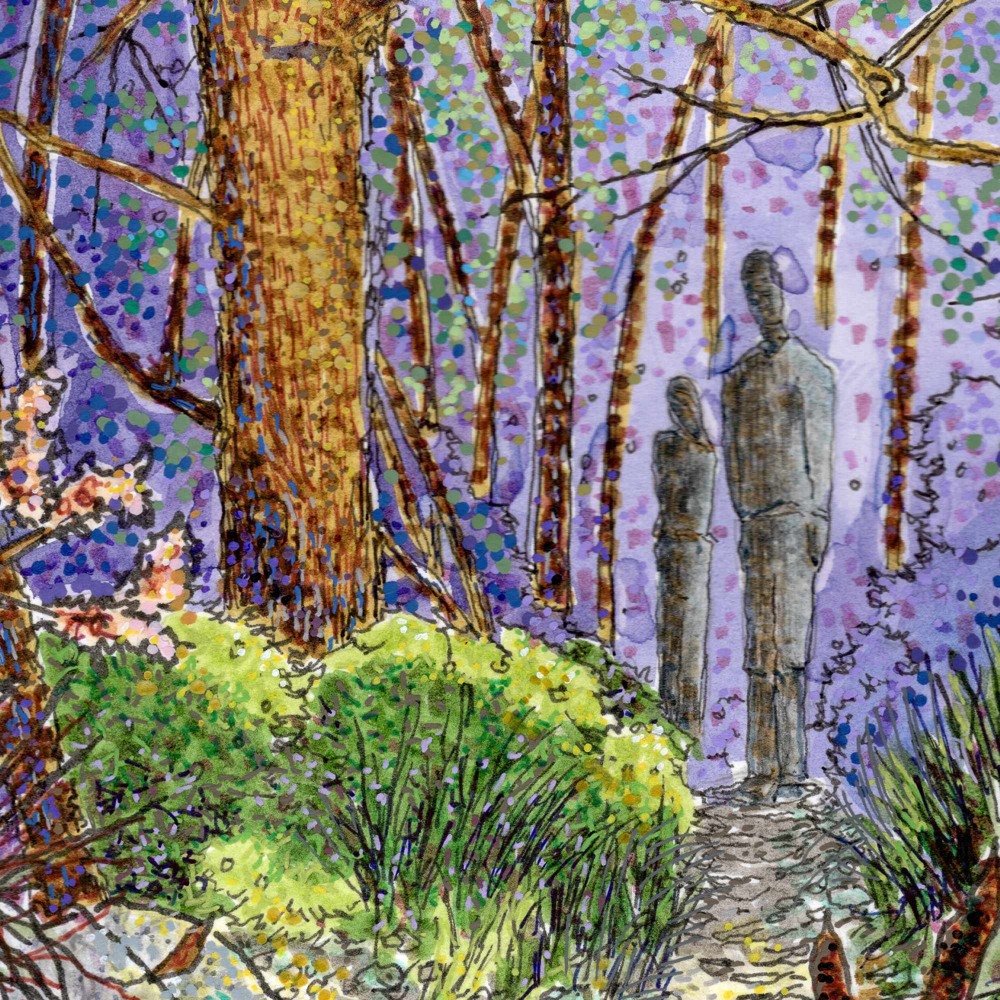
    I wanted this piece to feel like a fragment of a larger, untold story. It is composed from the exact vantage point of an unknown observer looking through the brush, watching two figures stand at a crossroads on a path. You are witnessing a fleeting, high-stakes moment, but the context is deliberately stripped away. Is one figure looking back because they finally spotted you? Are they standing forlornly as someone else prepares to disappear into the heavy tree line? Or are they simply frozen in a moment of sharp indecision? Leaving those questions unanswered is the entire point; it forces the viewer to fill in the blanks.

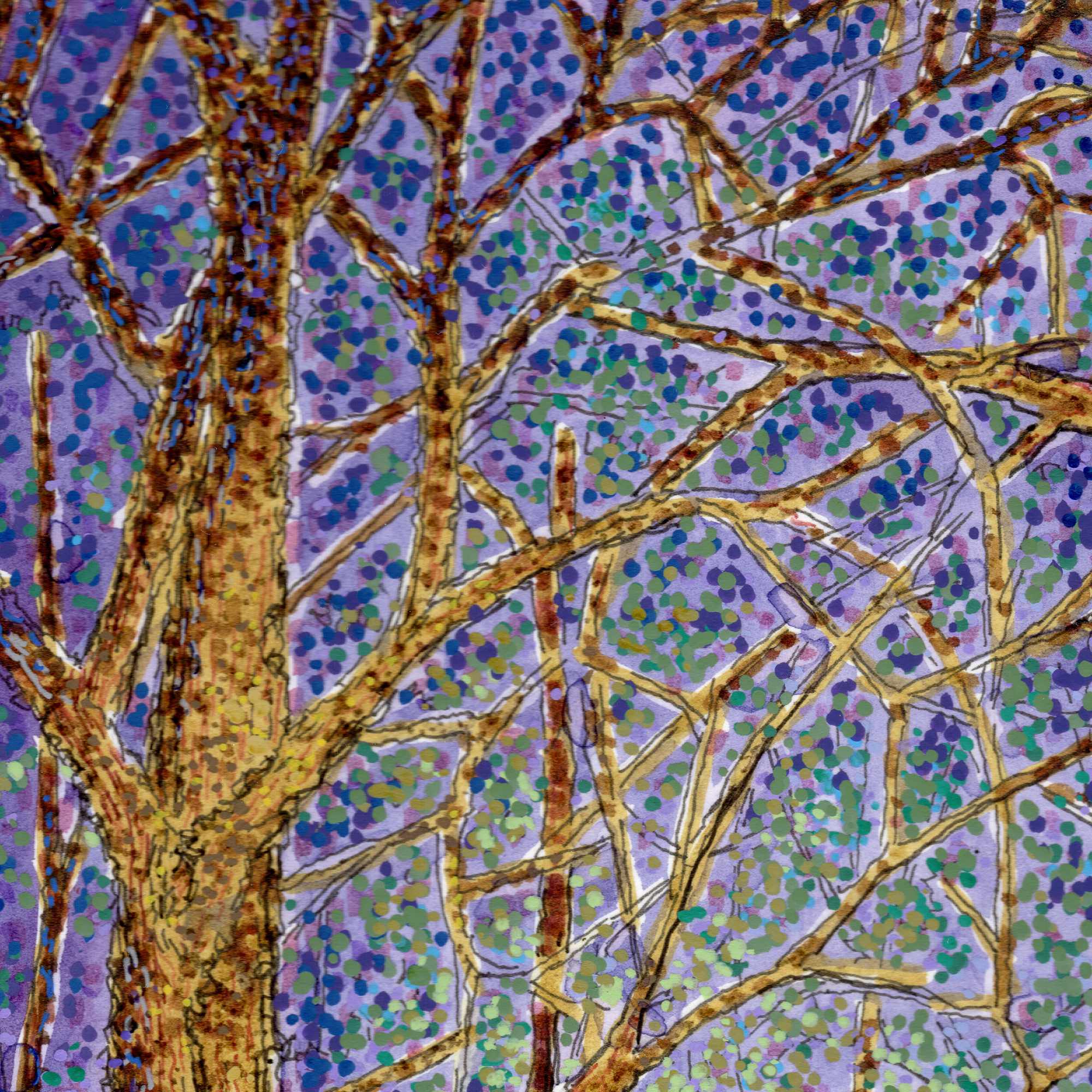
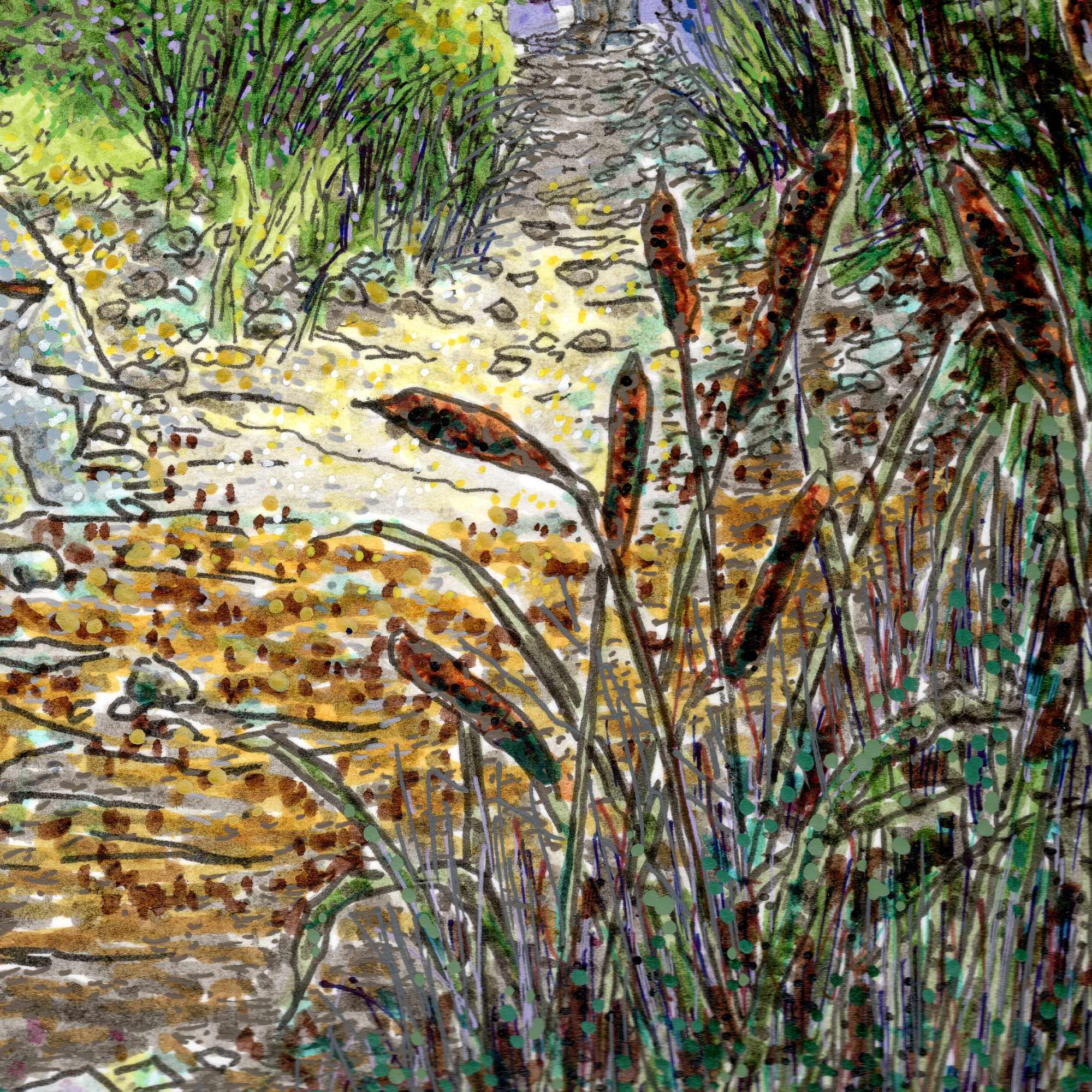
    To build this sense of atmospheric suspense, I used a complex multi-medium approach on hot press paper. I started with an India ink wash to establish the deep, heavy values and the overall mood of the environment. From there, I used a mix of Pigma pens and Pitt pens to layer the finer, sharper architectural lines of the massive tree trunks and the dense foliage. I relied heavily on stippling in the canopy, using rapid dots of vibrant purple and green to make the air itself feel like it is vibrating. Finally, I used a white gel pen to pull out the stark, sharp highlightsโ€”catching the light on the foreground rocks, cattails, and the edges of the figures to create a punchy contrast against the dark background wash. By blending the fluid ink with the rigid precision of the pens, the process itself becomes a balance of control and chaos, keeping the image grounded in texture while letting the narrative remain completely elusive.


  • The Yellow Hat

    The Yellow Hat

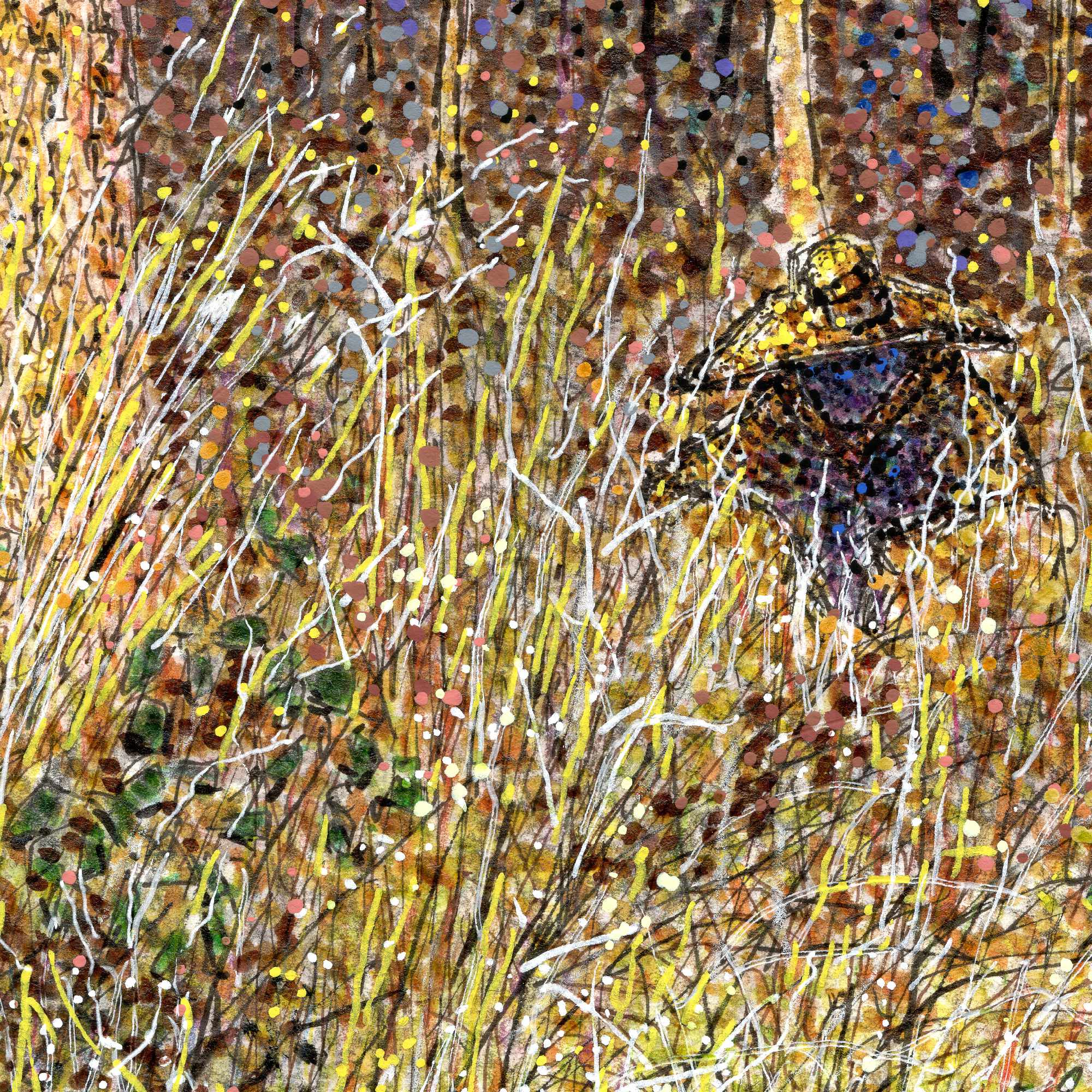
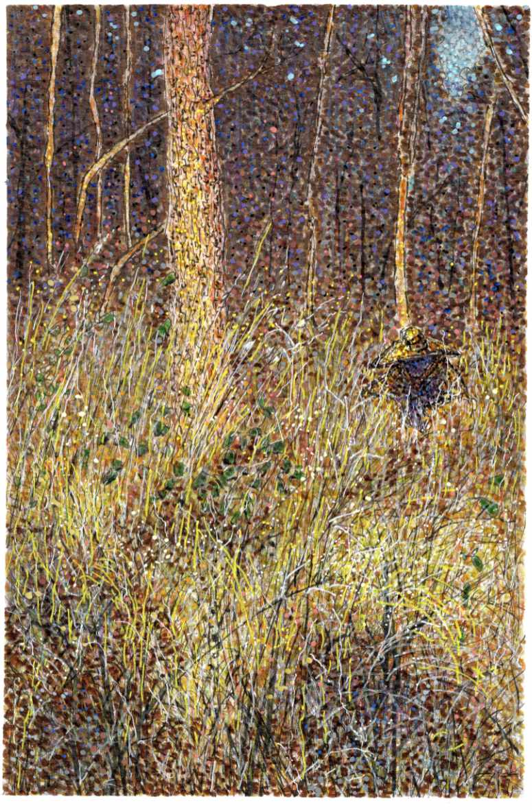
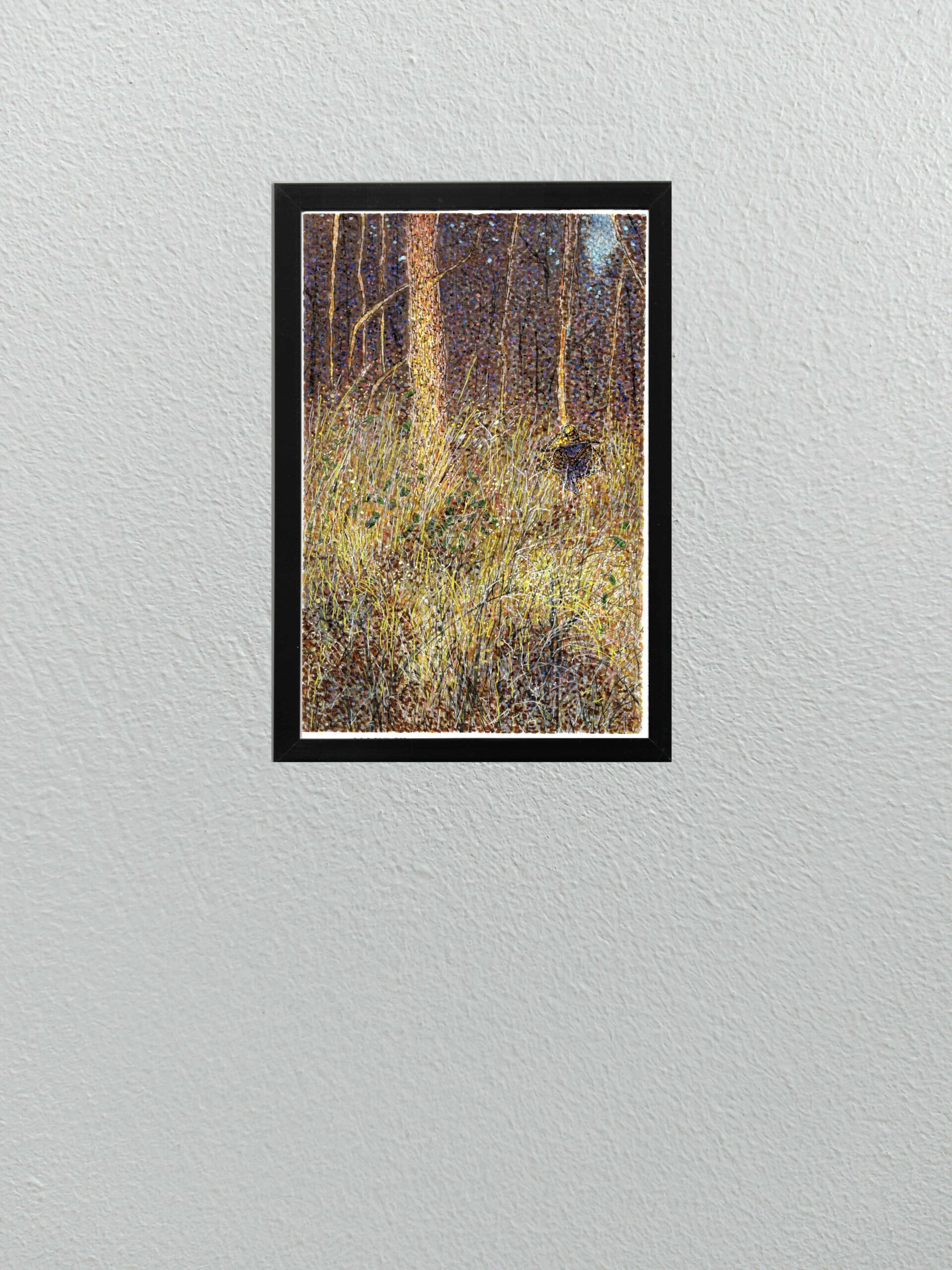
    Today I am sharing a new multi-media piece that continues to push the boundaries of my recent experiments with pointillism, but with a distinct narrative twist.

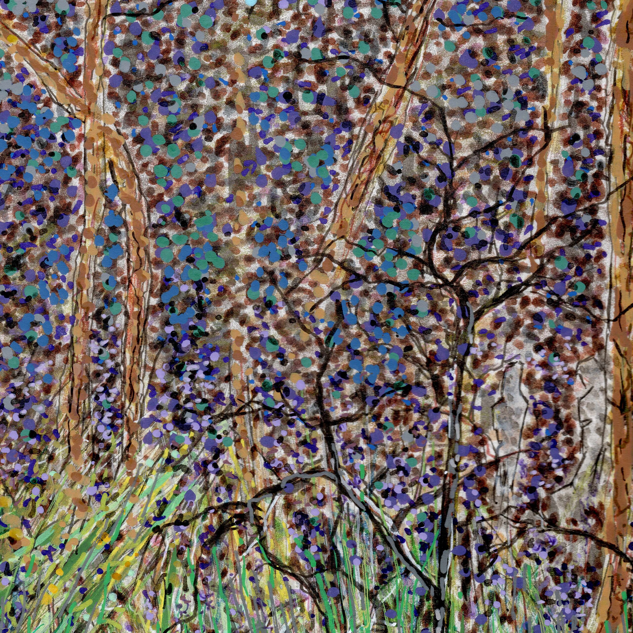
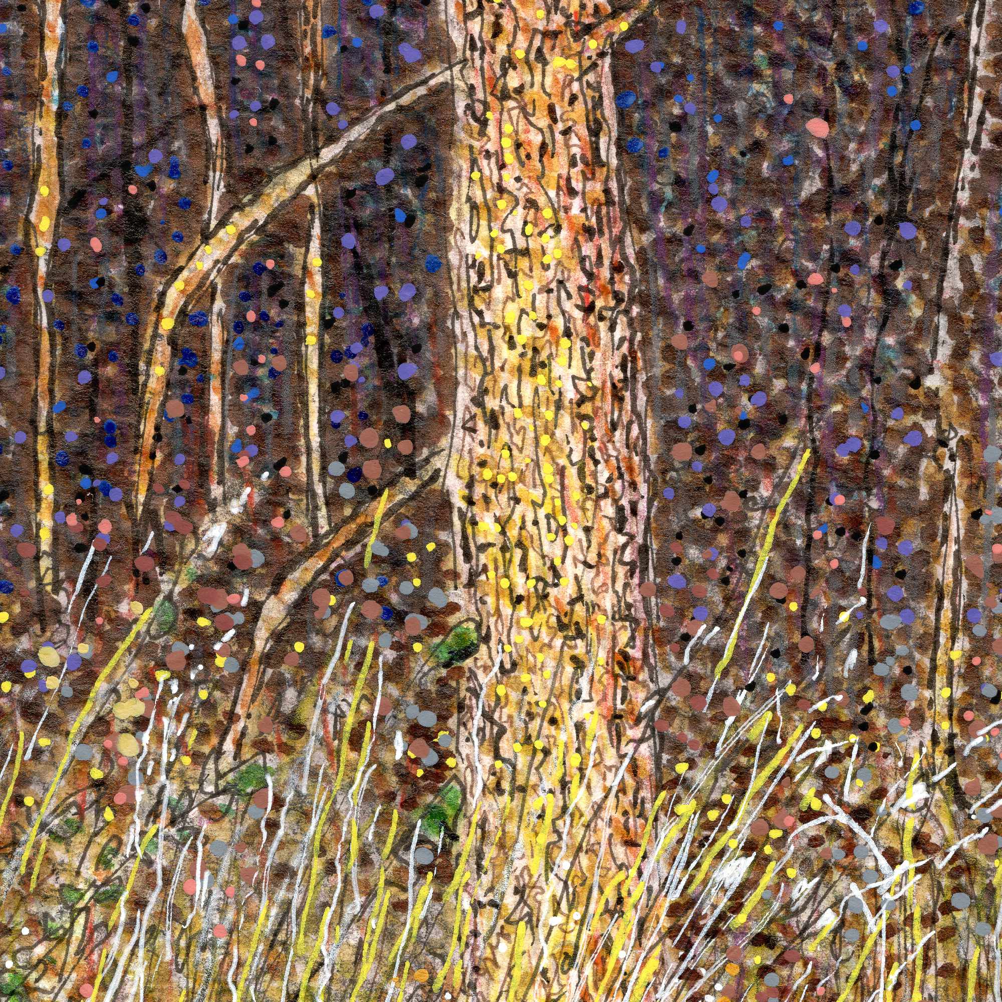
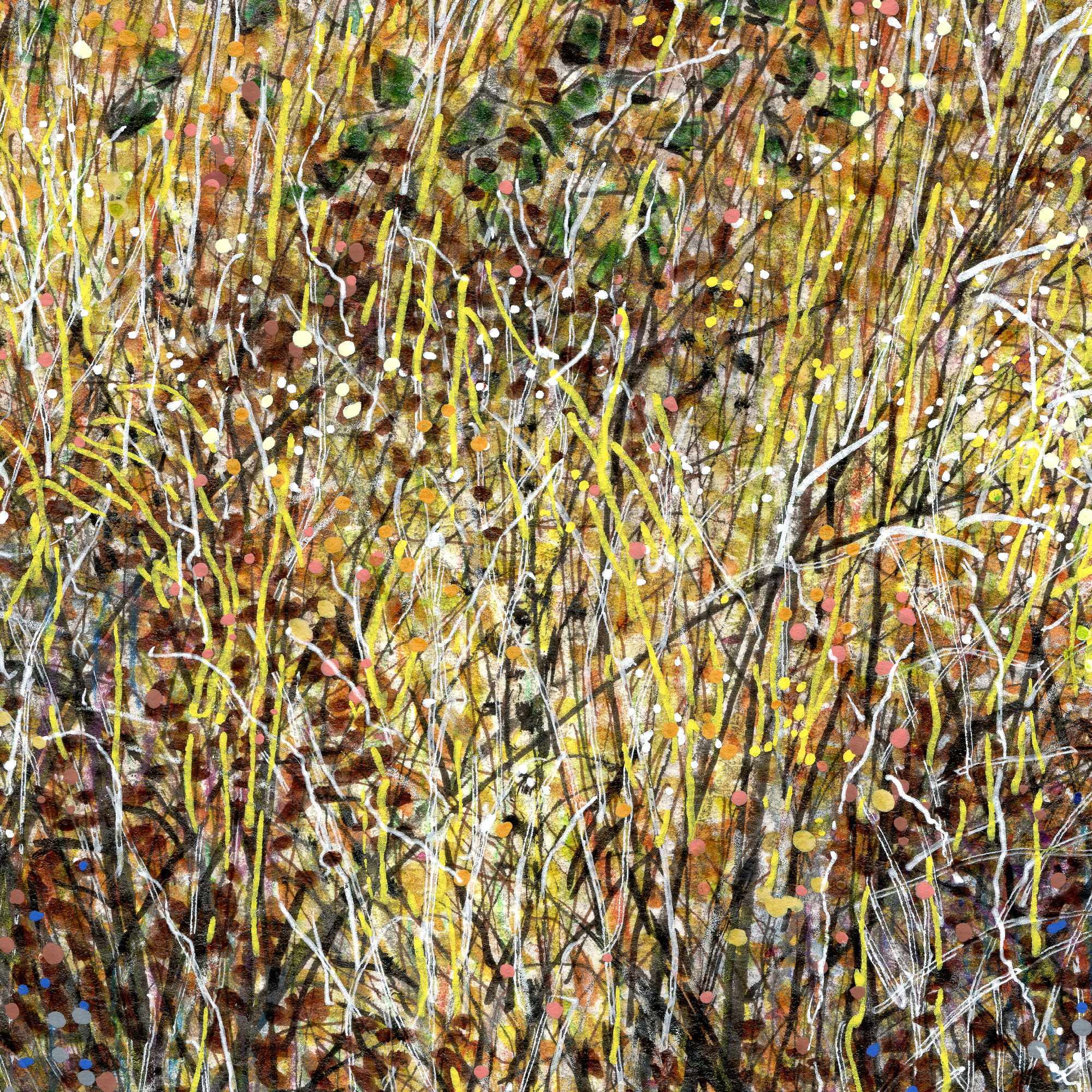
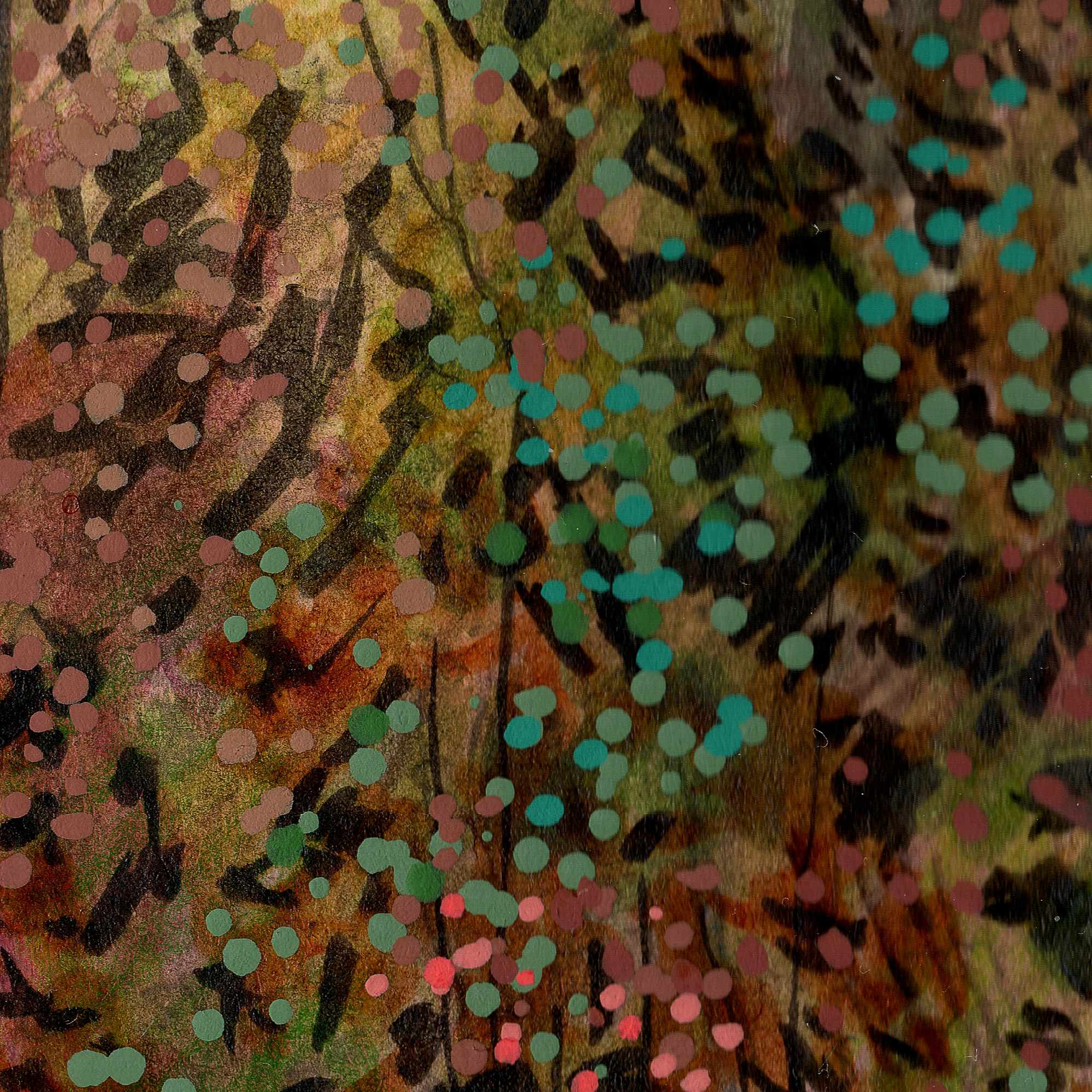
    This piece, based on an older photograph of a dense tree line and brush, relies on a highly textured mix of India ink, acrylic pens, and Pigma fine liners. To capture the thick, almost claustrophobic atmosphere of the undergrowth, I combined sharp, vertical scratches for the tall grass with heavy, vibrating dots of color. The optical mixing of the bright yellows and oranges in the foreground against the deep, heavy purples and blacks of the background gives the entire scene a buzzing, nocturnal energy.

    But this isn’t just a landscape study. If you look closely at the middle-right side of the composition, tucked away in the tall grass, there is a cloaked figure wearing a wide-brimmed yellow hat.

    I rendered this figure using the exact same pointillist and linework techniques as the surrounding environment, perfectly camouflaging them into the brush. Much of my work centers around the idea of being a “quiet observer” in rural, forgotten spaces. With this piece, I wanted to flip that dynamic. It introduces a subtle, eerie, Southern Gothic narrativeโ€”a reminder that when you are out observing the quiet edges of the world, sometimes you are also being observed.


  • The Yellow Patio

    The Yellow Patio

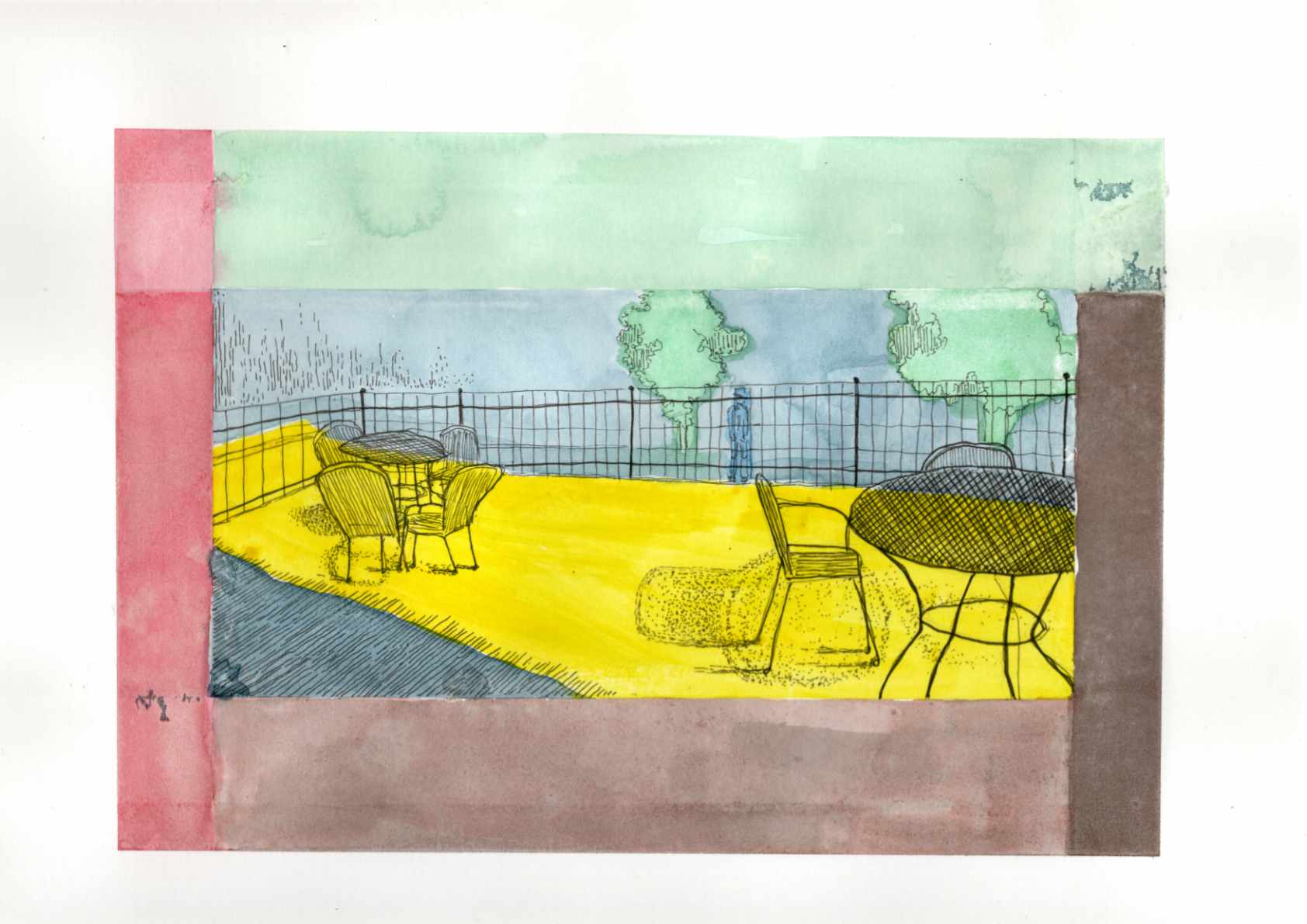
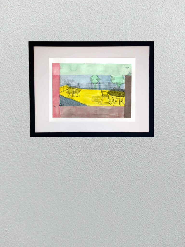
    Today I am sharing a new graphic piece titled “The Yellow Patio.” The title is intentionally a bit on the noseโ€”an ironic nod to a cheerful early spring setting that actually masks the heavier, psychological weight of the scene.

    Based on a reference photo of a small bistro area, this piece gave me the opportunity to lean heavily into a Synthetist, graphic style of color blocking. The composition is built entirely on the boundary between light and dark, inside and outside. To translate the intense feeling of that boundary, I used deep, unnatural blues and heavy purples to anchor the foreground shadows, which perfectly frame the harsh, acidic, vibrating yellow of the sunlight hitting the concrete floor.

    This piece ties directly into the theme of the “quiet observer” that runs through much of my work. By placing the viewer firmly within the cold shadow, looking out past the empty iron chairs toward a lone, distant figure beyond the fence, it creates a distinct sense of isolation and voyeurism. Itโ€™s a moment of being entirely separated from the warmth and the outside world, suspended in bold, flat color.

    Technical Details:

    • 9×12 140lb hot press
    • Sakura fine liners
    • India ink
  • Eveningโ€™s Quiet Unrest

    Eveningโ€™s Quiet Unrest

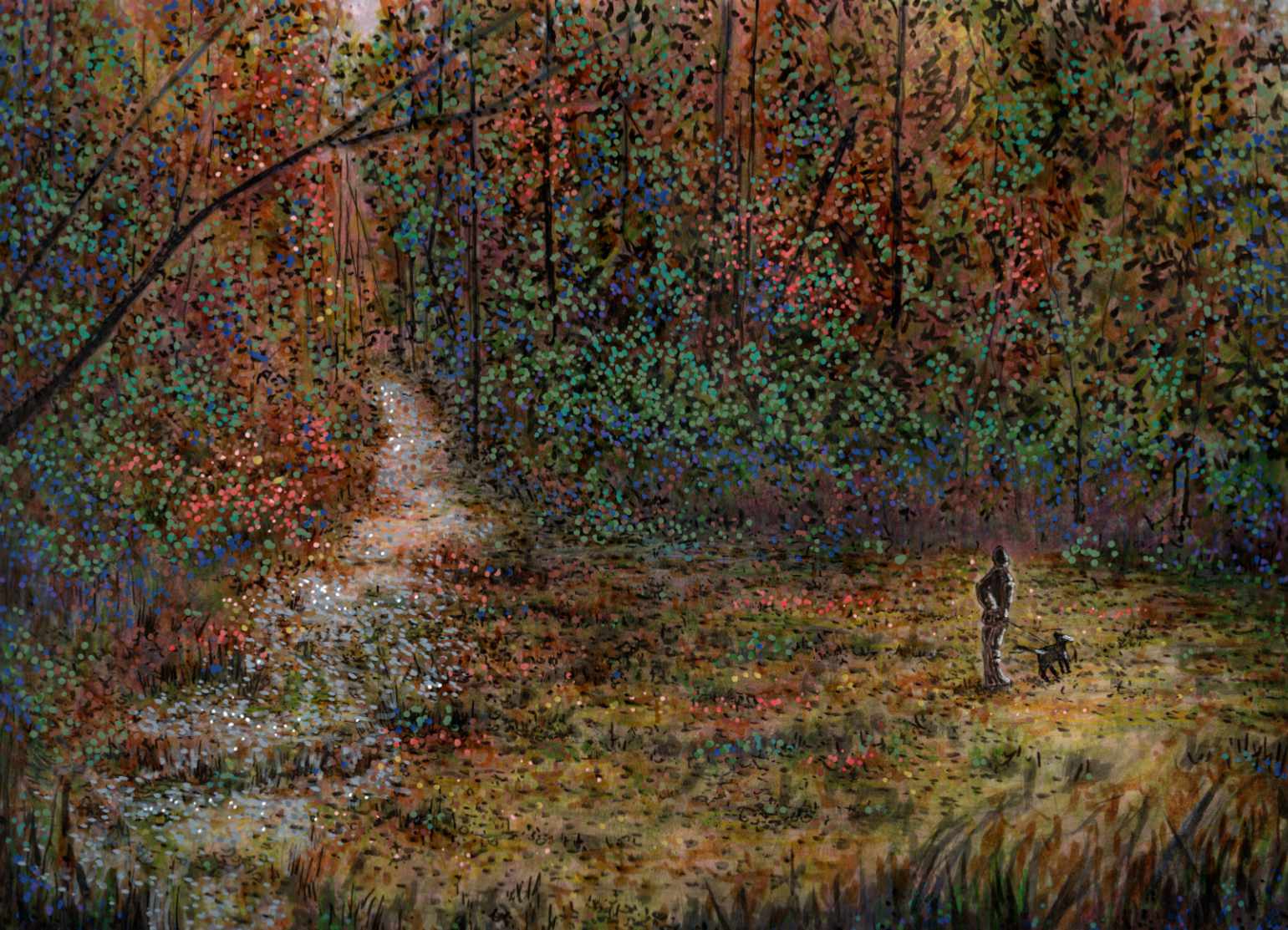
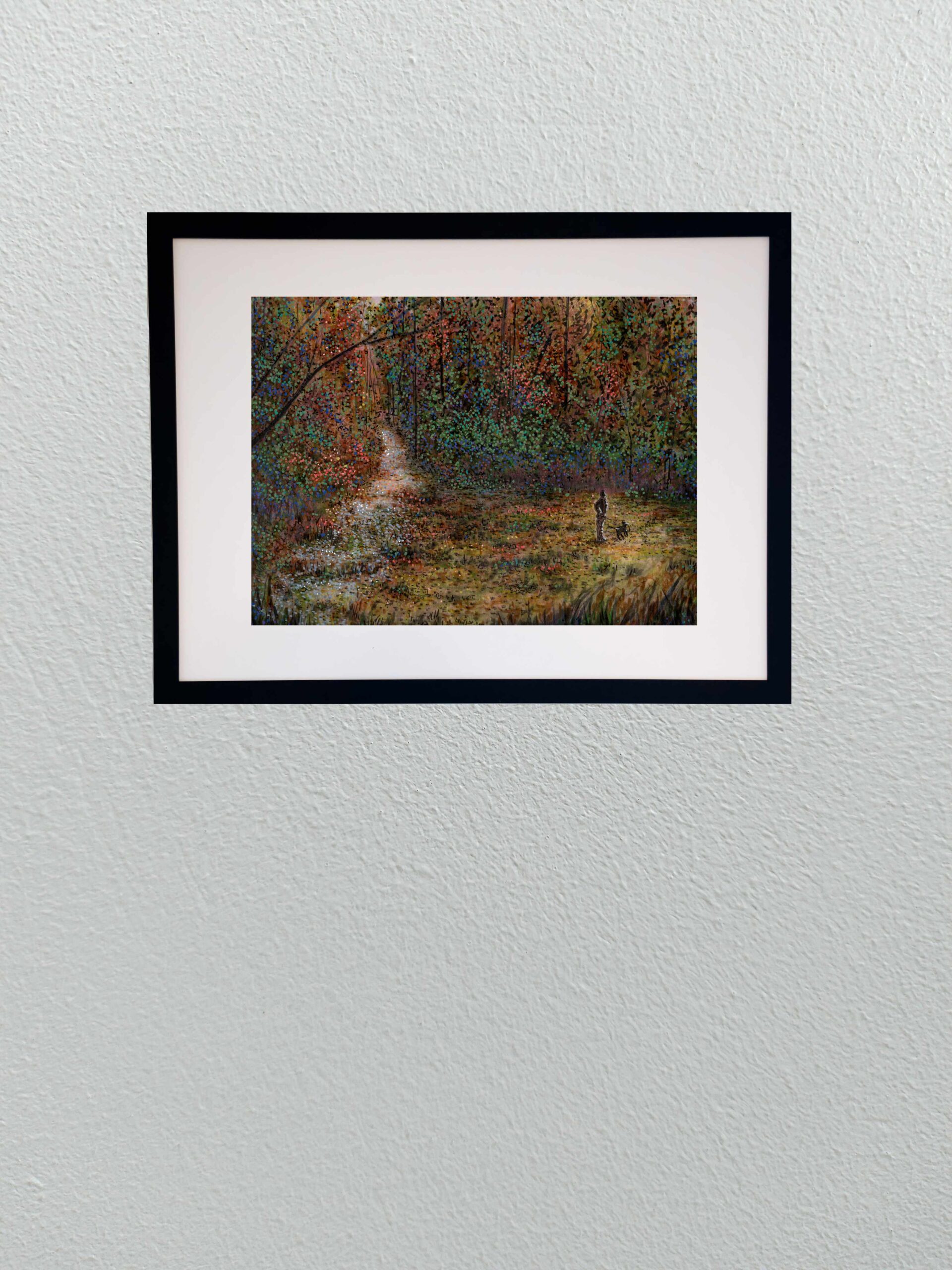
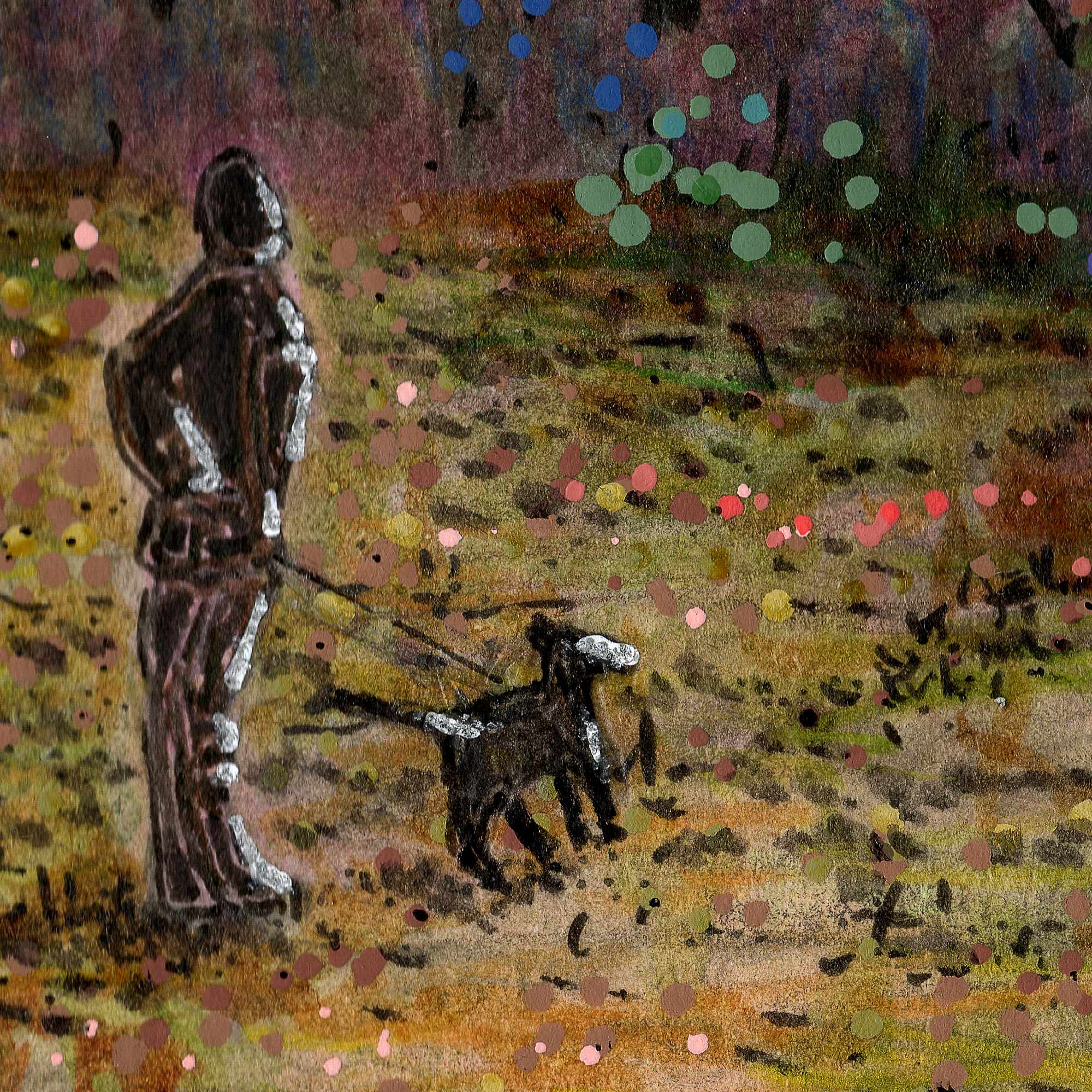
    Today I am sharing a new mixed media piece that explores a specific memoryโ€”twilight in a silent meadow. This composition, based on a low-light photograph taken a few years ago, was an exercise in capturing a delicate visual tension. The scene possesses a profound tranquility, yet beneath that stillness lies something subtly unsettlingโ€”a feeling I wanted to preserve and amplify.

    While the original photo provided the structure and the quiet posture of the figure, the translation to paper was driven entirely by a need to dictate emotional weight through medium. I build the density and movement in the foreground undergrowth through networks of energetic, scratching lines using Sakura fineliners and Faber-Castell Pitt pens, contrasting against the still, flat fields of color in the sky.

    By utilizing a Post-Impressionist or Synthetist paletteโ€”swapping natural colors for a heavy, low-light atmosphere of muted purple, cool blue, and an unnerving yellow-greenโ€”I aimed to create a psychological filter. This piece combines the raw texture of graphite and ink from my earlier studies with the bold, non-naturalistic color blocking I’ve been exploring recently. It is a portrait of solitude, suspended in a vibrating, eerie twilight.

    Technical Details:

    • 9×12 140lb cold press
    • Faber-Castell Pitt pens
    • Shuttle Art paint pens
    • Staedtler Pigment Liner
    • Sakura Pigma

  • Spring Vetch

    Spring Vetch

    This study captures a spring field in Georgia, where the greens and yellows feel like they arrived overnight. I used India ink to build the colors in layers, following an Impressionist approach where the depth emerges slowly through repeated marks rather than solid lines. Against that translucent ink, I used acrylics sparingly as a solid, opaque counterpoint.

    I applied them specifically to the purple vetch in the foreground and a few select leaves to give the eye a place to land. The cold press paper captures and holds the ink exactly where I want it, keeping the pigment in place while allowing just the smallest edges to blend into the tooth. Itโ€™s a fast, rhythmic way to work that records the spirit of the place without getting bogged down in every individual blade of grass.

    Technical Details:

    • 8×10 140lb cold press
    • Sakura Pigma pens
    • Faber-Castell Pitt pens
    • Acrylic swipe
  • sweets shoppe

    sweets shoppe

    The painting presents a charming drawing of a local confectionery by a verdant landscape. The house itself has a classic design, featuring a grey roof and brick walls, with two windows that add to its cozy and welcoming appearance.ย 

    In the background, the image is framed by towering trees with dense foliage, providing a natural backdrop that contributes to the overall serenity. The variety of trees, including palm trees on the right, adds a touch of tropical beauty and diversity to the setting. The bright colors used for the sky and surroundings indicate that it is daytime, casting the entire scene in a cheerful and peaceful light. The drawing captures a picturesque moment, inviting viewers to imagine the tranquility of life in such a lovely environment.

    Technical Details:

    • Acrylic wash
    • Sakura Pigma pens
    • 9ร—12 140lb cold press
  • Physical: Nunnally Road

    Physical: Nunnally Road

    Here is the first of the physical work for this series.

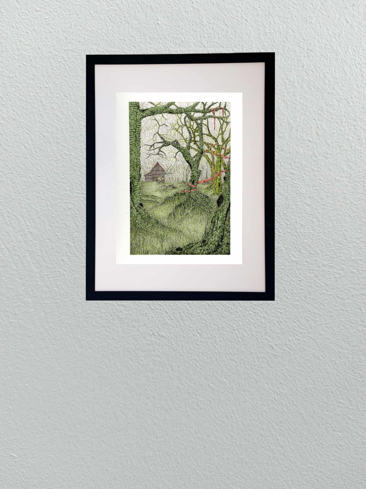
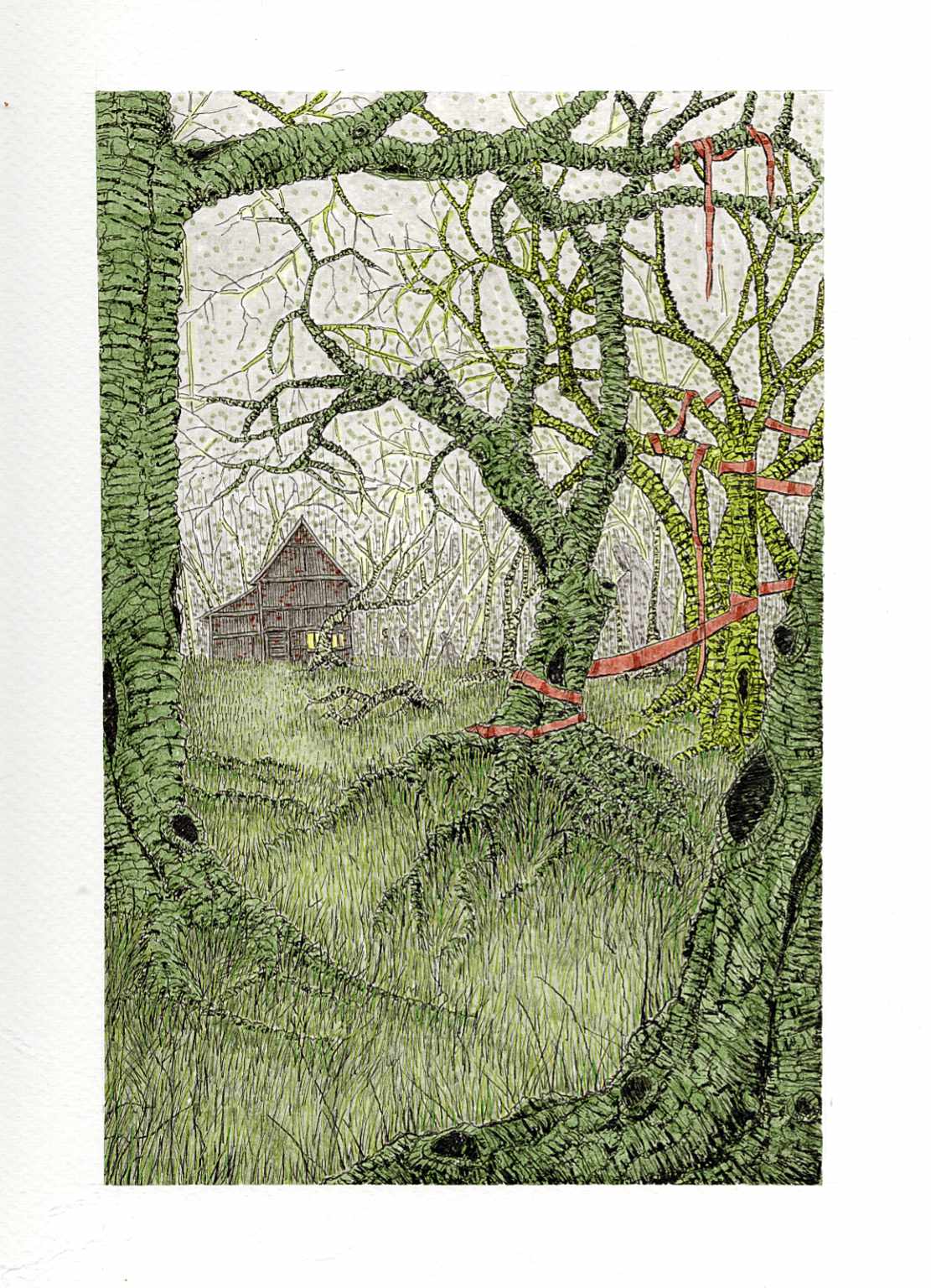
    Iโ€™m excited to introduce the first piece in a new three-part illustrative series. The theme is a blend of seasonal whimsy and the gentle, spooky feeling of unique, isolated structures. Over the years, Iโ€™ve collected photographs of fascinating buildings, and this series gives them a new life and a new story.

    I chose a stark, graphic style with strong linework to evoke the feeling of a classic block print or a storybook illustration. While this image was created digitally, Iโ€™m currently working on its physical counterpart, exploring the dialogue between the two mediums. This piece, โ€œNunnally Road,โ€ is the beginning of that exploration.

    Technical Details:

    • Acrylic swipe
    • Sakura Pigma pens
    • 9×12 140lb cold press